GIF & IGIS from space
/Made this for fun for the GIF & IGIS from NASA's "abcs from space" site: http://earthobservatory.nasa.gov/Features/ABC/. Was going to do "Kellylab" but ran out of time.
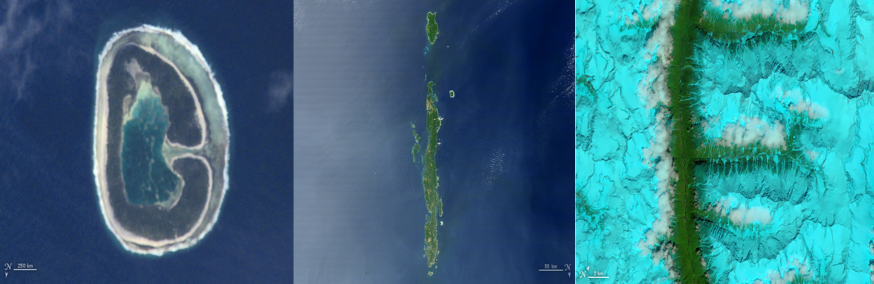
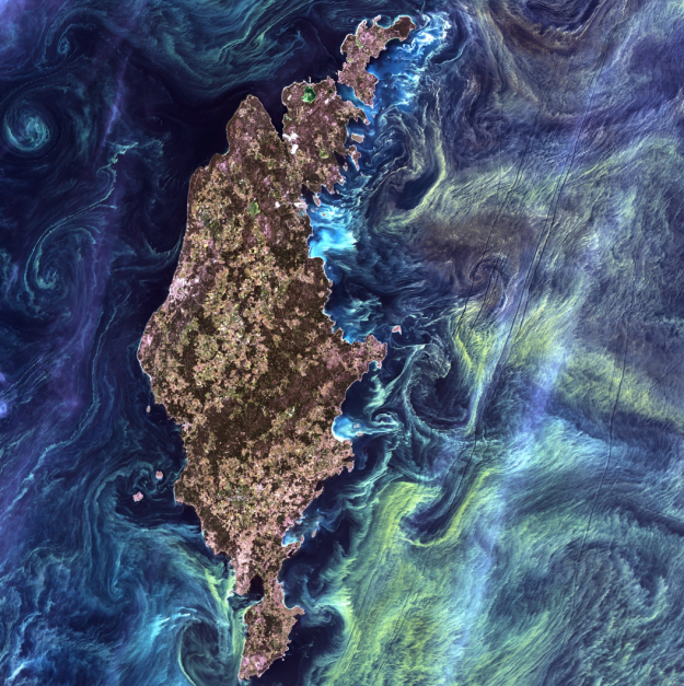
- G: This image of Pinaki Island was captured by astronauts on the International Space Station in April 2001.
- I: On February 10, 2007, the Moderate Resolution Imaging Spectroradiometer (MODIS) on NASA’s Terra satellite captured this image of the Andaman Islands. The thin, bright rings surrounding several of the islands are coral reefs that were lifted up by a massive earthquake near Sumatra in 2004.
- F: The Operational Land Imager (OLI) on Landsat 8 acquired this false-color image of valleys and snow-covered mountain ranges in southeastern Tibet on August 4, 2014. Firn is a granular type of snow often found on the surface of a glacier before it has been compressed into ice.
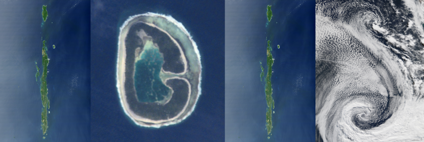
- I: On February 10, 2007, the Moderate Resolution Imaging Spectroradiometer (MODIS) on NASA’s Terra satellite captured this image of the Andaman Islands. The thin, bright rings surrounding several of the islands are coral reefs that were lifted up by a massive earthquake near Sumatra in 2004.
- G: This image of Pinaki Island was captured by astronauts on the International Space Station in April 2001.
- S: On April 29, 2009, the Moderate Resolution Imaging Spectroradiometer (MODIS) on the Terra satellite acquired this image of clouds swirling over the Atlantic Ocean.