Berkeley Food Institute's new grants announced

The new Berkeley Food Institute has released its crop of funded projects from its first seed grant program. Our project Making the Road by Mapping: Informing Food System Transformation through Participatory Mapmaking was selected for seed funding. This project, led by Kathryn DeMaster includes graduate students Adam Calo (ESPM) and Sarah Van Wart (Information), Darin Jensen (Geography), Tapan Parikh (Information), Kaley Grimland-Mendoza (Agriculture and Land-Based Training Association), Amber Sciligo (Post-doc, ESPM), Christy Getz (ESPM), and Jennifer Sowerwine (Jepson Herbaria). We look forward to digging in.

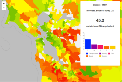
Our participatory mapping research project has four primary purposes: First, we explore participatory mapping as a way to collaboratively generate new food system knowledge with scholars, practitioners, and producers. Second, through a process we term “communitysourcing,” we aim to illuminate overlooked caches of community-based knowledge and engage community members, agricultural producers and scholars in collaborative efforts to map a particular food system supply chain (small-scale organic strawberry production in the Salinas Valley). Third, we aim to integrate the interdisciplinary community-based participatory research with specific understandings of the way that certain agricultural policies either facilitate or restrict sustainable small-scale organic strawberry production in the Salinas Valley (with a particular focus on water quality and food safety policy/regulations). Fourth, we will present our findings in novel, innovative, and visually captivating ways that will: (a) Inform specific policies/regulations and; (b) Provide small-scale producers with easily accessible caches of community generated knowledge to inform their practices.

http://berkeleyfoodinstitute.org/current-research/

Dense cities contribute less GHG

A CoolClimate Map of the SF Bay Area's carbon footprint by zipcode tabulation area shows a pattern typical of large metropolitan areas: a small footprint (green) in the urban core but a large footprint (orange and red) in surrounding suburbs.According to a new study by Dan Kammen and graduate student Christopher Jones at UC Berkeley, population-dense cities contribute less greenhouse-gas emissions per person than other areas of the country, but these cities’ extensive suburbs essentially wipe out the climate benefits.

Dominated by emissions from cars, trucks and other forms of transportation, suburbs account for about 50 percent of all household emissions – largely carbon dioxide – in the United States.

The study uses local census, weather and other data – 37 variables in total – to approximate greenhouse gas emissions resulting from the energy, transportation, food, goods and services consumed by U.S. households, so-called household carbon footprints.

A key finding of the UC Berkeley study is that suburbs account for half of all household greenhouse gas emissions, even though they account for less than half the U.S. population. The average carbon footprint of households living in the center of large, population-dense urban cities is about 50 percent below average, while households in distant suburbs are up to twice the average.

Interactive carbon footprint maps for more than 31,000 U.S. zip codes in all 50 states are available online at http://coolclimate.berkeley.edu/maps.

A link to their paper in Environmental Science & Technology is here: Spatial distribution of U.S. household carbon footprints reveals suburbanization undermines greenhouse gas benefits of urban population density (ES&T, 2014)

From: http://newscenter.berkeley.edu/2014/01/06/suburban-sprawl-cancels-carbon-footprint-savings-of-dense-urban-cores/

Helsinki wants feedback on its new urban plans

From Greg Brown.

Helsinki, Finland is developing a new city plan for the future (http://www.hel.fi/wps/portal/Kaupunkisuunnitteluvirasto_en). Helsinki becomes possibly the first major world city to use PPGIS to inform its comprehensive city planning process.   The PPGIS website was developed by Mapita (http://mapita.eu/), a software company founded by Prof. Marketta Kytta and others at Aalto University.  The website launched several days ago and has already had over 5500 participants map places and preferences for the future of Helsinki.
 
You can visit the website here:  https://helsinki.asiatkartalle.fi (There is an option to try out the website without having your map markers or survey responses included in the results…see option below the “Begin” button that says ”Try without saving answers”).

Some cool images showing the power of lidar and cartography

From Martin Isenburg, the brain behind LAStools.

Using LAStools, ArcGIS, and Photoshop, GRAFCAN has produced a LiDAR-derived digital suface model (DSM) that is seriously doped up: a synthetic map providing an intuitive understanding of the landscape. The product combines standard hillshading with a height and feature based color-coding that enables the viewer to "see" where trees are tall and to grasp height differences between buildings. The new product is available at a resolution of 2.5 meters/pixel via the GRAFCAN Web viewer and also as a WMS service. More info and pics here: http://rapidlasso.com/2013/11/03/grafcan-launches-dsm-on-steroids/.

Comparison between bare earth DTM and DSM with cartography.


Check out the greenhouses, which ppear as “low planar vegetatation”. They are made out of coarse maze fabric (instead of glass) that lets the laser through and does not deflect it (like glass would).

New study on diabetes risk and neighborhood walkability

The reading for this week's GIS class on vector analysis discussed network buffer measures of neighborhood walkability, and the class came up with numerous components of the built and social environment that the authors didn't include in their land-use based walkability measure that also likely influence people's walking behaviors (e.g. destinations to walk to, crime/safety, trees and greenness, sidewealk quality and ramps, traffic, disincentives from parking costs, etc.). It was a great discussion! I just came acrosos this write-up about a recent article in the journal Diabetes Care that finds a strong relationship between neighborhood walkability and diabetes risk, especially for low-income immigrants. The UC Library doesn't have online access to the most recent one month of articles for this journal, so I haven't been able to look at the full methodolgy for their walkabilty measure. But, I wanted to note it here and will follow-up later with details. Or, if anyone finds access to the full article, please let me know!


One Hundred Years of Land Values in Chicago

Gabriel Ahlfeldt, from the London School of Economics, presents in a video in the link below on an interesting project that digitized Olcott's Blue Books, a unique dataset of historical land values, land uses, building heights, and other information in Chicago and its suburbs, published annually between 1900 and 1990. The digitized information from the Blue Books allows for detailed historical statistical and geospatial analyses. The visualization of the data is presented in the video using GIS software.

View the video on youtube by clicking here.

New open datasets for City of Oakland and Alameda County

Following on the footsteps of the county and city of San Francisco open data repository at data.sfgov.org, two new beta open data repositories have recently been released for the City of Oakland and Alameda County. This development coincides with the recent 2012 Code for Oakland hackathon last week. The hackathon aims to make government more transparent in the city and county through the use of technology with apps and the web to make public access to government data easier. The City of Oakland’s open data repository at data.openoakland.org includes data on crime reports for a variety of spatial scales, a variety of tabular and geographic data such as parcels, roads, trees, public infrastructure, and locations of new development to name a few. It is important to note that the Oakland open data repository is currently not officially run or maintained by the City of Oakland. It is currently maintained by members of the community and the OpenOakland Brigade. Alameda County’s open data repository at data.acgov.org includes data on Sherriff crime reports, restaurant health reports, solar generation data, and a variety of tabular and geographic data and public health department data. Data can be viewed on a browser as an interactive table or an interactive map or the data can be downloaded in a variety of formats. Both sites are still in their infancy so expect more datasets to come online soon. Also on the same note, the Urban Strategies Council recently released a new version of their InfoAlamedaCounty webGIS data visualization and map viewer - check it out.

 Screenshot of City of Oakland Open Data: data.openoakland.org

Screenshot of Alameda County Open Data: data.acgov.org

Crowdsourced neighborhood boundaries

Andy Woodruff and Tim Wallace from Bostonography discuss the first preliminary results of an experiment they set up with an interactive webGIS tool that allows people to draw polygons where they think each of Boston’s neighborhoods are located. About 300 maps of neighborhoods have been submitted so far and with the compiled data there are many areas of agreement and disagreement on where neighborhood boundaries may lay. Bostonography created maps showing a gradient of agreement for each neighborhood's boundary. This exercise is reminiscent to the work of Kevin Lynch and is an interesting experiment in trying to see if there is a consensus on where people think neighborhood boundaries are as opposed to how they are defined officially by the city. For the full blog post and maps on Bostonography click here. For an article in the Atlantic Cities that discusses the maps click here.

Strength or density of polygon line placement of crowdsourced neighborhood boundaries

New Trulia commute time maps

Trulia recently released a new commute time map that shows your estimated time of arrival in real time to all points in a region. The service uses OpenStreetMap data and General Transit Feed Specification (GTFS) feeds to calculate travel time. Drive times are available nationwide with public transit travel time only available in select cities for now. Read the full story here or click here for the map.

Screenshot from Trulia commute map

Philadelphia food desert eradication project

Here is a recent article from the Washington Post examining Philadelphia's Get Healthy Philly initiative. $900,000 from the project is going to be spent on turning 632 corner stores in the city into green grocers. The effort helps these corner stores buy and supply fresh fruits and vegetables and buy the infrastructure needed to store them, such as refrigerators.

This effort goes in hand with a new study in the city that will examine what happens when more nutritious foods are introduced into traditionally underserved neighborhoods. Measuring what people bought before, what they’re eating now, and how health outcomes change. The article also explores other research on food deserts, access to healthy foods, and health outcomes with lessons learned.

For the full article click here.

Lidar + OPALs geolunch and workshop next week!

Full waveform lidarOur colleague Bernhard Hofle from the University of Heidelberg will be here next week as part of an international exchange project: Airborne Laser Scanning for 3D Vegetation Characterization: Set-up of an International Signature Database. Bernhard is interested in Open Source GI and Spatial Database Management Systems, Object-based image and point cloud analysis, radiometric calibration of full-waveform airborne LiDAR data, and other topics.

Bernhard is part of a group that now has one of the first Terrestrial Laser Scanning (TLS) systems worldwide with full-waveform recording capability (upgraded Riegl VZ-400). Deeper understanding and substantially improved analysis of the laser shot backscatter of natural objects by having direct access to full-waveform signatures and physical observables are expected. The unique system will be applied in new research projects dealing with the extraction of 3D geoinformation in e.g. precision farming, geoarchaelogy, geomorphology and forestry. Furthermore, an extensive web-based database of reference signatures for known objects will be developed based on calibrated waveform features derived by TLS.

He is a leader in analysis of discrete and waveform lidar data in urban and forest applications and one of the developers of the cool OPALS lidar software. He'll be giving a geolunch and a workshop afterwards on the software. The geolunch is 1-2, then we will stick around and learn about OPALS.

The structure of a city via Twitter

From Mashable Tech.

Check out this gorgeous visualization of NY City's tweetopolis from Oakland-based programmer Eric Fischer.

He plots out the motion of New Yorkers using public tweets on Twitter with geotags from May 2011 until January.

The project lays out around 10,000 geotagged tweets and 30,000 point-to-point trips in cities like New York City to plot the flow of people in terms of favored paths. In his map of NYC, seen above, there is a huge ink blot lining Broadway; as we’ve long suspected, it looks like the busy avenue is the backbone of the city.

Using a base map from OpenStreetMap, he drew out transit paths using Tweets. Movements are indicated on the geolocation of a Tweet, with an individual’s start point marked with one geotagged Tweet and ending with the next geotagged Tweet. This is what creates a mass of traffic routes.

Similar viz of the east bay“If you just draw lines from the beginning to the ending of each trip, you get a big mess, so the challenge is to come up with more plausible routes in between,” Fischer told Mashable. “That is where the 10,000 individual geotags come in, the most plausible routes are ones that pass closely through places that other people have been known to go.”

Fischer used Dijkstra’s Algorithm to calculate what exactly to map out. For those of who haven’t thought about math since high school algebra, that’s an equation that maps out the shortest path between two points on a graph. For this project, the equation pointed to the relevant paths to map out a city’s most dense corridors.

This might be of use for our mobility project with our space.

More here.

mapping gas leaks in Boston

The Google Earth image above shows shafts of bright green indicating natural gas leaking around BU's Charles River Campus. If there are multiple leaks, the display “looks like a stock market index during a busy day,” says Nathan Phillips. Photo courtesy of Nathan Phillips and Picarro, Inc.This is a very interesting report about work at BU Geography and Environment department to map gas leaks across the city. Nathan Phillips, Bob Ackley and Eric Crosson use a Nissan-mounted methane sensor to survey for leaks, and map results on a google earth scene. The accompanying video shows the setup, and discusses some nasty real time implications for trees as gas replaces oxygen in the soil. Also, this is just nuts to think of how much wasted gas is going up in a typical city. Yikes!

MIT releases new Urban Network Analysis Tool for ArcGIS 10

The MIT City Form Research Group recently released a new open-source plugin for ArcGIS 10 to perform advanced spatial analyses on network data such as urban street networks. The tool can give researchers a better understanding of how the spatial layout of cities and their social, economic, and environmental processes affect the way people live in it.

The tool measures reach, gravity, betweenness, closeness, and straightness on spatial networks. This means you can assess the number of services or resources within a certain walking distance and can analyze the volume of traffic along sidewalks and streets. Like other network analysis tools, the tool evaluates network element geometry and distance and distinguishes between shorter and longer links. What is unique about this tool is that it not only operates with node and edge elements like other network analysis tools, but it can also incorporate additional network elements such as buildings. Individual buildings or objects can be characterized within spatial networks and can be weighted to give more or less influence. For example, more populated buildings can be set to have a greater impact on results. The tool can also be used to assess urban growth and change.

Click here for the press release.

Travel time and housing prices map

Our Bay Area regional planning agencies have just released a new interactive map that lets you visualize your housing options given your employment location, income, and desired commute time and mode. It's all part of the regional planning efforts that are happening statewide as a result of SB 375, which requires the integration of housing and land use planning to encourage people to drive less.

The press release gives more details: "If you're in the market to buy a home in the Bay Area, wouldn't it be nice to know how long it would take to commute from neighborhoods in your price range to your work place? Well, now you can, thanks to a new mapping tool on OneBayArea.org.

The interactive map shows you approximately how far you can get from any address within the nine-county region by car, public transit, bike, or on foot, at different times of the day. You can customize your view by the travel time between areas, and the median price of homes in each area."

New BAAMA Journal Published

Volume 5, Issue 1 - Spring 2011

BAAMA is pleased to announce The BAAMA Journal has been published in conjunction with Earth Day.  Special thanks to all our contributing authors and editors.  The BAAMA Journal is a publication that highlights Bay Area people and projects that use geospatial technologies.

IN THIS ISSUE:

  • Building Virtual San Francisco: Growing Up With GIS
  • DPW Uses LiDAR and a Custom Algorithm for Delineating Drainage Catchments and Hydrologic Modeling
  • Preparing Historical Aerial Imagery of Southern California Deserts for use in LADWP's GIS
  • Where in the Bay Area