Day 4 Wrap Up from the NEON Data Institute 2017

Day 4 http://neondataskills.org/data-institute-17/day4/

This is it! Final day of LUV-DATA. Today we focused on hyperspectral data and vegetation. Paul Gader from the University of Florida kicked off the day with a survey of some of his projects in hyperspectral data, explorations in NEON data, and big data algorithmic challenges. Katie Jones talked about the terrestrial observational plot protocol at the NEON sites. Sites are either tower (in tower air-shed) or distributed (throughout site). She focused on the vegetation sampling protocols (individual, diversity, phenology, biomass, productivity, biogeochemistry). Data to be released in the fall. Samantha Weintraub talked to us about foliar chemistry data (e.g. C, N, lignin, chlorophyll, trace elements) and linking with remote sensing. Since we are still learning about fundamental controls on canopy traits within and between ecosystems, and we have a poor understanding of their response to global change, this kind of NEON work is very important. All these foliar chemistry data will be released in the fall. She also mentioned the extensive soil biogeochemical and microbial measurements in soil plots (30cm depth) again in tower and distributed plots (during peak greenness and 2 seasonal transitions).

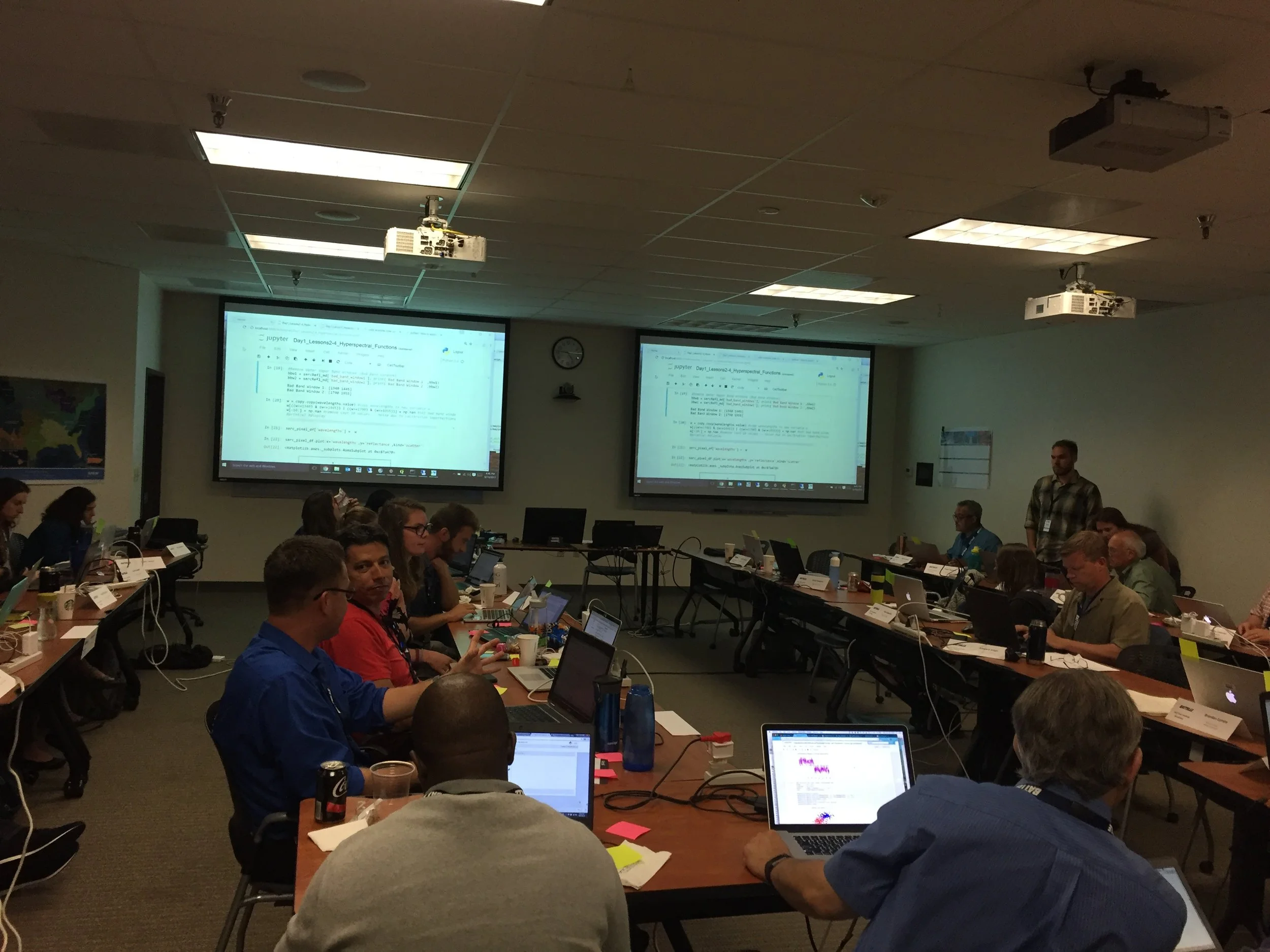
The coding work focused on classifying spectra (Classification of Hyperspectral Data with Ordinary Least Squares in Python), (Classification of Hyperspectral Data with Principal Components Analysis in Python) and (Using SciKit for Support Vector Machine (SVM) Classification with Python), using our new best friend Jupyter Notebooks. We spent most of the time talking about statistical learning, machine learning and the hazards of using these without understanding of the target system. 

Fun additional take-home messages/resources:

  • NEON data seems like a tremendous resource for research and teaching. Increasing amounts of data are going to be added to their data portal. Stay tuned: http://data.neonscience.org/home
  • NRC has collaborated with NEON to do some spatially extensive soil characterization across the sites. These data will also be available as a NEON product.
  • Fore more on when data rolls out, sign up for the NEON eNews here: http://www.neonscience.org/

Thanks to everyone today! Megan Jones (ran a flawless workshop), Paul Gader (remote sensing use cases/classification), Katie Jones (NEON terrestrial vegetation sampling), Samantha Weintraub (foliar chemistry data).

And thanks to NEON for putting on this excellent workshop. I learned a ton, met great people, got re-energized about reproducible workflows (have some ideas about incorporating these concepts into everyday work), and got to spend some nostalgic time walking around my former haunts in Boulder.

Day 1 Wrap Up
Day 2 Wrap Up
Day 3 Wrap Up

Day 3 Wrap Up from the NEON Data Institute 2017

Today we focused on uncertainty. Yay! http://neondataskills.org/data-institute-17/day3/

Tristan Goulden gave a talk on sources of uncertainty in the discrete return lidar data. Uncertainty comes from two main sources: geolocation - horizontal and vertical (e.g. distance from base station, distribution and number of satellites, and accuracy of IMU), and processing (e.g. classification of point cloud, interpolation method ). The NEON remote sensing team has developed tests for each of these error sources. NEON provides with all their lidar data a simulated point cloud error product, with horizontal and vertical error per point in LAS format (cool!). These products show the error is largest at the edges of scans, obvi.

  • The take homes are: fly within 20km of a basestation; test your lidar sensor annually; check your boresight; dense canopy make ground point density more sparce, so DTM is problematic; and initial point cloud misclassification can lead to large errors in downstream products. So much more in my notes.

We then coded an example from the PRIN NEON site, where NEON captured lidar data twice within 2 days, and so we could explore how different the data were. Again, we used Jupyter Notebooks and explored the relative differences in DSM and DTM values between the two lidar captures. The differences are random, but non-negligible, at least for DSM. For the DTM, the range = 0.0-20cm; but for the DSM the range = 0.0-1.5. The mean DSM is 6.34m, so the difference can be ~20%. The take home is that despite a 15cm accuracy spec from vendors on vertical accuracies, you can get very different measures on different flights and those can be considerable, especially with vegetation. In fact, NEON meets its 15cm accuracy requirements only in non-vegetated areas. Note, when you download NEON data, you can get line-to-line differences in the NEON lidar metadata, to kind of explore this. But assume if you are in heavily vegetated areas you should expect higher than 15cm error.

After lunch we launched into the NEON Imaging Spectrometer data and uncertainty with Nathan This is something I had not really thought about before this workshop.
We talked about orthorectfication and geolocation, focal plan characterization, spectral calibration and radiometric calibration and all the possible sources of error that can creep into the data, like blurring and ghosting of light. NEON calibrates their data across these areas, and provided information on each. I don't think there are many standards for reporting these kinds of spectral uncertainties.

The first live coding exercise (Hyperspectral Variation Uncertainty Analysis in Python) looked at the NEON site F07A, at which NEON acquired 18 individual flights (for BRDF work) over an hour on one day. We used these data and plotted the different spectral reflectance curves for several pixels. For a vegetated pixel, the NIR can vary tremendously! (e.g. 20% reflectance compared to 50% reflectance, depending on time of day, solar angle, etc.) Wow! I should note that the related indices - NDVI, which are ratios, will not be as affected. Also, you can normalize the output using some nifty methods like the Standard Normal Variate (SNV) algorithm, if you have large areas over which you can gather multiple samples.

The second live coding exercise (Assessing Spectrometer Accuracy using Validation Tarps with Python) focused on a calibration experiment they conducted at CHEQ for the NIS instrument. They laid out two reflectance tarps - 3% (black) and 48% (white), measured reflectance with an ASD spectrometer, and flew over with the NIS. We compared the data across wavelengths. Results summary: small differences between ASD and NIS across wavelengths; water absorption bands play a role; % differences can be quite high - up to 50% for the black tarp. This is mostly from stray light from neighboring areas. NEON has a calibration method for this (they call it their "de-blurring correction").

Fun additional take-home messages/resources:

  • All NEON point cloud classifications are done with LASTools. Go LASTools! https://rapidlasso.com/lastools/
  • Check out pdal - like gdal for point clouds. It can be used from bash. Learned from my workshop neighbor Sergio Marconi https://www.pdal.io/
  • Reflectance Tarps are made by GroupVIII http://www.group8tech.com/
  • ATCOR http://www.rese.ch/products/atcor/ says we should be able to rely on 3-5% error on reflectance when atmospheric correction is done correctly (say that 10 times fast) with a well-calibrated instrument.
  • NEON hyperspectral data is stored in HDF5 format. HDFView is a great tool for interrogating the metadata, among other things.

Thanks to everyone today! Megan Jones (our fearless leader), Tristan Goulden (Discrete Lidar Uncertainty and all the coding), Nathan Leisso (spectral data uncertainty), and Amanda Roberts (NEON intern - spectral uncertainty).

Day 1 Wrap Up
Day 2 Wrap Up 
Day 3 Wrap Up
Day 4 Wrap Up

Day 2 Wrap Up from the NEON Data Institute 2017

First of all, Pearl Street Mall is just as lovely as I remember, but OMG it is so crowded, with so many new stores and chains. Still, good food, good views, hot weather, lovely walk.

Welcome to Day 2! http://neondataskills.org/data-institute-17/day2/
Our morning session focused on reproducibility and workflows with the great Naupaka Zimmerman. Remember the characteristics of reproducibility - organization, automation, documentation, and dissemination. We focused on organization, and spent an enjoyable hour sorting through an example messy directory of misc data files and code. The directory looked a bit like many of my directories. Lesson learned. We then moved to working with new data and git to reinforce yesterday's lessons. Git was super confusing to me 2 weeks ago, but now I think I love it. We also went back and forth between Jupyter and python stand alone scripts, and abstracted variables, and lo and behold I got my script to run. All the git stuff is from http://swcarpentry.github.io/git-novice/

The afternoon focused on Lidar (yay!) and prior to coding we talked about discrete and waveform data and collection, and the opentopography (http://www.opentopography.org/) project with Benjamin Gross. The opentopography talk was really interesting. They are not just a data distributor any more, they also provide a HPC framework (mostly TauDEM for now) on their servers at SDSC (http://www.sdsc.edu/). They are going to roll out a user-initiated HPC functionality soon, so stay tuned for their new "pluggable assets" program. This is well worth checking into. We also spent some time live coding with Python with Bridget Hass working with a CHM from the SERC site in California, and had a nerve-wracking code challenge to wrap up the day.

Fun additional take-home messages/resources:

Thanks to everyone today! Megan Jones (our fearless leader), Naupaka Zimmerman (Reproducibility), Tristan Goulden (Discrete Lidar), Keith Krause (Waveform Lidar), Benjamin Gross (OpenTopography), Bridget Hass (coding lidar products).

Day 1 Wrap Up
Day 2 Wrap Up 
Day 3 Wrap Up
Day 4 Wrap Up

Our home for the week

Our home for the week

Day 1 Wrap Up from the NEON Data Institute 2017

I left Boulder 20 years ago on a wing and a prayer with a PhD in hand, overwhelmed with bittersweet emotions. I was sad to leave such a beautiful city, nervous about what was to come, but excited to start something new in North Carolina. My future was uncertain, and as I took off from DIA that final time I basically had Tom Petty's Free Fallin' and Learning to Fly on repeat on my walkman. Now I am back, and summer in Boulder is just as breathtaking as I remember it: clear blue skies, the stunning flatirons making a play at outshining the snow-dusted Rockies behind them, and crisp fragrant mountain breezes acting as my Madeleine. I'm back to visit the National Ecological Observatory Network (NEON) headquarters and attend their 2017 Data Institute, and re-invest in my skillset for open reproducible workflows in remote sensing. 

Day 1 Wrap Up from the NEON Data Institute 2017
What a day! http://neondataskills.org/data-institute-17/day1/
Attendees (about 30) included graduate students, old dogs (new tricks!) like me, and research scientists interested in developing reproducible workflows into their work. We are a pretty even mix of ages and genders. The morning session focused on learning about the NEON program (http://www.neonscience.org/): its purpose, sites, sensors, data, and protocols. NEON, funded by NSF and managed by Battelle, was conceived in 2004 and will go online for a 30-year mission providing free and open data on the drivers of and responses to ecological change starting in Jan 2018. NEON data comes from IS (instrumented systems), OS (observation systems), and RS (remote sensing). We focused on the Airborne Observation Platform (AOP) which uses 2, soon to be 3 aircraft, each with a payload of a hyperspectral sensor (from JPL, 426, 5nm bands (380-2510 nm), 1 mRad IFOV, 1 m res at 1000m AGL) and lidar (Optech and soon to be Riegl, discrete and waveform) sensors and a RGB camera (PhaseOne D8900). These sensors produce co-registered raw data, are processed at NEON headquarters into various levels of data products. Flights are planned to cover each NEON site once, timed to capture 90% or higher peak greenness, which is pretty complicated when distance and weather are taken into account. Pilots and techs are on the road and in the air from March through October collecting these data. Data is processed at headquarters.

In the afternoon session, we got through a fairly immersive dunk into Jupyter notebooks for exploring hyperspectral imagery in HDF5 format. We did exploration, band stacking, widgets, and vegetation indices. We closed with a fast discussion about TGF (The Git Flow): the way to store, share, control versions of your data and code to ensure reproducibility. We forked, cloned, committed, pushed, and pulled. Not much more to write about, but the whole day was awesome!

Fun additional take-home messages:

Thanks to everyone today, including: Megan Jones (Main leader), Nathan Leisso (AOP), Bill Gallery (RGB camera), Ted Haberman (HDF5 format), David Hulslander (AOP), Claire Lunch (Data), Cove Sturtevant (Towers), Tristan Goulden (Hyperspectral), Bridget Hass (HDF5), Paul Gader, Naupaka Zimmerman (GitHub flow).

Day 1 Wrap Up
Day 2 Wrap Up 
Day 3 Wrap Up
Day 4 Wrap Up

Cloud-based raster processors out there

Hi all,

Just trying to get my head around some of the new big raster processors out there, in addition of course to Google Earth Engine. Bear with me while I sort through these. Thanks for raster sleuth Stefania Di Tomasso for helping. 

1. Geotrellis (https://geotrellis.io/)

Geotrellis is a Scala-based raster processing engine, and it is one of the first geospatial libraries on Spark.  Geotrellis is able to process big datasets. Users can interact with geospatial data and see results in real time in an interactive web application (for regional, statewide dataset).  For larger raster datasets (eg. US NED). GeoTrellis performs fast batch processing using Akka clustering to distribute data across the cluster.  GeoTrellis was designed to solve three core problems, with a focus on raster processing:

  • Creating scalable, high performance geoprocessing web services;
  • Creating distributed geoprocessing services that can act on large data sets; and
  • Parallelizing geoprocessing operations to take full advantage of multi-core architecture.

Features:

  • GeoTrellis is designed to help a developer create simple, standard REST services that return the results of geoprocessing models.
  • GeoTrellis will automatically parallelize and optimize your geoprocessing models where possible.
  • In the spirit of the object-functional style of Scala, it is easy to both create new operations and compose new operations with existing operations.

2. GeoPySpark - in synthesis GeoTrellis for Python community

Geopyspark provides python bindings for working with geospatial data on PySpark (PySpark is the Python API for Spark). Spark is open source processing engine originally developed at UC Berkeley in 2009.  GeoPySpark makes Geotrellis (https://geotrellis.io/) accessible to the python community.  Scala is a difficult language so they have created this Python library. 

3. RasterFoundry (https://www.rasterfoundry.com/)

They say: "We help you find, combine and analyze earth imagery at any scale, and share it on the web." And "Whether you’re working with data already accessible through our platform or uploading your own, we do the heavy lifting to make processing your imagery go quickly no matter the scale."

Key RasterFoundry workflow: 

  1. Browse public data
  2. Stitch together imagery
  3. Ingest your own data
  4. Build an analysis pipeline
  5. Edit and iterate quickly
  6. Integrate with their API

4. GeoNotebooks

From the Kitware blog: Kitware has partnered with The NASA Earth Exchange (NEX) to design GeoNotebook, a Jupyter Notebook extension created to solve these problems (i.e. big raster data stacks from imagery). Their shared vision: a flexible, reproducible analysis process that makes data easy to explore with statistical and analytics services, allowing users to focus more on the science by improving their ability to interactively assess data quality at scale at any stage of the processing.

Extending Jupyter Notebooks and Jupyter Hub, this python analysis environment provides the means to easily perform reproducible geospatial analysis tasks that can be saved at any state and easily shared. As the geospatial datasets come in, they are ingested into the system and converted into tiles for visualization, creating a dynamic map that can be managed from the web UI and can communicate back to a server to perform operations like data subsetting and visualization. 

Blog post: https://blog.kitware.com/geonotebook-data-driven-quality-assurance-for-geospatial-data/ 

DS421 Data Science for the 21st Century Program Wrap Up!

Today we had our 1st Data Science for the 21st Century Program Conference. Some cool things that I learned: 

  • Cathryn Carson updated us on the status of the Data Science program on campus - we are teaching 1200 freshman data science right now. Amazing. And a new Dean is coming. 
  • Phil Stark on the danger of being at the bleeding edge of computation - if you put all your computational power into your model, you have nothing left to evaluate uncertainty in your model. Let science guide data science. 
  • David Ackerly believes in social networking! 
  • Cheryl Schwab gave us an summary of her evaluation work. The program outcomes that we are looking for in the program are: Concepts, communication, interdisciplinary research
  • Trevor Houser from the Rhodian Group http://rhg.com/people/trevor-houser gave a very interesting and slightly optimistic view of climate change. 
  • Break out groups, led by faculty: 
    • (Boettiger) Data Science Grand Challenges: inference vs prediction; dealing with assumptions; quantifying uncertainty; reproducibility, communication, and collaboration; keeping science in data science; and keeping scientists in data science. 
    • (Hsiang) Civilization collapses through history: 
    • (Ackerly) Discussion on climate change and land use. 50% of the earth are either crops or rangelands; and there is a fundamental tradeoff between land for food and wildlands. How do we deal with the externalities of our love of open space (e.g. forcing housing into the central valley). 
  • Finally, we wrapped up with presentations from our wonderful 1st cohort of DS421 students and their mini-graduation ceremony. 
  • Plus WHAT A GREAT DAY! Berkeley was splendid today in the sun. 
 

Plus plus, Carl B shared Drew Conway's DS fig, which I understand is making the DS rounds: 

From: http://drewconway.com/zia/2013/3/26/the-data-science-venn-diagram

From: http://drewconway.com/zia/2013/3/26/the-data-science-venn-diagram

Planet Lab wants YOU to work with their data!

They say: 

Are you a college student, researcher or professor? We’re looking for innovative academics, researchers and scientists to unlock the power of a one-of-a-kind dataset. You can now apply for access to Planet’s unique dataset for non-commercial research purposes. In an area as large as 2,000 square kilometers, you’ll have access to download imagery, analyze trends, and publish your results.

Check it: https://www.planet.com/products/education-and-research/

AAG 2017 Wrap Up: Day 3

Day 3: I opened the day with a lovely swim with Elizabeth Havice (in the largest pool in New England? Boston? The Sheraton?) and then embarked on a multi-mile walk around the fair city of Boston. The sun was out and the wind was up, showing the historical buildings and waterfront to great advantage. The 10-year old Institute of Contemporary Art was showing in a constrained space, but it did host an incredibly moving video installation from Steve McQueen (Director of 12 Years a Slave) called “Ashes” about the life and death of a young fisherman in Grenada.

My final AAG attendance involved two plenaries hosted by the Remote Sensing Specialty Group and the GIS Specialty Group, who in their wisdom, decided to host plenaries by two absolute legends in our field – Art Getis and John Jensen – at the same time. #battleofthetitans. #gisvsremotesensing. So, I tried to get what I could from both talks. I started with the Waldo Tobler Lecture given by Art Getis: The Big Data Trap: GIS and Spatial Analysis. Compelling title! His perspective as a spatial statistician on the big data phenomena is a useful one. He talks about how data are growing fast: Every minute – 98K tweets; 700K FB updates; 700K Google searches; 168+M emails sent; 1,820 TB of data created. Big data is growing in spatial work; new analytical tools are being developed, data sets are generated, and repositories are growing and becoming more numerous. But, there is a trap. And here is it. The trap of Big Data:

10 Erroneous assumptions to be wary of:

  1. More data are better
  2. Correlation = causation
  3. Gotta get on the bandwagon
  4. I have an impeccable source
  5. I have really good software
  6. I am good a creating clever illustrations
  7. I have taken requisite spatial data analysis courses
  8. It’s the scientific future
  9. Accessibly makes it ethical
  10. There is no need to sample

He then asked: what is the role of spatial scientists in the big data revolution? He says our role is to find relationships in a spatial setting; to develop technologies or methods; to create models and use simulation experiments; to develop hypotheses; to develop visualizations and to connect theory to process.

The summary from his talk is this: Start with a question; Differentiate excitement from usefulness; Appropriate scale is mandatory; and Remember more may or may not be better. 

When Dr Getis finished I made a quick run down the hall to hear the end of the living legend John Jensen’s talk on drones. This man literally wrote the book(s) on remote sensing, and he is the consummate teacher – always eager to teach and extend his excitement to a crowded room of learners.  His talk was entitled Personal and Commercial Unmanned Aerial Systems (UAS) Remote Sensing and their Significance for Geographic Research. He presented a practicum about UAV hardware, software, cameras, applications, and regulations. His excitement about the subject was obvious, and at parts of his talk he did a call and response with the crowd. I came in as he was beginning his discussion on cameras, and he also discussed practical experience with flight planning, data capture, and highlighted the importance of obstacle avoidance and videography in the future. Interestingly, he has added movement to his “elements of image interpretation”. Neat. He says drones are going to be routinely part of everyday geographic field research. 

What a great conference, and I feel honored to have been part of it. 

AAG Boston 2017 Day 1 wrap up!

Day 1: Thursday I focused on the organized sessions on uncertainty and context in geographical data and analysis. I’ve found AAGs to be more rewarding if you focus on a theme, rather than jump from session to session. But less steps on the iWatch of course. There are nearly 30 (!) sessions of speakers who were presenting on these topics throughout the conference.

An excellent plenary session on New Developments and Perspectives on Context and Uncertainty started us off, with Mei Po Kwan and Michael Goodchild providing overviews. We need to create reliable geographical knowledge in the face of the challenges brought up by uncertainty and context, for example: people and animals move through space, phenomena are multi-scaled in space and time, data is heterogeneous, making our creation of knowledge difficult. There were sessions focusing on sampling, modeling, & patterns, on remote sensing (mine), on planning and sea level rise, on health research, on urban context and mobility, and on big data, data context, data fusion, and visualization of uncertainty. What a day! All of this is necessarily interdisciplinary. Here are some quick insights from the keynotes.

Mei Po Kwan focused on uncertainty and context in space and time:

  • We all know about the MAUP concept, what about the parallel with time? The MTUP: modifiable temporal unit problem.
  • Time is very complex. There are many characteristics of time and change: momentary, time-lagged response, episodic, duration, cumulative exposure
    • sub-discussion: change has patterns as well - changes can be clumpy in space and time. 
  • How do we aggregate, segment and bound spatial-temporal data in order to understand process?
  • The basic message is that you must really understand uncertainty: Neighborhood effects can be overestimated if you don’t include uncertainty.

As expected, Michael Goodchild gave a master class in context and uncertainty. No one else can deliver such complex material so clearly, with a mix of theory and common sense. Inspiring. Anyway, he talked about:

  • Data are a source of context:
    • Vertical context – other things that are known about a location, that might predict what happens and help us understand the location;
    • Horizontal context – things about neighborhoods that might help us understand what is going on.
    • Both of these aspects have associated uncertainties, which complicate analyses.
  • Why is geospatial data uncertain?
    • Location measurement is uncertain
    • Any integration of location is also uncertain
    • Observations are non-replicable
    • Loss of spatial detail
    • Conceptual uncertainty
  • This is the paradox. We have abundant sources of spatial data, they are potentially useful. Yet all of them are subject to myriad types of uncertainty. In addition, the conceptual definition of context is fraught with uncertainty.
  • He then talked about some tools for dealing with uncertainty, such as areal interpolation, and spatial convolution.
  • He finished with some research directions, including focusing on behavior and pattern, better ways of addressing confidentiality, and development of a better suite of tools that include uncertainty.

My session went well. I chaired a session on uncertainty and context in remote sensing with 4 great talks from Devin White and Dave Kelbe from Oak Ridge NL who did a pair of talks on ORNL work in photogrammetry and stereo imagery, Corrine Coakley from Kent State who is working on reconstructing ancient river terraces, and Chris Amante from the great CU who is developing uncertainty-embedded bathy-topo products. My talk was on uncertainty in lidar inputs to fire models, and I got a great question from Mark Fonstad about the real independence of errors – as in canopy height and canopy base height are likely correlated, so aren’t their errors? Why do you treat them as independent? Which kind of blew my mind, but Qinghua Guo stepped in with some helpful words about the difficulties of sampling from a joint probability distribution in Monte Carlo simulations, etc. 

Plus we had some great times with Jacob, Leo, Yanjun and the Green Valley International crew who were showcasing their series of Lidar instruments and software. Good times for all!

GIF Bootcamp 2017 wrap up!

Our third GIF Spatial Data Science Bootcamp has wrapped!  We had an excellent 3 days with wonderful people from a range of locations and professions and learned about open tools for managing, analyzing and visualizing spatial data. This year's bootcamp was sponsored by IGIS and GreenValley Intl (a Lidar and drone company). GreenValley showcased their new lidar backpack, and we took an excellent shot of the bootcamp participants. What is Paparazzi in lidar-speak? Lidarazzi? 

Here is our spin: We live in a world where the importance and availability of spatial data are ever increasing. Today’s marketplace needs trained spatial data analysts who can:

  • compile disparate data from multiple sources;
  • use easily available and open technology for robust data analysis, sharing, and publication;
  • apply core spatial analysis methods;
  • and utilize visualization tools to communicate with project managers, the public, and other stakeholders.

At the Spatial Data Science Bootcamp we learn how to integrate modern Spatial Data Science techniques into your workflow through hands-on exercises that leverage today's latest open source and cloud/web-based technologies. 

Women in GIS interview!

Hi all! I was recently profiled for the excellent website: Women in GIS (or WiGIS). This is a group of technical-minded women who maintain this website to feature women working in the geospatial industry with our Who We Are spotlight series. and in addition, the individuals in this group make their presence known at conferences like CalGIS and ESRI’s UCs. We also plan to host a number of online resources women might find useful to start or navigate their GIS career.

Excellent time, and thanks for the opportunity!

Dronecamp coming in July. Check it!

IGIS is pleased to announce a three-day "Dronecamp" to be held July 25-27, 2017, in Davis. This bootcamp style workshop will provide "A to Z" training in using drones for research and resource management, including photogrammetry and remote sensing, safety and regulations, mission planning, flight operations (including 1/2 day of hands-on practice), data processing, analysis, and visualization. The workshop content will help participants prepare for the FAA Part 107 Remote Pilot exam. Participants will also hear about the latest technology and trends from researchers and industry representatives.

Dronecamp builds upon a series of workshops that have been developed by IGIS and Sean Hogan starting in 2016. Through these workshops and our experiences with drone research, we've learned that the ability to use mid-range drones as scientifically robust data collection platforms requires a proficiency in a diverse set of skills and knowledge that exceeds what can be covered in a traditional workshop. Dronecamp aims to cover all the bases, helping participants make a great leap forward in their own drone programs.

Dronecamp is open to all but will have a focus on applications in agriculture and natural resources. No experience is necessary. We expect interest to exceed the number of seats, so all interested participants must fill in an application before they can register. Applications are due on April 15, 2017. For further information, please visit http://igis.ucanr.edu/dronecamp/. Dronecamp Flier

New GPS/GLONASS Base Station installed on UC Berkeley campus. Happy geo-locationing!

California Surveying and Drafting recently installed a GPS/GLONASS base station antenna on McCone Hall and to reciprocate they’re allowing Berkeley researchers to use the real-time correction signal for free. This could be useful for anyone doing research in California with access to a mapping-grade or survey-grade GNSS unit such as a Trimble Geoexplorer. You’ll need to tether your Trimble to a strong 3G/4G wifi signal (for example from your cell phone) so this approach will only work in regions with cellular reception. 

Initial tests show under 5cm of error with a Trimble GeoXH 6000 unit on campus. Thanks Nico!

Summary of our pilot Soil Vegetation Map digitization project in Sonoma County

Between the years 1949-1979 the Pacific Southwest research station branch of the U.S. Forest service published two series of maps: 1) The Soil-Vegetation Maps, and 2) Timber Stand Vegetation Maps. These maps to our knowledge have not been digitized, and exist in paper form in university library collections, including the UC Berkeley BioScience and Natural Resources Library.

Collection Description

The Soil-Vegetation Maps use blue or black symbols to show the species composition of woody vegetation, series and phases of soil types, and the site-quality class of timber. A separate legend entitled “Legends and Supplemental Information to Accompany Soil-Vegetation Maps of California” allow for the interpretation of these symbols in maps published 1963 or earlier. Maps released following 1963 are usually accompanied by a report including legends, or a set of “Tables”. These maps are published on USGS quadrangles at two scales 1:31,680 and 1:24,000. Each 1:24,000 sheet represents about 36,000 acres. See Figure 1 for the original index key.

The Timber Stand Vegetation Maps use blue or black symbols to show broad vegetation types and the density of woody vegetation, age-size, structure, and density of conifer timber stands and other information about the land and vegetation resources is captured. The accompanying “Legends and Supplemental Information to Accompany Timber Stand-Vegetation Cover Maps of California” allows for interpretation of those symbols. Unlike the Soil-Vegetation Maps a single issue of the legend is sufficient for interpretation. See Figure 2 for the original index key.

Methods

We found 22 quad sheets for Sonoma County in the Koshland BioScience Library at UC Berkeley.

Scanning

Using a large format scanner at UC Berkeley’s Earth Science and Map library we scanned each original quad at a standard 300dpi resolution. The staff at the Earth Science Library completes the scans and provides an online portal with which to download. Current library recharge is at $10 per quad sheet. Coordinating the release of the maps from the UC Berkeley BioScience library and subsequent transfer to the UC Berkeley Earth Science and Map library currently requires a UC member with valid library privileges to check out the maps. 

Georeferencing

Georeferencing of the maps was done in ArcGIS Desktop using the georeferencing toolbar. For the Sonoma county quads which are at a standard 1:24,000 scale we were able to employ the use of the USGS 24k quad index file for corner reference points to manually georeference each quad. We used Upper Right, Upper Left, Lower Right, Lower Left as our tie points. The USGS quads are projected in polyconic NAD 1927 UTM Zone 10 projection so we adjusted our data frame to match this original projection and register the image. For a step by step description of this process see “Georeferencing Steps in ArcMap”.

Error estimation

The georeferencing process of historical datasets often produces error. We capture the error created through this process through the root mean squared error (RMSE). The min value from these 22 quads is 4.9, the max value is 15.6 and the mean is 9.9. This information must be captured before the image is registered. See Table 1 below for individual RMSE scores for all 22 quads. 

Table 1: Quad original name, quad name from the downloaded USGS 24k file, and the RMSE of the georeferencing process. 

Quad Name                      Quad Name                    RMSE (m)

60A-3                                Whispering Pines            7.48705

60B-3                                Asti                                 12.7461

60B-4                                The Geysers                    6.84357

60C-1                                Jimtown                          7.66811

60C-2                                Geyserville                      6.60752

60C-3                                Guerneville                     14.8663

60D-12                              Mount Saint Helena       10.7671

61A-3                                Big Foot Mountain          9.77075

61A-4                                Cloverdale                      9.37442

61B-3                                McGuire Ridge               7.90499

61B-4                                Gube Mountain              15.3223

61C-1                                Annapolis                       5.66674

61C-2                                Stewarts Point                 14.8612

61C-4                                Plantation                       4.91229

61D-1                                Warm Springs Dam         15.562

61D-2                                Tombs Creek                   12.995

61D-3                                Fort Ross                         9.06434

61D-4                                Cazadero                        13.0045

62A-4                                Gualala                          11.1405

63A-1                                Duncans Mills                 7.44373

63A-2                                Arched Rock                   5.55524

64B-2                                Camp Meeker                 8.91102

Aerial photography archives

Notes on where to find historical aerial imagery (thanks to Kass Green): The USDA has an archive of aerial imagery in Salt Lake City at APFOhttp://www.fsa.usda.gov/programs-and-services/aerial-photography/index.  There is a ArcGIS online map of the  tiles and dates of this photos. Search in ArcGIS online for the AFPO Historical Availability Tile Layer. USDA is in the process of scanning these photos, but you can order them through a manual process now (which can take a long time). 

The EROS data center in Sioux Falls also has an archive of high altitude photos for the US from the 1980s.  Also check out https://lta.cr.usgs.gov/NHAP  and https://lta.cr.usgs.gov/NAPP .  These photos are available digitally, but are not terrain corrected or georeferenced.

Great links from class today

Today was WebGIS and the Geoweb (I know, we could do a whole semester), and rounded up some nice resources. 

  1. Open Street Map interactions (from Vanessa):
    1. Here is Overpass Turbo, the OSM data filtering site. https://overpass-turbo.eu
    2. Here is Tag Info, where you can find the keys to query information on Overpass Turbo. https://taginfo.openstreetmap.org/
  2. Privacy (from Wyeth): Radiolab did a great piece on the intersection between GIS data and privacy.
    1. Link to the article: http://www.radiolab.org/story/update-eye-sky/ (this is the updated article after changes from the original broadcast in June 2015 [http://www.radiolab.org/story/eye-sky/] ) 
    2. Also, the company that developed from this: http://www.pss-1.com/

New digitization project: Soil-Vegetation Map Collection

Between the years 1949-1979 the Pacific Southwest research station branch of the U.S. Forest service published two series of maps: 1) The Soil-Vegetation Maps, and 2) Timber Stand Vegetation Maps. These maps to our knowledge have not been digitized, and exist in paper form in university library collections, including the UC Berkeley Koshland BioScience Library.

Index map for the Soil Vegetation MapsThe Soil-Vegetation Maps use blue or black symbols to show the species composition of woody vegetation, series and phases of soil types, and the site-quality class of timber. A separate legend entitled “Legends and Supplemental Information to Accompany Soil-Vegetation Maps of California” allow for the interpretation of these symbols in maps published 1963 or earlier. Maps released following 1963 are usually accompanied by a report including legends, or a set of “Tables”. These maps are published on USGS quadrangles at two scales 1:31,680 and 1:24,000. Each 1:24,000 sheet represents about 36,000 acres. 

The Timber Stand Vegetation Maps use blue or black symbols to show broad vegetation types and the density of woody vegetation, age-size, structure, and density of conifer timber stands and other information about the land and vegetation resources is captured. The accompanying “Legends and Supplemental Information to Accompany Timber Stand-Vegetation Cover Maps of California” allows for interpretation of those symbols. Unlike the Soil-Vegetation Maps a single issue of the legend is sufficient for interpretation. 

We found 22 quad sheets for Sonoma County in the Koshland BioScience Library at UC Berkeley, and embarked upon a test digitization project. 

Scanning. Using a large format scanner at UC Berkeley’s Earth Science and Map library we scanned each original quad at a standard 300dpi resolution. The staff at the Earth Science Library completes the scans and provides an online portal with which to download. 

Georeferencing. Georeferencing of the maps was done in ArcGIS Desktop using the georeferencing toolbar. For the Sonoma county quads which are at a standard 1:24,000 scale we were able to employ the use of the USGS 24k quad index file for corner reference points to manually georeference each quad. 

Error estimation. The georeferencing process of historical datasets produces error. We capture the error created through this process through the root mean squared error (RMSE). The min value from these 22 quads is 4.9, the max value is 15.6 and the mean is 9.9. This information must be captured before the image is registered. See Table 1 below for individual RMSE scores for all 22 quads. 

Conclusions. Super fun exercise, and we look forward to hearing about how these maps are used. Personally, I love working with old maps, and bringing them into modern data analysis. Just checking out the old and the new can show change, as in this snap from what is now Lake Sonoma, but was the Sonoma River in the 1930s.

Thanks Kelly and Shane for your work on this!