Lidar and owls
/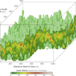 Related to our SNAMP work, and the research Celia is doing here: this NASA highlight article featuring Ralph Dubayah's Sierra forest work. Must follow up on this.
mapping for a changing california
Welcome to the Kellylab blog! We post fun facts and things that catch our eye. Occasionally I wax lyrically about a topic of interest.
Related to our SNAMP work, and the research Celia is doing here: this NASA highlight article featuring Ralph Dubayah's Sierra forest work. Must follow up on this.
I just came across a helpful bibliography of GIS literature created and maintained by ESRI. It indexes journals, conference proceedings, books, and reports fro the origins of GIS to the present. There are currently 78,400 entries. You can't download all articles directly from the site, but the keyword search is really helpful to get a list of articles on a particular topic that would be good to look into.
 The Federal CIO Coucil has just launched Data.gov, a site that brings all federal data into one searchable place. You can directly download xml, csv, kml/kmz, and shp files and find links to tools for finding other data.
Here are some more details from the White House press release:
"Created as part of the President's commitment to open government and democratizing information, Data.gov will open up the workings of government by making economic, healthcare, environmental, and other government information available on a single website, allowing the public to access raw data and transform it in innovative ways.
Such data are currently fragmented across multiple sites and formats—making them hard to use and even harder to access in the first place. Data.gov will change this, by creating a one-stop shop for free access to data generated across all federal agencies. The Data.gov catalog will allow the American people to find, use, and repackage data held and generated by the government, which we hope will result in citizen feedback and new ideas.
Data.gov will also help government agencies—so that taxpayer dollars get spent more wisely and efficiently. Through live data feeds, agencies will have the ability to easily access data both internally and externally from other agencies, which will allow them to maintain higher levels of performance. In the months and years ahead, our goal is to continuously improve and update Data.gov with a wide variety of available datasets and easy-to-use tools based on public feedback and as we modernize legacy systems over time.
Democratizing government data will help change how government operates—and give citizens the ability to participate in making government services more effective, accessible, and transparent."
This seems like a decent way to overcome, or at least mitigate, corruption in the lumber industry. Possible applications in Carbon monitoring / Forestry research? Is this being done already?
NASA has a nice site, and some resources, highlighting 50 years in earth observation. Over the past 50 years, thousands of satellites have been sent into space on missions to collect data about the Earth. Today, the ability to forecast weather, climate, and natural hazards depends critically on these satellite-based observations.
At the request of the National Aeronautics and Space Administration, the National Academies published the report Earth Observations from Space: The First 50 Years of Scientific Achievements (2008) to describe how the ability to view the entire globe at once, uniquely available from satellite observations, has revolutionized Earth studies and ushered in a new era of multidisciplinary Earth sciences.

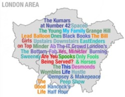 From Meg Pickard's photostream (which shows pictures of her needlepoint maps): a map showing the locations of UK's TV shows.
"If we don't take care of the soil, which is just the first five centimeters layer of life that is on the earth, our future is totally condemned," said UC Berkeley Professor Miguel Altieri, Ph.D.
This video is an ABC promo about the Dirt the Movie presentation on Monday. Our buddy Ron Amundson is featured too. Soil is disappearing, and fast. Check it.
The Las Vegas Sun ran an article about researchers from Kansas State who conducted a study on mapping the "Seven Deadl Sins". Well, actually proxies for those sins. Judge for yourself if you believe the surrogate variables are indeed indicative of the "sins". No matter how you slice it, it's mapping, and it's interesting...
http://www.lasvegassun.com/news/2009/mar/26/one-nation-seven-sins/
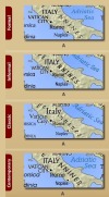 From Marek. Perhaps borrowing a bit of the name from the famous ColorBrewer (snap at right) project
  comes the TypeBrewer project (snap at left) to help us pick fonts on our maps. TypeBrewer is a free help tool that gives non-specialist mapmakers a chance to explore typography in a semi-structured environment. I confess I could spend some time playing with font type, spacing, density on a map of Italy.
This article describes how the LAPD online crime map mistakenly geocoded 1,380 crimes to a spot directly in front of the LA Times Office because it was the default location for unmatched geocodes. This mistake then lead to the popular site EveryBlock to rank that ZIP code as one of the most dangerous in the city. Lesson learned: don't believe every dot on a map is the absolute truth.

Another interesting article describes how analysis of an FBI database links long-haul truckers to serial killings. This shows that local data linked together can change the scale of analysis to reveal a "mobile crime scene".
Yes, yet another fire in Santa Barbara. This one started out looking harmless, and has since been called "out of control". Here are some pics compiled by my friend Seth Peterson who is in the Dar Roberts lab at UCSB. Some pretty good amateur photos here...
http://trattoriascorpacciata.blogspot.com/2009/05/yet-another-fire-in-sb.html
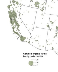 Retail sales of organic produce have reached $20 billion; 5% of veggies sold are now organic; and 1% of milk comes from organic dairy farms. And Michael Pollan (on last week's forum program) says there is a new form of organic conservative calling themselves "crunchycons". It is a new world. To illuminate these trends, NYTimes' map department turns to organic farms, and produces these useful maps.
 I love this scale comparison work by Bill Rankin, as posted on Radical Cartography.
http://www.radicalcartography.net/?manhattan


Some delta resources for us out there:
Delta Vision Status and Trends Report
General website
Report PDF
DRMS Phase 1 Report
http://www.water.ca.gov/floodmgmt/dsmo/sab/drmsp/phase1_information.cfm
DRMS Technical Memoranda
http://www.water.ca.gov/floodmgmt/dsmo/sab/drmsp/techmemos.cfm
Envisioning Futures for the Sacramento-San Joaquin Delta (BOOK) By Jay R Lund 2007
http://books.google.com/books?hl=en&lr=&id=HR9A--fs2qoC&oi=fnd&pg=PP14&dq=lund+2007+delta&ots=toBkES8aSl&sig=xafR0-lAYR1tPBp0H37xN6D3T5E#PPP1,M1
Delta Protection Commission Annual Reports
http://www.delta.ca.gov/annual/default.asp
Delta Protection Commission Background Reports
http://www.delta.ca.gov/plan/background.asp
Delta Atlas
http://baydeltaoffice.water.ca.gov/DeltaAtlas/index.cfm
Other Interesting Links
http://www.ppic.org/main/mapdetail.asp?i=858
http://www.ppic.org/main/mapdetail.asp?i=853
From the SF Chron: When Google Earth added historical maps of Japan to its online collection last year, the search giant didn't expect a backlash. The finely detailed woodblock prints have been around for centuries, but they show the locations of former low-caste communities. The maps dat e back to the country's feudal era, when shoguns ruled and a strict caste system was in place. Some surveys have shown that such neighborhoods have lower property values than surrounding areas, and residents have been the target of racial taunts and graffiti. But the modern locations of the old villages are largely unknown to the general public, until these maps were overlain on current street maps.
Kevin and I will be presenting at this conference next week. Looks to be a very interesting collection of topics.
 Nice mapping project out of Harvard: AfricaMap. AfricaMap is based on the Harvard University Geospatial Infrastructure (HUG) platform, and was developed by the Center for Geographic Analysis to make spatial data on Africa easier for researchers to discover and explore.
 I've been a sucker for these stories of people re-building sailing and exploring craft based on 1,000-year old plans ever since my parents gave me Kon-Tiki to read as an impressionable youth. Maybe it is why I love such riduculous Hollywood tripe like the 13th Warrior.
Now comes this news item: A replica 16th Century junk has sunk off Taiwan, one day short of completing an epic voyage to the US and back (see article). One day short of finishing! And you know why? They were, in BBC lingo, "rammed in two" by a freighter (there is a photograph). The 54ft-long (16.5m) Princess Taiping, powered only by cotton sails on three masts, was designed according to ancient specifications. Like the original Kon-Tiki, the raft used by Norwegian explorer and writer Thor Heyerdahl in his 1947 expedition across the Pacific Ocean from South America to the Polynesian islands. (Amazingly, there is a you tube video). Both expeditions set out to prove that folks other than the usual suspects could have made it here and back earlier than we thought.
There was another, similar, high-profile event with the building and sailing of the "Sea Stallion" Viking ship, which made the journey from Denmark to Ireland in 2007, fully blogged. The entries started with hopeful titles like "Building a Viking warship" and "the ship is launched", and quickly turned shorter and grimmer, with "a rough first night" and "hypothermia strikes" and "hampered by the weather" and "false hope"... suggesting 1) that Vikings were, perhaps not surprisingly, very hardy, and 2) reasons why they didn't have time to leave detailed on-voyage journals.
Still, I guess this stuff appeals to the same part of me that loves old maps, and that is the purported link to the blog.
There are over 35 million geotagged, time-stamped photos on flickr now. That's enough to start doing some pretty interesting analyses, including this one from Crandall, et al., at Cornell (presented at the WWW 2009 conference, "Mapping the World's Photos" [PDF]). Not only is it possible to map hot spots of world tourism, but by incorporating the time stamps to map the routes people are taking, you can make out individual streets. As suggested by the Information Aesthetics blog, you could even design popular walking tours.

Once GPS-enabled cameras represent a larger share of the market, flickr may provide data for all sorts of important analyses: tracking SOD, the migration of an endangered song bird, or estimating the "desolation" of a place: the world heat map that the Cornell group presents looks shockingly like the lights at night. The machine... it's ALIVE!!!
 This is a nice summary of the work Dennis Baldocchi and his group have been doing to pull together the data from the FluxNet towers to get at regional views of carbon fluxes. We read about this effort last week in remote sensing class, and here is a more familiar and friendly venue to learn about it.