SPUR 2021 update: Mapping changes to police spending in California

The Fall 2020 UC Berkeley’s Rausser College of Natural Resources Sponsored Project for Undergraduate Research (SPUR) project “Mapping municipal funding for police in California” continued in Spring 2021 with the Kellylab. This semester we continued our work with Mapping Black California (MBC), the Southern California-based collective that incorporates technology, data, geography, and place-based study to better understand and connect African American communities in California. Ben Satzman, lead in the Fall, was joined by Rezahn Abraha. Together they dug into the data, found additional datasets that helped us understand the changes in police funding from 2014 to 2019 in California and were able to dig into the variability of police spending across the state. Read more below, and here is the Spring 2021 Story Map: How Do California Cities Spend Money on Policing? Mapping the variability of police spending from 2014-2019 in 476 California Cities.

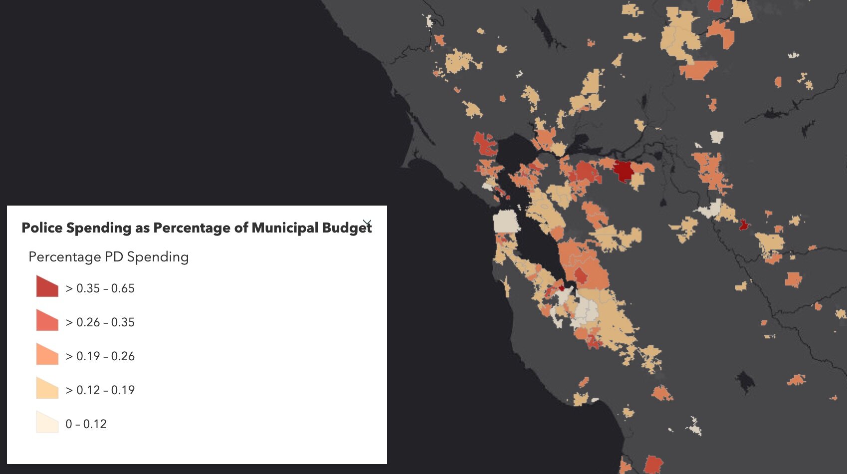
This semester we again met weekly and used data from 476 cities across California detailing municipal police funding in 2014 and 2019. By way of background, California has nearly 500 incorporated cities and most municipalities have their own police departments and create an annual budget determining what percentage their police department will receive. The variability in police spending across the state is quite surprising. This is what we dug into in Fall 2020. In 2019 the average percentage of municipal budgets spent on policing is about 20%, and while some municipalities spent less than 5% of their budgets on policing, others allocated more than half of their budgets to their police departments. Per capita police spending is on average about $500, but varies largely from about $10 to well over $2,000. Check out the Fall 2020 Story Map.

This semester, we set out to see how police department spending changed from 2014 to 2019, especially in relation to population changes from that same 5-year interval. We used the California State Controller's Finance Data to find each city's total expenditures and police department expenditures from 2014 and 2019. This dataset also had information about each city's total population for these given years. We also used a feature class provided by CalTrans that had city boundary GIS data for all incorporated municipalities in California.

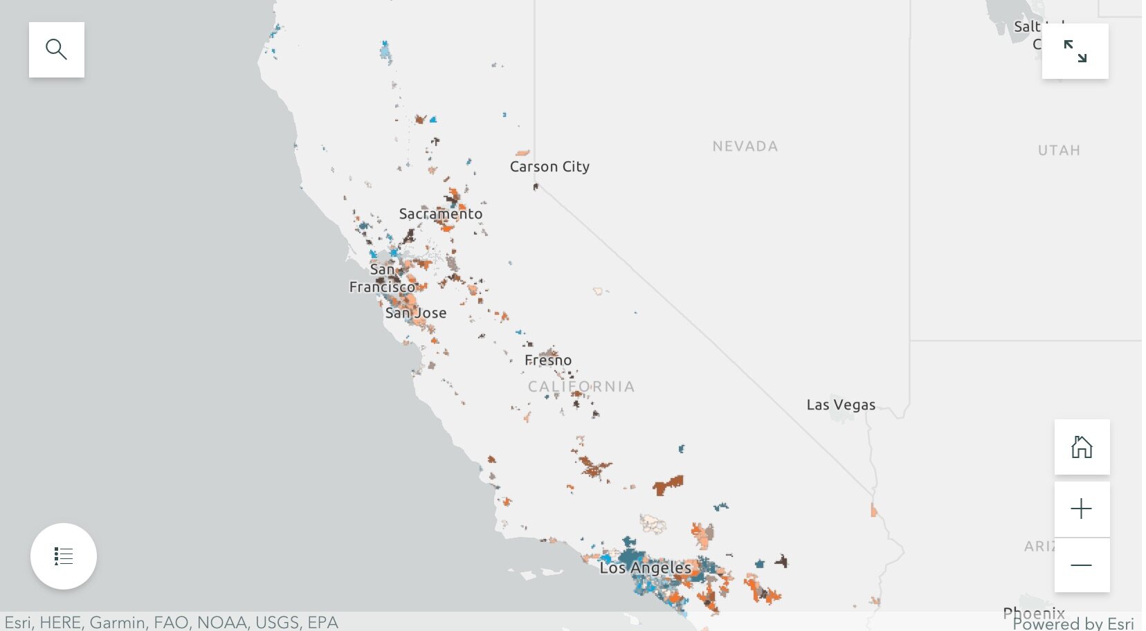
By dividing the police department expenditures by the total city expenditures for both 2014 and 2019, we were able to create a map showing what percentage of their municipal budgets 476 California cities were spending on policing. We were also able to visualize the percentage change in percentage police department spending and population from 2014 to 2019. Changes in police spending (and population change) were not at all consistent across the state. For example, cities that grew sometimes increased spending, but sometimes did not. Ben and Rezahn came up with a useful way of visualizing how police spending and population change co-vary (click on the map above to go to the site), and found 4 distinct trends in the cities examined:

SPUR2021.jpg
  • Cities that increased police department (PD) spending, but saw almost no change in population (these are colored bright blue in the map);

  • Cities that saw increases in population, but experienced little or negative change in PD spending (these are bright orange in the map);

  • Cities that saw increases in both PD spending and population (these are dark brown in the map); and

  • Cities that saw little or negative change in both PD spending and population (these are cream in the map).

They then dug into southern California and the Bay Area, and selected mid-size cities that exemplified the four trends to tell more detailed stories. These included for the Bay Area: Vallejo (increased police department (PD) spending, but saw almost no change in population), San Ramon (increases in population, but experienced little or negative change in PD spending), San Francisco (increases in both PD spending and population) and South San Francisco (little or negative change in both PD spending and population); and for southern California: Inglewood (increased police department (PD) spending, but saw almost no change in population), Irvine (increases in population, but experienced little or negative change in PD spending), Palm Desert (increases in both PD spending and population), Simi Valley (little or negative change in both PD spending and population). Check out the full Story Map here, and read more about these individual cities.

The 5-year changes in municipal police department spending are challenging to predict. Cities with high population growth from 2014 to 2019 did not consistently increase percentage police department spending. Similarly, cities that experienced low or even negative population growths varied dramatically in percentage change police department spending. The maps of annual police department spending percentages and 5-year relationships allowed us to identify these complexities, and will be an important source of future exploration.

The analysts on the project were Rezahn Abraha, a UC Berkeley Society and Environment Major, and Ben Satzman, a UC Berkeley Conservation and Resource Studies Major with minors in Sustainable Environmental Design and GIS. Both worked in collaboration with MBC and the Kellylab to find, clean, visualize, and analyze statewide data. Personnel involved in the project are: from Mapping Black California - Candice Mays (Partnership Lead), Paulette Brown-Hinds (Director), Stephanie Williams (Exec Editor, Content Lead), and Chuck Bibbs (Maps and Data Lead); from the Kellylab: Maggi Kelly (Professor and CE Specialist), Chippie Kislik (Graduate Student), Christine Wilkinson (Graduate Student), and Annie Taylor (Graduate Student).

We thank the Rausser College of Natural Resources who funded this effort.

Fall 2020 Story Map: Mapping Police Spending in California Cities. Examine Southern California and the Bay Area in detail, check out a few interesting cities, or search for a city and click on it to see just how much they spent on policing in 2017. 

Spring 2021 Story Map: How Do California Cities Spend Money on Policing? Mapping the variability of police spending from 2014-2019 in 476 California Cities.

SPUR2020 Update: Mapping Police Budgets in California

In September 2020, UC Berkeley’s Rausser College of Natural Resources selected the Kellylab for a Sponsored Project for Undergraduate Research (SPUR) project for their proposal entitled “Mapping municipal funding for police in California.” The project partnered with Mapping Black California (MBC), the Southern California-based collective that incorporates technology, data, geography, and place-based study to better understand and connect African American communities in California. We met weekly during the fall semester and gathered data from 472 cities across California, detailing the per-capita police funding and percent of municipal budget that is spent on police departments. California has nearly 500 incorporated cities and most municipalities have their own police departments and create an annual budget determining what percentage their police department will receive. The variability in police spending across the state is quite surprising - check out the figures below. The average percentage of municipal budgets spent on policing is about 20%, and while some municipalities spent less than 5% of their budgets on policing, others allocated more than half of their budgets to their police departments. Per capita police spending is on average about $500, but varies largely from about $10 to well over $2,000. If you are interested in this project, explore our findings through the Story Map: examine Southern California and the Bay Area in detail, check out a few interesting cities, or search for a city and click on it to see just how much they spent on policing in 2017. 

Figure showing variability in Police Spending (% of municipal budget) in Northern California in 2017. Data from California State Controller's Cities Finances Data, 2017 (City and police spending information). For more information see the Story Map h…

Figure showing variability in Police Spending (% of municipal budget) in Northern California in 2017. Data from California State Controller's Cities Finances Data, 2017 (City and police spending information). For more information see the Story Map here

Figure showing variability in Police Spending (PEr capita) in Northern California in 2017. Data from California State Controller's Cities Finances Data, 2017 (City and police spending information). For more information see the Story Map here. 

Figure showing variability in Police Spending (PEr capita) in Northern California in 2017. Data from California State Controller's Cities Finances Data, 2017 (City and police spending information). For more information see the Story Map here

The analyst on the project has been Ben Satzman, a UC Berkeley Conservation and Resource Studies Major with minors in Sustainable Environmental Design and GIS, who worked in collaboration with MBC and the Kellylab to find, clean, visualize, and analyze statewide data. We plan on continuing the project to explore the possible influences (such as racial diversity, crime, poverty, ethnicity, income, and education) underlying these regional trends and patterns in police spending. Personnel involved in the project are: from Mapping Black California - Candice Mays (Partnership Lead), Paulette Brown-Hinds (Director), Stephanie Williams (Exec Editor, Content Lead), and Chuck Bibbs (Maps and Data Lead); from the Kellylab: Maggi Kelly (Professor and CE Specialist), Chippie Kislik (Graduate Student), Christine Wilkinson (Graduate Student), and Annie Taylor (Graduate Student).

We thank the Rausser College of Natural Resources who funded this effort.

Day 1 Wrap Up from the NEON Data Institute 2017

I left Boulder 20 years ago on a wing and a prayer with a PhD in hand, overwhelmed with bittersweet emotions. I was sad to leave such a beautiful city, nervous about what was to come, but excited to start something new in North Carolina. My future was uncertain, and as I took off from DIA that final time I basically had Tom Petty's Free Fallin' and Learning to Fly on repeat on my walkman. Now I am back, and summer in Boulder is just as breathtaking as I remember it: clear blue skies, the stunning flatirons making a play at outshining the snow-dusted Rockies behind them, and crisp fragrant mountain breezes acting as my Madeleine. I'm back to visit the National Ecological Observatory Network (NEON) headquarters and attend their 2017 Data Institute, and re-invest in my skillset for open reproducible workflows in remote sensing. 

Day 1 Wrap Up from the NEON Data Institute 2017
What a day! http://neondataskills.org/data-institute-17/day1/
Attendees (about 30) included graduate students, old dogs (new tricks!) like me, and research scientists interested in developing reproducible workflows into their work. We are a pretty even mix of ages and genders. The morning session focused on learning about the NEON program (http://www.neonscience.org/): its purpose, sites, sensors, data, and protocols. NEON, funded by NSF and managed by Battelle, was conceived in 2004 and will go online for a 30-year mission providing free and open data on the drivers of and responses to ecological change starting in Jan 2018. NEON data comes from IS (instrumented systems), OS (observation systems), and RS (remote sensing). We focused on the Airborne Observation Platform (AOP) which uses 2, soon to be 3 aircraft, each with a payload of a hyperspectral sensor (from JPL, 426, 5nm bands (380-2510 nm), 1 mRad IFOV, 1 m res at 1000m AGL) and lidar (Optech and soon to be Riegl, discrete and waveform) sensors and a RGB camera (PhaseOne D8900). These sensors produce co-registered raw data, are processed at NEON headquarters into various levels of data products. Flights are planned to cover each NEON site once, timed to capture 90% or higher peak greenness, which is pretty complicated when distance and weather are taken into account. Pilots and techs are on the road and in the air from March through October collecting these data. Data is processed at headquarters.

In the afternoon session, we got through a fairly immersive dunk into Jupyter notebooks for exploring hyperspectral imagery in HDF5 format. We did exploration, band stacking, widgets, and vegetation indices. We closed with a fast discussion about TGF (The Git Flow): the way to store, share, control versions of your data and code to ensure reproducibility. We forked, cloned, committed, pushed, and pulled. Not much more to write about, but the whole day was awesome!

Fun additional take-home messages:

Thanks to everyone today, including: Megan Jones (Main leader), Nathan Leisso (AOP), Bill Gallery (RGB camera), Ted Haberman (HDF5 format), David Hulslander (AOP), Claire Lunch (Data), Cove Sturtevant (Towers), Tristan Goulden (Hyperspectral), Bridget Hass (HDF5), Paul Gader, Naupaka Zimmerman (GitHub flow).

Day 1 Wrap Up
Day 2 Wrap Up 
Day 3 Wrap Up
Day 4 Wrap Up

DS421 Data Science for the 21st Century Program Wrap Up!

Today we had our 1st Data Science for the 21st Century Program Conference. Some cool things that I learned: 

  • Cathryn Carson updated us on the status of the Data Science program on campus - we are teaching 1200 freshman data science right now. Amazing. And a new Dean is coming. 
  • Phil Stark on the danger of being at the bleeding edge of computation - if you put all your computational power into your model, you have nothing left to evaluate uncertainty in your model. Let science guide data science. 
  • David Ackerly believes in social networking! 
  • Cheryl Schwab gave us an summary of her evaluation work. The program outcomes that we are looking for in the program are: Concepts, communication, interdisciplinary research
  • Trevor Houser from the Rhodian Group http://rhg.com/people/trevor-houser gave a very interesting and slightly optimistic view of climate change. 
  • Break out groups, led by faculty: 
    • (Boettiger) Data Science Grand Challenges: inference vs prediction; dealing with assumptions; quantifying uncertainty; reproducibility, communication, and collaboration; keeping science in data science; and keeping scientists in data science. 
    • (Hsiang) Civilization collapses through history: 
    • (Ackerly) Discussion on climate change and land use. 50% of the earth are either crops or rangelands; and there is a fundamental tradeoff between land for food and wildlands. How do we deal with the externalities of our love of open space (e.g. forcing housing into the central valley). 
  • Finally, we wrapped up with presentations from our wonderful 1st cohort of DS421 students and their mini-graduation ceremony. 
  • Plus WHAT A GREAT DAY! Berkeley was splendid today in the sun. 
 

Plus plus, Carl B shared Drew Conway's DS fig, which I understand is making the DS rounds: 

From: http://drewconway.com/zia/2013/3/26/the-data-science-venn-diagram

From: http://drewconway.com/zia/2013/3/26/the-data-science-venn-diagram

Planet Lab wants YOU to work with their data!

They say: 

Are you a college student, researcher or professor? We’re looking for innovative academics, researchers and scientists to unlock the power of a one-of-a-kind dataset. You can now apply for access to Planet’s unique dataset for non-commercial research purposes. In an area as large as 2,000 square kilometers, you’ll have access to download imagery, analyze trends, and publish your results.

Check it: https://www.planet.com/products/education-and-research/

AAG 2017 Wrap Up: Day 3

Day 3: I opened the day with a lovely swim with Elizabeth Havice (in the largest pool in New England? Boston? The Sheraton?) and then embarked on a multi-mile walk around the fair city of Boston. The sun was out and the wind was up, showing the historical buildings and waterfront to great advantage. The 10-year old Institute of Contemporary Art was showing in a constrained space, but it did host an incredibly moving video installation from Steve McQueen (Director of 12 Years a Slave) called “Ashes” about the life and death of a young fisherman in Grenada.

My final AAG attendance involved two plenaries hosted by the Remote Sensing Specialty Group and the GIS Specialty Group, who in their wisdom, decided to host plenaries by two absolute legends in our field – Art Getis and John Jensen – at the same time. #battleofthetitans. #gisvsremotesensing. So, I tried to get what I could from both talks. I started with the Waldo Tobler Lecture given by Art Getis: The Big Data Trap: GIS and Spatial Analysis. Compelling title! His perspective as a spatial statistician on the big data phenomena is a useful one. He talks about how data are growing fast: Every minute – 98K tweets; 700K FB updates; 700K Google searches; 168+M emails sent; 1,820 TB of data created. Big data is growing in spatial work; new analytical tools are being developed, data sets are generated, and repositories are growing and becoming more numerous. But, there is a trap. And here is it. The trap of Big Data:

10 Erroneous assumptions to be wary of:

  1. More data are better
  2. Correlation = causation
  3. Gotta get on the bandwagon
  4. I have an impeccable source
  5. I have really good software
  6. I am good a creating clever illustrations
  7. I have taken requisite spatial data analysis courses
  8. It’s the scientific future
  9. Accessibly makes it ethical
  10. There is no need to sample

He then asked: what is the role of spatial scientists in the big data revolution? He says our role is to find relationships in a spatial setting; to develop technologies or methods; to create models and use simulation experiments; to develop hypotheses; to develop visualizations and to connect theory to process.

The summary from his talk is this: Start with a question; Differentiate excitement from usefulness; Appropriate scale is mandatory; and Remember more may or may not be better. 

When Dr Getis finished I made a quick run down the hall to hear the end of the living legend John Jensen’s talk on drones. This man literally wrote the book(s) on remote sensing, and he is the consummate teacher – always eager to teach and extend his excitement to a crowded room of learners.  His talk was entitled Personal and Commercial Unmanned Aerial Systems (UAS) Remote Sensing and their Significance for Geographic Research. He presented a practicum about UAV hardware, software, cameras, applications, and regulations. His excitement about the subject was obvious, and at parts of his talk he did a call and response with the crowd. I came in as he was beginning his discussion on cameras, and he also discussed practical experience with flight planning, data capture, and highlighted the importance of obstacle avoidance and videography in the future. Interestingly, he has added movement to his “elements of image interpretation”. Neat. He says drones are going to be routinely part of everyday geographic field research. 

What a great conference, and I feel honored to have been part of it. 

New digitization project: Soil-Vegetation Map Collection

Between the years 1949-1979 the Pacific Southwest research station branch of the U.S. Forest service published two series of maps: 1) The Soil-Vegetation Maps, and 2) Timber Stand Vegetation Maps. These maps to our knowledge have not been digitized, and exist in paper form in university library collections, including the UC Berkeley Koshland BioScience Library.

Index map for the Soil Vegetation MapsThe Soil-Vegetation Maps use blue or black symbols to show the species composition of woody vegetation, series and phases of soil types, and the site-quality class of timber. A separate legend entitled “Legends and Supplemental Information to Accompany Soil-Vegetation Maps of California” allow for the interpretation of these symbols in maps published 1963 or earlier. Maps released following 1963 are usually accompanied by a report including legends, or a set of “Tables”. These maps are published on USGS quadrangles at two scales 1:31,680 and 1:24,000. Each 1:24,000 sheet represents about 36,000 acres. 

The Timber Stand Vegetation Maps use blue or black symbols to show broad vegetation types and the density of woody vegetation, age-size, structure, and density of conifer timber stands and other information about the land and vegetation resources is captured. The accompanying “Legends and Supplemental Information to Accompany Timber Stand-Vegetation Cover Maps of California” allows for interpretation of those symbols. Unlike the Soil-Vegetation Maps a single issue of the legend is sufficient for interpretation. 

We found 22 quad sheets for Sonoma County in the Koshland BioScience Library at UC Berkeley, and embarked upon a test digitization project. 

Scanning. Using a large format scanner at UC Berkeley’s Earth Science and Map library we scanned each original quad at a standard 300dpi resolution. The staff at the Earth Science Library completes the scans and provides an online portal with which to download. 

Georeferencing. Georeferencing of the maps was done in ArcGIS Desktop using the georeferencing toolbar. For the Sonoma county quads which are at a standard 1:24,000 scale we were able to employ the use of the USGS 24k quad index file for corner reference points to manually georeference each quad. 

Error estimation. The georeferencing process of historical datasets produces error. We capture the error created through this process through the root mean squared error (RMSE). The min value from these 22 quads is 4.9, the max value is 15.6 and the mean is 9.9. This information must be captured before the image is registered. See Table 1 below for individual RMSE scores for all 22 quads. 

Conclusions. Super fun exercise, and we look forward to hearing about how these maps are used. Personally, I love working with old maps, and bringing them into modern data analysis. Just checking out the old and the new can show change, as in this snap from what is now Lake Sonoma, but was the Sonoma River in the 1930s.

Thanks Kelly and Shane for your work on this!

ISECCI historical ecology working group wrap-up

Last week Kelly and I with others travelled to the Sierra Nevada Aquatic Research Lab (SNARL) in the eastern Sierra Nevada, just south of Mono Lake for a research retreat. SNARL is part of the UC's Natural Reserve System, which is comprised of nearly 40 properties across the state. These are preserves that foster research, education and collaboration. They have much in common with ANR's REC system. I've been to a few of them now, and am very pleased to make more visits. I love the east side of the Sierra, and that iconic Highway 395. 

This trip was a retreat for the ISECCI historical ecology working group, led by the inspirational Peter Alagona from UCSB. We discussed our existing projects, including the VTM work (see figure below), and talked about potentials for more collaborative research and further integration between NRS and ANR. We have a list of wishes for digitization, and if anyone out there has ideas about pitching these to donors, please let me know. For example: 

  • Kelly and I want to digitize the Leiburg maps from the northern Sierra to add to the VTM stack;
  • We want to find a better way to index and view historical aerial photography state-wide. Something like this for historical maps: http://ngmdb.usgs.gov/maps/TopoView/help/

And we had a field trip looking at Mono Lake water issues. Great time spent!

Density of VTM features across the collections

LandFire is looking for field data! Add yours now.

I wanted to send out a friendly reminder that the data submission deadline for the current data call is March 31, 2016.  Data submitted before March 31 are evaluated for inclusion in the appropriate update cycle, and submissions after March 31 are typically considered in subsequent updates.  

This is the last call for vegetation/fuel plot data that can be used for the upcoming LANDFIRE Remap. If you have any plot data you would like to contribute please submit the data by March 31 in order to guarantee the data will be evaluated for inclusion in the LF2015 Remap. LANDFIRE is also accepting contributions of polygon data from 2015/2016 for disturbance and treatment activities. Please see the attached data call letter for more information.

Brenda Lundberg, Senior Scientist

Stinger Ghaffarian Technologies (SGT, Inc.)

Contractor to the U.S. Geological Survey (USGS)

Earth Resources Observation & Science (EROS) Center

Phone: 406.329.3405

Email: blundberg@usgs.gov

Data Science for the 21st Century - External Partners Invited!

Developing data-driven solutions in the face of rapid global change

Global environmental change poses critical environmental and societal needs, and the next generation of students are part of the future solutions.  This National Science Foundation Research Traineeship (NRT) in Data Science for the 21st Century prepares graduate students at the University of California Berkeley with the skills and knowledge needed to evaluate how rapid environmental change impacts human and natural systems and to develop and evaluate data-driven solutions in public policy, resource management, and environmental design that will mitigate negative effects on human well-being and the natural world.  Trainees will research topics such as management of water resources, regional land use, and responses of agricultural systems to economic and climate change, and develop skills in data visualization, informatics, software development, and science communication.

In a final semester innovative team-based problem-solving course, trainees will collaborate with an external partner organization to tackle a challenge in global environmental change that includes a significant problem in data analysis and interpretation of impacts and solutions. This collaboration is a fundamental and distinguishing component of the NRT program. We hope this collaboration will not only advance progress on the grand challenges of national and global importance, but also be memorable and useful for the trainees, and for the partners.

An Invitation to Collaborate

We are inviting collaboration with external partners to work with our students on their Team Research Project in 2016-17. Our students would greatly benefit from working with research agencies, non-profits, and industry.

  • Our first cohort of 14 students come from seven different schools across campus, each bringing new skillsets, backgrounds, and perspectives.
  • Team projects will be designed and executed in the spring of 2017.
  • Partners are welcome to visit campus, engage with students and take part in our project activities.
    • Join us at our first annual symposium on May 6th 4-7 pm.
    • Participate in workplace/ campus exchange.
    • Contact the program coordinator at hconstable@berkeley.edu
    • Visit us at http://ds421.berkeley.edu/ for more information.

This new NSF funded DS421 program is in the first of 5 years. We look forward to building ongoing collaborations with partners and UC Berkeley.

California parcel data download

Parcel data for California summary and download here. http://egis3.lacounty.gov/dataportal/2015/09/11/california-statewide-parcel-boundaries/

The data are not complete. But downloadable in geodatabase format. 

"A geodatabase with parcel boundaries for 51 (out of 58) counties in the State of California. The original target was to collect data for the close of the 2013 fiscal year. As the collection progressed, it became clear that holding to that time standard was not practical. Out of expediency, the date requirement was relaxed, and the currently available dataset was collected for a majority of the counties. Most of these were distributed with minimal metadata."

rOpenSci- new R package to search biodiversity data

Awesome new (ish?) R package from the gang over at rOpenSci 

Tired of searching biodiversity occurance data through individual platforms? The "spocc" package comes to your rescue and allows for a streamlined workflow in the collection and mapping of species occurrence data from range of sites including: GBIF, iNaturalist, Ecoengine, AntWeb, eBird, and USGS's BISON.

There is a caveat however, since the sites use alot of the same repositories the authors of the package caution to check for dulicates. Regardless what a great way to simplify your workflow!

Find the package from CRAN: install.packages("spocc") and read more about it here!

Historical data and the NRS

Just got off a call with a group of people focusing on historical data discovery at the Natural Reserve System (NRS). This process is part of the recently funded Institute for the Study of Ecological Effects of Climate Impacts (ISEECI). People in the group include:  

Of particular note was the introduction of the Online Archive of California, which is a collection of metadata about historical archives. Peter is adding all his data to the OAC. His work was funded through a Research Opportunity Fund grant through UCOP, and a NSF grant.  The process the NRS has used is different than what we have done with the REC data. They have assembled metadata from the research reports from the stations, and full digitization can be opportunisic and focused on particular questions. There is a Zotero database of publications that have resulted from the reserves. 

Other important links:

The metadata data from research applications submitted through RAMS - tends to be incomplete as we rely on PI's to proof the entry and then submit it. 

http://nrs.ucop.edu/MetaData.htm

The reference database, this has had extensive work done on it, and should be fairly complete. Lynn's working on a complementary database for Santa Cruz Island historic data, which will be made available. 

http://nrs.ucop.edu/bibliography.htm

Climate data - currently hosted on DRI's website, and data should be available for download.

http://www.wrcc.dri.edu/ucnrs/index.html

Satellites can be vulnerable to solar storms

I don't use ocean color data, but found this report of interest nonetheless. From the HICO website. HICO is the Hyperspectral Imager for the Coastal Ocean.

HICO Operations Ended. March 20, 2015

In September 2014 during an X-class solar storm, HICO’s computer took a severe radiation hit, from which it never recovered.  Over the past several months, engineers at NRL and NASA have attempted to restart the computer and have conducted numerous tests to find alternative pathways to communicate with it.  None of these attempts have been successful.  So it is with great sadness that we bid a fond farewell to HICO.

Yet we rejoice that HICO performed splendidly for five years, despite being built in only 18 months from non space-hardened, commercial-off-the-shelf parts for a bargain price.  Having met all its Navy goals in the first year, HICO was granted a two-year operations extension from the Office of Naval Research and then NASA stepped in to sponsor this ISS-based sensor, extending HICO’s operations another two years.  All told, HICO operated for 5 years, during which it collected approximately 10,000 hyperspectral scenes of the earth.

Most of the HICO scenes taken over sites worldwide are available now, and will remain accessible to researchers through two websites:  http://oceancolor.gsfc.nasa.gov/ and http://hico.coas.oregonstate.edu.  HICO will live on through research conducted by scientists using HICO data, especially studies exploring the complexities of the world’s coastal oceans.

Lidar + hyperspectral, ortho and field data released by NEON

http://www.neoninc.org/data-resources/get-data/airborne-dataFrom LASTools list:

The National Ecological Observatory Network (NEON) published this week airborne remote sensing data including full waveform and discrete return LiDAR data and LiDAR derivatives (DTM, DSM, CHM) as well as corresponding hyperspectral data, orthophotos, and field data on vegetation strucutre, foliar chemistry and ASD field spectra.

NEON Airborne Data Set
.

List of Online Geospatial Data

From Sean's IGIS workshops this week.

Base Layers

Land Cover and Wildlife Habitat

Imagery

Soils

Climate and Weather Data

California Geopolitical Boundaries

Digital Elevation Models

NASA NEX wins the 2014 HPCwire Readers' and Editors' Choice Award

Congratulations to the NASA NEX Team! They have won the 2014 HPCwire Readers’ & Editors’ Choice Award for the Best Data-Intensive System (End User focused).  See the article here: NASA Earth Exchange (NEX) Platform supports dozens of data-intensive projects in Earth sciences.

The NASA Earth Exchange (NEX) platform supports dozens of data-intensive projects in Earth sciences, bringing together supercomputers and huge volumes of NASA data, and enabling scientists to test hypotheses and execute modeling/analysis projects at a scale previously out of their reach. NEX-supported applications range from modeling El Niño, creating neighborhood-scale climate projections, assisting in crop water management, and mapping changes in forest structure across North America, to mapping individual tree crowns at continental scale as a foundation for new global science at unprecedented spatial resolution. NEX’s OpenNEX challenge ties in to White House initiatives, including Open Data, Big Data and Climate Data, which advance national goals to address climate change impacts and include competitions and challenges to foster regional innovation.

The GIF has been partnering with NASA NEX, and developing a framework to bring NEX data and analytical capabilities into HOLOS.

High resolution free DEM data released for Africa

SRTM 3 Arc-Second (approx. 90m) SRTM 1 Arc-Second (approx. 30m) Landsat 7 December 17, 2000

Just in time for class on topography and rasters tomorrow: new high res shuttle DEM data is being released for Africa. The image above shows the Niger River Delta in 90m res, 30m res, and landsat.

From the press release: In Africa, accurate elevation (topographic) data are vital for pursuing a variety of climate-related studies that include modeling predicted wildlife habitat change; promoting public health in the form of warning systems for geography and climate-related diseases (e.g. malaria, dengue fever, Rift Valley fever); and monitoring sea level rise in critical deltas and population centers, to name just a few of many possible applications of elevation data.

On September 23, the National Aeronautics and Space Administration (NASA), the National Geospatial-Intelligence Agency (NGA), and the U.S. Geological Survey (USGS, a bureau of the U.S. Department of the Interior) released a collection of higher-resolution (more detailed) elevation datasets for Africa. The datasets were released following the President’s commitment at the United Nations to provide assistance for global efforts to combat climate change. The broad availability of more detailed elevation data across most of the African continent through the Shuttle Radar Topography Mission (SRTM) will improve baseline information that is crucial to investigating the impacts of climate change on African communities.

Enhanced elevation datasets covering remaining continents and regions will be made available within one year, with the next release of data focusing on Latin America and the Caribbean region. Until now, elevation data for the continent of Africa were freely available to the public only at 90-meter resolution. The datasets being released today and during the course of the next year resolve to 30-meters and will be used worldwide to improve environmental monitoring, climate change research, and local decision support. These SRTM-derived data, which have been extensively reviewed by relevant government agencies and deemed suitable for public release, are being made available via a user-friendly interface on USGS’s Earth Explorer website.

Nice slider comparing the 90m to the 30m data here.

Cropland Data Layer (CDL) and National Land Cover Dataset (NLCD): new versions released this year

Both the NASS Cropland Data Layer (CDL) and the National Land Cover Dataset (NLCD) released new versions in early 2014. Links for download are here: