Flow Map Layout
/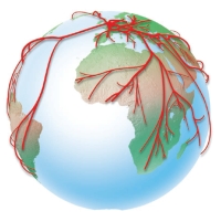 Several researchers at Stanford have written some software for visualizing flow maps. There pictures are very pretty, and, I think, good data vis. The map above shows the top ten states providing migrants to NY and CA. Here's their abstract:
Cartographers have long used flow maps to show the movement of objects from one location to another, such as the number of people in a migration, the amount of goods being traded, or the number of packets in a network. The advantage of flow maps is that they reduce visual clutter by merging edges. Most flow maps are drawn by hand and there are few computer algorithms available. We present a method for generating flow maps using hierarchical clustering given a set of nodes, positions, and flow data between the nodes. Our techniques are inspired by graph layout algorithms that minimize edge crossings and distort node positions while maintaining their relative position to one another. We demonstrate our technique by producing flow maps for network traffic, census data, and trade data.