Some nice global cartograms via worldmapper.org
/From www.worldmapper.org at the University of Sheffield, via the BBC. All mapmakers must select a projection for their maps. Projections, especially for regional and global maps, can convey political messages, whether intended or not. The following show cartograms whose projections are based on factors other than polar coordinates.
First, these global examples from the Atlas of the Real World (more at their website).
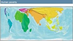 Human poverty cartogramThe size of each territory shows the overall level of poverty, quantified as the population of the territory multiplied by the Human Poverty Index. The index is used by the UNDP to measure the level of poverty in different territories. It attempts to capture all elements of poverty, such as life expectancy and adult literacy. The highest index scores are in central Africa; the lowest in Japan.
Next, these population cartorgrams.
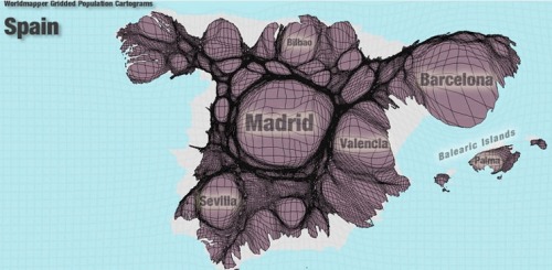 Spain's population cartogram
This example (chosen in honor of Celia) shows the dominance of Madrid and Barcelona in Spain's population. There are many other examples, and a nice flash app.