the world according to facebook
/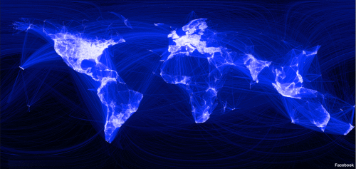 From the BBC: Using some of the information on friends data from facebook's 500m members, intern Paul Butler has constructed an interesting map of the world's connections. The map above is the result of his attempts to visualise where people live relative to their Facebook friends. Each line connects cities with pairs of friends. The brighter the line, the more friends between those cities.