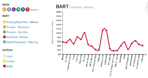
Bay Area Inequality & Mass Transit
/Dan Grover and Mike Z created an interactive data visualization that shows the income distribution along mass transit routes in the Bay Area. 2010 Census median household income for each mass transit station within a census tract for MUNI metro and bus, BART, and CalTrain routes are currently viewable. The project was inspired by The New Yorker’s New York City income distribution viewer for the New York Subway here.
