Food Environmental Atlas for the US

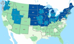
Example from the USDA food atlas: pounds per capita of solid fats eatenFood insecurity, diet choice, access to healthy foods: these vary greatly across communities in the US.  In order to visualize these patterns and stimulate research and discussion, the USDA has published an online food atlas.  The USDA Food Atlas currently includes 90 indicators of the food environment such as: store/restaurant proximity, food prices, food and nutrition assistance programs, and community characteristics—interact to influence food choices and diet quality. It is fairly course, but very illustrative of spatial pattern of food insecurity, diet, access to restaurants and fast food, and many other factors.  With this interactive atlas, you can:

  • Create maps showing the variation in a single indicator across the U.S.; for example, variation in the prevalence of obesity or access to grocery stores across U.S. counties. Check out this scary example above: pounds per capita of solid fats eaten (light green - low; dark blue high, up to 24 pounds);

  • View all of the county-level indicators for a selected county;

  • Use the advanced query tool to identify counties sharing the same degree of multiple indicators; for example, counties with both high poverty and high obesity rates;

  • Download data.

Fog in California - it's declining

James A. Johnstone and Tod Dawson's recent paper in PNAS show that California's coastal fog has decreased significantly over the past 100 years, potentially endangering coast redwood trees dependent on cool, humid summers. Coast redwoods, Sequoia sempervirens, grow in a narrow coastal band, from Big Sur to Oregon, characterized by cool summer temperatures and high humidity from fog (see map at right from USGS).  They analyzed 20th century climate station records, and have shown that since 1901, the average number of hours of fog along the coast in summer has dropped from 56 percent to 42 percent, which is a loss of about three hours per day. Excerpted here.

CPAD 1.4 drops today! California Protected Areas Database

From GreenInfo Network.  The new California Protected Areas Database (CPAD 1.4) has just been released in geodatabase and shape file formats.  Please visit www.calands.org to download.  Updates and improvements to CPAD are described in the CPAD Manual also available on the CALands web site.

WHAT'S NEW IN CPAD 1.4:  CPAD 1.4 contains a number of important data improvements - more coverage of urban parks, more complete alignment to parcels, broader implementation of management designations, and more.

VIEW CPAD DATA ONLINE, REPORT ISSUES:  For those who do not use GIS or prefer to view CPAD via the web, you can do so though a google map overlay at http://www.calands.org/review.php.  We welcome input from the CPAD user community to keep us informed about errors and updates in CPAD.  Please report errors by clicking on the "Report Error" button.

GET NOTIFIED WHEN CPAD IS UPDATED: We encourage you to receive CPAD updates.  You can do this by clicking on the "Receive Update Notification" link on the calands.org homepage.  We will not distribute any of your information or use your email outside of the CPAD mailing list.  Registering helps us better serve the CPAD user community.

Disaster response evolves: faster, more detailed, and community focused

The recent earthquake in Haiti makes us, placed as we are on another of the great faults of the western hemisphere, take pause and think about the fragility of life and the suddenness of disasters like earthquakes.  The mapping of earthquakes - their shake strength, fault lines, and past seismicity - and their damage, has changed in recent years. The Haiti quake shows this: within hours and days of the quake, we were able to see the shake intensity, historical seismicity and detailed faults from the USGS, and Open Street Map opened up a crisis center for participatory mapping. International agencies requested satellite data of the area and, NASA, GeoEye and the European Space Agency responded, and shared their imagery freely.  A number of detailed before and after visualizations from outlets like the NY Times and Bing Maps quickly followed. The disaster and the geospatial response was chronicled in many blogs. 

This is more than what was available to us recently with the San Diego, California fires or the San Francisco Oil Spill in 2007, or Hurricane Katrina in 2005, or the Indian Ocean Tsunami in 2004, each of which set new records for mapping speed and creativity. Each global-scale disaster seems to be a driving innovative force to help shape and evolve participatory mapping, detailed imagery delivery, and spatial decision support tools.  For example, this past weekend I was involved in a World Bank effort called Operation GEO-CAN – Global Earth Observation – Catastrophe Assessment Network (press release here) to analyze aerial imagery from imagery from Port au Prince in 2009 (top) and 2010 (bottom)before and after the Haiti earthquake.  The World Bank needed fast action to get a clearer picture of damage and rebuilding needs. Hundreds of people, from 20 countries, recruited via email, were quick to lend their expertise to digitize and describe collapsed buildings evident in new GeoEye imagery when compared to older imagery (see example at left).  The Earthquake Engineering Research Institute (EERI), who helped coordinate the effort, used a fast, mobile, distributed thinking system that employed a Google Earth framework and a clever workload management system that allowed users to check out individual tiles of imagery, search for collapsed buildings, digitize them, and then upload the data as lean and mean kmz files. The effort was viral, and continued to grow over the weekend as many of us analyzed tile after tile of imagery, and saw the unimaginable destruction in Haiti. It is astonishing what you are able to see with detailed, multi-temporal, nadir view imagery: collapsed buildings and walls; tents erected in back yards; blocked roads.  The dataset we created will be used to guide emergency response and restoration.

This kind of distributed analysis was inconceivable not long ago. The GeoEye satellite, which captures sub-meter imagery routinely, and Google Earth, which seamlessly coordinates multiple imagery streams, are now mainstream in the 21st century, as are other tools like Open Street Map and Bing. New imagery of disaster foci, new software to fuse and analyze multi-temporal imagery, new database management tools to guide workflow are critical, but it is visionary thinking that is able to quickly capture a concerned and technically capable audience that is paramount. We can learn from our response to the horror of natural disasters like earthquakes to support research in environmental sciences.  These experiences reinforce the message that geospatial tools, as tools alone, are inconsequential. But when we can quickly and accurately map pattern and context, and use that to support decisions, plan for the future, and communicate options, geospatial tools can be the among most powerful available to us.  Along these lines, we at the GIF have been turning our attention internationally, and are focusing on several international projects. For example, we are working with colleagues from the Department of Economics to map land cover change in order to study patterns of human conflict in Sierra Leone, and helping train professional health care students from UCSF who will be stationed in African and India in coming years to look for connections between human health and environment.  We will write about some of these in our upcoming newsletter.

As a last word, there is plenty more to do in Haiti: places to donate include the Red Cross, Salvation Army, and Partners in Health, among many, many more.

Free Haiti Imagery through Digital Globe

Digital Globe is offering free access to Haiti imagery pre- and post-earthquake.

They're offering three ways to access the imagery:

  1. KML Overlay for Google Earth that displays the most current imagery for a given location.
  2. ImageConnect plug-in for GIS software that allows GIS professionals to view all the images that have been loaded to the Crisis Event Service.
  3. FTP access to GeoTIFF imagery from QuickBird, WorldView-1 and WorldView-2.

Register at this site for free imagery: http://dgl.us.neolane.net/res/dgl/survey/CES_H.jsp

Transit & Trails: Go hiking without a car in the Bay Area

Ryan Branciforte at the Bay Area Open Space Council reports on their new web tool: Transit and Trails. The new interactive website identifies more than 500 trailheads and 150 campgrounds in our region’s 1.2 million acres of preserved lands. Just enter your starting location at Transit and Trails’ Google Maps-powered site, and select the radius. Once you’ve picked your ideal trail from the results, Transit and Trails will open a new link in 511 Transit Trip Planner, where you’ll find a detailed trip itinerary, complete with a map, transit times, fares, and walking directions to and from the transit stop. Very cool.

Related news: from the SF Chron, SF Hostels, mother nature network, & triple pundit.

Haiti earthquake information & maps

Note: The Map Room has a good wrap-up of related maps, updated almost daily.

The Haiti earthquake, 7.0 magnitude, struck about 10 miles south-west of Port-au-Prince, was quickly followed by two aftershocks of 5.9 and 5.5 magnitude. The automatically generated Preliminary Earthquake Report from theUSGS shake map U.S. Geological Survey includes many maps, including a shake map (top) and a look at historical seismicity in the area (bottom).  More maps here.

They say: The January 12, 2010, Haiti earthquake (7.0 magnitude) occurred in the boundary region separating the Caribbean plate and the North America plate. This plate boundary is dominated by left-lateral strike slip motion and compression, and accommodates about 20 mm/y slip, with the Caribbean plate moving eastward with respect to the North America plate.

Historical seismicityThe location and focal mechanism of the earthquake are consistent with the event having occurred as left-lateral strike slip faulting on the Enriquillo-Plaintain Garden fault system. This fault system accommodates about 7 mm/y, nearly half the overall motion between the Caribbean plate and North America plate. More here.

From the U.S. Geological Survey, National Earthquake Information Center, World Data Center for Seismology, Denver.

And from NASA Earth Observatory, a map showing the topography and tectonic influences in the region of the earthquake.

the topography and tectonic influences in the region of the earthquake

The NYTimes mapping division has a useful before and after tool using satellite (GeoEye) imagery; several key buildings are highlighted.

Mapping the arctic tern's amazing pole-to-pole flight

After setting out (yellow line) the birds pause in the North Atlantic (red circle) to feed. Going home (orange line), they follow the winds.We still might not know the air-speed velocity of an unladen swallow, but now we know the daily flight distance (up to 500km!) of the tiny arctic tern. Reported in the BBC.

Starting in August and September, the small (3.5oz) bird will head from Greenland and fly to the Weddell Sea, on the shores of Antarctica. It will spend about four or five months in the deep south before heading back to the far north, arriving home in May or June.

A team from Greenland, Denmark, the US, the UK and Iceland attached small (0.05oz) geolocating archival light loggers to the birds' legs to find out exactly where they went on this polar round trip. The devices do not rely on satellite navigation, but record light intensity.  This gives an estimate of the local day length, and the times of sunrise and sunset; and from this information it is possible to work out a geographical position of the birds. They banded 50 birds in July 2007 in Greenland, and one year later collected the devices from 10 birds (more birds with loggers were seen in the colony, but these could not be recaptured). More on these cool devices here.  More info on these amazing birds here.

Year-end comments on self-location technology and privacy

As many in recent academic papers have pointed out (e.g. Sarah Ellwood, Jerry Dobson, Michael Goodchild) we seem, for a number of reasons, to be increasingly comfortable disclosing our location by "opting in" to technology that in addition to being very useful, also allows our surveillance. I am not talking Lucy Milligan-style gps necklaces here, but more common fare: gps-enabled cell phones, street view, cctv cameras and the like.  These technologies and our use of them might be changing our notions of our “reasonable expectations of privacy”. It is perhaps no coincidence that in this season for the media to summarize the year's news, there have been many interesting examples focusing on the interface between privacy and geo-location. Consider these:

  • Along those lines is the much posted recent revelation that Sprint has so far filled over 8 million requests from law enforcement for customer GPS data. Posted at Engaget and elsewhere.

Welcome to 2010, another exciting year in mapping technology no doubt.

Happy Holidays 2009! Map-related gift ideas for the economic recovery

Just in time for the holidays: a round-up of cool map-themed gifts and chotchkies for the house... when the economy recovers.

First, the incomperably beautiful (and justifiably pricey) map butterflies from image surgery. These ethereal beauties would look great on any wall. Check out this specimen at left.

A more solid but no less beautiful option is the customizable fruit bowl (or brooch, or table, or clock - is there no end to their creativity?) from FluidForm. You can pick your area from a google maps interface (multilple scales supported!), and they will create a one-of-a-kind 3-D bowl using computer-controlled router dealie. Just don't pick an island or your fruit will roll away.  Very cool. 

While technically not for sale, we can't omit the proliferation of wildly inventive and gorgeous examples of map art (some displayed here at inventorspot.com - look at this carto-fabulous ball gown!). 

And finally... If only this beaute was available: the 1920s-era proto-gps watch, complete with tiny scrollable paper maps printed on individual canisters of rolled paper. Look at those little tiny road maps. From Portable Content.

Local Code : Real Estates - GIS and environmental design

Check out this great video that was produced by Nicholas de Monchaux, Assistant Professor of Architecture here at UC Berkeley!  Nicholas and his team have been working with the GIF over the last two years to explore the connections between geospatial technology and archtectural design, and to train architecture students in GIS applications. 

This video does a great job of highlighting the innovative approach they are taking.  It is a finalist in the WPA 2.0 competition sponsored by UCLA Citylab.

Their project description:

Local Code : Real Estates uses geospatial analysis to identify thousands of publicly owned abandoned sites in major US cities, imagining this distributed, vacant landscape as a new urban system. Using parametric design, a landscape proposal for each site is tailored to local conditions, optimizing thermal and hydrological performance to enhance the whole city’s ecology—and relieving burdens on existing infrastructure. Local Code’s quantifiable effects on energy usage and stormwater remediation eradicate the need for more expensive, yet invisible, sewer and electrical upgrades. In addition, the project uses citizen participation to conceive a new, more public infrastructure as well —a robust network of urban greenways with tangible benefits to the health and safety of every citizen.


geospatial IT specialist needed @ UC Berkeley

The Geospatial Innovation Facility (GIF) at UC Berkeley is seeking a full-time Computer Resource Specialist (CRS II), who has experience in both IT/server support and geospatial programming including ArcGIS Server and Google Maps API development.

The GIF supports research and outreach activities of users interested in geospatial analysis utilizing GIS, GPS, spatial analysis, remote sensing, 3D visualization, and webGIS. We serve the geospatial needs of UC students, faculty, and staff. In addition, the GIF reaches out to K-12 youth groups and the general public.

The GIF Geospatial IT specialist will gain and share experience in the newest geospatial software and technology available on the market today, including state-of-the-art techniques (e.g. object-based image analysis and remote sensing) and software (e.g. open-source GIS and webGIS applications) used in natural resource and social science research.

For more information, see this page. Note, You MUST apply for this job via UC Berkeley’s Jobs Website. Job ID: 10328.

The map that changed the world goes digital

Ancient volcanic rock under EdinburghFor those of you who devoured Simon Winchester's "The Map that Changed the World" about geologist William Smith's journey to create the first geologic map of England and Wales, the first geologic map in the world, this news will please you. (Smith published the 10' x 16' map in 1815. His pivotal insights were that each local outcrop of rock strata was a portion of a single universal sequence of strata and that these rock strata could be distinguished, followed for great distances, and their relative date ascertained by means of imbedded fossilized organisms. His work kick-started the science of geology, and contributed to the theory of evolution. Modified from Wikipedia.)

Now, as the BBC reports, the British Geological Survey's (BGS) has released their new OpenGeoscience portal, which allows the public to study all the UK's geology via a variety of webGIS formats (e.g. Google, and ArcServer). There is a viewer for bedrock geology and the overlying superficial deposits, and another for more geological layers — artificial ground, faults, mass movements, etc.

Worker at Pitlochry depot, Perthshire, processing Scottish mica.In a companion effort, the BGS is also releasing images from their historic image archive: 50,000 images are searchable and usable for non-commercial purposes. These images include lovely photography of some of Britain's icons of geology, but also includes image from 100 years ago of miners, explorers, and early 20th century industry.

Reproduced with the permission of the British Geological Survey ©NERC. All rights Reserved


Bing Maps adds new enhanced features

Bing Maps, Microsoft's online mapping application, has just launched a big update in Bing Maps Beta with lots of cool new features.  As you will see, the new maps site requires the installation of "silverlight" which you will be prompted to install, but it can be used in most ie, firefox, or safari browsers. 

Though there are many new features, be sure to check out the "Streetside" viewer, Microsoft's answer to Google's Street view.  Streetside takes a similar aproach in displaying photos along streets, but also takes advantage of the building surfaces for 3D viewing.


Whither UC?

From the NY Times, Data from UC.

The NYTimes has an article describing the situation here in the UC system. It is sobering reading, and of course, we know how grim the situation is.  The graphics above tell the story: fewer staff, fewer new faculty hires, more expensive for students, and less support from the state. How do we continue to provide access to excellence for the increasingly diverse student body? Where do we go from here? More private investment? Larger classes? Smaller and more streamlined curriculum?

Extremely rare plant discovered in Doyle Drive construction site

Franciscan Manzanita.jpeg

© California Academy of Sciences

The incredibly rare Franciscan Manzanita

A pair of the state's foremost experts in manzanita plants have weighed in that the bush recently uncovered during the Doyle Drive project is a living specimen of the Franciscan Manzanita -- a discovery akin to stumbling across a Dodo or Passenger Pigeon. The plant was last seen in the wild in 1947, when legendary local botanist James Roof ran in front of a platoon of bulldozers to grab a few samples of the bushes just before they were ripped from the ground as the former Laurel Hill Cemetery was converted into homes and buildings.

"It's a very big story," said a laughing Mike Vasey, a lecturer at San Francsico State called in by Presidio officials to examine the plant. Both Vasey and Professor Tom Parker believe the bush to be the genuine article. So they're excited. But two factors are mitigating their joy. First, they'll have to wait a month or two until the plant buds to do a chromosome count and determine it really is the Franciscan Manzanita. And, second, it's smackdab in the middle of where the highway is supposed to go.

"It's hard to say exactly what's going to happen," said Vasey. "My impression is that there's a good chance the individual may be relocated -- hopefully successfully -- and many cuttings will be taken so the genotype can be preserved."

Botanists are fortunate to have several different "bloodlines" of the Franciscan Manzanita -- the cuttings Roof ran in front of the bulldozers to obtain were successfully planted in the East Bay Regional Parks Botanical Garden, where their ancestors thrive still.

Vasey believes the plant in question -- the location of which is being kept guarded for obvious reasons -- may be 40 to 70 years old. It grew on a small outcropping of serpentine rock bordered by the concrete of the highway and the dormant seed may have been stimulated by highway work decades ago. During the current work, plants surrounding the manzanita were cleared, and the bush caught the eye of an ecologist. He called in officials from the Presidio, who, in turn, called in Vasey and Parker.

The Franciscan Manzanita is the close cousin -- and possible genetic precursor -- to the Raven's Manzanita. That extremely rare plant is down to its last genetic individual; the "mother plant" is believed to be more than a century old and sits in an undisclosed location in the Presidio some miles from the newly rediscovered Franciscan Manzanita

  (reposted from SF Weekly blog)

GIS Day 2009: Wednesday, November 18

 November 18, 2009
3:00 pm to 8:30 pm
UC Berkeley, Mulford Hall
http://gif.berkeley.edu/gisday.html

Please join us for GIS Day 2009 on Wednesday, November 18.  The list of speakers and topics are now available on the event site, including this year’s keynote presentation from James Fee!

GIS Day is free, but we encourage you to register, so that we know how many people to expect.  We still have room for posters, if you’d like to display a poster (project, map, imagery) just sign up online.

This year's event is co-hosted by the Bay Area Automated Mapping Association (BAAMA) and Geospatial Innovation Facility (GIF), with support from the Northern California Region of the American Society for Photogrammetry and Remote Sensing (ASPRS).


Google Navigation announced for Android phones

Smart phones featuring Android 2.0 will now support a new Navigation feature developed by Google

From their blog:

This new feature comes with everything you'd expect to find in a GPS navigation system, like 3D views, turn-by-turn voice guidance and automatic rerouting. But unlike most navigation systems, Google Maps Navigation was built from the ground up to take advantage of your phone's Internet connection.

This application will including turn-by-turn directions, overlayed on Google's satellite and street views, which looks very cool. 

Check out the video:

Now I just need my new Droid...

A year in the life of the world's precipitation: video

John Chiang gave the geolunch last week, and discussed the possible changes to tropical rainfall in the future. Tropical precipitation is controlled much differently than precipitation at the mid-latitudes.  To illustrate this, at the begining of his talk he showed us this video from UCAR/NCAR visualization team, which is a simluation for one year from the CommunitA snap from the video showing a Pacific storm about to drench Cali.y Climate System Model (CCSM), a coupled climate model for simulating Earth's climate system using the Community Atmosphere Model (CAM), the latest in a series of global atmosphere models developed at NCAR for the weather and climate research communities. Watch storms develop in the mid-latitudes as clear easterly moving systems; in the tropics you have daily convective action governing precipitation. 

DataSF.org - a new San Francisco data resource

The City of San Francisco has recently developed a new website (http://datasf.org) to help disseminate data related to the city’s elections, environment, geography, health, housing, public safety, public works, and transportation.  Many of which are available in GIS format!

From the site:

DataSF is a clearinghouse of datasets available from the City & County of San Francisco. While there is plenty of room for improvement, our goal in releasing this site is:
(1) improve access to data
(2) help our community create innovative apps
(3) understand what datasets you'd like to see
(4) get feedback on the quality of our datasets.

In addition to the wealth of data sources, there is also a section showing off some of the applications that outside developers have created with the data.