New NAIP imagery available for CA!

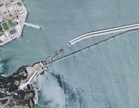
New Bay Bridge construction as seen in the 2009 NAIP imagery

Two great new resources from the National Agriculture Imagery Program (NAIP) are now available for the State of California, and can be download via Cal-Atlas:

2009 Natural Color Imagery: Divided into counties, natural color imagery is now available in MrSid Format.  These images were acquired in the summer of 2009.

2005 Color Infrared Imagery: Divided into quarter-quads, color infrared image tiles from the 2005 dataset are now available for the entire state in jpeg2000 format. 

Michael Byrne, California’s Geographic Information Officer, estimates that the color infrared imagery from the 2009 dataset will be available in 6-7 months.

Mapping US Energy Futures

19th & 20th century power: coal plants in the eastern US with existing power gridFrom NPR: these new maps showing the US energy grid, a "complex network of independently owned and operated power plants and transmission lines. Aging infrastructure, combined with a rise in domestic electricity consumption, has forced experts to critically examine the status and health of the nation's electrical systems." This site has maps of existing power sources (coal, nuclear, gas, hydro and oil), and potential for new alternatives (wind and solar - no bio).  What new infrastructure will be needed to bring wind and solar power from high production areas to the rest of the country?


Looking back to Loma Prieta... and forward

ShakeMap of the 1989 M 6.9 Loma Prieta EarthquakeToday is the 20th anniversary of the Loma Prieta earthquake. Although a bay area native I was not here then, but remember it vividly. I was worried about my parents, my childhood haunts, and Jose Conseco, who was playing at the time for the Oakland A's in the "Bay Bridge World Series" vs the SF Giants. Fans at the game on October 17 1989 talk about the field bulging and moving like a "giant rolling pin under the ground." Jose and my folks were ok, but many people lost their livExpected Levels of Shaking from Future Earthquakeses, the bay bridge was changed forever, and the region sustained billions in damage. There are many great maps of the shaking produced by the 6.9 quake, here is one at left found at the USGS guide to living in earthquake country. The region is still primed for another big shake: look at this graphic of potential shaking forecasted for the future.

TauDEM software: for your hydro modeling needs

This was recommended to me recently by Orien; he is using it to create topographic indices to use as ancillary data in an object-based classification of palustrine wetlands in the foothills of the Sierra Nevada. These wetland sites are terrifically important for rails, and mapping them efficiently is a challenge.  Topographic information is proving useful in the classification, and Orien used this software rather than the ArcGIS hydro modeler suite.

From David Tarboton at Utah State: Terrain Analysis Using Digital Elevation Models (TauDEM) is a set of tools for the analysis of terrain using digital elevation models. TauDEM currently provides numerous capabilities that expand on the ESRI suite including (more listed on website):

  • Computation of flow directions and slopes;
  • Contributing area using single and multiple flow direction methods;
  • Multiple methods for the delineation of channel networks that include curvature;
  • Delineation of watersheds and subwatersheds draining to each stream segment; and
  • Specialized functions for terrain analysis, including wetness indices, accumulation measures, and downslope and upslope functions.

Some nice global cartograms via worldmapper.org

From www.worldmapper.org at the University of Sheffield, via the BBC.  All mapmakers must select a projection for their maps. Projections, especially for regional and global maps, can convey political messages, whether intended or not. The following show cartograms whose projections are based on factors other than polar coordinates.

First, these global examples from the Atlas of the Real World (more at their website).

Human poverty cartogramThe size of each territory shows the overall level of poverty, quantified as the population of the territory multiplied by the Human Poverty Index. The index is used by the UNDP to measure the level of poverty in different territories. It attempts to capture all elements of poverty, such as life expectancy and adult literacy. The highest index scores are in central Africa; the lowest in Japan.

Next, these population cartorgrams.

Spain's population cartogram

This example (chosen in honor of Celia) shows the dominance of Madrid and Barcelona in Spain's population. There are many other examples, and a nice flash app.

LAS 2.0 Specifications

Hot on the heels of the recent release of ASPRS LAS Specification 1.3 (mentioned earlier), the ASPRS Lidar Committee is now undertaking work on LAS 2.0.  LAS Specification 1.3 added support for waveform and flagging of synthetically-generated returns.  The goals and direction for LAS 2.0 are currently under discussion within the ASPRS Lidar Committee.  We welcome your participation at our upcoming meeting at the San Antonio conference – Lidar Hot Topics, Open Discussion – scheduled on Wednesday, November 18, from 4:00 to 5:00 PM. 
For more information, contact:

  • Randy Rhoades: Lidar Committee Chair; Randy.Rhoads@optimalgeo.com
  • Lewis Graham: Chair LAS Working Committee; lgraham@geocue.com

Some favorite ecology-related mashups

From Ken-ichi Ueda and friends: iNaturalist.org.

  • Where you can record what you see in nature, meet other nature lovers, and learn about the natural world. Colorful, well-designed and useful, this site is a must for all you explorers of the natural world, or those of you who just ponder the wildlife in your backyard.

From GreenInfo Network and CalLands:

  • The new California Protected Areas Database (CPAD 1.3) has just been released in geodatabase and shape file formats, and is available through google maps overlay here.

From UC Davis' Road Ecology Center and the Information Center for the Environment: California Roadkill Observation System.

  • You can report roadkills you observe anywhere in the state, helping all of us to understand the causes of roadkill and how we can reduce the conflict between animals and vehicles. Roadkill is a major cause of mortality for many animals in California, but designing appropriate management responses takes political support, money, and knowledge of where and how to act. Roadkill data are an important part of that equation and we invite you, our expert colleagues, to join us in collecting these data on a public site.

From my lab: the OakMapper.

  • OakMapper is designed to let users explore the locations of confirmed P. ramorum sites, and contribute to our database by reporting trees that might have the disease. And it is now mobile! Speaking of mobile:

From Imperial College London: EpiCollect.

  • A mobile phone application will help professional and "citizen" scientists collect and analyse data from "in the field", anywhere in the world. The EpiCollect software collates data from certain mobiles - on topics such as disease spread or the occurrence of rare species - in a web-based database. Uses Android. The BBC article.


Bing map layers now available in ArcGIS applications

ESRI and Bing Maps (formerly Microsoft Virtual Earth) have recently developed a seamlessly integrated solution to view Bing’s aerial, road, or hybrid data as a base map in ArcGIS applications.  These layers are the same that can be viewed via Bing Maps web interface offering a huge variety of imagery throughout the world including very high resolution sources.

The layers are easily integrated into ArcMap by adding the .lyr files from ESRI’s website to any project.  These small .lyr files may be saved on your hard drive and accessed just like any other layers that you have stored locally.   In order to use these layers, however, you will need to have the latest version of ArcMap (9.3.1) installed, and a new license must be installed as described in the link.  For those of you connecting through UC Berkeley’s license server, you will be happy to know that this license update has already been made.

OakMapper has gone mobile!

Not be mistaken with OatsMapper.com (mapping Hall and Oats reunion concerts), the OakMapper has gone mobile!

If you have an iPhone with OS 3.0, you can now download and install the mobile version of OakMapper on iTune's App Store for free. The mobile version of OakMapper allows you to do the same thing as the web version: view submitted Sudden Oak Death cases and report a SOD occurrence. However, the OakMapper makes those two actions much easier by taking advantage of the GPS unit onboard the iPhone. The GPS coordinates provided by the iPhone will allow you to quickly report an SOD case and will allow you to find out all the submitted SODs within a 20 miles radius around you. We hope that the ease of reporting SOD cases using the OakMapper iPhone application will encourage more submissions from the general public who own an iPhone. 

Mapping wetlands: the GlobWetland project

A bit late, but a good source of wetland mapping information from the the GlobWetland Symposium: Looking Lake Bogoria in Kenya, Landsatat wetlands from space.  The GlobWetland project was launched in 2003 with the aim of developing and demonstrating earth observation-based information services to support wetland managers and national authorities worldwide in responding to the requirements agreed under the Convention. The project involved 50 different wetlands in 21 countries and relied on the direct collaboration of several regional, national and local conservation authorities and wetland managers. It has now produced a number of standardised information products (e.g. land use and land cover maps, change-detection maps, water cycle regime maps and others) validated over the 50 selected sites by the users themselves, consolidated methods and guidelines for the users to continue the work after the project lifetime.

The GlobWetland Symposium was held in October 2006 in Frascati, Italy to inform the general public and policy makers of the importance of wetlands and to promote their conservation and protection worldwide. The papers in this special issue highlight the major points and recommendations derived from the Symposium while the final conclusions provide a basis for initiating new actions within the ESA in support of the EO requirements of the Ramsar Convention and the wetlands community.

The special issue in Journal of Environmental Management from the conference has many interesting papers on wetlands mapping.

Wall-E was right! Space junk mapped

Low earth orbitOrbital debris, or “space junk,” is any man-made object in orbit around the Earth that no longer serves a useful purpose. To minimize the risk of collision between spacecraft and space junk, the U.S. Space Surveillance Network tracks all debris larger than 10 centimeters. These images represent all man-made objects, both functioning and useful objects and debris, currently being tracked. Though the black dots that represent objects in space swarm around the Earth, obscuring the surface in the lower image, the space junk situation is not as dire as it may appear. The dots are not to scale, and space is a very big place. Collisions between large objects are fairly rare. The orbit of each piece is well known. If any debris comes into the path of an operating NASA satellite, flight controllers will maneuver the satellite out of harm’s way. From NASA's Earth Observatory.

Vast shifts in bird species expected as CA warms: Diana's article

From SF Gate: Because of climate changes in the next few decades, the changes in bird habitats and behavior between now and 2070 will equal the evolutionary and adaptive shifts that normally occur over tens of thousands of years, according to researchers with PRBO, also known as the Point Reyes Bird Observatory.

"What we found is that not only will species shift and communities change, but the composition of communities in certain places will not resemble anything we see today," said Diana Stralberg, a landscape ecologist and the lead author of the report, "Reshuffling of Species With Climate Disruption: A No-Analog Future for California Birds?" published in PLOS.

From the abstract: By facilitating independent shifts in species’ distributions, climate disruption may result in the rapid development of novel species assemblages that challenge the capacity of species to co-exist and adapt. ...Projections of future no-analog communities based on two climate models and two species-distribution-model algorithms indicate that by 2070 over half of California could be occupied by novel assemblages of bird species, implying the potential for dramatic community reshuffling and altered patterns of species interactions. ...Efforts to conserve and manage biodiversity could be substantially improved by considering not just future changes in the distribution of individual species, but including the potential for unprecedented changes in community composition and unanticipated consequences of novel species assemblages.

New(-ish) graphics software

These are not GIS or mapping software, but if you are looking for cheap, intuitive, effective and well-designed software for processing your summer vacation snaps or spreadsheets, consider these software programs:

  • Acorn: an innovative image editor built with simplicity in mind. Fast, easy, and fluid, Acorn provides the tools you need to alter and enhance your images, without any overhead. Acorn feels right, it won't drain your bank account, and you don't need a Ph.D. in computer graphics to use it. Cropping, color management, transformations are a breeze.
  • OmniGraphSketcher: helps you make elegant and precise graphs in seconds by combining the data plotting power of charting applications with the ease of a basic drawing program. You can import directly from excel. (Other Omni software includes OmniGraffle, my other favorite line drawing program (with TONS of stencils to steal ideas from)). On Tim's suggestion, I just recreated a series of excel charts for a publication using this software, and really like the switch.

New Interface for the Manhatta Project. Check it.

We talked about this before here; and the Manhatta project has a nice new interface for exploring the 1609 map of the island of Manhatta(n), block by block, through time.  I love this project! The combination of mashup, history, design and art are breathtaking.  (And our own Tim Bean worked on reconstructing the early topography! - see his comment below.) Go Fullscreen on your 30"-monitor. I dare you.

“The goal of the Mannahatta Project has never been to return Manhattan to its primeval state. The goal of the project is discover something new about a place we all know so well, whether we live in New York or see it on television, and, through that discovery, to alter our way of life. New York does not lack for dystopian visions of the future…. But what is the vision of the future that works? Might it lie in Mannahatta, the green heart of New York, and with a new start to history, a few hours before Hudson arrived that sunny afternoon four hundred years ago?”

- from Mannahatta: A Natural History of New York City

It's hot down there! New map of the London tube hot spots.

I have a real fondness for the London Underground, having spent many hours on it as a child and teenager, but also because of the role the first tube map played in transportation cartography and 20th Century design, so nicely described in Bill Bryson's Notes from a Small Island.  From a BBC website devoted to the map: the map was devised in the 1930s by Harry Beck, who worked on it throughout his life, trying to improve and modify it. A nice website that captures this evolution is here. Many of the world's cities use a similar "non-geographic, electrical wiring" design for their public transport maps.

Luckily, many of my hours on the Tube were on the cooler Jubillee Line, and not on the Central Line. A new map compiled by Transport for London (TfL) has revealed the hottest spots on the Tube network, notorious for its lack of air-conditioning.  For many, it proves that London has indeed become a melting pot. The Central Line — which serves some of the most popular tourist spots such as Oxford Street and St Paul’s Cathedral — is one to avoid on a hot day.  The Central Line boasted some of the highest temperatures when the heat map was compiled on July 28 last year — the hottest day. Many sections of the tube reach over 30C (86F). Full-size graphic:  Graphic: underground hotspots. From the Times, via the Map Room.

NY Times Interactive Map of SoCal Wildfires

The New York Times has an interesting interactive map displaying the progression of the latest Southern California wildfires over the course the past week. In addition to the rapid spread of the fires, what's interesting is that this map was generated via satellite imagery. (The map legend states that a fire has been detected by satellite within each 0.5 mile buffer displayed). Unfortunately no further details of the source data are offered.

William Bowen: 3 new aerial flights of the Sierra Nevada


William Bowen has produced some new lovely high res aerial flyovers (some with what he describes as "choppy and unscripted" - but very informative - narration). At left, one of his great images of the Delta from the California Atlas of Panoramic Images.


Three new silent movies focusing on the High Sierra:

Examples with narration:

Fall 2009 GIF Geolunch Series Schedule Posted

The fall 2009 Geolunch series at the Geospatial Innovation Facility has been posted!

The GIF and the Museum of Vertebrate Zoology (MVZ) host a weekly GeoLunch seminar series offering interesting talks, group discussion, and show-and-tells - all invloving geospatial theory, research, and application!

GeoLunch occurs throughout the academic year every Friday, 1-2pm at the GIF 111 Mulford Hall Conference Room.

See the schedule here!

Awesome (and useful) Mashup Example

We've all seen numerous examples of "mashups", or webmaps containing information from multiple resources, in the past year. Of course, I'm a big fan of the mashup... I'm also a big fan of finding a great mix between form and function, as anyone who's involved with cartographic design can attest to. This mashup appears to have captured this essence quite well, combining simplicity, good cartographic design and decent ergonomics. It's also open source! Oh, and did I mention that it's highly useful?

http://sanfrancisco.crimewatch.org

...and for you East Bay-ers

http://oakland.crimewatch.org/