NLCD released and webinar April 15 2014
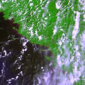
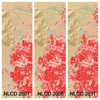
These three panels of cyclical data (2001, 2006, 2011) from the National Land Cover Database depict intervals of land cover change in the vicinity of Spring Valley, a suburb of Las Vegas, NV.[Source: USGS] Just released, the latest edition of the nation’s most comprehensive look at land-surface conditions from coast to coast shows the extent of land cover types from forests to urban areas. The National Land Cover Database (NLCD 2011) is made available to the public by the U.S. Geological Survey and partners.

Dividing the lower 48 states into 9 billion geographic cells, the massive database provides consistent information about land conditions at regional to nationwide scales. Collected in repeated five-year cycles, NLCD data is used by resource managers and decision-makers to conduct ecosystem studies, determine spatial patterns of biodiversity, trace indications of climate change, and develop best practices in land management.

Based on Landsat satellite imagery taken in 2011, NLCD 2011 describes the land cover of each 30-meter cell of land in the conterminous United States and identifies which ones have changed since the year 2006. Nearly six such cells — each 98 feet long and wide — would fit on a football field. Land cover is broadly defined as the biophysical pattern of natural vegetation, agriculture, and urban areas. It is shaped by both natural processes and human influences. NLCD 2011 updates the previous database version, NLCD 2006.

Webinar about the release will be Tuesday, April 15, 2014, 2:00 PM Eastern Time: "New Version of the National Land Cover Database - April 4, 2014 Release”

The latest version of the National Land Cover Database (NLCD) for the conterminous United States will be publicly released on April 4, 2014.  NLCD 2011 is the most up-to-date and extensive iteration of the National Land Cover Database, the definitive Landsat-based, 30-meter resolution land cover database for the Nation.  NLCD 2011 products are completely integrated with those of previous versions (2001, 2006), providing a 10-year record of change for the Nation.  Products include 16 classes of land cover, the percent of imperviousness in urban areas, and the percent of tree canopy cover. NLCD is constructed by the 10-member federal interagency Multi-Resolution Land Characteristics (MRLC) Consortium.   This seminar will highlight the new features of NLCD 2011 and the related applicationsCollin Homer, 605-594-2714, homer@usgs.gov)
For more information and to download NLCD data, visit http://www.mrlc.gov/.
Please click the following link to join the webinar:
 https://usgs.webex.com/usgs/j.php?ED=279876177&UID=490357047&RT=MiM3

At start time of the webinar, each location must call one of the dial-in numbers:
From the National Center in Reston, dial internally x4848
From all other USGS/DOI locations, dial 703-648-4848
From non DOI locations, dial toll free 855-547-8255
After the voice prompt, please enter the Conference Security Code 73848024 followed by the # key. You will hear a tone confirming that you have successfully joined the conference call. If you weren't successful, you will hear another voice prompt with instructions.

Big Data for sustainability: an uneven track record with great potential

An interesting position piece on the appropriate uses of big data for climate resilience. The author, Amy Luers, points out three opportunities and three risks.

She sums up:

"The big data revolution is upon us. How this will contribute to the resilience of human and natural systems remains to be seen. Ultimately, it will depend on what trade-offs we are willing to make. For example, are we willing to compromise some individual privacy for increased community resilience, or the ecological systems on which they depend?—If so, how much, and under what circumstances?"

Read more from this interesting article here.

The evolution of a Digital Earth

In 1998 Al Gore made his now famous speech entitled The Digital Earth: Understanding our planet in the 21st Century. He described the possibilities and need for the development of a new concept in earth science, communication and society. He envisioned technology that would allow us "to capture, store, process and display an unprecedented amount of information about our planet and a wide variety of environmental and cultural phenomena.” From the vantage point of our hyper-geo-emersed lifestyle today his description of this Digital Earth is prescient yet rather cumbersome: 

"Imagine, for example, a young child going to a Digital Earth exhibit at a local museum. After donning a head-mounted display, she sees Earth as it appears from space. Using a data glove, she zooms in, using higher and higher levels of resolution, to see continents, then regions, countries, cities, and finally individual houses, trees, and other natural and man-made objects. Having found an area of the planet she is interested in exploring, she takes the equivalent of a "magic carpet ride" through a 3-D visualization of the terrain.”

He said: "Although this scenario may seem like science fiction, most of the technologies and capabilities that would be required to build a Digital Earth are either here or under development. Of course, the capabilities of a Digital Earth will continue to evolve over time. What we will be able to do in 2005 will look primitive compared to the Digital Earth of the year 2020. In 1998, the necessary technologies were: Computational Science, Mass Storage, Satellite Imagery, Broadband networks, Interoperability, and Metadata. 

He anticipated change: "Of course, further technological progress is needed to realize the full potential of the Digital Earth, especially in areas such as automatic interpretation of imagery, the fusion of data from multiple sources, and intelligent agents that could find and link information on the Web about a particular spot on the planet. But enough of the pieces are in place right now to warrant proceeding with this exciting initiative.” 

Example from NOAA's Science on a Sphere projectMuch has changed since he gave his talk, obviously. We have numerous examples of Virtual Globes for data exploration - for example, Google Earth, NASA’s WorldWind, ESRI’s ArcGIS Explorer, Bing Maps 3D, TerraExplorer, Marble.  (These virtual examples are made tangible with NOAA's terrific Science on a Sphere project.)

We also have realized a new vision of the Digital Earth that includes much more than immersive viewing of data. Today’s Digital Earth vision(s) include analytics and expertise for solving problems that are often cross-discplinary and large scale. Additionally, we make much more use today than was anticipated in 1998 from sensor networks and the geoweb (e.g. volunteered geographic information and croudsourcing). Examples of this multi-disciplinary Digital Earth concept include Google Earth Engine (and its recent forest loss product), Nasa Earth Exchange, and our own HOLOS.

NSF has adopted this concept for their Earth Cube concept. Last year NSF was looking for transformative concepts and approaches to create integrated data management infrastructures across the Geosciences. They were interested in the multifaceted challenges of modern, data-intensive science and education and envision an environment where low adoption thresholds and new capabilities act together to greatly increase the productivity and capability of researchers and educators working at the frontiers of Earth system science. I am not sure if this will be funded in 2014, but the concept reafirms that the concept of the Digital Earth is widespread and will likely be an important part of academia.

NASA shares satellite and climate data on Amazon’s cloud


NASA has announced a partnership with Amazon Web Services that the agency hopes will spark wider collaboration on climate research. In an effort that is in some ways parallel to Google's Earth Engine, NASA has uploaded terabytes of data to Amazon's public cloud and made it available to the anyone. 

Three data sets are already up at Amazon. The first is climate change forecast data for the continental United States from NASA Earth Exchange (NEX) climate simulations, scaled down to make them usable outside of a supercomputing environment. The other two are satellite data sets—one from from the US Geological Survey's Landsat, and the other a collection of Moderate Resolution Imaging Spectroradiometer (MODIS) data from NASA's Terra and Aqua Earth remote sensing satellites.

More Here

New Berkeley Institute for Data Science Launched!

UC Berkeley is establishing a new institute to enable university researchers to harness the full potential of the data-rich world that today characterizes all fields of science and discovery. The Berkeley Institute for Data Science (BIDS) will be part of a multi-million dollar effort supported by the Gordon and Betty Moore Foundation and the Alfred P. Sloan Foundation.

The new 5-year, $37.8 million initiative was announced today at a meeting sponsored by the White House Office of Science and Technology Policy (OSTP) focused on developing innovative partnerships to advance technologies that support advanced data management and data analytic techniques.

The ambitious Moore/Sloan partnership, which also includes New York University and the University of Washington, will spur collaborations within and across the three campuses and other partners pursuing similar data-intensive science goals. The three PIs who lead the respective campus efforts – Saul Perlmutter at UC Berkeley, Ed Lazowska at the University of Washington, and Yann Le Cunn at NYU – will promote common approaches to form the basis for ongoing collaboration between the three campuses.

To provide a home for the new Berkeley Institute for Data Science UC Berkeley has set aside renovated space in a historical library building on the central campus in 190 Doe Library. The Institute is expected to move into its new quarters in spring 2014. In order to help address challenges related to creating and sustaining attractive career paths the new Institute will offer new Data Science Fellow positions for faculty, post-doctoral fellows, and staff to be shared with departmental partners across the campus. The new Institute will also offer support for graduate students, and organize short courses, boot camps, hack-a-thons and many other activities.

More information about specific BIDS programs will be forthcoming in the coming weeks. The new Institute will be launched at a campus event on December 12, 2013. If you or your students and collaborators are interested in participating in the Data Science Faire that day, please be sure to register at http://vcresearch.berkeley.edu/datascience/dec12-registration. The deadline is November 25, 2013.

For updates and more information, please visit http://vcresearch.berkeley.edu/datascience/overview-data-science and contact data science@berkeley.edu with any questions you may have.

California Geoportal Offers One-Stop Shop for Statewide GIS Data

The California Geoportal, officially launched in March 2013 (see here for related launch press release), augments and in some ways replaces the original Cal-Atlas statewide GIS data download webpage with a more simplified, smooth, and more intuitive website for all GIS related data in the state. You can now search or browse for GIS data by geography and any corresponding metadata using traditional search queries as well as by using a standalone webGIS interface. The portal also provides direct download links to some Oregon and Nevada state GIS datasets. The site acts as a GIS data repository for publicly available GIS data and related documents and maps from state agencies and local and regional governments. Rather than hosting the physical data, the site instead acts as a library of direct download links to datasets that connect directly to the author’s databases. The site also links you to other state GIS applications such as the California Coastal Geoportal and webGIS viewers from various state agencies.

Screenshot of the CA Geoportal

Screenshot of the CA Geoportal Map ViewerSee below for an informative video on how and why the portal was created and for highlights of features:

Landsat 8 imagery available

From Kelly:

Data collected by the Operational Land Imager (OLI) and the Thermal Infrared Sensor (TIRS) onboard the Landsat 8 satellite are available to download at no charge from GloVis, EarthExplorer, or via the LandsatLook Viewer

Orbiting the Earth every 99 minutes, Landsat 8 images the entire Earth every 16 days in the same orbit previously used by Landsat 5. Data products are available within 24 hours of reception. Check it.

Conference wrap up: DataEdge 2013

The 2nd DataEdge Conference, organized by UC Berkeley’s I School, has wrapped, and it was a doozy. The GIF was a sponsor, and Kevin Koy from the Geospatial Innovation Facility gave a workshop Understanding the Natural World Through Spatial Data. Here are some of my highlights from what was a solid and fascinating 1.5 days. (All presentations are now available online.)

Michael Manoochehri, from Google, gave the workshop Data Just Right: A Practical Introduction to Data Science Skills. This was a terrific and useful interactive talk discussing/asking: who/what is a data scientist? One early definition he offered was a person with 3 groups of skills: statistics, coding or an engineering approach to solving a problem, and communication. He further refined this definition with a list of practical skills for the modern data scientist:

  • Short-term skills: Have a working knowledge of R; be proficient in python and JavaScript, for analysis and web interaction; understand SQL; know your way around a unix shell; be familiar with distributed data platforms like Hadoop; understand the Data Pipeline: collection, processing, analysis, visualization, communication.
  • Long-term skills: Statistics: understand what k-means clustering is, multiple regression, Baysien inference; and Visualization: both the technical and communication aspects of good viz.
  • Finally: Dive into a real data set; and focus on real use cases.

Many other great points were brought up in the discussion: the data storage conundrum in science was one. We are required to make our public data available: where will we store datasets, how will we share them and pay for access of public scientific data in the future?

Kate Crawford, Principal Researcher, Microsoft Research New England gave the keynote address entitled The Raw and the Cooked: The Mythologies of Big Data. She wove together an extremely thoughtful and informative talk about some of our misconceptions about Big Data: the “myths” of her title. She framed the talk by introducing Claude Levi-Strauss’ influential anthropological work “The Raw and the Cooked” - a study of Amerindian mythology that presents myths as a type of speech through which a language and culture could be discovered and learned. You know you are in for a provocative talk in a Big Data conference when the keynote leads with CLS. She then presented a series of 6 myths about Big Data, illustrated simply with a few slides each. Here is a quick summary of the myths:

  1. Big Data is new: the term was first used in 1997, but the “pre-history” of Big Data originates much earlier, in 1950s climate science for example, or even earlier. What we have is new tools driving new foci.
  2. Big Data is objective: she used the example of post-Sandy tweets, and makes the point that while widespread, these data are a subset of a subset. Muki Haklay makes the same point with his cautionary: “you are mining the outliers” comment (see previous post). She also pointed out that 2013 marks the point in the history of the internet when 51% of web traffic is non-human. Who are you listening to?
  3. Big Data won't discriminate: does BD avoid group level prejudice? We all know this, people not only have different access to the internet, but given that your user experience has been framed by your previous use and interaction with the web, the rich and the poor see different internets.
  4. Big Data makes cities smart: there are numerous terrific examples of smart cities (even many in the recent news) but resource allocation is not even. When smart phones are used for example to map potholes needing repair, repairs are concentrated in areas where cell phone use is higher: the device becomes a proxy for the need.
  5. Big Data is anonymous: Big Data has a Big Privacy problem. We all know this, especially in the health fields. I learned the new term “Health Surrogate Data” which is information about your health that results from your interaction with the Internet. Great stuff for Google Flu Tracker for example, but still worrying. The standard law for protection in the public health field, HIPAA, is similar to “bringing a knife to a gunfight” as she quoted Nicholas Terry.
  6. You can opt out: there are currently no clear ways to opt out. She asks: how much would you pay for privacy? And if the technological means to do so were created and made widespread, we would likely see the development of privacy as a luxury good, further differentiating internet experience based on income.

The panel discussion Digital Afterlife: What Happens to Your Data When You Die? moderated by Jess Hemerly from Google, and including Jed Brubaker from UC Irvine and Stephen Wu, a technology and intellectual property attorney was eye-opening and engaging. Each speaker gave a presentation from their expertise: Stephen Wu gave us a primer on digital identity estate planning and Jed Brubaker shared his research on the spaces left in social media when someone dies. Both talks were utterly fascinating, thought provoking and unique.

And finally, Jeffrey Heer from Stanford University gave a stunning and fun talk entitled Visualization and Interactive Data Analysis showcased his Viz work, and introduced to many of us Data Wrangler, which is awesome.

Great conference!

Mobile Field Data Collection, Made Easy

Recommendation from Greeninfo Network's MapLines newsletter:

"Attention land trusts, weed mappers, trail maintainers and others - Are you ready for the Spring field work season?  GreenInfo recommends using this customizable, free app for collecting data in the field - Fulcrum App, which offers a free single user plan for storing up to 100 mb of data."

According to their website, with Fulcrum, you build apps to your specifications, allowing you to control exactly what data is captured from the field and how. Maintain high standards of quality to minimize rework, QA/QC, and error correction by getting it done right the first time.

PROBA-V satellite launched May 7

Proba-V’s first image of FranceI haven't used PROBA imagery, but many colleagues in Europe rely on this sensor.

PROBA-V (i.e. "vegetation") was launched May 7. The miniature satellite is designed to map land cover and vegetation growth across the entire planet every two days. The data can be used for alerting authorities to crop failures or monitoring the spread of deserts and deforestation.

Less than a cubic metre in volume, Proba-V is a miniaturised ESA satellite tasked with a full-scale mission: to map land cover and vegetation growth across the entire planet every two days.

Proba-V is flying a lighter but fully functional redesign of the Vegetation imaging instruments previously flown aboard France’s full-sized Spot-4 and Spot-5 satellites, which have been observing Earth since 1998.

Check it out: http://www.esa.int/Our_Activities/Technology/Proba_Missions/Proba-V_opens_its_eyes

CPAD 1.9 released today: mapping protected areas in California

CPAD, the California's Protected Areas Database is releasing a new version. This product maps lands owned in fee by public and nongovernmental organizations for open space purposes, ranging from small neighborhood parks to large wilderness areas.

CPAD 1.9 a major update that corrects many outstanding issues with CPAD holdings data and also has many new additions, particular for urban parks.

CPAD is produced and managed by GreenInfo Network, a 16 year old non-profit organization that supports public interest groups and agencies with geospatial technology. CPAD data development is conducted with Esri ArcGIS products, supplemented with open source web application tools. 

Find the data here.

Mapping and interactive projections with D3

D3 is a javascript library that brings data to life through an unending array of vizualizations.  Whether you've realized it or not, D3 has been driving many of the most compeling data visualizations that you have likely seen throughout the last year including a popular series of election tracking tools in the New York Times.

You can find a series of examples in D3's gallery that will keep you busy for hours!

In addition to the fantastic charting tools, D3 also enables a growing list of mapping capabilities.  It is really exciting to see where all this is heading.  D3's developers have been spending a lot of time most recently working on projections transformations.  Check out these amazing interactive projection examples:

Projection Transitions

Comparing Map Projections

Adaptive Composite Map Projections (be sure to use chrome for the text to display correctly)

Can't wait to see what the future has in store for bringng custom map projections to life in more web map applications!


Hey Sandi Toksvig! Denmark is releasing data...

From the LASTools list. Recently, the Danish government released this announcement of free access to public sector data. Among other things, it means that Danish mapping and elevation data will become free (apparenty "free" as in speech as well as in beer).

Apparently, the intention is that the data should be accessible from the beginning of next year. Ole Sohn, Danish Minister for Business and Growth said:

“When the data has been released it can be used to develop completely new types of digital products, solutions, and services, which will benefit our companies as well as society at large. It is a vital part of Denmark's digital raw material that we are now releasing, which will create growth and jobs in Denmark”.

Bing Maps completes Global Ortho project for US

The Bing Maps team has anounced the completion of the Global Ortho Project for the US.  The project provides 30cm resolution imagery for the entire US, all acquired within the last 2 years.  You can access all of the imagery now through Bing Maps, it is pretty amazing to see such detail for all of the far off places that typically don't get high resolution attention. 

Find out more about the project from the Bing Maps Blog, or view the data for yourself.

New open datasets for City of Oakland and Alameda County

Following on the footsteps of the county and city of San Francisco open data repository at data.sfgov.org, two new beta open data repositories have recently been released for the City of Oakland and Alameda County. This development coincides with the recent 2012 Code for Oakland hackathon last week. The hackathon aims to make government more transparent in the city and county through the use of technology with apps and the web to make public access to government data easier. The City of Oakland’s open data repository at data.openoakland.org includes data on crime reports for a variety of spatial scales, a variety of tabular and geographic data such as parcels, roads, trees, public infrastructure, and locations of new development to name a few. It is important to note that the Oakland open data repository is currently not officially run or maintained by the City of Oakland. It is currently maintained by members of the community and the OpenOakland Brigade. Alameda County’s open data repository at data.acgov.org includes data on Sherriff crime reports, restaurant health reports, solar generation data, and a variety of tabular and geographic data and public health department data. Data can be viewed on a browser as an interactive table or an interactive map or the data can be downloaded in a variety of formats. Both sites are still in their infancy so expect more datasets to come online soon. Also on the same note, the Urban Strategies Council recently released a new version of their InfoAlamedaCounty webGIS data visualization and map viewer - check it out.

 Screenshot of City of Oakland Open Data: data.openoakland.org

Screenshot of Alameda County Open Data: data.acgov.org

New high resolution coastal elevation data for California

The California Ocean Protection Council has released state-wide high resolution elevation data for coastal California and much of San Francisco Bay. LiDAR data were collected between 2009-2011 and cover nearly 3,800 square miles. Data can be download from NOAA Coastal Services Center's Digital Coast website:

New OSGeo-Live GIS software collection released

OSGeo-Live is a self-contained bootable DVD, USB flash drive and Virtual Machine based upon Ubuntu Linux that is pre-configured with a wide variety of robust open source geospatial software. The applications can be trialled without installing anything on your computer, simply by booting the computer from the DVD or USB drive. The lightening overview introduces all these applications, and hence provides a comprehensive introduction to the breadth of Geospatial Open Source.

http://live.osgeo.org

Highlights
50 Quality Geospatial Open Source applications installed and pre-configured
Quality free world maps and geodata
One page overviews and quick start guides for all applications
Overviews of key OGC standards
Translations for Greek, German, Polish, Spanish and Japanese

Contents

Browser Clients

  • OpenLayers - Browser GIS Client
  • Geomajas - Browser GIS Client
  • Mapbender - Geoportal Framework
  • MapFish - Web Mapping Framework
  • GeoMoose - Web GIS Portal

Crisis Management

  • Sahana Eden - Disaster management
  • Ushahidi - Mapping and Timeline for events

Databases

  • PostGIS - Spatial Database
  • SpatiaLite - Lightweight Database
  • Rasdaman - Multi-Dimensional Raster Database
  • pgRouting - Routing for PostGIS


Desktop GIS

  • Quantum GIS (QGIS)
  • GRASS GIS
  • gvSIG Desktop
  • User-friendly Desktop Internet GIS (uDig)
  • Kosmo Desktop
  • OpenJUMP GIS
  • SAGA
  • OSSIM - Image Processing
  • Geopublisher - Catalogue
  • AtlasStyler - Style Editor
  • osgEarth - 3D Terrain Rendering
  • MB-System - Sea Floor Mapping

Navigation and Maps

  • GpsDrive - GPS Navigation
  • Marble - Spinning Globe
  • OpenCPN - Marine GPS Chartplotter
  • OpenStreetMap - OpenStreetMap Tools
  • Prune - View, Edit and Convert GPS Tracks
  • Viking - GPS Data Analysis and Viewer
  • zyGrib - Weather Forecast Maps


Spatial Tools

  • GeoKettle - ETL (Extract, Transform and Load) Tool
  • GDAL/OGR - Geospatial Data Translation Tools
  • GMT - Cartographic Rendering
  • Mapnik - Cartographic Rendering
  • MapTiler - Create Map Tiles
  • OTB - Image Processing
  • R Spatial Task View - Statistical Programming


Web Services

  • GeoServer
  • MapServer
  • deegree
  • GeoNetwork - Metadata Catalogue
  • pycsw - Metadata Catalogue
  • MapProxy - Proxy WMS & tile services
  • QGIS Server - Web Map Service
  • 52°North WSS - Web Security Service
  • 52°North WPS - Web Processing Service
  • 52°North SOS - Sensor Observation Service
  • TinyOWS - WFS-T Service
  • ZOO Project - Web Processing Service


Data

  • Natural Earth - Geographic Data Sets
  • OSGeo North Carolina, USA Educational dataset
  • OpenStreetMap - Sample extract from OpenStreetMap


Geospatial Libraries

  • GeoTools - Java GIS Toolkit
  • MetaCRS - Coordinate Reference System Transformations
  • libLAS - LiDAR Data Access


Other software of interest (not available Live)

  • MapWindow GIS - Microsoft Windows based GIS
  • MapGuide Open Source - Web Service

TanDEM-X and TerraSAR-X cover the globe

TanDEM's view of Iceland: The country was beyond the sight of the shuttle topography mission in 2000We talked about TanDEM before, after launch. The German satellite radar twins - TanDEM-X and TerraSAR-X - are a year through their quest to make the most precise, seamless map of varying height on Earth.

They've now acquired data across the entire globe at least once. However, some tricky sampling areas, such as tall mountains and thick forests, will require several passes and so we don't expect to see a fully finished product before 2014.

As compared with the Shuttle product at best spatial resolution of 30m by 30m, and a vertical resolution that varies from 16m to 10m, the intention of the TanDEM mission is to go down to a spatial resolution of 12m by 12m and a vertical resolution of 2m. Airbone lidars can achieve much better precision, but these maps are necessarily regional in extent - they will cover only relatively small areas. The purpose of TanDEM is to build a world DEM that is single-source and has "no joins".

Report from the BBC here.

The TanDEM Digital Elevation Model of Mount Etna, Sicily, Italy