ANR Land Use Change workgroup website
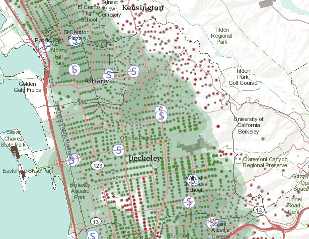
Changing land use is one of the most important issues facing California. ANR programs and personnel can help decision makers and land owners make land use decisions that benefit agricultural, natural, and human resources. Our focal areas include land use change, water quality and watershed management, habitat conservation, preservation of working landscapes, and managing growth. This workgroup provides ANR resources to interested clientele. We also identify gaps in our existing knowledge and in our extension materials and work to fill these gaps. We increase communication among our various members and collaborators, both within and beyond DANR and UC. Please see our Land use change website.

Before and after the Japanese earthquake, and our nuclear sites in CA

California’s two nuclear power plant locations: Diablo Canyon and San OnofreUpdated satellite photos from Japan, before and after the earthquake, including the Fukushima Daiichi Nuclear Plant. From the NY Times. Imagery from GeoEye and Digital Globe.  FYI, California’s two nuclear power plants, the dual-unit Diablo Canyon and dual-unit San Onofre systems, produce about one-fifth of the state’s total electricity generation. San Onofre is featured in a number of films, including Naked Gun. Both are apparently designed to withstand earthquakes of 7 or 7.5 magnitude, depending on who you ask. 

Apps for Oak Trees: Can social media help save a forest?

From the East Bay Express: a nice article by Caitlin Esch about mobile apps, citizen science and environmental science. The article features the OakMapper, and ken-ichi ueda's iNaturalist, and UC Davis' Roadkill Observation System. The article includes a nice history of the OakMapper, including our early days wrangling faxes and hand-drawn maps, and the early inspiration for the site: the USGS Earthquake Mapper.

ESRI Food Desert Mapping

Also from Greeninfo Network. Team ESRI, publisher of ArcGIS software, has rolled out “The Food Desert Finder” a terrific interactive map which shows where there are gaps in access to supermarkets.  If access to nutritious food is limited or made difficult by factors such as cost or the distance traveled to obtain it, peoples’ health suffers – these areas that lack relatively easy access to nutritious, affordable food as popularly known as “food deserts.”  The ESRI Food Desert Finder is a searchable map that shows populations in poverty who live beyond a one mile walk to a supermarket and who lack other access to healthy fresh foods.

Berkeley/Kensington area, CAHere is a snap from the Berkeley/Kensington area. Obviously, something more than just walking distance to supermarkets is critical, as the Kensigton area (showing all the red dots - indicating people without easy access to grocery stores) is not known as an underserved community. Still a very nice tool, and one which will be used by our OurSpace project.


California Protected Areas Database (CPAD) 1.6 released

From Greeninfo Network: Announcing the release of California Protected Areas Database (CPAD) 1.6 - you can download it at www.calands.org.  Released concurrently is MapCollaborator, our new mapping wiki which available here http://bit.ly/hjbEwg. Mapcollaborator is a great new web interface for crowdsourcing data review and improvement. Check it out and start providing your edits and input today!

And, we now have a CPAD e-newsletter!  If you would like to receive quarterly updates about CPAD, go to www.calands.org and click on the “Sign up for Updates” button on the right.

Very high res urban mapping: research reported at the Berkeley BEARS 2011 EECS Annual Research Symposium

February 17th Berkeley Electrical Engineering and Computer Sciences (EECS) Annual Research Symposium some interesting new developments and research in the world of information technology were showcased. The first section of the symposium hosted four talks about current and future research at UC Berkeley in IT focusing on large scale data mining, aggregation and analysis; artificial intelligence and language processing; augmenting reality with virtual and mobile systems of information display and collection; and sensor/communication nanotechnology.

Most notable in application to GIS, although far off, it was mentioned that work is underway to try to miniaturize the lasers in LiDAR sensors to the scale of inserting them into mobile phones to enable collective 3D ground mapping of urban areas from mobile users and for placement in building materials to monitor building occupants/conditions. More current was the talk from Avideh Zakhor about work in the VIP lab on combining data from mobile ground based sensors, similar to those used to create Google street view, with aerial photos to create 3D urban models at varying resolutions (Read more) (Video). Also in development is putting the same technology that is used to create Google street view of exterior streets in the interiors of buildings. This enables the creation of 3D interior building models and photorealistic walk through environments of interior spaces. This may have many implications in emergency  preparedness/management, design, and marketing (Read more) (Example image below).

Source: Image from Avideh Zakhor homepage: http://www-video.eecs.berkeley.edu/~avz/

Check out the BEARS 2011 website here for more information and for video recordings of the talks to be up soon.

For more information on the individual presenters: Ion Stoica, Dan Klein, Avideh Zakhor, Kristofer Pister, and Jan Rabaey.

Map of scientific collaboration between researchers

This map of scientific collaboration between researchers by Olivier Beauchesne has a similar look and methodology to the facebook friend maps done by Paul Butler but instead of mapping facebook friendships these maps try to describe the level of scientific collaboration between researchers from 2005 to 2009 using databases of academic paper authorship and author location. From Olivier Beauchesne's blog this is how to interpret it: "For example, if a UCLA researcher published a paper with a colleague at the University of Tokyo, this would create an instance of collaboration between Los Angeles and Tokyo." The brighter the lines, the higher number of collaborations between a pair of locations. Seems to be a lack of data in certain regions.

For more information and to view the maps in hi-res see Olivier's blog post here.


Open Street Map's further integration into commercial mapping products

MapQuest has recently announced the opening of a secondary beta open source mapping website based on the Open Street Maps engine where community members can post and edit map data that will then be integrated into Open Street Maps and MapQuest products. The announcement also indicates MapQuest may in the near future merge this beta open source map portal with their commercial map portal. The integration of community based map editing and open source data in commercial products has started to become a trend in the commercial mapping world. Other commercial map products such as Microsoft Bing and commercial mapping applications such as ESRI ArcGIS 10 base maps already offer Open Street Map as a product to view alongside their propriety map data. Community led commercial map editing is not entirely new as Google and other map services already allow account members to point out errors and make corrections. What is different in the case of MapQuest is the integration of open source data with commercial data. This continues to push the boundaries of community led mapping and the further proliferation of open source data products in the commercial and public spheres.

Read the full article here.

Open MapQuest Beta

UrbanFood.org released

This new internet map site from Nathan McClintock shows both existing urban gardens and vacant or open spaces in Oakland, CA where food could potentially be produced. Publicly owned land with productive potential totals 1,201 acres while private vacant land totals 848 acres. Food production at these sites could potentially produce as much as 15 to 20 percent of Oakland’s fruit and vegetable needs. Read the report on the website for details. This is such a great resource, and beautifully designed.

OakMapper in the news!

OakMapper is featured in a new ANR news report from Pam Kan Rice. Check it out here. From the article:

Smartphone users can report sudden oak death

California’s majestic oak trees have been felled by the hundreds of thousands by a disease first reported in 1995 and dubbed “sudden oak death.”  To get a broader perspective on the disease, UC Berkeley scientists have developed a smartphone app for hikers and other nature lovers to report trees they find that have succumbed to sudden oak death.

While out in a park or forest, iPhone users can use the new OakMapper mobile application to report sightings of trees killed by Phytophthora ramorum, the plant pathogen that causes sudden oak death. Onsite, they can note the symptoms they see, such as seeping, bark discoloration, crown discoloration, dead leaves, shoot die-back, fungus, beetle frass and beetle bore holes. The OakMapper app, created by scientists in the UC Berkeley Geospatial Innovation Facility, uses the phone's built-in GPS to identify the participant’s location when the data is submitted.

the world according to facebook

From the BBC: Using some of the information on friends data from facebook's 500m members, intern Paul Butler has constructed an interesting map of the world's connections. The map above is the result of his attempts to visualise where people live relative to their Facebook friends. Each line connects cities with pairs of friends. The brighter the line, the more friends between those cities.

21st century maps are commercial products, not national efforts

From the Map Room. Popsci has an interesting article about "how digital maps are changing the landscape of the 21st century". Among the interesting bits is this RAD image, showing a moving plane captured by the GeoEye satellite. But the main argument is that mapping used to be the purview of nations and international bodies, but now commercial entities like Google, Bing, Mapquest, and other digital services are the principal mapmakers of the 21st century. Now, maps are commercial products, compiled from a variety of sources that often blend government-derived mapping data with user-generated content. The article suggests they are subject to conflicting information, differences of political opinion and outright error. In addition, the article claims we haven't really focused on this transfer of cartographic power, but of course many have commented on this (e.g. Goodchild's VGI article frfom 2007 in Geojournal) in the academic world.

Visualizing slavery from 1860

From the NYT comes a great article about an early map from the US Coast Survey (creators of those lovely coastal charts from the late 19th century that adorn many of my walls) that shows slavery in the southern US, based on the 1860 census. The map used novel cartographic techniques for the day and was a masterful piece of public outreach: it was important in convincing the Union public that the civil war was about slavery, and not just state's rights. Map here.

From the article: 

The 1860 Census was the last time the federal government took a count of the South’s vast slave population. Several months later, the United States Coast Survey—arguably the most important scientific agency in the nation at the time—issued two maps of slavery that drew on the Census data, the first of Virginia and the second of Southern states as a whole. Though many Americans knew that dependence on slave labor varied throughout the South, these maps uniquely captured the complexity of the institution and struck a chord with a public hungry for information about the rebellion.

The map uses what was then a new technique in statistical cartography: Each county not only displays its slave population numerically, but is shaded (the darker the shading, the higher the number of slaves) to visualize the concentration of slavery across the region (legend at left). The counties along the Mississippi River and in coastal South Carolina are almost black, while Kentucky and the Appalachians are nearly white.

The mapping brain

This is an interesting article from National Geographic about "The Map and the Mind", which makes the argument that our intellectual maturation as individuals can be traced through the way we draw pictures, or maps, of our surroundings, and that the humble map helped “advance the evolution of abstract thinking” throughout society.

"Nicholas Carr’s new book, The Shallows: What the Internet Is Doing to Our Brains, examines how our intellectual technologies—the tools we use to find, store, and share information—influence the way that we think, from the map and the clock to the book and the Internet. In this excerpt, Carr looks at the map’s far-reaching effects on the intellectual lives of our ancestors."

I assume in the book he talks about internet mapping and LBS, but that will have to wait until I can get my hands on the book.

Google Earth Engine Debuted at the International Climate Change Conference in Cancun, Mexico

Google.org introduced a new Google Labs product called Google Earth Engine at the International Climate Change Conference in Cancun, Mexico. Google Earth Engine is a new technology platform that puts petabytes of satellite imagery and data from the past 25 years online, many of which have never been seen, much less analyzed. The platform will enable scientists around the world to use Google’s cloud computing infrastructure to implement their applications. For example, creating a detailed forest cover and water map of Mexico, a task that would have taken 3 years on one computer, was accomplished in less than a day.

Google Earth Engine can help scientists track and analyze changes in Earth’s environment  and can be used for a wide range of applications—from mapping and monitoring water resources to ecosystem services to deforestation. The idea is to enable global-scale monitoring and measurement of changes in the earth’s environment by providing scientists a vast new amount of data and powerful computing resources.

Read more at Introducing Google Earth Engine or watch Google Earth Engine Overview videos.