Forest clearing and regrowth in Washington
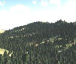
These shots (both Landsat 5) are from much larger images provided by NASA Earth Observatory. They depict forest clearing and regrowth in Washington state. The checkerboard pattern is typical of land ownership patterns in the American West.  A nice article on this checkerboarded ownership patterns is here. The overall article talks about carbon storage and forestry; the point of the images below is 1) the pattern of clearing in 1984, which is really quite interesting and abstract, and 2) the regrowth in 2010.


From the article:

This pair of images, both from the Landsat 5 satellite, shows grids of forest disappearing and gradually regrowing over 26 years. In 1984, logging in the area appears to be in the early stages. In many places, red-brown earth is exposed under the swaths of freshly cut forest. Other grids, cleared just a bit earlier, are pale green with newly growing grasses or very young trees. The rest of the image is dominated by the deep green of dense, mature forest. In 2010, the logging operation seems to be more mature. There is little evidence of fresh cuts, but some areas have been recently cleared. Pockets of mature forest remain, and forest is regrowing in other places. Grids that had been clear in 1984 are forested in 2010.

Trees become houses, furniture, paper products, and myriad other products that we use every day. Trees are also important because they take carbon dioxide from the atmosphere and convert it to the sugars that make up the leaves and wood of the tree. Trees store carbon. The Earth Observatory’s new carbon cycle article describes the impact of deforestation on the carbon cycle:

When we clear forests, we remove a dense growth of plants that had stored carbon in wood, stems, and leaves—biomass. By removing a forest, we eliminate plants that would otherwise take carbon out of the atmosphere as they grow. We also expose soil that vents carbon from decayed plant matter into the atmosphere. Humans are currently emitting just under a billion tons of carbon into the atmosphere per year through land use changes. Changes that put carbon gases into the atmosphere result in warmer temperatures on Earth.

Satellite images like these help scientists estimate how much carbon dioxide goes into the atmosphere when a forest is cleared, and how much carbon dioxide is being taken out of the atmosphere as a forest regrows.

Read more in the Carbon Cycle feature.

Debris from Japanese tsunami steadily drifting toward California

This item got heavy news rotation this morning: the considerable debris from the tsunami in Japan is out to sea and slowly moving toward Hawaii and the west coast of the US. 

The debris is moving east at roughly 10 miles a day, and is spread over an area about 350 miles wide and 1,300 miles long -- an area roughly the size of California. It should reach beaches and coastal cities in California, Oregon and Washington in 2013 or early 2014. These estimates are from a computer model, the details of which are spotty in the articles I read. Example here from insidebayarea.

Debris movement similation: purple is low density, red is high density of debrisThere is considerable concern about this.  Last Monday, representatives from the Coast Guard, NOAA, the Environmental Protection Agency, the U.S. State Department and other agencies met for the first time in Honolulu to share information about the Japanese debris and begin to chart a strategy.

Among their plans: to notify the U.S. Navy and commercial shipping companies that regularly sail across the Pacific so they can begin to document what is floating. That could lead to expeditions to go map and study it.

Curtis Ebbesmeyer, a Seattle oceanographer who has studied marine debris for more than 20 years (and done some neat work with rubber duckies to map ocean currents) is one of the leads interviewed for the report.


Sacramento - vulnerable to levee breaks

Sacramento's levee system: levees are in orange, the inset is the capital under floodwaters.A good article from NYTimes discussing the vulnerability of Sacramento to levee breaks. Scientists consider Sacramento — which sits at the confluence of the Sacramento and American Rivers and near the delta — the most flood-prone city in the nation. The city is at risk from earthquake-damaged levees and storm related flooding.

New York City Solar Map Released

An interactive web-based map called The New York City Solar Map was recently released by the New York City Solar America City Partnership, led by Sustainable CUNY. The map allows users to search by neighborhood and address or interactively explore the map to zoom and click on a building or draw a polygon to calculate a number metrics related to building roof tops and potential solar power capacity including: potential energy savings, kilowatt output (in a time series), carbon emission reductions, payback, and a calculator for examining different solar installation options and savings with your utility provider. The map is intended to encourage solar panel installations and make information regarding solar panel capacity easier to access. Lidar data covering the entire city was collected last year and was used to compute the metrics used to determine solar panel capacity.

Solar Energy CalculatorThe data reveals that New York City has the potential to generate up to 5,847 megawatts of solar power. The installed solar capacity in the US today is only 2,300 megawatts. 66.4 percent of the city’s buildings have roof space suitable for solar panels. If panels were installed on those roof tops 49.7 percent of the current estimated daytime peak demand and about 14 percent of the city’s total annual electricity use could be met.

This map showcases the utility and power of webGIS and how it can be used to disseminate complex geographic information to anyone with a browser, putting the information needed to jump start solar panel installation in the hands of the city’s residents. The map was created by the Center for Advanced Research of Spatial Information (CARSI) at CUNY’s Hunter College and funded primarily by a United States Department of Energy grant.

Source: Click here for a NYTimes Article on the project for more information.

Click here to view the New York City Solar Map.

New York City Solar Map

Tracking apex marine predator movements in a dynamic ocean

From a new Nature article focusing on the tracking of marin predators in the Pacific. What a cool graphic!

a, Daily mean position estimates (circles) and annual median deployment locations (white squares) of all tagged species. b, Daily mean position estimates of the major TOPP guilds (from left): tunas (yellowfin, bluefin and albacore), pinnipeds (northern elephant seals, California sea lions and northern fur seals), sharks (salmon, white, blue, common thresher and mako), seabirds (Laysan and black-footed albatrosses and sooty shearwaters), sea turtles (leatherback and loggerhead) and cetaceans (blue, fin, sperm and humpback whales).

Wallow fire image from Nasa

From the Nasa Earth Observatory: The newly burned land left in the wake of the Wallow Fire is dark red in this false-color image taken on June 15, 2011. The image, acquired by the Landsat 5 satellite, is made with infrared light. The slightly blue blur is smoke, and dots of bright orange-red on the south side of the burn are active fires. Unburned forest is green, and sparsely vegetated land is pink.

By the end of the day on June 15, the Wallow Fire had burned 487,016 acres of forest in eastern Arizona and was 20 percent contained. Most of the fire activity was on the south side of the fire, away from the majority of the communities that had been evacuated. Among the places evacuated were Greer and Eager, labeled in the image. Irrigated plants (like lawns) are pale spots of green and buildings are tiny dots of blue. Most of the 32 homes destroyed in the fire were in Greer, where the fire clearly burned to the edge of the community. While the burned area encroaches on Eager in places, a buffer of green separates the community from the fire.

Cal-adapt goes live: making California climate change data available to all

California - 2090 - Annual Average Temperature - High EmissionsThe exciting project the GIF staff have been working on for 9 months is ready to be revealed. Cal-Adapt is a web-based climate adaptation planning tool that will help local governments respond to climate change. The site was developed by UC Berkeley’s Geospatial Innovation Facility with funding and oversight from the California Energy Commission’s Public Interest Energy Research Program. The information for Cal-Adapt was gathered from California’s scientific community and represents the most current data available.


“Cal-Adapt will allow people to identify climate change risks in specific areas around the state.” said Secretary for Natural Resources, John Laird. “This tool will be especially beneficial to government agencies and city and county planners, as they will now have access to climate change information in a very user-friendly application.”


UC Berkeley press release.

Weed Day 2011 comes to UC Davis July 14

Weed Day 2011 comes to UC Davis July 14

The latest developments in weed control will take center stage at UC Davis once again when scores of scientists, students, regulators and more gather July 14 for the 55th annual Weed Day. 

“We look forward to another great turnout with a wide range of weed-control demonstrations,” said Cooperative Extension Specialist Brad Hanson from the UC Davis Department of Plant Sciences, who is chairing this year’s popular event. “Weed Day provides a great opportunity to see, first hand, weed research being conducted on campus and to find out what we are doing throughout the state.”

Among the presentations will be weed control in fresh-market tomato, residual herbicides in almonds and walnut orchards, symptomology of herbicide drift in row crops, thermal soil disinfestation research, weed-risk assessment for the horticulture industry and many more ongoing projects with other crops and non-crops. For a full agenda, click here or visit http://wric.ucdavis.edu.

Weed Day is held each July to give pest control advisors, farm advisors, chemical company cooperators, college faculty, students and regulatory officials the opportunity to learn more about current weed science research at UC Davis. The event begins at 7:30 a.m. with registration and a morning bus tour to the campus research fields to view demonstrations and research in terrestrial and aquatic weed control. Lunch and afternoon presentations will be held indoors and will wrap up by 4:30 p.m. Continuing education credits have been requested from the Department of Pesticide Regulation.

Cost is $65 for those who register and pay before July 6 and $90 for those register after that date. The cost for students with ID is $20. Class size is limited so early enrollment is always a good idea.

Registration is open:

On-line registration (credit card only)
On-line registration (UC recharge number only)
Print registration form to fax or mail.

For more details, see Weed Day 2011.


ESRI's ChangeMatters and New Landsat Image Services

Yesterday at the annual ASPRS conference in Milwaukee, WI (yes there were sausages shaped like the state), Jack Dangermond announced the release of ChangeMatters, and new Landsat Image Services from ESRI.

ChangeMatters. Working with partners, ESRI developed this web application - ChangeMatters - which allows users throughout the globe to quickly view the GLS Landsat imagery both multi-spectrally (in different Landsat band combinations) and multi-temporally (across epochs), and to conduct simple change detection analysis.

Image Services, with examples of vegetation, false color, land-water band combinations in seamless, color matched Landsat mosaics. Downloads will be available soon. Pretty nice. Website.

Example from ChangeMatters: Las Vegas from 1975 - 2000. Green is increase and red decrease in veg


New SOD Confirmations Added to OakMapper!

New confirmed cases of Sudden Oak Death (SOD) (P. ramorum) have been added to OakMapper, a project that tracks the spread of Sudden Oak Death from data collected by citizens and organizations. All official SOD cases are collected and confirmed by the California Department of Food and Agriculture or the University of California. Community SOD cases are submitted by citizens via the OakMapper website and iPhone application. 415 new points collected between 2008 and 2011 have been added to OakMapper bringing the total number of confirmed SOD locations to 1570. The new data consists of laboratory confirmed cases collected by the annual SOD Blitz campaigns of 2008-2010 from the Forest Pathology and Mycology Lab run by Dr. Matteo Garbelotto and also data collected by the California Department of Food and Agriculture between 2008 and 2011.

Click on the images below to view close-ups of the new confirmed SOD data (in green) from the SOD Blitz and California Department of Food and Agriculture (CDFA).

New SOD Blitz 08-10 Data

New CDFA 08-11 Data


Explore the new data online here

OakMapper.org

Growth in geospatial jobs & need for training

The market for geospatial technologies is growing at about 35% a year, studies suggest, and the geospatial industry as a whole is expected to add at least 330,000 jobs between 2008 and 2018, claims recent article in Directions Magazine.

Summary: In this article, Becky Shumate, GISP, discusses the definition of the GIS profession, as well as its potential growth. She cites the Geospatial Workforce Development Center's work, as well as the Department of Labor's Employment and Training Administration's recently concluded study of the field's potential growth.

Of note: the Dept. of Labor's Employment and Training Administration (ETA) tagged Geospatial Technologies as a "High Growth Industry" in March of 2010. They estimated that the geospatial technology profession will experience a growth of over 330,000 geospatial professionals between 2008 and 2018. This growth figure would bring the number of geospatial professionals to just under 1.2 million and is supported by similar estimates by other geospatial organizations. As quoted by the Geospatial Information & Technology Association (GITA), "uses for geospatial technology are so widespread and diverse, the market is growing at an annual rate of almost 35 percent, with the commercial subsection of the market expanding at the rate of 100 percent each year. "

Here is the report: http://www.careeronestop.org/competencymodel/pyramid.aspx?GEO=Y

New BAAMA Journal Published

Volume 5, Issue 1 - Spring 2011

BAAMA is pleased to announce The BAAMA Journal has been published in conjunction with Earth Day.  Special thanks to all our contributing authors and editors.  The BAAMA Journal is a publication that highlights Bay Area people and projects that use geospatial technologies.

IN THIS ISSUE:

  • Building Virtual San Francisco: Growing Up With GIS
  • DPW Uses LiDAR and a Custom Algorithm for Delineating Drainage Catchments and Hydrologic Modeling
  • Preparing Historical Aerial Imagery of Southern California Deserts for use in LADWP's GIS
  • Where in the Bay Area


London Mapping Festival: 18 months of all things maps + london. Sign me up.

The London Mapping Festival 2011 – 2012, or LMF for short, is an exciting and unique initiative being launched in June 2011 and will run through to December 2012. It sets out to promote greater awareness and understanding of how maps and digital geographic data are being created and used within the Capital.   Through a diverse range of activities LMF will engage with a wide audience of mapping enthusiasts whether they are professionals, enthusiasts or others. We should do something like this for the SF Bay Area. More here.

A personal note: "Berkeley class recalls integration 41 years later"

The only tenuous connection to mapping in this story is that it was in Mrs. Room's class I first fell in love with maps. She had us do an elaborate field mapping project in the school's gardens with hula hoops and such, in kindergarten. One day I will find the result and scan it.

This article from SF Chronicle is about our recent reunion at John Muir School in Berkeley.

Forty-one years ago, in the early days of forced integration, a small group of Berkeley schoolchildren were placed in an experimental class and held together from kindergarten through third grade with the same teacher. On Sunday, they came back to see each other again - and to reminisce about what they saw as an idyllic time. Read more: http://www.sfgate.com/cgi-bin/article.cgi?f=/c/a/2011/04/10/BAP91ITSUD.DTL#ixzz1JFTvtD7e

New SNAMP spatial newsletter on lidar posted

This is an exerpt from our recent SNAMP newsletter on our lidar work, written by me, Sam, and Qinghua.

We are using Lidar data to map forests before and after vegetation treatments and measuring forest habitat characteristics across our treatment and control sites. These data will give us detailed information about how forest habitat was affected by fuel management treatments.

Visualizing the forest
The image at left is not a photograph: it is a computer generated image of our SNAMP study area, using only Lidar data. These kinds of visualizations are commonly used in the forestry field for stand and landscape management, and to predict environments into the future.  But visualization software packages usually only focus on one stand at a time. Our method allows us to visualize the whole firescape.  This is useful for understanding the complexity in forest structure across the landscape, how the forest recovers from treatments, and how animals with large home ranges might use the forest.  The UC Merced team created this cutting-edge product.

Finding the trees in the forest
In order to see the trees in the forest, the UC Merced spatial team researchers developed a method to segment individual trees from the Lidar point cloud. The method identifies and classifies trees individually and sequentially from the tallest tree to the shortest tree. We tested this method on our SNAMP Lidar data. These forests are complex mixed coniferous forests on rugged terrain, and yet our method is very accurate at defining individual tree shapes. We are applying the method in both of the SNAMP study areas.

Mapping downed Logs with lidar data
The UC Berkeley spatial team researchers used some new techniques that help distinguish individual features, and mapped the logs, as well as some of the trees in this stand. In the figure at left: red colors are logs, green colors are trees.

More information on these and other projects can be found on the SNAMP website.

Earth is like a potato in space

the new geoid: yellow is highest and blue lowest gravityNew results from Europe's Goce satellite has rendered a highly detailed map of how gravity varies across the Earth. These kind of measures are important for understanding how gravity shapes some key processes on Earth.

"Chief among these new insights is a clearer view of how the oceans are moving and how they redistribute the heat from the Sun around the world - information that is paramount to climate studies.

Those interested in earthquakes are also poring over the Goce results. The giant jolts that struck Japan last month and Chile last year occurred because huge masses of rock suddenly moved. Goce should reveal a three-dimensional view of what was going on inside the Earth."

The article describing the work, from the BBC, also includes a nice discussion of the concept of the geoid.

SNAMP spatial newsletter on lidar

This is an exerpt from an older SNAMP newsletter Marek and I wrote describing the use of lidar in our Sierra Nevada Adaptive Management Project. Originally published November 2008.

Environmental sciences are inherently spatial, and geospatial tools such as Geographical Information Systems (GIS), Global Positioning Systems (GPS) and remote sensing are fundamental to these research enterprises.  Remote sensing has been used for forest and habitat mapping for a long time, and new technological developments such as LIDAR (light detection and ranging) are making this field even more exciting.  Here we briefly describe LIDAR’s basic principles and show some preliminary analyses completed for the SNAMP Project. We are using this data to model detailed topography to help the water team understand runoff in the SNAMP watersheds, to map forest canopy cover and vegetation height as inputs to the fire and forest health team’s detailed fire models, and to derive important forest habitat characteristics for the spotted owl and fisher teams.

We contracted with the National Center for Airborne LIDAR Mapping (NCALM) for our data.  They flew the GEMINI instrument at approximately 600 m above ground level, with 67% swath overlap. The instrument collected 4 discrete returns per pulse at 125kHz, and the data has a final
density of 9 points per m2.

Raw Data: LIDAR data is typically delivered as a “point cloud,” a collection of elevations and their intensities that can be projected in a three-dimensional space. In Figure 2 (right) we show this “point cloud” concept. There are thousands of individual points in the image, each colored according to its height (magenta and red are high, orange and yellow are low). 

Bare Earth: Once the data is collected, the first step is to transform the data into a “bare earth” model; which is an approximation of the ground if all objects above surface are removed.  We use the “Last Return” data (see Figure 1 above) to generate this model of the bare earth.  These are typically very detailed products (with a small footprint on the ground) and provide much more topographic information than from Digital Elevation Models (DEMs) that were derived from topographic maps.  Our DEM has a ground resolution of under 1m.

Forest Structure: Another typical step in processing LIDAR data is to examine individual trees and forest structure.  An example of a forest stand is shown in Figure 4.  These and other products help us understand how the forest influences surface hydrology, how a patch of forest might provide habitat for a fisher and how a forest might burn given certain weather and wind patterns.  

Future Analyses: We are in the process of linking the forest parameters gathered by the Fire & Forest Ecosystem Health Team in summer 2008 with the LIDAR-derived data to help scale-up forest variables to the fireshed scale.  For example, tree height, tree DBH (diameter-at- breast-height) and canopy cover have been successfully modeled using LIDAR data in other studies, and there is active research linking field-based and LIDAR-based fire-related measures such as canopy base height and ladder fuels, and wildlife-related measures such as vertical structure. 

The City Project: Park Poor, Income Poor, and People of Color

example from orange countyThe City Project has released a report for California analyzing access to green space.  The report uses geographic, demographic, economic and historical data to map and analyze access to the region's green space. In addition, the report examines access to green space based on income, race or ethnicity.
The report's GIS maps were produced by GreenInfo Network and help illustrate unfair disparities in park access.

The areas that are symbolized with red and crosshatching indicate areas that are park poor (less than 3 acres of parks per 1,000 residents) and income poor (below $47,331 median household income), and disproportionately populated by people of color.