LandFire is looking for field data! Add yours now.

I wanted to send out a friendly reminder that the data submission deadline for the current data call is March 31, 2016.  Data submitted before March 31 are evaluated for inclusion in the appropriate update cycle, and submissions after March 31 are typically considered in subsequent updates.  

This is the last call for vegetation/fuel plot data that can be used for the upcoming LANDFIRE Remap. If you have any plot data you would like to contribute please submit the data by March 31 in order to guarantee the data will be evaluated for inclusion in the LF2015 Remap. LANDFIRE is also accepting contributions of polygon data from 2015/2016 for disturbance and treatment activities. Please see the attached data call letter for more information.

Brenda Lundberg, Senior Scientist

Stinger Ghaffarian Technologies (SGT, Inc.)

Contractor to the U.S. Geological Survey (USGS)

Earth Resources Observation & Science (EROS) Center

Phone: 406.329.3405

Email: blundberg@usgs.gov
Workshop: create maps for Ebola's first responders

Workshop: HOW TO CREATE MAPS FOR EBOLA's FIRST RESPONDERS which are used by Doctors Without Borders, Red Cross, WHO and others. The workshop quickly shows how to easily use a humanitarian mapping freeware so anyone can contribute to this global mapping collaboration.


Easy‐to‐Learn and Then Map on Your Own Time

Volunteer now! Join contributors world‐wide and help create the maps which are being used in the fight against Ebola. Easy to make, these maps are for first responders including the World Health Organization, Red Cross, Doctors Without Borders and others.

Come and Learn how to map rooftops in cities and the paths and roadways to remote villages using Open Street Map and satellite images. First responders need your help today.

  • You’ll learn about this global collaboration

  • You’ll see how to use OpenStreetMap’s humanitarian mapping freeware which is quickly becoming the communication tool used by international first

    responders

  • And, you can share your ideas on how you can participate in this collaborative effort.
  •  

D‐LAB (356 Barrows Hall)

Thursday, October 30th, 1:00 – 2:00 p.m.
Friday, October 31st, 10:00 – 11:00 a.m.

Register:  http://dlab.berkeley.edu/training

VGI or micro-mapping for response to Philippine’s typhoon disaster

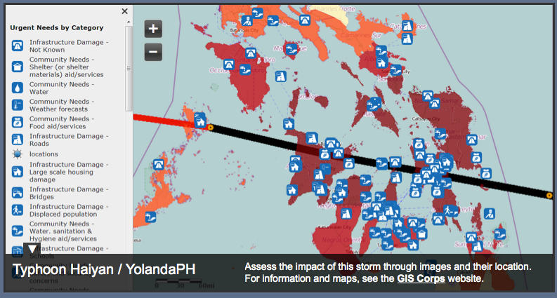
urgent needs from the Philippines, from tweets and images

YolandaPH is a ESRI-based mapping platform for post-disaster response in the Philippines. Snapshot above.

These maps were produced using a selection of photos from Twitter, Facebook, news articles, and other websites curated using the MicroMapper platform. The locations are approximate and more photos and information are currently being mapped and categorized by the GIS Corps

Hundreds of digital humanitarian volunteers worldwide, including media monitors, translators, GIS specialists, statistical analysts, emotional support teams, and standby task forces, are working around the clock with rescue and recovery efforts, particularly in the hard-hit eastern city of Tacloban.

"DHN is sorting through very high volumes of social media information,” said Sara Jane Terp, a DHN volunteer with the Standby Volunteer Task Force.

Approximately 182,000 tweets have been collected and automatically filtered down to 35,715 based on relevance and uniqueness, according to Carden.

Volunteers use triangulation (comparing information against two other sources, such as traditional media and official government reports) to verify information. The time-consuming work is made easier because of the large number of volunteers working in different time zones.

Useful slideshow of the workflow is found here.

from: http://www.irinnews.org/report/99102/micro-mapping-philippine-s-typhoon-disaster

UPDATE: Nice round-up of disaster response from flying sheep here.

How does the USFS map vegetation post fires?

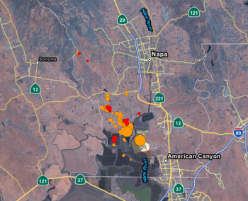
The discussion of how the USFS deals with fires on public forests came up strongly in our recent SNAMP Public Meeting. Our Last Change field site burned in October, and we are very interested in understanding the behavior and impact of the American fire. Part of the discussion stemmed from this presentation on preliminary estimates for fire intensity, ascertained partly from analysis of WorldView imagery delivered at our SNAMP meeting. For more on the SNAMP presentation, check out our website.

The website (linked below) offers an initial description of post-fire vegetative conditions using the Rapid Assessment of Vegetation Condition after Wildfire (RAVG) process. RAVG analysis looks at fires that burn more than 1,000 acres of forested National Forest System (NFS) lands, beginning with fires that occurred in 2007. These fires result in direct losses of vegetative cover and many of the benefits associated with forested ecosystems.

NFS lands experience thousands of wildfires every year, most of which are relatively small. The largest fires typically account for 90% of the total acreage burned. RAVG analysis provides a first approximation of areas that due to severity of the fire may require reforestation treatments. These reforestation treatments would re-establish forest cover and restore associated ecosystem services. This initial approximation could be followed by a site-specific diagnosis and development of a silvicultural prescription identifying reforestation needs.

Some resources:


FUEGO — A concept for a fire detection satellite

A nice press release about our new paper on the concepts behind a fire detection satellite with perhaps the coolest acronym yet: FUEGO — Fire Urgency Estimator in Geosynchronous Orbit. From Bob Sanders.

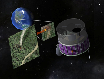
Artist's conception of the FUEGO satellite

Current and planned wildfire detection systems are impressive but lack both sensitivity and rapid response times. A small telescope with modern detectors and significant computing capacity in geosynchronous orbit can detect small (12 m2) fires on the surface of the earth, cover most of the western United States (under conditions of moderately clear skies) every few minutes or so, and attain very good signal-to-noise ratio against Poisson fluctuations in a second. Hence, these favorable statistical significances have initiated a study of how such a satellite could operate and reject the large number of expected systematic false alarms from a number of sources. We suggest a number of algorithms that can help reduce false alarms, and show efficacy on a few. Early detection and response would be of true value in the United States and other nations, as wildland fires continue to severely stress resource managers, policy makers, and the public, particularly in the western US. Here, we propose the framework for a geosynchronous satellite with modern imaging detectors, software, and algorithms able to detect heat from early and small fires, and yield minute-scale detection times. Open Access Journal Link. Press Release. KPIX spot.

Post American fire imagery

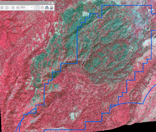
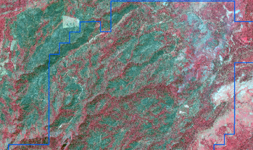
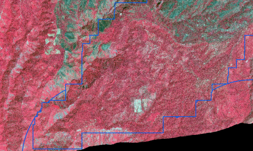
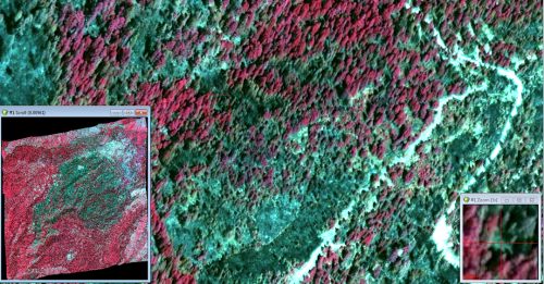
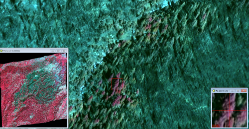
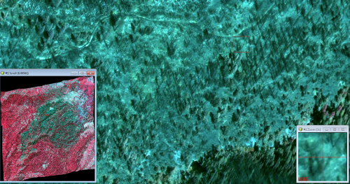
Check out these images from after the American fire, from the WorldView 2 satelllite from our northern SNAMP site. The blue boundary is our SNAMP site.  This background imagery is a pan-sharpened WV2 image (0.5 meters, channels 7, 5, 3). The red color depicts alive vegetation (at least for the time being) and green-blue is post-fire NPV (non-photosynthetic veg).  Thanks to Carlos Ramirez for the images.

 The post-fire imagery shows the heterogeneity of this fire - some spots burned all the vegetation, some spots have standing trees remaining.

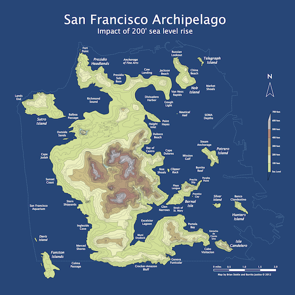
San Francisco circa 2072

SF archipelago, c. 2072

Some fun before the semester starts! Like something out of a great scifi novel: from Burrito Justice (and via Mark O.) "March 20th, 2072 (AP), Northern California Association of City States: With the surprising acceleration of sea level rise due to the melting of both the Greenland and Antarctic ice sheets over the past decade, the San Francisco canal system was officially abandoned this week. Additional ferry service has been announced between the new major islands of the San Franciscan Archipelago while the boring machines make progress under the Van Ness Passage and Richmond Pass for new transit tunnels." This rad poster is available for sale!

Urgent Request - GISCorps is looking for remote sensing specialists for Mega Storm Sandy

GISCorps is looking for remote sensing specialists for Mega Storm Sandy

The project is in collaboration with the International Charter "Space and Major Disasters" (http://www.disasterscharter.org/). The assistance of Remote Sensing Specialists is needed for analyzing imagery in various regions affected by the recent mega storm in the east coast of the United States.

The desired volunteer(s) must have considerable expertise in working with TerraSAR-X (Synthetic Aperture Radar data in the X-band) imagery and conducting analysis related to TerraSAR-X. Some of the desired analysis includes measuring the extent of the flood (pooling of water), depth of water, and conducting change detection from TerraSAR-X taken at various stages of the storm and producing shape files from areas of change. The image datasets will be provided to volunteer(s) by the Charter and from their FTP site.
 
Duration: This project is urgent and work can start immediately; the approximate duration is 1-2 weeks and 3-5 hours a day.
 
Type of mission: this mission does NOT require traveling and is conducted remotely. The volunteer will be using their own hardware and software and will be working closely with Charter's contact person throughout the project via emails, phone, VoIP, IRC and FTP sites.

If interested in applying, please send an email to recruit@giscorps.org along with your latest resume by midnight of November 7th, 2012 (or as soon as possible).  Please reply ONLY if you have TerraSAR-X imagery experience.


Thank you in advance,

GISCorps Recruitment Team

Cool cartography--Risk mapping at a broad view

I came across this short blurb by  on some tricks for catchy large-scale maps. The bullet-points include:

  • Interesting Topic.  The subjects of these maps inherently represent risk, which we want to understand.
  • Unexpected Scope.  A forest view of something that’s usually seen at the tree-level offers satisfying perspective.
  • Big and Clear.  A single dataset is conceptually simple, and when large enough, it provides its own context-promoting conversation in the wild.
  • Sharable.  A static image is portable and paste-able, easily nestling into articles, blogs, tweets, and PowerPoints.
  • Attractive.  The currency of design buys a second or third look.

There is often a push to make large datasets available through interactive webGIS portals, but I think this makes a good case that there is still also a role for skilled cartography to present information in captivating ways. 

Below is an example of one of the author's (John Nelson) maps, and more can be found here

What is "success" with post-disaster crowdsourcing?

At a recent workshop I gave on webGIS, after giving an overview of some of the recent uses of crowdsourced and VGI in disasters (fire in San Diego, earthquake in Christchurch, Ushahidi everywhere...), I was asked about success of these projects. Who used the data? How? (and who funded these websites, but that is another story.) And I had only the vaguest of answers. Here is a thoughful critique on this subject by Paul Currion on MobileActive.org. He examines the use of the Ushahidi project in Haiti. Paul is an aid worker who has been working on the use of ICTs in large-scale emergencies for the last 10 years.  He asks whether crowdsourcing adds significant value to responding to humanitarian emergencies, arguing that merely increasing the quantity of information in the wake of a large-scale emergency may be counterproductive. Why? because aid workers need clear answers, not a fire-hose of information. Information from the crowd needs to be curated, organized, targeted for response. He makes the point that since crowdsourced data is going have to be sorted through, and can be biased, and can be temporary, aid agencies are going to have to carry out exactly the same needs assessments that they would done without the crowdsourced information.

Where and when do crowdsourced data add value to a situation or project? How can we effectively deal with the bias in the data that comes naturally? We deal with this all the time in my smaller web-related projects: oakmapper and snamp for example. What is the future role of the web for adaptive forest management for example? How do these new collaborative and extensive tools help us make important decisions about natural resources management in often contentious contexts? More to think about.

ASPRS 2012 Wrap-up

ASPRS 2012, held in Sacramento California, had about 1,100 participants. I am back to being bullish about our organization, as I now recognize that ASPRS is the only place in geospatial sciences where members of government, industry, and academia can meet, discuss, and network in a meaningful way. I saw a number of great talks, met with some energetic and informative industry reps, and got to catch up with old friends. Some highlights: Wednesday's Keynote speaker was David Thau from Google Earth Engine whose talk "Terapixels for Everyone" was designed to showcase the ways in which the public's awareness of imagery, and their ability to interact with geospatial data, are increasing. He calls this phenomena (and GEE plays a big role here): "geo-literacy for all", and discussed new technologies for data/imagery acquisition, processing, and dissemination to a broad public(s) that can include policy makers, land managers, and scientists. USGS's Ken Hudnut was Thursday's Keynote, and he had a sobering message about California earthquakes, and the need (and use) of geospatial intelligence in disaster preparedness.

Berkeley was well represented: Kevin and Brian from the GIF gave a great workshop on open source web, Kevin presented new developments in cal-adapt, Lisa and Iryna presented chapters from their respective dissertations, both relating to wetlands, and our SNAMP lidar session with Sam, Marek, and Feng (with Wenkai and Jacob from UCMerced) was just great!

So, what is in the future for remote sensing/geospatial analysis as told at ASPRS 2012? Here are some highlights:

  • Cloud computing, massive datasets, data/imagery fusion are everywhere, but principles in basic photogrammetry should still comes into play;
  • We saw neat examples of scientific visualization, including smooth rendering across scales, fast transformations, and immersive web;
  • Evolving, scaleable algorithms for regional or global classification and/or change detection; for real-time results rendering with interactive (on-the-fly) algorithm parameter adjustment; and often involving open source, machine learning;
  • Geospatial data and analysis are heavily, but inconsistently, deployed throughout the US for disaster response;
  • Landsat 8 goes up in January (party anyone?) and USGS/NASA are looking for other novel parterships to extend the Landsat lifespan beyond that;
  • Lidar is still big: with new deployable and cheaper sensors like FLASH lidar on the one hand, and increasing point density on the other;
  • Obia, obia, obia! We organized a nice series of obia talks, and saw some great presentations on accuracy, lidar+optical fusion, object movements; but thorny issues about segmentation accuracy and object ontology remain; 
  • Public interaction with imagery and data are critical. The Public can be a broader scientific community, or a an informed and engaged community who can presumably use these types of data to support public policy engagement, disaster preparedness and response.

Fire in the Great Dismal Swamp, VI

A nice example of remote sensing for fire: this visualization allows you to compare the utility of hyperspectral images to see through the smoke and map fire scars. The article is about a lightning strick fire in the fantastically named "Great Dismal Swamp" in Virginia. Hurricane Irene might put a damper on the fire.

“Eight inches of rain will not put the fire out,” said Tim Craig, Fire Management Officer for the refuge. “It will buy us time to clear our way through the downed trees back to the fire zone after the storm.” Irene generously drenched the swamp with 10 – 15 inches of rain, but initial assessments show that the fire is still burning. Before the storm, the Lateral West fire was 35 percent contained. Smoke still rose from at least 30 acres after the storm though open flames were no longer visible and the fire did not spread under Irene’s strong winds, said local news reports. The sudden flush of rain left puddles that are still soaking in to the soil and may yet help extinguish the fire.

See the interactive tool and article here.

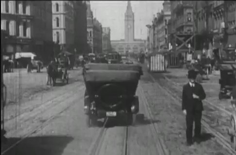
Photogrammetry in action: dating the great "A trip down Market Street", 1906

Sometime before the 1906 San Francisco earthquake, a camera was attached to a streetcar travelling north along Market Street, San Francisco, and recorded the hustle and bustle, the multi-modal transportation options, and the wonderful fashions of early 19th century San Francisco. The movie, which I happend to catch last week at SFMOMA as part of their great (but too large) Stein collection, is mesmerizing. Check it out here on You Tube. It is clearly pre-earthquake, but its exact timing has not been known until now.

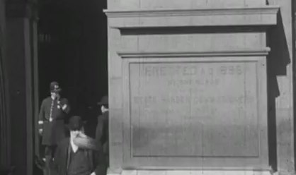
Ferry Building arrivalIn an article in Photogrammetric Engineering and Remote Sensing, Richard Greene narrows the window of aquisition down to between 24 March and 30 March 1906, just weeks before the earthquake on 18 April. Remember, that earthquake and the fires that followed largely destroyed much of the city. He performs this feat of timing through detailed photogrammetry: determing the time of day, the solar position, and the time of year from shadows on cornices and other architectural details.

Another windy day in the city! these cornices were helpful in determing solar positionSo cool! The article can be found here. Full reference here: 

Greene, R., 2011. Dating the fliming of "A trip down Market Street". Photogrametric Engineering & Remote Sensing 77, 839-848.

Check out some fun pics from the movie.


A bit late, but the tornado track from Tuscaloosa, AL

NASA has released a unique satellite image tracing the damage of a monster EF-4 tornado that tore through Tuscaloosa, Alabama, on April 27th. It combines visible and infrared data to reveal damage unseen in conventional photographs.

"This is the first time we've used the ASTER instrument to track the wake of a super-outbreak of tornadoes," says NASA meteorologist Gary Jedlovec of the Marshall Space Flight Center in Huntsville, AL.

How would you map it? as a line or as a field?

Another cool image of the tornado track.

Debris from Japanese tsunami steadily drifting toward California

This item got heavy news rotation this morning: the considerable debris from the tsunami in Japan is out to sea and slowly moving toward Hawaii and the west coast of the US. 

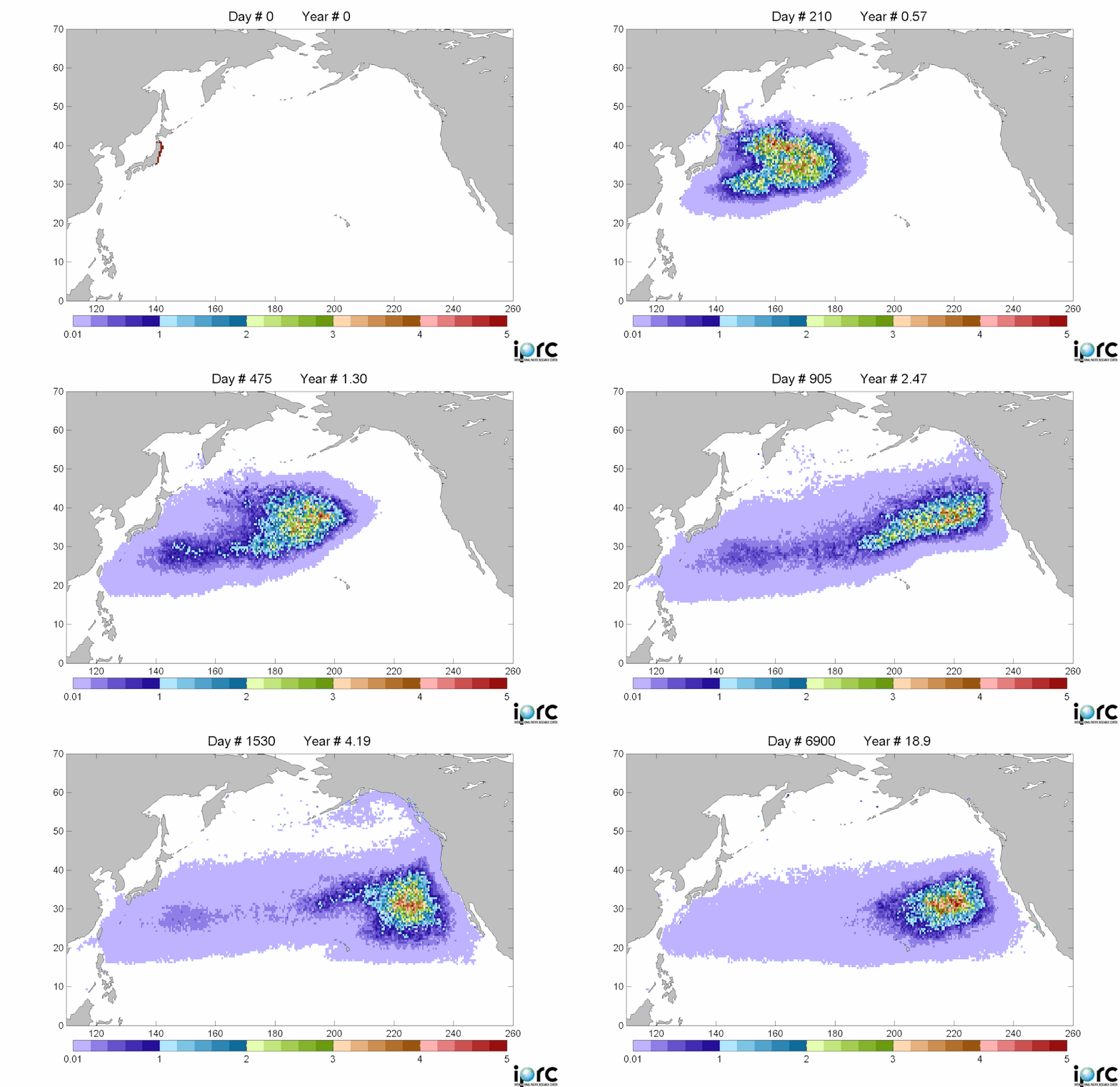
The debris is moving east at roughly 10 miles a day, and is spread over an area about 350 miles wide and 1,300 miles long -- an area roughly the size of California. It should reach beaches and coastal cities in California, Oregon and Washington in 2013 or early 2014. These estimates are from a computer model, the details of which are spotty in the articles I read. Example here from insidebayarea.

Debris movement similation: purple is low density, red is high density of debrisThere is considerable concern about this.  Last Monday, representatives from the Coast Guard, NOAA, the Environmental Protection Agency, the U.S. State Department and other agencies met for the first time in Honolulu to share information about the Japanese debris and begin to chart a strategy.

Among their plans: to notify the U.S. Navy and commercial shipping companies that regularly sail across the Pacific so they can begin to document what is floating. That could lead to expeditions to go map and study it.

Curtis Ebbesmeyer, a Seattle oceanographer who has studied marine debris for more than 20 years (and done some neat work with rubber duckies to map ocean currents) is one of the leads interviewed for the report.