Wrap-up from ESRI User Conference 2019 Day 2

Day 2 Highlights

Morning sessions included using ArcGIS Pro for Lidar analysis. This was a great overview of working with LAS files within ArcGIS Pro: data formats, including LAS related data structures multipoints and multipatches, data diagnostics to examine data quality and coverage, and basic processing of Lidar data in ArcGIS Pro. Very useful. Thanks to ccrawford. Next Shane and I checked out Data Science in ArcGIS Pro: Using R and Python. This is an update from last year’s session on R and Python in ArcGIS, and again we started with the classic battle of the bands. The python demo showed PySAL, and how to do a quick spatial econometric analysis in PySAL within Pro. Need more time, obvi. The R demo was a nice walk through of data input - vector and raster - via the R-bridge, and showed how easy the framework is. Very useful. 

Afternoon sessions included a bunch of stuff, but the highlight was the always funny, always useful, always inspiring wizards of cartography Kenneth Field, John Nelson, and Edie Punt and Mapping with Style. Another great session! Edie discussed the excellent Styles capacity in Pro, which I am aware of but not an expert at. She helpfully pointed out some key things to pay attention to: USE STYLES FOR COLOR CONTROL! because of the new graphics engines used in Pro, TRANSPARENCY is available on all colors, and will be transferred to your PDF! Also, color locking is great! And color brewer schemes are available in Pro Styles. So much love! Interspersed with Edie’s slide were John and Kenneth delivering their usual hilarious take on making beautiful maps: John showed off some nice and creative new published styles: Firefly, Imhof, and Lego; and Kenneth presented a whimsical case study bringing to life a 1930s map of Redlands using the watercolor style from John. See other styles here. Good day.
Wrap-up from Day 1

New digitization project: Soil-Vegetation Map Collection

Between the years 1949-1979 the Pacific Southwest research station branch of the U.S. Forest service published two series of maps: 1) The Soil-Vegetation Maps, and 2) Timber Stand Vegetation Maps. These maps to our knowledge have not been digitized, and exist in paper form in university library collections, including the UC Berkeley Koshland BioScience Library.

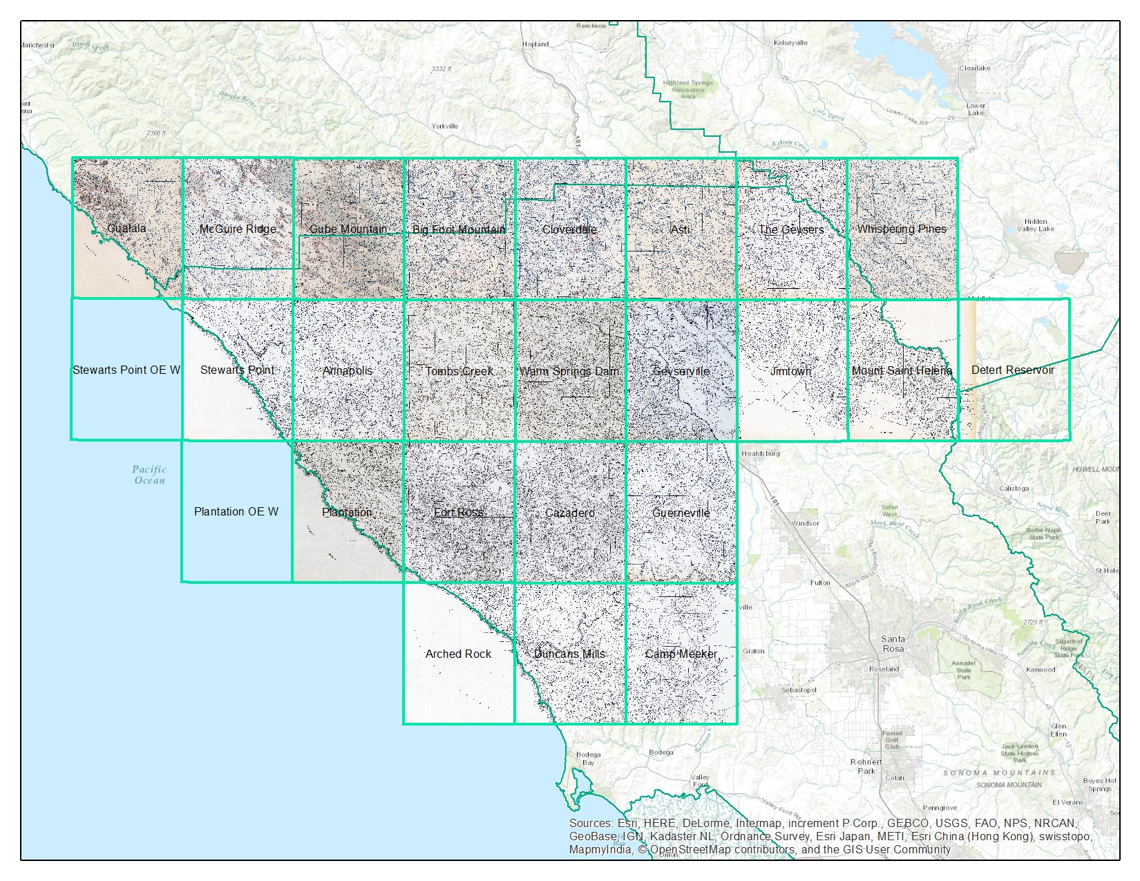
Index map for the Soil Vegetation MapsThe Soil-Vegetation Maps use blue or black symbols to show the species composition of woody vegetation, series and phases of soil types, and the site-quality class of timber. A separate legend entitled “Legends and Supplemental Information to Accompany Soil-Vegetation Maps of California” allow for the interpretation of these symbols in maps published 1963 or earlier. Maps released following 1963 are usually accompanied by a report including legends, or a set of “Tables”. These maps are published on USGS quadrangles at two scales 1:31,680 and 1:24,000. Each 1:24,000 sheet represents about 36,000 acres. 

The Timber Stand Vegetation Maps use blue or black symbols to show broad vegetation types and the density of woody vegetation, age-size, structure, and density of conifer timber stands and other information about the land and vegetation resources is captured. The accompanying “Legends and Supplemental Information to Accompany Timber Stand-Vegetation Cover Maps of California” allows for interpretation of those symbols. Unlike the Soil-Vegetation Maps a single issue of the legend is sufficient for interpretation. 

We found 22 quad sheets for Sonoma County in the Koshland BioScience Library at UC Berkeley, and embarked upon a test digitization project. 

Scanning. Using a large format scanner at UC Berkeley’s Earth Science and Map library we scanned each original quad at a standard 300dpi resolution. The staff at the Earth Science Library completes the scans and provides an online portal with which to download. 

Georeferencing. Georeferencing of the maps was done in ArcGIS Desktop using the georeferencing toolbar. For the Sonoma county quads which are at a standard 1:24,000 scale we were able to employ the use of the USGS 24k quad index file for corner reference points to manually georeference each quad. 

Error estimation. The georeferencing process of historical datasets produces error. We capture the error created through this process through the root mean squared error (RMSE). The min value from these 22 quads is 4.9, the max value is 15.6 and the mean is 9.9. This information must be captured before the image is registered. See Table 1 below for individual RMSE scores for all 22 quads. 

Conclusions. Super fun exercise, and we look forward to hearing about how these maps are used. Personally, I love working with old maps, and bringing them into modern data analysis. Just checking out the old and the new can show change, as in this snap from what is now Lake Sonoma, but was the Sonoma River in the 1930s.

Thanks Kelly and Shane for your work on this!

ISECCI historical ecology working group wrap-up

Last week Kelly and I with others travelled to the Sierra Nevada Aquatic Research Lab (SNARL) in the eastern Sierra Nevada, just south of Mono Lake for a research retreat. SNARL is part of the UC's Natural Reserve System, which is comprised of nearly 40 properties across the state. These are preserves that foster research, education and collaboration. They have much in common with ANR's REC system. I've been to a few of them now, and am very pleased to make more visits. I love the east side of the Sierra, and that iconic Highway 395. 

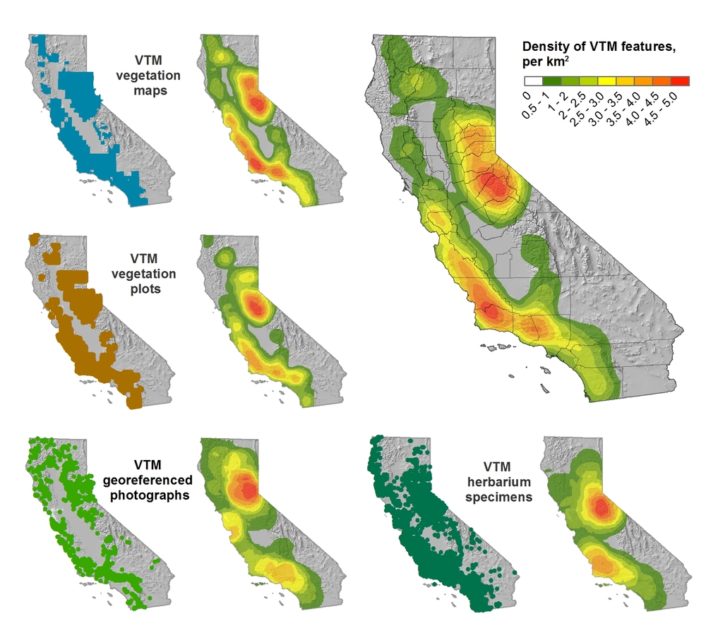
This trip was a retreat for the ISECCI historical ecology working group, led by the inspirational Peter Alagona from UCSB. We discussed our existing projects, including the VTM work (see figure below), and talked about potentials for more collaborative research and further integration between NRS and ANR. We have a list of wishes for digitization, and if anyone out there has ideas about pitching these to donors, please let me know. For example: 

  • Kelly and I want to digitize the Leiburg maps from the northern Sierra to add to the VTM stack;
  • We want to find a better way to index and view historical aerial photography state-wide. Something like this for historical maps: http://ngmdb.usgs.gov/maps/TopoView/help/

And we had a field trip looking at Mono Lake water issues. Great time spent!

Density of VTM features across the collections

Wolf Hall meets GIS: Mapping musings for the holidays

The great Mark Rylance in character of Thomas Cromwell, from the BBC. I realize this is not the real Cromwell, but Rylance is way easier on the eyes.There are so many reasons I keep returning to Hilary Mantel's Wolf Hall. The book to me seems infinitely revealing, I keep hearing new details. I also managed to use a quote from the book's dialogue in a faculty meeting this year, so there. She comments on history, art, science, collaboration, violence, power, love, politics, craft, cooking, and family. And of course, also mapping. Maps are mentioned many times through the book. At the end, Mantel has Thomas Cromwell say:

"But the trouble is, maps are always last year's. England is always remaking herself, her cliffs eroding, her sandbanks drifting, springs bubbling up in dead ground. They regroup themselves while we sleep, the landscapes through which we move..."

Lovely stuff! and a great holiday read (or re-read, or re-listen). It reminds us that mapping is a continual effort, a continuous process. All that we map changes: crops are harvested and fields are replanted, cities evolve, forests burn and re-grow, and people move across the face of the earth leaving traces. Our task is to capture in virtual space the key functional elements of space and time - through maps, through spectral reflectance and lidar, through text and discussions - so that we can find answers to to the key questions facing society today. It can also be very personal effort: mapping is mostly concerned with finding the best way to represent and describe a landscape or process that we love and want to understand better. 

Excerpt From: Mantel, Hilary. Wolf Hall. Henry Holt and Company, 2009. iBooks.

A great week for radio

What a great week for radio and matters geospatial+web. On Wednesday last week we finished out our GIS class with a talk about the geoweb and issues of access, bias, motivation, control, and of course privacy. I used alot of William Gibson's previous writings about Google (posted here earlier) in that lecture. Yesterday TTBOOK re-aired a great interview with Gibson, on the topic of writing, but also about the internet. I recommend it. Additionally, last week Talk of the Nation had a interesting interview with Jerry Brotton about his new book "A History of the World in Twelve Maps"; the interview touched on Google Earth and representation, why north is up, and many other fantastic questions raised through the history of cartography. Check them out!

Pre-development Delta report from SFEI

The San Francisco Estuary Institute-Aquatic Science Center is pleased to announce the publication of its latest report, Sacramento-San Joaquin Delta Historical Ecology Investigation: Exploring Pattern and Process. The report is the culmination of several years of research synthesizing thousands of pieces of historical evidence with contemporary scientific understanding. The report provides new information about how the Delta functioned to provide habitat for native species and includes dozens of rarely seen historical accounts, maps, and photographs. For more information, please see today's press release.

The report and Geographic Information System (GIS) data are available for download here. Printed copies of the report will be available in several weeks, at a cost of $75 each (plus tax/shipping).

Media Contacts:
Robin Grossinger, Senior Scientist, San Francisco Estuary Institute-Aquatic Science Center, (510) 746-7380 (office), 510 326 3732 (cell), or robin@sfei.org

Carl Wilcox, Policy Advisor to the Director for the Bay-Delta, California Department of Fish and Game, (707) 738-4134, or cwilcox@dfg.ca.gov

AAG 2012 Wrap-up

NY skyline from Tim DeChant's blogAAG was a moderately large conference (just under 9,000) this year, held in mid-town NY. It was a brief trip for me, but I did go to some great talks across RS, GIScience, cartography, and VGI. I also went to a very productive OpenGeoSuite workshop hosted by OpenGeo. Some brief highights from the conference: Muki Hacklay discussed participation inequities in VGI: when you mine geoweb data, you are mining outliers, not society; there are biases in gender, education, age and enthusiasm. Agent-based modeling is still hot, and still improving. I saw some great talks in ABM for understanding land use change. Peter Deadman showed how new markets in a hot crop (like Acai) can transform a region quite quickly. Landsat 8 will likely be launched in early 2013, but further missions are less certain. My talk was in a historical ecology session, and Qinghua Guo and I highlighted some of the new modeled results of historic oak diversity in California using VTM data and Maxent.

Saturday evening I had the great pleasure of being locked in after hours at the NY Public Library for a session on historic maps. David Rumsey, with Humphrey Southall (University of Portsmouth) and Petr Pridal (Moravian Library) led a presentation introducing a new website: oldmapsonline.org. The website's goal is to provide a clearer way to find old maps, and provide them with a stable digital reference. 

Finding old maps online: new resource now available

David Rumsey, with Humphrey Southall (University of Portsmouth) and Petr Pridal (Moravian Library) led a presentation at AAG introducing a new website: oldmapsonline.org. The website's goal is to provide a clearer way to find old maps, and provide them with a stable digital reference. As David says: hundreds of thousands of historical maps have now been scanned and made available on-line by libraries around the world, and this has been a great boon to anyone interested in the history of cartography. However, those interested in the history of the places shown on maps have been less well served: just because a map is "on the web" does not mean we can find the relevant library web site, and even when we find the site the available catalogues are little help in finding maps covering particular places.  A further problem is that even when digitized historical maps have been made available via geo-spatially aware online systems, the resulting references,i.e. the Uniform Resource Locators for accessing the maps, are generally very technology-dependent and unlikely to work even a few years later. The Old Maps Online project provides a universal search portal for historic maps designed to complement rather than compete with libraries' own search interfaces, and also developing best practices for defining persistent Uniform Resource Identifiers for historic maps - URIs not URLs.

GIS and historical analysis: a good mix

In the new NYT artilce "Digital Maps Are Giving Scholars the Historical Lay of the Land," Patricia Cohen discusses the new academic field known as spatial humanities. Historians, literary theorists, archaeologists and others are using Geographic Information Systems to re-examine real and fictional places like the villages around Salem, Mass., at the time of the witch trials; the Dust Bowl region devastated during the Great Depression; and the Eastcheap taverns where Shakespeare’s Falstaff and Prince Hal caroused.

Mapping spatial information reveals part of human history that otherwise we couldn’t possibly know,” said Anne Kelly Knowles, a geographer at Middlebury College in Vermont. “It enables you to see patterns and information that are literally invisible.”

Fun stuff!

London Mapping Festival: 18 months of all things maps + london. Sign me up.

The London Mapping Festival 2011 – 2012, or LMF for short, is an exciting and unique initiative being launched in June 2011 and will run through to December 2012. It sets out to promote greater awareness and understanding of how maps and digital geographic data are being created and used within the Capital.   Through a diverse range of activities LMF will engage with a wide audience of mapping enthusiasts whether they are professionals, enthusiasts or others. We should do something like this for the SF Bay Area. More here.

Visualizing slavery from 1860

From the NYT comes a great article about an early map from the US Coast Survey (creators of those lovely coastal charts from the late 19th century that adorn many of my walls) that shows slavery in the southern US, based on the 1860 census. The map used novel cartographic techniques for the day and was a masterful piece of public outreach: it was important in convincing the Union public that the civil war was about slavery, and not just state's rights. Map here.

From the article: 

The 1860 Census was the last time the federal government took a count of the South’s vast slave population. Several months later, the United States Coast Survey—arguably the most important scientific agency in the nation at the time—issued two maps of slavery that drew on the Census data, the first of Virginia and the second of Southern states as a whole. Though many Americans knew that dependence on slave labor varied throughout the South, these maps uniquely captured the complexity of the institution and struck a chord with a public hungry for information about the rebellion.

The map uses what was then a new technique in statistical cartography: Each county not only displays its slave population numerically, but is shaded (the darker the shading, the higher the number of slaves) to visualize the concentration of slavery across the region (legend at left). The counties along the Mississippi River and in coastal South Carolina are almost black, while Kentucky and the Appalachians are nearly white.

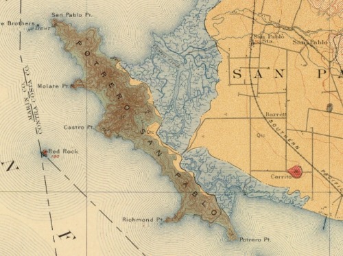
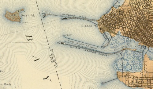
Lovely geologic quads of SF Bay - 1914

This is the bay bridge plan... Goat Island is Treasure Is., there was a narrow gauge railway from Oakland for shipments to SF and beyond.The repository interface with integrated Yahoo! Maps was developed by the Digital Initiatives -- Research & Technology group within the TAMU Libraries using the Manakin interface framework on top of the DSpace digital repository software.

Geologic Atlas of the United States by Texas A & M University Libraries is licensed under a Creative Commons Attribution 3.0 United States License.

casablanca: the google earth prototype

I am so glad someone wrote this up! I was watching Casablanca (1942!) again awhile back, and just loved the intro scene of the earth, europe, and the route from Paris to Casablanca. This blog ((E)Space&Fiction: spatial machinery of fiction) (cool name, right?) makes the case that it was the first proto google earth, and analyzes the technical specifics that presaged Keyhole, etc. Specifically:

  • the combination of the spinning globe with a zoom effect on a specific point: Paris;
  • the use of a “jump” effect similar to Google Earth to move from one place (Paris) to another (Casablanca); and
  • the perspective changes from the vertical view to an oblique perspective of the streets of Casablanca, similar to current street views.

california map society website

The California Map Society has just launched a cool new website.  I am a member, I like these guys and their message. They say it well:

We are passionate about all phases of cartography in its broadest sense. We are fascinated by the potential of remote sensing, GIS, and the tools for today’s digital mapmaking. Yet we love the art and history embodied in antique maps. Understanding man’s continuing change in perception of his environment and world is part of the fun of viewing old maps. And we never fail to delight in the curious forms that maps have taken over the centuries.

Check out the website here.

Orthorectifying for the Masses

In a bit of Tom Sawyer-inspired app making, the New York Public Library has created an online application for rectifying their collection of digital maps of New York City. "Finding control points is so much fun! It is truly an honor to allow you, our special internet browser, to assist us in collecting them." The NYPL Map Rectifier allows you to export the rectified maps as KMLs. They've also added a separate section for maps of Haiti to assist in earthquake relief. 

The map that changed the world goes digital

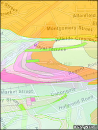
Ancient volcanic rock under EdinburghFor those of you who devoured Simon Winchester's "The Map that Changed the World" about geologist William Smith's journey to create the first geologic map of England and Wales, the first geologic map in the world, this news will please you. (Smith published the 10' x 16' map in 1815. His pivotal insights were that each local outcrop of rock strata was a portion of a single universal sequence of strata and that these rock strata could be distinguished, followed for great distances, and their relative date ascertained by means of imbedded fossilized organisms. His work kick-started the science of geology, and contributed to the theory of evolution. Modified from Wikipedia.)

Now, as the BBC reports, the British Geological Survey's (BGS) has released their new OpenGeoscience portal, which allows the public to study all the UK's geology via a variety of webGIS formats (e.g. Google, and ArcServer). There is a viewer for bedrock geology and the overlying superficial deposits, and another for more geological layers — artificial ground, faults, mass movements, etc.

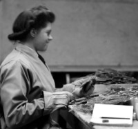
Worker at Pitlochry depot, Perthshire, processing Scottish mica.In a companion effort, the BGS is also releasing images from their historic image archive: 50,000 images are searchable and usable for non-commercial purposes. These images include lovely photography of some of Britain's icons of geology, but also includes image from 100 years ago of miners, explorers, and early 20th century industry.

Reproduced with the permission of the British Geological Survey ©NERC. All rights Reserved


New Interface for the Manhatta Project. Check it.

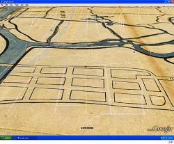
We talked about this before here; and the Manhatta project has a nice new interface for exploring the 1609 map of the island of Manhatta(n), block by block, through time.  I love this project! The combination of mashup, history, design and art are breathtaking.  (And our own Tim Bean worked on reconstructing the early topography! - see his comment below.) Go Fullscreen on your 30"-monitor. I dare you.

“The goal of the Mannahatta Project has never been to return Manhattan to its primeval state. The goal of the project is discover something new about a place we all know so well, whether we live in New York or see it on television, and, through that discovery, to alter our way of life. New York does not lack for dystopian visions of the future…. But what is the vision of the future that works? Might it lie in Mannahatta, the green heart of New York, and with a new start to history, a few hours before Hudson arrived that sunny afternoon four hundred years ago?”

- from Mannahatta: A Natural History of New York City

A downside to sharing historical maps

From the SF Chron: When Google Earth added historical maps of Japan to its online collection last year, the search giant didn't expect a backlash. The finely detailed woodblock prints have been around for centuries, but they show the locations of former low-caste communities. The maps date back to the country's feudal era, when shoguns ruled and a strict caste system was in place. Some surveys have shown that such neighborhoods have lower property values than surrounding areas, and residents have been the target of racial taunts and graffiti. But the modern locations of the old villages are largely unknown to the general public, until these maps were overlain on current street maps.