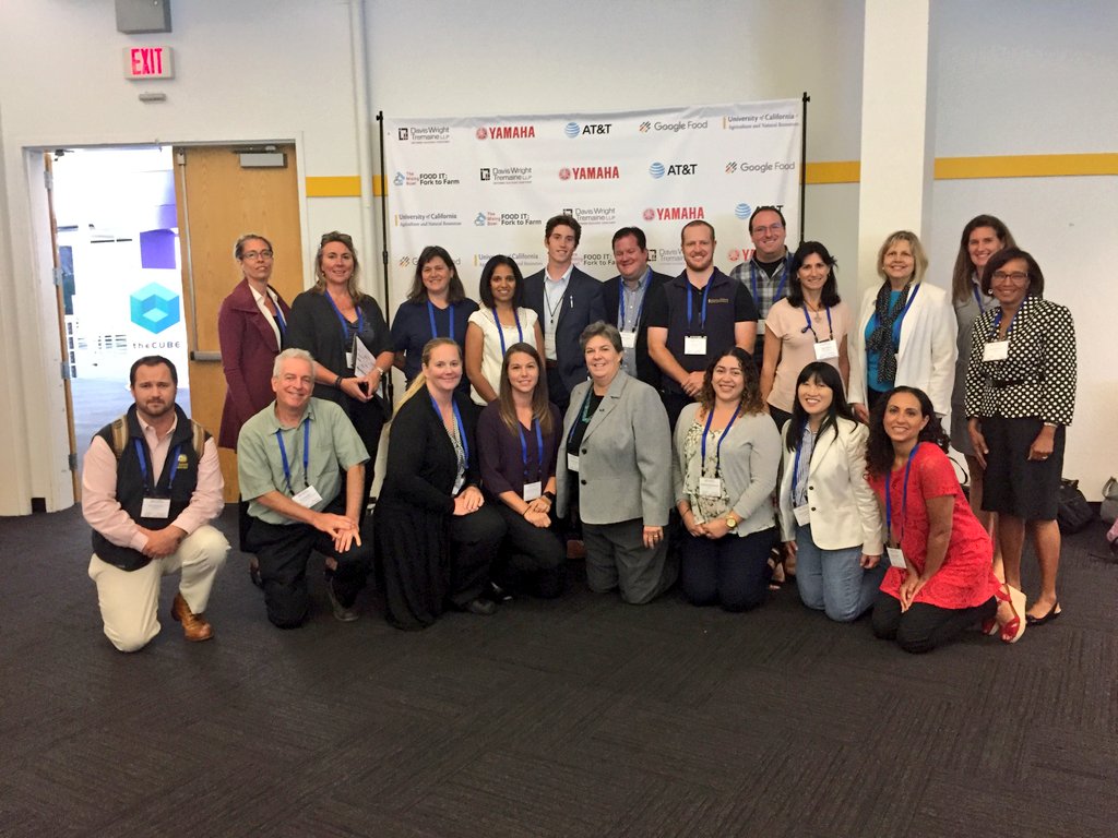
Wrap up from the FOODIT: Fork to Farm Meeting

UC ANR was a sponsor for the FOODIT: Fork to Farm meeting in June 2017: http://mixingbowlhub.com/events/food-fork-farm/. Many of us were there to learn about what was happening in the food-data-tech space and learn how UCANR can be of service. It was pretty cool. First, it was held in the Computer History Museum, which is rad. Second, the idea of the day was to link partners, industry, scientists, funders, and foodies, around sustainable food production, distribution, and delivery. Third, there were some rad snacks (pic below). 

We had an initial talk from Mikiel Bakker from Google Food, who have broadened their thinking about food to include not just feeding Googlers, but also the overall food chain and food system sustainability. They have developed 5 "foodshots" (i.e. like "moonshot" thinking): 1) enable individuals to make better choices, 2) shift diets, 3) food system transparency, 4) reduce food losses, and 5) how to make a closed, circular food system.

We then had a series of moderated panels.

The Dean's List introduced a panel of University Deans, moderated by our very own Glenda Humiston @UCANR, and included Helene Dillard (UCDavis), Andy Thulin (CalPoly), Wendy Wintersteen (Iowa State). Key discussion points included lack of food system transparency, science communication and literacy, making money with organics, education and training, farm sustainability and efficiency, market segmentation (e.g. organics), downstream processing, and consumer power to change food systems. Plus the Amazon purchase of Whole Foods.

The Tech-Enabled Consumer session featured 4 speakers from companies who feature tech around food. Katie Finnegan from Walmart, David McIntyre from Airbnb, Barbara Shpizner from Mattson, Michael Wolf from The Spoon. Pretty neat discussion around the way these diverse companies use tech to customize customer experience, provide cost savings, source food, contribute to a better food system. 40% of food waste is in homes, another 40% is in the consumer arena. So much to be done!

The session on Downstream Impacts for the Food Production System featured Chris Chochran from ReFed @refed_nowaste, Sabrina Mutukisna from The Town Kitchen @TheTownKitchen, Kevin Sanchez from the Yolo Food Bank @YoloFoodBank, and Justin Siegel from UC Davis International Innovation and Health. We talked about nutrition for all, schemes for minimizing food waste, waste streams, food banks, distribution of produce and protein to those who need them (@refed_nowaste and @YoloFoodBank), creating high quality jobs for young people of color in the food business (@TheTownKitchen), the amount of energy that is involved in the food system (David Lee from ARPA-E); this means 7% of our energy use in the US inadvertently goes to CREATING FOOD WASTE. Yikes!

The session on Upstream Production Impacts from New Consumer Food Choices featured Ally DeArman from Food Craft Institute @FoodCraftInst, Micke Macrie from Land O' Lakes, Nolan Paul from Driscoll's @driscollsberry, and Kenneth Zuckerberg from Rabobank @Rabobank. This session got cut a bit short, but it was pretty interesting. Especially the Food Craft Institute, whose mission is to help "the small guys" succeed in the food space.

The afternoon sessions included some pitch competitions, deep dive breakouts and networking sessions. What a great day for ANR.

Dense cities contribute less GHG

A CoolClimate Map of the SF Bay Area's carbon footprint by zipcode tabulation area shows a pattern typical of large metropolitan areas: a small footprint (green) in the urban core but a large footprint (orange and red) in surrounding suburbs.According to a new study by Dan Kammen and graduate student Christopher Jones at UC Berkeley, population-dense cities contribute less greenhouse-gas emissions per person than other areas of the country, but these cities’ extensive suburbs essentially wipe out the climate benefits.

Dominated by emissions from cars, trucks and other forms of transportation, suburbs account for about 50 percent of all household emissions – largely carbon dioxide – in the United States.

The study uses local census, weather and other data – 37 variables in total – to approximate greenhouse gas emissions resulting from the energy, transportation, food, goods and services consumed by U.S. households, so-called household carbon footprints.

A key finding of the UC Berkeley study is that suburbs account for half of all household greenhouse gas emissions, even though they account for less than half the U.S. population. The average carbon footprint of households living in the center of large, population-dense urban cities is about 50 percent below average, while households in distant suburbs are up to twice the average.

Interactive carbon footprint maps for more than 31,000 U.S. zip codes in all 50 states are available online at http://coolclimate.berkeley.edu/maps.

A link to their paper in Environmental Science & Technology is here: Spatial distribution of U.S. household carbon footprints reveals suburbanization undermines greenhouse gas benefits of urban population density (ES&T, 2014)

From: http://newscenter.berkeley.edu/2014/01/06/suburban-sprawl-cancels-carbon-footprint-savings-of-dense-urban-cores/

mapping gas leaks in Boston

The Google Earth image above shows shafts of bright green indicating natural gas leaking around BU's Charles River Campus. If there are multiple leaks, the display “looks like a stock market index during a busy day,” says Nathan Phillips. Photo courtesy of Nathan Phillips and Picarro, Inc.This is a very interesting report about work at BU Geography and Environment department to map gas leaks across the city. Nathan Phillips, Bob Ackley and Eric Crosson use a Nissan-mounted methane sensor to survey for leaks, and map results on a google earth scene. The accompanying video shows the setup, and discusses some nasty real time implications for trees as gas replaces oxygen in the soil. Also, this is just nuts to think of how much wasted gas is going up in a typical city. Yikes!

Details on ESRI's solar radiation tools

June solar radiation in YellowstoneA nice case study of detailed solar radiation modeling/mapping for Yellowstone National Park. All using existing ESRI spatial analyst tools.

Scientists at the National Aeronautics and Space Administration (NASA) Ames Research Center, including our buddy Chris Potter, the Yellowstone Ecological Research Center (YERC), the Creekside Center for Earth Observation (CCEO), and Esri have created 30-meter solar and temperature distribution maps in mountainous Yellowstone National Forest using tools in the ArcGIS Spatial Analyst extension. These products support ecological management in Yellowstone. 

An overview of ESRI's Solar Radiation Tools can be found here. Go forth and insolate.

New evidence of indirect land use change from biofuel production in Brazil

Querência, in Mato Grosso, BrazilA new article in Environmental Research Letters “Statistical confirmation of indirect land use change in the Brazilian Amazon," looks at how mechanized agriculture in Brazil affects the country's forest in the Amazon, which is the second largest forest in the world. The article is authored by Marcelus Caldas, an assistant professor of geography at K-State, and colleagues Eugenio Arima from the University of Texas at Austin, and Peter Richards and Robert Walker from Michigan State University. Using data from 2003-2008, the team statistically linked the loss of forest area as the indirect effect of changing pastureland into space for soybean and biofuel crops in counties bordering the Amazon.

Marcelus Caldas, an assistant professor of geography at K-State says: "Between 2003-2008 soy production expanded in Brazil by 39,000 square kilometers. Of this 39,000 square kilometers, our study shows that reducing soybean production by 10 percent in these pasture areas could decrease deforestation in heavily forested counties of the Brazilian Amazon by almost 26,000 square kilometers -- or 40 percent."

The Brazilian government says soybean and sugarcane are grown largely in degraded pasture, but data from the team's spatial analysis work cascading impacts: many of these crops have crept into the Brazilian savanna, a large area bordering the Amazon that's used for cattle. Consequently, this has created deforestation in the savanna, driving cattle inside the Amazon.

"Our data shows that the Amazon now has 79 million heads of cattle," Caldas said. "Fifteen years ago, it had less than 10 million. That means that there's a problem with cattle moving inside the forest."

This could be exacerbated with increased global demand for food crops in Brazil. The tradeoffs between food, fuel and forest could continue to come down on the side of food and fuel, at the expense of forests.

More here. Official press release here.

Forest clearing and regrowth in Washington

These shots (both Landsat 5) are from much larger images provided by NASA Earth Observatory. They depict forest clearing and regrowth in Washington state. The checkerboard pattern is typical of land ownership patterns in the American West.  A nice article on this checkerboarded ownership patterns is here. The overall article talks about carbon storage and forestry; the point of the images below is 1) the pattern of clearing in 1984, which is really quite interesting and abstract, and 2) the regrowth in 2010.


From the article:

This pair of images, both from the Landsat 5 satellite, shows grids of forest disappearing and gradually regrowing over 26 years. In 1984, logging in the area appears to be in the early stages. In many places, red-brown earth is exposed under the swaths of freshly cut forest. Other grids, cleared just a bit earlier, are pale green with newly growing grasses or very young trees. The rest of the image is dominated by the deep green of dense, mature forest. In 2010, the logging operation seems to be more mature. There is little evidence of fresh cuts, but some areas have been recently cleared. Pockets of mature forest remain, and forest is regrowing in other places. Grids that had been clear in 1984 are forested in 2010.

Trees become houses, furniture, paper products, and myriad other products that we use every day. Trees are also important because they take carbon dioxide from the atmosphere and convert it to the sugars that make up the leaves and wood of the tree. Trees store carbon. The Earth Observatory’s new carbon cycle article describes the impact of deforestation on the carbon cycle:

When we clear forests, we remove a dense growth of plants that had stored carbon in wood, stems, and leaves—biomass. By removing a forest, we eliminate plants that would otherwise take carbon out of the atmosphere as they grow. We also expose soil that vents carbon from decayed plant matter into the atmosphere. Humans are currently emitting just under a billion tons of carbon into the atmosphere per year through land use changes. Changes that put carbon gases into the atmosphere result in warmer temperatures on Earth.

Satellite images like these help scientists estimate how much carbon dioxide goes into the atmosphere when a forest is cleared, and how much carbon dioxide is being taken out of the atmosphere as a forest regrows.

Read more in the Carbon Cycle feature.

New York City Solar Map Released

An interactive web-based map called The New York City Solar Map was recently released by the New York City Solar America City Partnership, led by Sustainable CUNY. The map allows users to search by neighborhood and address or interactively explore the map to zoom and click on a building or draw a polygon to calculate a number metrics related to building roof tops and potential solar power capacity including: potential energy savings, kilowatt output (in a time series), carbon emission reductions, payback, and a calculator for examining different solar installation options and savings with your utility provider. The map is intended to encourage solar panel installations and make information regarding solar panel capacity easier to access. Lidar data covering the entire city was collected last year and was used to compute the metrics used to determine solar panel capacity.

Solar Energy CalculatorThe data reveals that New York City has the potential to generate up to 5,847 megawatts of solar power. The installed solar capacity in the US today is only 2,300 megawatts. 66.4 percent of the city’s buildings have roof space suitable for solar panels. If panels were installed on those roof tops 49.7 percent of the current estimated daytime peak demand and about 14 percent of the city’s total annual electricity use could be met.

This map showcases the utility and power of webGIS and how it can be used to disseminate complex geographic information to anyone with a browser, putting the information needed to jump start solar panel installation in the hands of the city’s residents. The map was created by the Center for Advanced Research of Spatial Information (CARSI) at CUNY’s Hunter College and funded primarily by a United States Department of Energy grant.

Source: Click here for a NYTimes Article on the project for more information.

Click here to view the New York City Solar Map.

New York City Solar Map

USGS seeks input for new carbon accounting plan

A draft methodology is proposed in response to requirements by the Energy Independence and Security Act of 2007 to assess ecosystems for carbon stocks, carbon sequestration, and greenhouse-gas fluxes. The assessment will be conducted to estimate capacities of ecosystems to increase carbon sequestration and reduce greenhouse-gas fluxes, in contexts of land-use, land-cover, and land-management scenarios as well as other controlling processes, such as climate change and wildland fires. Results of the assessment will be useful for evaluating a range of choices for formulating mitigation strategies and other land management policies.

Mapping US Energy Futures

19th & 20th century power: coal plants in the eastern US with existing power gridFrom NPR: these new maps showing the US energy grid, a "complex network of independently owned and operated power plants and transmission lines. Aging infrastructure, combined with a rise in domestic electricity consumption, has forced experts to critically examine the status and health of the nation's electrical systems." This site has maps of existing power sources (coal, nuclear, gas, hydro and oil), and potential for new alternatives (wind and solar - no bio).  What new infrastructure will be needed to bring wind and solar power from high production areas to the rest of the country?