Spatial Data Science Bootcamp 2016!

Last week we held another bootcamp on Spatial Data Science. We had three packed days learning about the concepts, tools and workflow associated with spatial databases, analysis and visualizations. Our goal was not to teach a specific suite of tools but rather to teach participants how to develop and refine repeatable and testable workflows for spatial data using common standard programming practices.

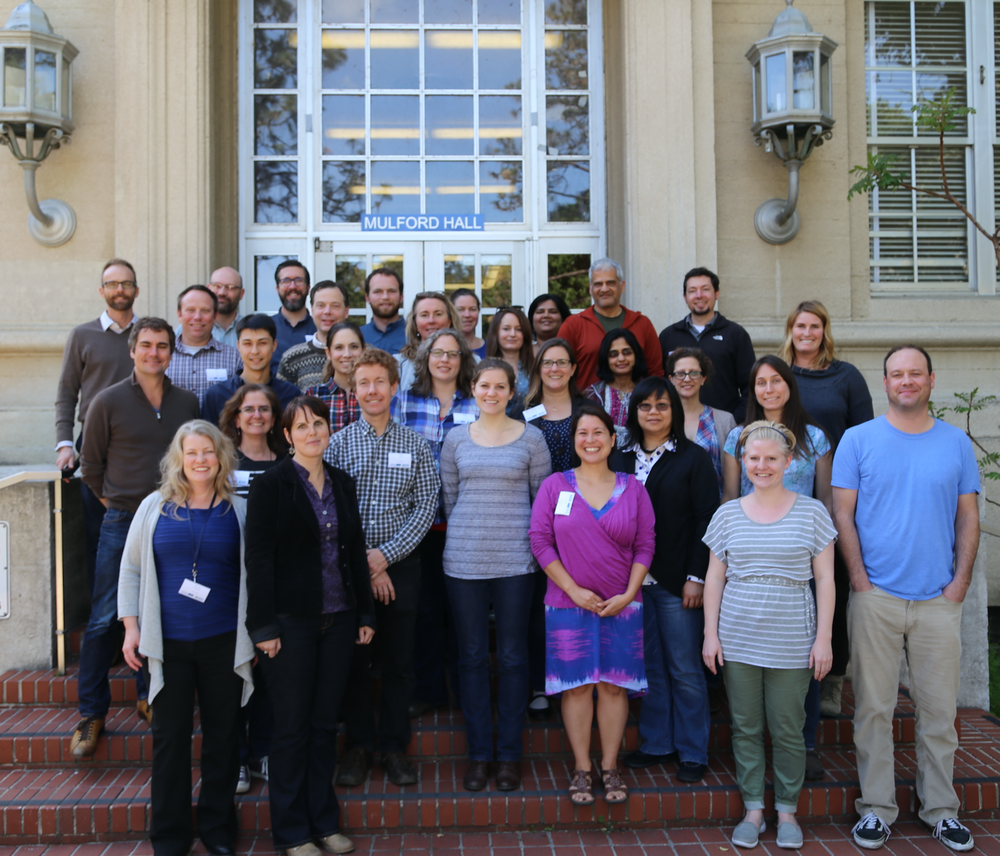
2016 Bootcamp participants

On Day 1 we focused on setting up a collaborative virtual data environment through virtual machines, spatial databases (PostgreSQL/PostGIS) with multi-user editing and versioning (GeoGig). We also talked about open data and open standards, and moderndata formats and tools (GeoJSON, GDAL).  On Day 2 we focused on open analytical tools for spatial data. We focused on Python (i.e. PySAL, NumPy, PyCharm, iPython Notebook), and R tools.  Day 3 was dedicated to the web stack, and visualization via ESRI Online, CartoDB, and Leaflet. Web mapping is great, and as OpenGeo.org says: “Internet maps appear magical: portals into infinitely large, infinitely deep pools of data. But they aren't magical, they are built of a few standard pieces of technology, and the pieces can be re-arranged and sourced from different places.…Anyone can build an internet map."

All-in-all it was a great time spent with a collection of very interesting mapping professionals from around the country. Thanks to everyone!

Mapsense talk at BIDS for your viewing pleasure

Here is Erez Cohen's excellent talk from the BIDS feed: http://bids.berkeley.edu/resources/videos/big-data-mapping-modern-tools-geographic-analysis-and-visualization

Title: Big Data Mapping: Modern Tools for Geographic Analysis and Visualization

Speaker: Erez Cohen, Co-Founder and CEO of Mapsense

We'll discuss how smart spatial indexes can be used for performant search and filtering for generating interactive and dynamic maps in the browser over massive datasets. We'll go over vector maps, quadtree indices, geographic simplification, density sampling, and real-time ingestion. We'll use example datasets featuring real-time maps of tweets, California condors, and crimes in San Francisco. 

The BIDS Data Science Lecture Series is co-hosted by BIDS and the Data, Science, and Inference Seminar. 

About the Speaker

Erez is co-founder and CEO at Mapsense, which is builds software for the analysis and visualization of massive spatial datasets. Previously Erez was an engineer at Palantir Technologies, where he worked with credit derivatives and mortgage portfolio datasets. Erez holds a BS/MS from UC Berkeley's Industrial Engineer and Operations Research Department. He was a PhD candidate in the same department at Columbia University.

print 'Hello World (from FOSS4G NA 2015)'

FOSS4G NA 2015 is going on this week in the Bay Area, and so far, it has been a great conference.

Monday had a great line-up of tutorials (including mine on PySAL and Rasterio), and yesterday was full of inspiring talks.  Highlights of my day: PostGIS Feature Frenzy, a new geoprocessing Python package called PyGeoprocessing, just released last Thurs(!) from our colleagues down at Stanford who work on the Natural Capital Project, and a very interesting talk about AppGeo's history and future of integrating open source geospatial solutions into their business applications. 

The talk by Michael Terner from AppGeo echoed my own ideas about tool development (one that is also shared by many others including ESRI) that open source, closed source and commercial ventures are not mutually exclusive and can often be leveraged in one project to maximize the benefits that each brings. No one tool will satisfy all needs.

In fact, at the end of my talk yesterday on Spatial Data Analysis in Python, someone had a great comment related to this: "Everytime I start a project, I always wonder if this is going to be the one where I stay in Python all the way through..."  He encouraged me to be honest about that reality and also about how Python is not always the easiest or best option.

Similarly, in his talk about the history and future of PostGIS features, Paul Ramsey from CartoDB also reflected on how PostGIS is really great for geoprocessing because it leverages the benefits of database functionality (SQL, spatial querying, indexing) but that it is not so strong at spatial data analysis that requires mathematical operations like interpolation, spatial auto-correleation, etc. He ended by saying that he is interested in expanding those capabilities but the reality is that there are so many other tools that already do that.  PostGIS may never be as good at mathematical functions as those other options, and why should we expect one tool to be great at everything?  I completely agree.

Turf: Advanced geospatial analysis for browsers and node

Mapbox introduced a new javascript library for spatial analysis called Turf.js. On the "Guides to getting started" page, it claims that Turf "helps you analyze, aggregate, and transform data in order to visualize it in new ways and answer advanced questions about it."

Turf provides you with functions like calculating buffers and areas. Other common functions include aggregation, measurement, transformation, data filtering, interpolation, joining features, and classification. The detailed explanations of these functions can be found on this page.

Turf seems like a cool tool to try out if you want to provide spatial analysis functions on your webGIS applications.

Wow! new D3 panel visualization

Mike Bostock's visualizations are glorious. This gives me lots of ideas for visualizing temporal variability across space. I can't embed this here, but I recommend you check it out.

http://bost.ocks.org/mike/drought/

They say: We published a more serious graphic today on drought’s effect on crops, but this was a fun animation we made to sanity-check parsing drought data. NOAA publishes monthly values for the Palmer Drought Severity Index going all the way back to 1895! Dark purple represents extreme drought, while dark green represents extreme moisture. In effect, this is a crazy electric version of Haeyoun Park and Kevin Quealy’s graphic, Drought’s Footprint.

Web mapping of high res imagery helps conservation

One of our collaborators on the Sonoma Vegetation Mapping Project has sent work on how web mapping and high resolution imagery has helped them do their job well. These are specific comments, but might be more generally applicable to other mapping and conservation arenas.

  1. Communicating with partnering agencies.
    • In the past year this included both large wetland restoration projects and the transfer of ownership of several thousands of acres to new stewards.
  2. Articulating to potential donors the context and resources of significant properties that became available for purchase.
    • There are properties that have been identified as high priority conservation areas for decades and require quick action or the opportunity to protect would pass.
  3. Internal communication to our own staff.
    • We have been involved in the protection of over 75 properties, over 47,000 acres. At this time we own 18 properties (~6500 acres) and 41 conservation easements (~7000  acres). At this scale high quality aerial imagery is essential to the size of land we steward and effective broad understanding. The way it is served as a seamless mosaic means it is available to extremely experienced and intelligent people who find the process of searching and joining orthorectified imagery by the flight path and row cumbersome or inefficient.
  4. Researching properties of interest.
    • Besides our own internal prioritization of parcels to protect, I understand that we receive a request a week for our organization’s attention towards some property in Sonoma. Orienting ourselves to the place always includes a map with the property boundary using the most recent and/or high quality imagery for the parcel of interest and its neighbors.  This is such a regular part of our process that we created a ArcGIS Server based toolset that streamlines this research task and cartography. The imagery service we consume as the basemap for all these maps is now the 2011 imagery service.  This imagery is of high enough resolution that we can count on it for both regional and parcel scale inspection to support our decisions to apply our resources.
  5. Orienting participants to site.
    • Our On the Land Program uses the imagery in their introduction maps to help visitors on guided hikes quickly orient to the place they are visiting and start folding their experience and sense of place into their visit.
  6. Complementing grant applications.
    • Grants are an important part of the funding for major projects we undertake. High quality imagery facilitates our ability to orient the grant reviewer and visually support the argument we are making which is that our efforts will be effective and worthy of funds that are in short supply.
  7. Knowing what the resources on a property are is an essential part of thoughtfully managing them.
    • In one example we used the aerial imagery (only a year old at the time) as a base map for botanists to classify the vegetation communities. These botanists are not experts in GIS, but by using paper maps with high resolution prints in the field they were easily able to delineate what they were observing on the ground on features interpreted in the photo.  We then scanned and confidently registered their hand annotations to the same imagery, allowing staff to digitized the polygons that represent the habitat observed. These vegetation observations are shared with Sonoma County and its efforts to map all the vegetation of Sonoma County.
  8. Conservation easement monitoring makes extensive use of aerial imagery.
    • In some cases we catch violations of our easements that are difficult to view on the ground, for example unpermitted buildings by neighbors on the lands we protect, illegal agriculture or other encroachment. It is often used to orient new and old staff to a large property before walking their and planning for work projects that might be part of prescribed management.
  9. The imagery helps reinforce our efforts to communicate the challenge to preserve essential connectivity in the developed and undeveloped areas of Sonoma County.
    • In the Sonoma Valley there is a wildlife corridor of great interest to us as conservation priority. Aerial imagery has been an important part of discussing large land holdings such as the Sonoma Developmental Center, existing conserved land by Sonoma Land Trust and others, and the uses of the valley for housing and agriculture.
  10. Celebration of the landscape cannot be forgotten.
    • We often pair this high quality aerial imagery with artful nature photography. The message of the parts and their relation to the whole are succinctly and poetically made. This is essential feedback to members and donors who need to see the numbers of acres protected with their support and have the heartfelt sense of success.

We look forward to the continued use of this data and the effective way it is shared.
 
We hope that future imagery and other raster or elevation data can be served as well as this, it would benefit many engaged in science and conservation.

Thanks to Joseph Kinyon, GIS Manager, Sonoma Land Trust

Mapping Ebola Over Time

HealthMap is an automated electronic information system that monitors data from electronic media sources (e.g. social media, government websites, physician social networks) in order to visualize and foster an understanding of infectious disease outbreaks around the world.  The system is credited with recognizing the current Ebola epidemic in West Africa nine days before the World Health Organization was able to do so (see: http://www.politico.com/story/2014/08/healthmap-ebola-outbreak-109881.html?hp=l8).  Here you can access their visualization of the spread of Ebola across West Africa, and later into Europe and the United States: http://healthmap.org/ebola/#timeline.

Those crowded skies: Flight maps and delays

real time map of flights from planefinder.netYou've probably seen the frequently-cited "Misery Map" (D3 behind the scenes) showing how the Thanksgiving storm has blown many a tight travel plan off schedule.

Here is another cool one: real-time map of all the flights in the air. It looks crowded!

How it works.


Happy and safe travels everyone.

FlightAware.com has created the Misery Map, a real-time weather and flight data visualization tool that overlays Nexrad radar imagery on a map of the country, with red-green graphs showing the pain at major airports.
Read more at http://www.flyingmag.com/technique/flight-planning/flightaware-misery-map-tracks-travel-delays#tXwGX8OjSo5QhDUk.99

Past fire visualization: SandTable to SimTable

Chips fire via SimTableWhile up at Forestry Camp, Mike DeLasaux turned us on to this site: SimTable. Apparently in the early days (and still today) sandtables were used to practice for wildland fire management. A few pictures are shown here. A nice tool developed to update the sandtable idea using digital data and fire modeling is SimTable. Their website also has some great visualizations of past fires with real fire perimeter data.

For example, check out the spread of the Chips fire using their website (image at right). The fire was first sighted on July 29, 2012, burning about 20 miles (32 km) west of Quincy, California. It burned through the begining of September 2012, eventually burning about 75,000 acres in Plumas and Lassen national forests. In late August, a series of backfires along the eastern flank of the fire were lit (check out the forest treatments in purple on the map) to slow the spread. News article about the backfire here. The site is: http://apps.simtable.com/fireProgression/tests/chips/simpleOverlay.html.

Here is the Chips burn scar from NASA.

Bay Area Inequality & Mass Transit

Dan Grover and Mike Z created an interactive data visualization that shows the income distribution along mass transit routes in the Bay Area. 2010 Census median household income for each mass transit station within a census tract for MUNI metro and bus, BART, and CalTrain routes are currently viewable. The project was inspired by The New Yorker’s New York City income distribution viewer for the New York Subway here.

Screenshot of data viewer from dangrover.github.io

Google Timelapse

Google recently released the Timelapse project, hosted by Time Magazine, which shows Landsat images from 1984 to today in a timelapse video animation for the entire globe. The viewer allows users to navigate to any spot on the globe via place name and visualize changes on the earth’s surface over the time period captured by Landsat. Google highlights specific areas of interest such as Dubai, Las Vegas, and the Amazon.

Click the image below for more info and to access the site:

Screenshot of Google Timelapse on Time.com

Mapping and interactive projections with D3

D3 is a javascript library that brings data to life through an unending array of vizualizations.  Whether you've realized it or not, D3 has been driving many of the most compeling data visualizations that you have likely seen throughout the last year including a popular series of election tracking tools in the New York Times.

You can find a series of examples in D3's gallery that will keep you busy for hours!

In addition to the fantastic charting tools, D3 also enables a growing list of mapping capabilities.  It is really exciting to see where all this is heading.  D3's developers have been spending a lot of time most recently working on projections transformations.  Check out these amazing interactive projection examples:

Projection Transitions

Comparing Map Projections

Adaptive Composite Map Projections (be sure to use chrome for the text to display correctly)

Can't wait to see what the future has in store for bringng custom map projections to life in more web map applications!


CartoDB launches tools for visualizing temporal data

CartoDB, a robust and easy to use web mapping application, today launched "torque" a new feature enabling visualization of temporal data sets. 

From the CartoDB team:

Torque is a library for CartoDB that allows you to create beautiful visualizations with temporal datasets by bundling HTML5 browser rendering technologies with an efficient data transfer format using the CartoDB API. You can see an example of Torque in action on the Guardian's Data Blog, and grab the open source code from here.

Be sure to check out the example based on location data recorded from Captain's logs from the British Royal Navy during the first World War.  Amazing stuff!


One Hundred Years of Land Values in Chicago

Gabriel Ahlfeldt, from the London School of Economics, presents in a video in the link below on an interesting project that digitized Olcott's Blue Books, a unique dataset of historical land values, land uses, building heights, and other information in Chicago and its suburbs, published annually between 1900 and 1990. The digitized information from the Blue Books allows for detailed historical statistical and geospatial analyses. The visualization of the data is presented in the video using GIS software.

View the video on youtube by clicking here.

New Perpetual Ocean and Wind Map Animations

Two interesting natural phenomena spatial animations were recently released. The first is from NASA which visualizes ocean surface currents around the world from 2005 to 2007. The animations were generated from data modeled using NASA’s Estimating the Circulation and Climate of the Ocean, Phase II also known as ECCO2. For more information click here. See the video below:

The second is from HINT.FM which visualizes near real time wind movement patterns in the US using data from the National Digital Forecast Database. To see the animation click here. Here is a static screenshot from their website:

HINT.FM Wind Map

Berkeley Earthquake Visualized Through Tweets

Eric Fischer created a set of interesting animations that visualize the location and number of tweets related to the two earthquakes in Berkeley yesterday (afternoon and evening) over 12 minutes. This is technically measuring the level of discussion about the earthquakes. The animations where created with data from the Twitter streaming API.

Click here to view the video.

The left animation shows tweets about the afternoon earthquake and the right shows tweets about the evening earthquake. Green circles are tweets about the earthquakes and gray circles are tweets about everything else.

Here is one he made for the Virginia quake in August: Video.