COVID-19 map resources

Hello all from the new shelter-in-place normal. We are all figuring this new way of working and living out, so in the meantime, stay calm, be compassionate, be positive and productive. At least that is what I am telling myself daily! Thanks to the wonderful former Kellylabber John Connors (who put together a great list), here is a quick round-up of some of the best map resources for COVID-19 out there.

NYTimes: Good map viz, lots of map resources

StoryMap from ESRI: Good visuals, good presentation, detail for China

ESRI: Solutions for local government, Esri toolkits

CDC: simple map from CDC

Stanford: Data visualization, timeline, literature, updated travel bans, and some resources

Washington Post: spread simulation model, showing how social isolation works

WHO: dynamic dashboard (built in Esri tools), up-to-date country totals

Stay safe and healthy out there everyone.
ESRI @ GIF Open GeoDev Hacker Lab

We had a great day today exploring ESRI open tools in the GIF. ESRI is interested in incorporating more open tools into the GIS workflow. According to www.esri.com/software/open, this means working with:

  1. Open Standards: OGC, etc.

  2. Open Data formats: supporting open data standards, geojson, etc.

  3. Open Systems: open APIs, etc.

We had a full class of 30 participants, and two great ESRI instructors (leaders? evangelists?) John Garvois and Allan Laframboise, and we worked through a range of great online mapping (data, design, analysis, and 3D) examples in the morning, and focused on using ESRI Leaflet API in the afternoon. Here are some of the key resources out there.

Great Stuff! Thanks Allan and John

International Map Year

Did you know that it is International Map Year? 2015-2016.  

The International Map Year (IMY) is a worldwide celebration of maps and their unique role in our world. Supported by the United Nations, IMY provides opportunities to demonstrate, follow, and get involved in the art, science and technology of making and using maps and geographic information.

http://mapyear.org/about-international-map-year/

Think about ways in which maps can be integrated into your work!

Mapsense talk at BIDS for your viewing pleasure

Here is Erez Cohen's excellent talk from the BIDS feed: http://bids.berkeley.edu/resources/videos/big-data-mapping-modern-tools-geographic-analysis-and-visualization

Title: Big Data Mapping: Modern Tools for Geographic Analysis and Visualization

Speaker: Erez Cohen, Co-Founder and CEO of Mapsense

We'll discuss how smart spatial indexes can be used for performant search and filtering for generating interactive and dynamic maps in the browser over massive datasets. We'll go over vector maps, quadtree indices, geographic simplification, density sampling, and real-time ingestion. We'll use example datasets featuring real-time maps of tweets, California condors, and crimes in San Francisco. 

The BIDS Data Science Lecture Series is co-hosted by BIDS and the Data, Science, and Inference Seminar. 

About the Speaker

Erez is co-founder and CEO at Mapsense, which is builds software for the analysis and visualization of massive spatial datasets. Previously Erez was an engineer at Palantir Technologies, where he worked with credit derivatives and mortgage portfolio datasets. Erez holds a BS/MS from UC Berkeley's Industrial Engineer and Operations Research Department. He was a PhD candidate in the same department at Columbia University.

100 Years of National Geographic Maps: The Art and Science of Where

Great retrospective on 100 years of National Geographic map making. 

100 Years of National Geographic Maps: The Art and Science of Where

Since 1915, National Geographic cartographers have charted earth, seas, and skies in maps capable of evoking dreams.

This beaut on the right is from 1968 of the ocean floor.  The article says: " Based on the work of geophysicists Bruce Heezen and Marie Tharp, this 1968 map of the ocean floor helped bring the concept of plate tectonics to a wide audience. Tharp began plotting the depths in 1950 from soundings taken by ships in the Atlantic, but, as a woman, wasn't allowed on the ships herself. In 1978 she was awarded the Society's Hubbard Medal for her pioneering research." 

The mapping process: musings at the end of 2014

Here are some evocative words about mapping from an unlikely source: in her astounding and engrossing book Wolf Hall, Hilary Mantel has Thomas Cromwell say:

But the trouble is, maps are always last year's. England is always remaking herself, her cliffs eroding, her sandbanks drifting, springs bubbling up in dead ground. They regroup themselves while we sleep, the landscapes through which we move..."

Lovely stuff! and a great holiday read (or re-read, or re-listen). It reminds us that mapping is a continual effort, a continuous process. All that we map changes: crops are harvested and fields are replanted, cities evolve, forests burn and re-grow, and people move across the face of the earth leaving traces. Our task is to capture in virtual space the key functional elements of space and time - through maps, through spectral reflectance and lidar, through text and discussions - so that we can find answers to to the key questions facing society today.

Excerpt From: Mantel, Hilary. Wolf Hall. Henry Holt and Company, 2009. iBooks.

Workshop on Oct 19: Planet Mapping: The Science of 3D Maps

swissnex San Francisco
730 Montgomery St., San Francisco, 94111
- See more at: http://www.swissnexsanfrancisco.org/event/planetmapping/#sthash.G5iIInIJ.dpuf
swissnex San Francisco
730 Montgomery St., San Francisco, 94111
- See more at: http://www.swissnexsanfrancisco.org/event/planetmapping/#sthash.G5iIInIJ.dpuf

Planet Mapping: The Science of 3D Maps. Find out what tools and techniques are enabling today’s modern cartographers to render 3D maps.

Location: swissnex San Francisco
730 Montgomery St., San Francisco, 94111

Our world is constantly being captured through GPS, cameras, satellites, and scanners and rendered by algorithms into navigable maps of Planet Earth. But how are 3D maps really made? How is the data collected?
Hear from some of the hottest startups in the field about the science and technology behind 3D map making—from data collection, to processing, to display—and discover how you can make your own 3D maps.
During the event, enjoy the visual stimulation of the PLACEMAKERS exhibit on view at swissnex San Francisco.

Program:

  • 6:30 pm doors open
  • 7:00 pm intro
  • 7:10 pm talks + Q&A
  • 8:45 pm networking reception

See more at: http://www.swissnexsanfrancisco.org/event/planetmapping/#sthash.G5iIInIJ.dpuf

Our world is constantly being captured through GPS, cameras, satellites, and scanners and rendered by algorithms into navigable maps of Planet Earth. But how are 3D maps really made? How is the data collected?

Hear from some of the hottest startups in the field about the science and technology behind 3D map making—from data collection, to processing, to display—and discover how you can make your own 3D maps.

During the event, enjoy the visual stimulation of the PLACEMAKERS exhibit on view at swissnex San Francisco.

Program

6:30 pm doors open
7:00 pm intro
7:10 pm talks + Q&A
8:45 pm networking reception

- See more at: http://www.swissnexsanfrancisco.org/event/planetmapping/#sthash.G5iIInIJ.dpuf

Some cool images showing the power of lidar and cartography

From Martin Isenburg, the brain behind LAStools.

Using LAStools, ArcGIS, and Photoshop, GRAFCAN has produced a LiDAR-derived digital suface model (DSM) that is seriously doped up: a synthetic map providing an intuitive understanding of the landscape. The product combines standard hillshading with a height and feature based color-coding that enables the viewer to "see" where trees are tall and to grasp height differences between buildings. The new product is available at a resolution of 2.5 meters/pixel via the GRAFCAN Web viewer and also as a WMS service. More info and pics here: http://rapidlasso.com/2013/11/03/grafcan-launches-dsm-on-steroids/.

Comparison between bare earth DTM and DSM with cartography.


Check out the greenhouses, which ppear as “low planar vegetatation”. They are made out of coarse maze fabric (instead of glass) that lets the laser through and does not deflect it (like glass would).

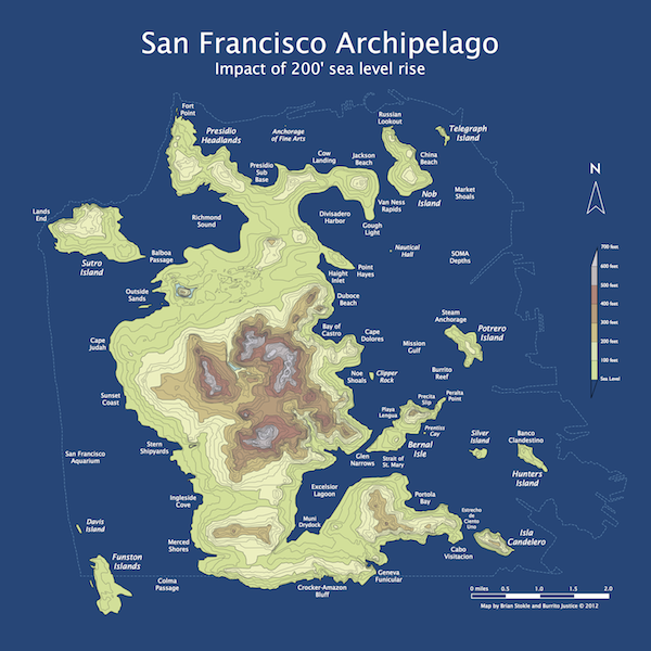
San Francisco circa 2072

SF archipelago, c. 2072

Some fun before the semester starts! Like something out of a great scifi novel: from Burrito Justice (and via Mark O.) "March 20th, 2072 (AP), Northern California Association of City States: With the surprising acceleration of sea level rise due to the melting of both the Greenland and Antarctic ice sheets over the past decade, the San Francisco canal system was officially abandoned this week. Additional ferry service has been announced between the new major islands of the San Franciscan Archipelago while the boring machines make progress under the Van Ness Passage and Richmond Pass for new transit tunnels." This rad poster is available for sale!

Workshop wrap up: Google Earth Higher Education Summit 2013

For three days in late July 2013 Kevin Koy, Executive Director of the GIF and Maggi spent time at Google with 50+ other academics and staff to learn about Google Earth's mapping and outreach tools that leverage cloud computing. The meeting was called Google Earth for Higher Education Summit, and it was jam packed with great information and hands-on workshops. Former Kellylabber Karin Tuxen-Bettman was at the helm, with other very helpful staff (including David Thau - who gave the keynote at last year's ASPRS conference). Google Earth Outreach has been targeting non-profits and K-12 education, and are now increasingly working with higher education, hence the summit. We learned about a number of valuable tools for use in classrooms and workshops, a short summary is here.  

Google Mapping Tools - the familiar and the new

  • Google Earth Pro. You all know about this tool, increasing ability to plan, measure and visualize a site, and to make movies and maps and export data.
  • Google Maps Engine Lite. This is a free, lite mapping platform to import, style and embed data. Designed to work with small (100 row) spreadsheets.
  • Google Maps Engine Platform. The scaleable and secure mapping platform for geographic data hosting, data sharing and map making. streamlines the import of GIS data: you can import shapefiles and imagery. http://mapsengine.google.com.
  • Google Earth Engine. Data (40 years of global satellite imagery - Landsat, MODIS, etc.) + methods to analyze (Google's and yours, using python and javascript) + the Cloud make for a fast analytical platform to study a changing earth. http://earthengine.google.org/#intro
  • TimeLapse. A new tool showcasing 29 years of Landsat imagery, allows you to script a tour through a part of the earth to highlight change. Features Landsat 4, 5 7 at 30m, with clouds removed, colors normalized with MODIS. http://earthengine.google.org/
  • Field Mobile Data Collection. GME goes mobile, using Open Data Kit (ODK) - a way to capture structured data and locate it and analyze after home.
  • Google Maps APIs. The way to have more hands-on in map styling and publishing. developers.google.com/maps
  • Street View. They have a car in 32 countries, on 7 continents, and are moving into national parks and protected areas. SV is not just for roads anymore. They use trikes, boats, snowmobiles, trolleys; they go underwater and caves, backpacks.

Here are a couple of my first-cuts:

Mapping and interactive projections with D3

D3 is a javascript library that brings data to life through an unending array of vizualizations.  Whether you've realized it or not, D3 has been driving many of the most compeling data visualizations that you have likely seen throughout the last year including a popular series of election tracking tools in the New York Times.

You can find a series of examples in D3's gallery that will keep you busy for hours!

In addition to the fantastic charting tools, D3 also enables a growing list of mapping capabilities.  It is really exciting to see where all this is heading.  D3's developers have been spending a lot of time most recently working on projections transformations.  Check out these amazing interactive projection examples:

Projection Transitions

Comparing Map Projections

Adaptive Composite Map Projections (be sure to use chrome for the text to display correctly)

Can't wait to see what the future has in store for bringng custom map projections to life in more web map applications!


Food: An Atlas by Guerrilla Cartographers is ready for your support!

An atlas of food: a cooperatively-created, crowd-sourced and crowd-funded project of guerrilla cartography and publishing. Check it out! Food: An Atlas is ready to roll. Check out the promo at kickstarter and consider supporting the project.

5 months
+ 80 collaborating cartographers and researchers
+ 8 volunteer editors
+ An abundance of volunteer campaign wranglers, academics, designers, and artists
+ You
= Food: An Atlas

Cool cartography--Risk mapping at a broad view

I came across this short blurb by  on some tricks for catchy large-scale maps. The bullet-points include:

  • Interesting Topic.  The subjects of these maps inherently represent risk, which we want to understand.
  • Unexpected Scope.  A forest view of something that’s usually seen at the tree-level offers satisfying perspective.
  • Big and Clear.  A single dataset is conceptually simple, and when large enough, it provides its own context-promoting conversation in the wild.
  • Sharable.  A static image is portable and paste-able, easily nestling into articles, blogs, tweets, and PowerPoints.
  • Attractive.  The currency of design buys a second or third look.

There is often a push to make large datasets available through interactive webGIS portals, but I think this makes a good case that there is still also a role for skilled cartography to present information in captivating ways. 

Below is an example of one of the author's (John Nelson) maps, and more can be found here

AAG 2012 Wrap-up

NY skyline from Tim DeChant's blogAAG was a moderately large conference (just under 9,000) this year, held in mid-town NY. It was a brief trip for me, but I did go to some great talks across RS, GIScience, cartography, and VGI. I also went to a very productive OpenGeoSuite workshop hosted by OpenGeo. Some brief highights from the conference: Muki Hacklay discussed participation inequities in VGI: when you mine geoweb data, you are mining outliers, not society; there are biases in gender, education, age and enthusiasm. Agent-based modeling is still hot, and still improving. I saw some great talks in ABM for understanding land use change. Peter Deadman showed how new markets in a hot crop (like Acai) can transform a region quite quickly. Landsat 8 will likely be launched in early 2013, but further missions are less certain. My talk was in a historical ecology session, and Qinghua Guo and I highlighted some of the new modeled results of historic oak diversity in California using VTM data and Maxent.

Saturday evening I had the great pleasure of being locked in after hours at the NY Public Library for a session on historic maps. David Rumsey, with Humphrey Southall (University of Portsmouth) and Petr Pridal (Moravian Library) led a presentation introducing a new website: oldmapsonline.org. The website's goal is to provide a clearer way to find old maps, and provide them with a stable digital reference. 

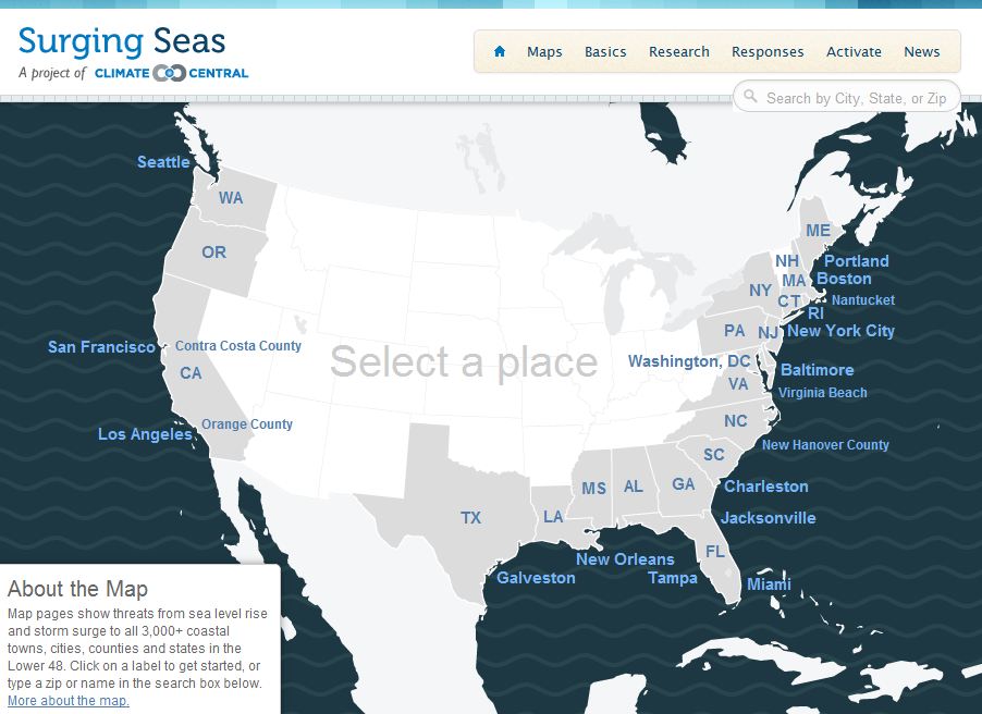
New Map Tool and Widgets: What’s Your Coastal Flood Risk?

This new interactive website SurgingSeas, a project of Climate Central, lets you see the combined coastal flood threat from sea level rise and storm surge, town by town and city by city from coast to coast. Type in your Zip code or the name of your community, choose a water level anywhere from 1 to 10 feet above the current high-tide line, and you can see what areas might be at risk of flooding from water that high. You can also go to any one of 55 tide gauges we studied around the country, and see the odds we’ve calculated for how soon flood waters may reach different elevations as the sea continues to rise. There are gauges close to most major coastal cities. If you want to embed the map in your own blog or website, there’s a widget for that, and you can make any view your default — not just the national one. - Michael D. Lemonick