SPUR 2021 update: Mapping changes to police spending in California

The Fall 2020 UC Berkeley’s Rausser College of Natural Resources Sponsored Project for Undergraduate Research (SPUR) project “Mapping municipal funding for police in California” continued in Spring 2021 with the Kellylab. This semester we continued our work with Mapping Black California (MBC), the Southern California-based collective that incorporates technology, data, geography, and place-based study to better understand and connect African American communities in California. Ben Satzman, lead in the Fall, was joined by Rezahn Abraha. Together they dug into the data, found additional datasets that helped us understand the changes in police funding from 2014 to 2019 in California and were able to dig into the variability of police spending across the state. Read more below, and here is the Spring 2021 Story Map: How Do California Cities Spend Money on Policing? Mapping the variability of police spending from 2014-2019 in 476 California Cities.
This semester we again met weekly and used data from 476 cities across California detailing municipal police funding in 2014 and 2019. By way of background, California has nearly 500 incorporated cities and most municipalities have their own police departments and create an annual budget determining what percentage their police department will receive. The variability in police spending across the state is quite surprising. This is what we dug into in Fall 2020. In 2019 the average percentage of municipal budgets spent on policing is about 20%, and while some municipalities spent less than 5% of their budgets on policing, others allocated more than half of their budgets to their police departments. Per capita police spending is on average about $500, but varies largely from about $10 to well over $2,000. Check out the Fall 2020 Story Map.

This semester, we set out to see how police department spending changed from 2014 to 2019, especially in relation to population changes from that same 5-year interval. We used the California State Controller's Finance Data to find each city's total expenditures and police department expenditures from 2014 and 2019. This dataset also had information about each city's total population for these given years. We also used a feature class provided by CalTrans that had city boundary GIS data for all incorporated municipalities in California.

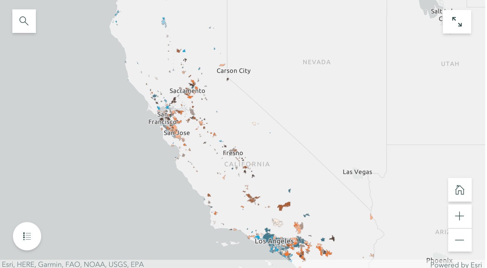
By dividing the police department expenditures by the total city expenditures for both 2014 and 2019, we were able to create a map showing what percentage of their municipal budgets 476 California cities were spending on policing. We were also able to visualize the percentage change in percentage police department spending and population from 2014 to 2019. Changes in police spending (and population change) were not at all consistent across the state. For example, cities that grew sometimes increased spending, but sometimes did not. Ben and Rezahn came up with a useful way of visualizing how police spending and population change co-vary (click on the map above to go to the site), and found 4 distinct trends in the cities examined:

SPUR2021.jpg
  • Cities that increased police department (PD) spending, but saw almost no change in population (these are colored bright blue in the map);

  • Cities that saw increases in population, but experienced little or negative change in PD spending (these are bright orange in the map);

  • Cities that saw increases in both PD spending and population (these are dark brown in the map); and

  • Cities that saw little or negative change in both PD spending and population (these are cream in the map).

They then dug into southern California and the Bay Area, and selected mid-size cities that exemplified the four trends to tell more detailed stories. These included for the Bay Area: Vallejo (increased police department (PD) spending, but saw almost no change in population), San Ramon (increases in population, but experienced little or negative change in PD spending), San Francisco (increases in both PD spending and population) and South San Francisco (little or negative change in both PD spending and population); and for southern California: Inglewood (increased police department (PD) spending, but saw almost no change in population), Irvine (increases in population, but experienced little or negative change in PD spending), Palm Desert (increases in both PD spending and population), Simi Valley (little or negative change in both PD spending and population). Check out the full Story Map here, and read more about these individual cities.

The 5-year changes in municipal police department spending are challenging to predict. Cities with high population growth from 2014 to 2019 did not consistently increase percentage police department spending. Similarly, cities that experienced low or even negative population growths varied dramatically in percentage change police department spending. The maps of annual police department spending percentages and 5-year relationships allowed us to identify these complexities, and will be an important source of future exploration.

The analysts on the project were Rezahn Abraha, a UC Berkeley Society and Environment Major, and Ben Satzman, a UC Berkeley Conservation and Resource Studies Major with minors in Sustainable Environmental Design and GIS. Both worked in collaboration with MBC and the Kellylab to find, clean, visualize, and analyze statewide data. Personnel involved in the project are: from Mapping Black California - Candice Mays (Partnership Lead), Paulette Brown-Hinds (Director), Stephanie Williams (Exec Editor, Content Lead), and Chuck Bibbs (Maps and Data Lead); from the Kellylab: Maggi Kelly (Professor and CE Specialist), Chippie Kislik (Graduate Student), Christine Wilkinson (Graduate Student), and Annie Taylor (Graduate Student).

We thank the Rausser College of Natural Resources who funded this effort.

Fall 2020 Story Map: Mapping Police Spending in California Cities. Examine Southern California and the Bay Area in detail, check out a few interesting cities, or search for a city and click on it to see just how much they spent on policing in 2017. 

Spring 2021 Story Map: How Do California Cities Spend Money on Policing? Mapping the variability of police spending from 2014-2019 in 476 California Cities.
SPUR2020 Update: Mapping Police Budgets in California

In September 2020, UC Berkeley’s Rausser College of Natural Resources selected the Kellylab for a Sponsored Project for Undergraduate Research (SPUR) project for their proposal entitled “Mapping municipal funding for police in California.” The project partnered with Mapping Black California (MBC), the Southern California-based collective that incorporates technology, data, geography, and place-based study to better understand and connect African American communities in California. We met weekly during the fall semester and gathered data from 472 cities across California, detailing the per-capita police funding and percent of municipal budget that is spent on police departments. California has nearly 500 incorporated cities and most municipalities have their own police departments and create an annual budget determining what percentage their police department will receive. The variability in police spending across the state is quite surprising - check out the figures below. The average percentage of municipal budgets spent on policing is about 20%, and while some municipalities spent less than 5% of their budgets on policing, others allocated more than half of their budgets to their police departments. Per capita police spending is on average about $500, but varies largely from about $10 to well over $2,000. If you are interested in this project, explore our findings through the Story Map: examine Southern California and the Bay Area in detail, check out a few interesting cities, or search for a city and click on it to see just how much they spent on policing in 2017. 

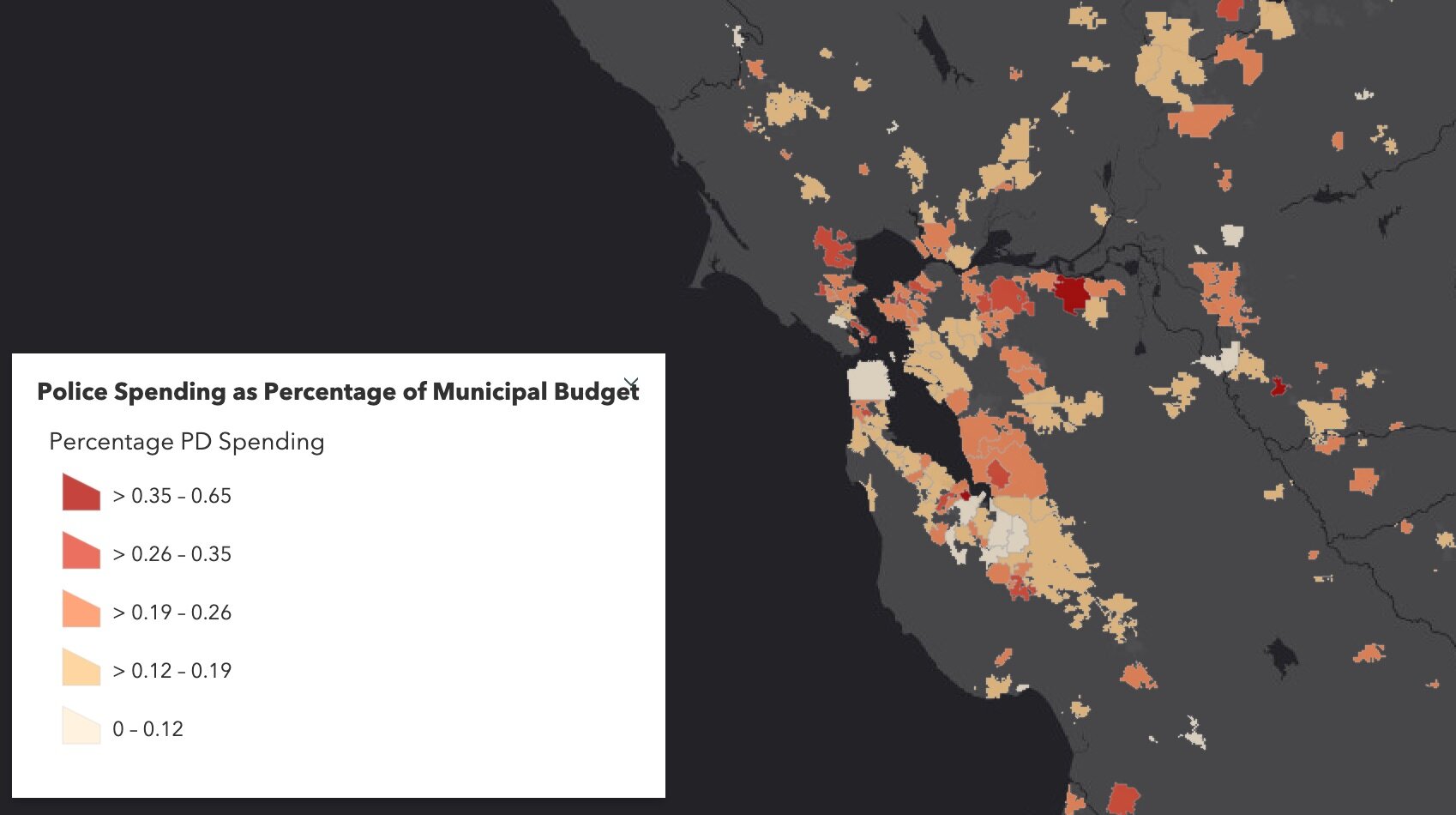
Figure showing variability in Police Spending (% of municipal budget) in Northern California in 2017. Data from California State Controller's Cities Finances Data, 2017 (City and police spending information). For more information see the Story Map h…

Figure showing variability in Police Spending (% of municipal budget) in Northern California in 2017. Data from California State Controller's Cities Finances Data, 2017 (City and police spending information). For more information see the Story Map here

Figure showing variability in Police Spending (PEr capita) in Northern California in 2017. Data from California State Controller's Cities Finances Data, 2017 (City and police spending information). For more information see the Story Map here. 

Figure showing variability in Police Spending (PEr capita) in Northern California in 2017. Data from California State Controller's Cities Finances Data, 2017 (City and police spending information). For more information see the Story Map here

The analyst on the project has been Ben Satzman, a UC Berkeley Conservation and Resource Studies Major with minors in Sustainable Environmental Design and GIS, who worked in collaboration with MBC and the Kellylab to find, clean, visualize, and analyze statewide data. We plan on continuing the project to explore the possible influences (such as racial diversity, crime, poverty, ethnicity, income, and education) underlying these regional trends and patterns in police spending. Personnel involved in the project are: from Mapping Black California - Candice Mays (Partnership Lead), Paulette Brown-Hinds (Director), Stephanie Williams (Exec Editor, Content Lead), and Chuck Bibbs (Maps and Data Lead); from the Kellylab: Maggi Kelly (Professor and CE Specialist), Chippie Kislik (Graduate Student), Christine Wilkinson (Graduate Student), and Annie Taylor (Graduate Student).

We thank the Rausser College of Natural Resources who funded this effort.

Mapping COVID19: a technology overview

Hello everyone, I hope you are all healthy, safe, sane, and if possible, being productive.

Here I provide a summary of some of the mapping technology that has been used in the past few weeks to understand the COVID-19 pandemic. This is not exhaustive! I pick three areas that I am personally focusing on currently: map-based data dashboards, disease projections, and social distancing scorecards. I look at where the data comes from and how the sites are built. More will come on the use of remote sensing and earth observation data in support of COVID-19 monitoring, response or recovery, and some of the cool genome evolution and pandemic spread mapping work going on.

COVID-19 map-based data dashboards. You have seen these: lovely dashboards displaying interactive maps, charts, and graphs that are updated daily. They tell an important story well. They usually have multiple panels, with the map being the center of attention, and then additional panels of data in graph or tabular form. There are many many data dashboards out there. My two favorites are the Johns Hopkins site, and the NYTimes coronavirus outbreak hub.

Where do these sites get their data?

  • Most of these sites are using data from similar sources. They use data on number of cases, deaths, and recoveries per day. Most sites credit WHO, US CDC (Centers for Disease Control and Prevention), ECDC (European Centre for Disease Prevention and Control), Chinese Center for Disease Control and Prevention (CCDC), and other sources. Finding the data is not always straightforward. An interesting article came out in the NYTimes about their mapping efforts in California, and why the state is such a challenging case. They describe how “each county reports data a little differently. Some sites offer detailed data dashboards, such as Santa Clara and Sonoma counties. Other county health departments, like Kern County, put those data in images or PDF pages, which can be harder to extract data from, and some counties publish data in tabular form”. Alameda County, where I live, reports positive cases and deaths each day, but they exclude the city of Berkeley (where I live), so the NYTimes team has to scrape the county and city reports and then combine the data.

  • Some of the sites turn around and release their curated data to us to use. JH does this (GitHub), as does NYTimes (article, GitHub). This is pretty important. Both of these data sources (JH & NYTimes) have led to dozens more innovative uses. See the Social Distancing Scorecard discussed below, and these follow-ons from the NYTimes data: https://chartingcovid.com/, and https://covid19usmap.com/.

  • However… all these dashboards are starting with simple data: number of patients, number of deaths, and sometimes number recovered. Some dashboards use these initial numbers to calculate additional figures such as new cases, growth factor, and doubling time, for example. All of these data are summarized by some spatial aggregation to make them non-identifiable, and more easily visualized. In the US, the spatial aggregation is usually by county.

How do these sites create data dashboards?

  • The summarized data by county or country can be visualized in mapped form on a website via web services. These bits of code allow users to use and display data from different sources in mapped form without having to download, host, or process them. In short, any data with a geographic location can be linked to an existing web basemap and published to a website; charts and tables are also done this way. The technology has undergone a revolution in the last five years, making this very doable. Many of the dashboards out there use ESRI technology to do this. They use ArcGIS Online, which is a powerful web stack that quite easily creates mapping and charting dashboards. The Johns Hopkins site uses ArcGIS Online, the WHO does too. There are over 250 sites in the US alone that use ArcGIS Online for mapping data related to COVID-19. Other sites use open source or other software to do the same thing. The NYTimes uses an open source mapping platform called MapBox to create their custom maps. Tools like MapBox allow you to pull data from different sources, add those data by location to an online map, and customize the design to make it beautiful and informative. The NYTimes cartography is really lovely and clean, for example.

An open access peer reviewed paper just came out that describes some of these sites, and the methods behind them. Kamel Boulos and Geraghty, 2020.

COVID-19 disease projections. There are also sites that provide projections of peak cases and capacity for things like hospital beds. These are really important as they can help hospitals and health systems prepare for the surge of COVID-19 patients over the coming weeks. Here is my favorite one (I found this via Bob Watcher, @Bob_Wachter, Chair of the UCSF Dept of Medicine):

  • Institute for Health Metrics and Evaluation (IHME) provides a very good visualization of their statistical model forecasting COVID-19 patients and hospital utilization against capacity by state for the US over the next 4 months. The model looks at the timing of new COVID-19 patients in comparison to local hospital capacity (regular beds, ICU beds, ventilators). The model helps us to see if we are “flattening the curve” and how far off we are from the peak in cases. I’ve found this very informative and somewhat reassuring, at least for California. According to the site, we are doing a good job in California of flattening the curve, and our peak (projected to be on April 14), should still be small enough so that we have enough beds and ventilators. Still, some are saying this model is overly optimistic. And of course keep washing those hands and staying home.

Where does this site get its data?

  • The IHME team state that their data come from local and national governments, hospital networks like the University of Washington, the American Hospital Association, the World Health Organization, and a range of other sources.

How does the model work?

  • The IHME team used a statistical model that works directly with the existing death rate data. The model uses the empirically observed COVID-19 population and calculates forecasts for population death rates (with uncertainty) for deaths and for health service resource needs and compare these to available resources in the US. Their pre-print explaining the method is here.

On a related note, ESRI posted a nice webinar with Lauren Bennet (spatial stats guru and all-around-amazing person) showing how the COVID-19 Hospital Impact Model for Epidemics (CHIME) model has been integrated into ArcGIS Pro. The CHIME model is from Penn Medicine’s Predictive Healthcare Team and it takes a different approach than the IHME model above. CHIME is a SIR (susceptible-infected-recovery) model. A SIR model is an epidemiological model that estimates the probability of an individual moving from a susceptible state to an infected state, and from an infected state to a recovered state or death within a closed population. Specifically, the CHIME model provides estimates of how many people will need to be hospitalized, and of that number how many will need ICU beds and ventilators. It also factors social distancing policies and how they might impact disease spread. The incorporation of this within ArcGIS Pro looks very useful, as you can examine results in mapped form, and change how variables (such as social distancing) might change outcomes. Lauren’s blog post about this and her webinar are useful resources.

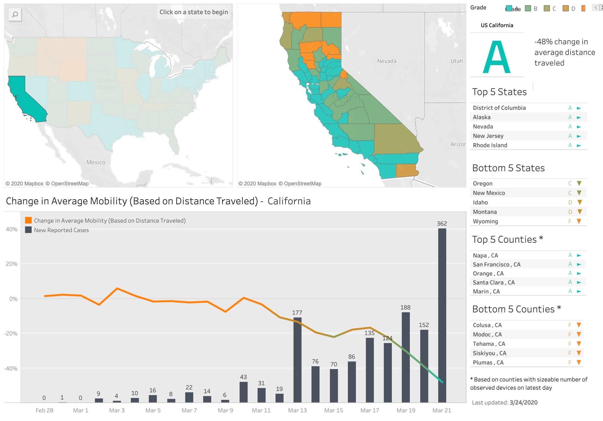
Social distancing scorecards. This site from Unicast got a lot of press recently when it published a scoreboard for how well we are social distancing under pandemic rules. It garnered a lot of press because it tells and important story well, but also, because it uses our mobile phone data (more on that later). In their initial model, social distancing = decrease in distance traveled; as in, if you are still moving around as you were before the pandemic, then you are not socially distancing. There are some problems with this assumption of course. As I look out on my street now, I see people walking, most with masks, and no one within 10 feet of another. Social distancing in action. These issues were considered, and they updated their scorecard method. Now, in addition to a reduction in distance traveled, they also include a second metric to the social distancing scoring: reduction in visits to non-essential venues. Since I last blogged about this site nearly two weeks ago, California’s score went from an A- to a C. Alameda County, where I live, went from an A to a B-. They do point out that drops in scores might be a result of their new method, so pay attention to the score and the graph. And stay tuned! Their next metric is going to be the change rate for the number of person-to-person encounters for a given area. Wow.

Where do these sites get their data?

  • The data on reported cases of COVID-19 is sourced from the Corona Data Scraper (for county-level data prior to March 22) and the Johns Hopkins Github Repository (for county-level data beginning March 22 and all state-level data).

  • The location data is gathered from mobile devices using GPS, Bluetooth, and Wi-Fi connections. They use mobile app developers and publishers, data aggregation services, and providers of location-supporting technologies. They are very clear on their privacy policy, and they do say they are open to sharing data via dataforgood@unacast.com. No doubt, this kind of use of our collective mobile device location data is a game-changer and will be debated when the pandemic is over.

How does Unicast create the dashboard?

  • They do something similar to the dashboard sites discussed above. They pull all the location data together from a range of sites, develop their specific metrics on movement, aggregate by county, and visualized on the web using custom web design. They use their own custom basemaps and design, keeping their cartography clean. I haven’t dug into the methods in depth yet, but I will.

Please let me know about other mapping resources out there. Stay safe and healthy. Wash those hands, stay home as much as possible, and be compassionate with your community.

Social Distancing Scorecard

According to the World Health Organization and the CDC, social distancing is currently the most effective way to slow the spread of COVID-19. Unacast created this interactive Scoreboard, updated daily, to empower organizations to measure and understand the efficacy of social distancing initiatives at the local level. 

They want us to explore the data — the more we all understand, the more lives we can save together.

Hooray! California gets an “A”. Good job California! Check out the maps and chart below (just a screenshot - much more on the site). See how our mobility has declined as the first cases came in; and its drastically reduced in the last week. This is good. Go Napa! Yet there are some outlier counties too - we can do better.

Covid-19_Social_Distancing_Scoreboard_—_Unacast.jpg

COVID-19 map resources

Hello all from the new shelter-in-place normal. We are all figuring this new way of working and living out, so in the meantime, stay calm, be compassionate, be positive and productive. At least that is what I am telling myself daily! Thanks to the wonderful former Kellylabber John Connors (who put together a great list), here is a quick round-up of some of the best map resources for COVID-19 out there.

NYTimes: Good map viz, lots of map resources

StoryMap from ESRI: Good visuals, good presentation, detail for China

ESRI: Solutions for local government, Esri toolkits

CDC: simple map from CDC

Stanford: Data visualization, timeline, literature, updated travel bans, and some resources

Washington Post: spread simulation model, showing how social isolation works

WHO: dynamic dashboard (built in Esri tools), up-to-date country totals

Stay safe and healthy out there everyone.

Sabbatical in China in the spring...

Sabbatical report April 2019

I’ve been on sabbatical now for a few months, and it’s time to report. I’ve been working on updating all my course materials: slides, reading and labs, for the fall. This has been a blast, and a lot of work! Especially the labs. We are finally moving to ArcGIS Pro, people! It’s been scary, but thanks to some excellent on-line resources, including this list of excellent tutorials from Jarlath O’Neil-Dunne and from ESRI (Getting started with Pro) we are making progress. Shane Feirer and Robert Johnson from #IGIS are helping here too, and we’ll likely be using some of the new material in IGIS workshops soon. 

Currently, I am in China, visiting former PhD student Dr Qinghua Guo and my “grandstudent” Dr Yanjun Su at their lab set in the bucolic Institute of Botany northwest of Beijing (just outside the 5th ring, for those of you in the know). It has been a blast. I came to catch up on all the excellent UAV, lidar, remote sensing, and modeling work going on in the Digital Ecosystem Lab at the Institute of Botany (part of the Chinese Academy of Sciences). These students are serious Data Scientists: they are working on key spatial problems and remote sensing data problems using ML, classification, spatio-temporal algorithms, data fusion tools. They routinely work with lidar, hyperspectral, multispectral and field data, and focus on leaf-scale to landscape-scale processes. One of the big experiments they are working on uses a new instrument, dubbed “Crop3D”. It is a huge frame installed over an ag field with a movable sensor dock. The field is about 30m x 15m, and the sensor can move to cover the entire field. Here is my summary in graphic form:

CROP3D. Very cool.

CROP3D. Very cool.

This season’s experiment focuses on mapping corn plant phenotypes using hyperspectral, RGB, and lidar data by classifying leaf-scale metrics such as leaf angle and branching angles, along with spectral indices. VERY COOL STUFF. I am eager to hear more about the results of the experiment and see what is yet to come. 

I gave a couple of talks, one on “big” (serious air quotes here) data and ecology (to the Institute of Botany at the Chinese Academy of Sciences) and one on UAVs (to the Institute of Geographical Sciences and Natural Resources Research, CAS). In both I highlighted all the excellent work done by students and staff in my various research and outreach groups. In the first I focused on our Lidar work in the Sierra Nevada (with Qinghua Guo, Yanjun Su, Marek Jakubowski); the VTM work and FAIR data (with Kelly Easterday); and UAV/water stress (with Kelly again plus Sean Hogan and Jacob Flanagan). In the second talk I got to gush about all the IGIS work we are doing across our “Living Laboratories” in California. We have flown ~30 missions (total 25 km2) on and around the network of research properties in California (see the panel below for some examples). I talked about the recent CNN work with Ovidiu Csillik; the BORR water stress experiment with Kelly, Sean and Jacob; the fire recovery work at Hopland with Shane Feirer and the rest of the IGIS crew; and the outreach we do like DroneCamps. I also talked about UAV Grand Challenges: Scaling, Sampling, and Synergies. Those ideas are for another post. 

IGIS UAV Missions in California

IGIS UAV Missions in California

My hosts took great care of me: Showing me the sites, making sure I tried all the regional delicacies, and indulging me in my usual blather. Below are some pics of us on our adventures, including in the bus on our way to a distant portion of the Great Wall. Walking the Wall was: 1) awesome (in the real sense of the word – it really is mind-blowing); 2) STEEP (calves were screaming at the end of the day); and 3) windy. Plus there are snakes. I was told that there are other sections of the Wall that are called “Wild Wall” which I think is extremely cool. And speaking of walls, GOT starts again this weekend. China in springtime is BURSTING with flowers. And being housed at the Institute of Botany means all of them are on show in a concentrated area. Finally, you can get all over this huge country on trains. Trains that go really fast (220 MPH), and are on time, and are comfortable! I went to Shanghai (800+ miles away) for the weekend by train! My current joke: “In China, it takes 4 hours to get from Beijing to Shanghai. In California, it takes 4 hours to get from Berkeley to Sacramento.” (Thanks Dad!).   

GroupPeeps2.jpg

Off to Tokyo. But not before a final panel of pics that remind me of this trip: Technology, Art, Food, Flowers, Shopping, History. Here in China, Red = Happiness + GoodLuck, not the Cardinal.

ChinaFavs2.jpg

Mapping post-fire landscapes at Hopland Research & Extension Center

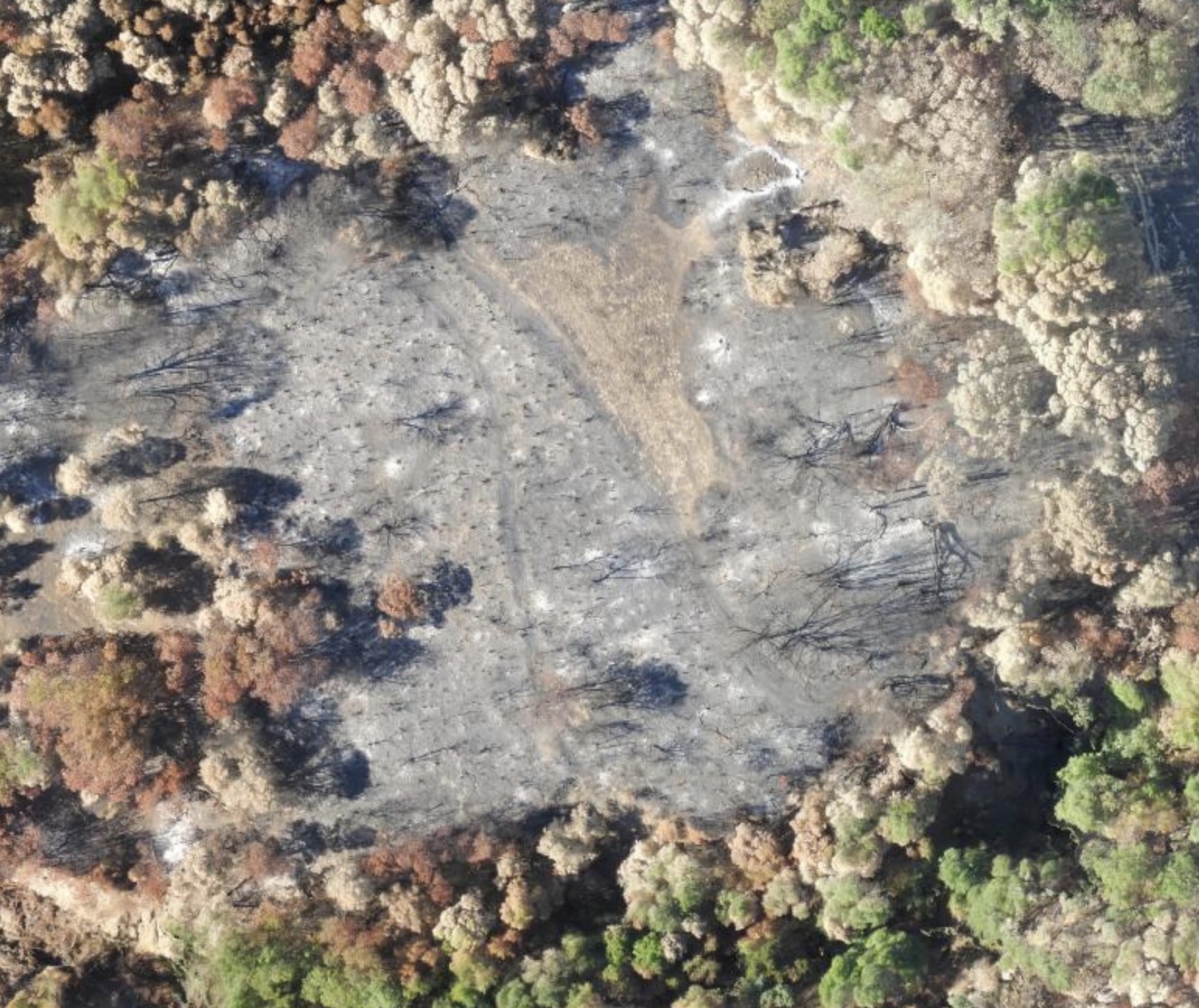
The River Fire began July 27, 2018 at 1pm on Old River Road in Hopland. By the evening it had spread, and was threatening numerous buildings in the area. We have a ANR Research and Extension Center (HREC) there, and Shane Feirer from IGIS lives and works here. Evacuations were ordered quickly, and down in the bay area we all held our breath hoping the fire wouldn’t harm people or animals or consume the HREC buildings. By the time it was contained (as part of the Mendocino Complex), it had burned 48,920 acres. We’ve been flying drones over HREC for awhile, and the last month we did more drone flights to map the post-fire landscape. We flew some Hangar 360 flights with a DJI Phantom to get some sweet overviews of the scene (example1, example2, example3), and flew much of the area with our eBee on the first mission and Matrices on the second mission with both multispectral and RGB cameras.

These pics below compare the eBee imagery (2cm) with Planet imagery (3m).

These are pics of the eBee (far left) and the Matrice (far right) getting ready to fly into the blackened landscape, and some snaps from the Hanger pics.

Tracking people and crime

This article describes how the LAPD online crime map mistakenly geocoded 1,380 crimes to a spot directly in front of the LA Times Office because it was the default location for unmatched geocodes. This mistake then lead to the popular site EveryBlock to rank that ZIP code as one of the most dangerous in the city. Lesson learned: don't believe every dot on a map is the absolute truth.

Another interesting article describes how analysis of an FBI database links long-haul truckers to serial killings. This shows that local data linked together can change the scale of analysis to reveal a "mobile crime scene".