Mapping fires and fire damage in real time: available geospatial tools
/Many of us have watched in horror and sadness over the previous week as fires consumed much of the beautiful hills and parts of the towns of Napa and Sonoma Counties. Many of us know people who were evacuated with a few minutes’ notice - I met a retired man who left his retirement home with the clothes on his back. Many other friends lost everything - house, car, pets. It was a terrible event - or series of events as there were many active fires. During those 8+ days all of us were glued to our screens searching for up-to-date and reliable information on where the fires were, and how they were spreading. This information came from reputable, reliable sources (such as NASA, or the USFS), from affected residents (from Twitter and other social media), and from businesses (like Planet, ESRI, and Digital Globe who were sometimes creating content and sometimes distilling existing content), and from the media (who were ofen using all of the above). As a spatial data scientist, I am always thinking about mapping, and the ways in which geospatial data and analysis plays an increasingly critical role in disaster notification, monitoring, and response. I am collecting information on the technological landscape of the various websites, media and social media, map products, data and imagery that played a role in announcing and monitoring the #TubbsFire, #SonomaFires and #NapaFires. I think a retrospective of how these tools, and in particular how the citizen science aspect of all of this, helped and hindered society will be useful.
In the literature, the theoretical questions surrounding citizen science or volunteered geography revolve around:
Accuracy – how accurate are these data? How do we evaluate them?
Access – Who has access to the data? Are their technological limits to dissemination?
Bias (sampling issues)/Motivation (who contributes) are critical.
Effectiveness – how effective are the sites? Some scholars have argued that VGI can be inhibiting.
Control - who controls the data, and how and why?
Privacy - Are privacy concerns lessened post disaster?
I think I am most interested in the accuracy and effectiveness questions, but all of them are important. If any of you want to talk more about this or have more resources to discuss, please email me: maggi@berkeley.edu, or Twitter @nmaggikelly.
Summary so far. This will be updated as I get more information.
Outreach from ANR About Fires
ANR has a number of programs dedicated to fire preparedness, recovery, and prevention.
Core Geospatial Technology During Fires
Wildfire products
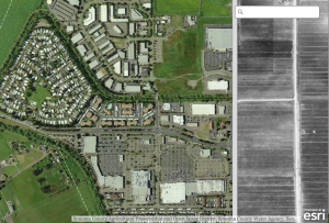
Fire perimeters from https://www.geomac.gov/services.shtml
The Active Fire Perimeters layer is a product of Geospatial Multi-Agency Coordination (GeoMAC). In order to give fire managers near real-time information, fire perimeter data is updated daily based upon input from incident intelligence sources, GPS data, infrared (IR) imagery from fixed wing and satellite platforms.”
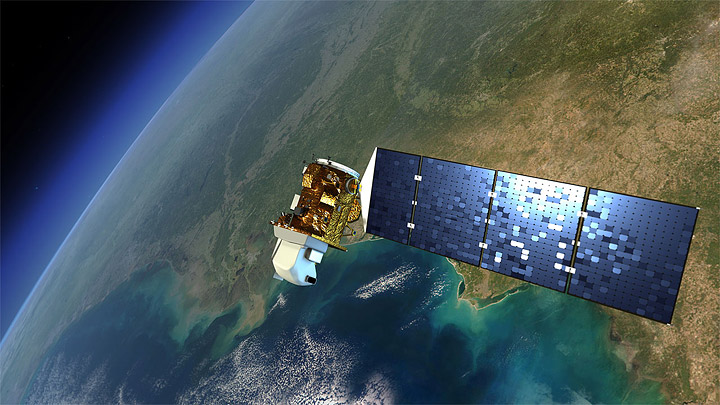
MODIS hot spots from USFS Active Fire Mapping Program. MODIS The MODIS instrument is on board NASA’s Earth Observing System (EOS) Terra (EOS AM) and Aqua (EOS PM) satellites. In addition to lots of other data, MODIS delivers Channel 31 brightness temperature (in Kelvins) of a hotspot/active fire pixel.
For more on how these are made: http://www.arcgis.com/home/item.html?id=b4ce4179b04f47e4ba79e234205565c1
WebGIS sites
Media using maps (super short list)
http://projects.sfchronicle.com/2017/interactive-map-wine-country-fires/
NYTimes: Minutes to Escape: How One California Wildfire Damaged So Much So Quickly. https://www.nytimes.com/interactive/2017/10/21/us/california-fire-damage-map.html?smid=fb-nytimes&smtyp=cur
NYTimes: How California’s Most Destructive Wildfire Spread, Hour by Hour. OCT. 21, 2017. https://www.nytimes.com/interactive/2017/10/21/us/california-fire-damage-map.html?smid=fb-nytimes&smtyp=cur
SFGate focusing on SkyIMD: http://www.sfgate.com/news/article/incredible-aerial-photos-wine-country-fires-12285123.php
Social media
Twitter: #sonomafires, #napafires, #tubbsfire
Flickr: SonomaFires, TubbsFires, NapaFires, etc.
Core Technology for Post-Fire Impact
High resolution imagery collection and analysis
From satellite
Planet has made fire imagery available: https://www.planet.com/pulse/northern-california-wildfire-satellite-data-available-for-access/
Digital Globe + MapBox made a post-fire tool: (Author: @robinkraft
Email: rkraft4@gmail.com, Github repo, Source: Overview News // DigitalGlobe 2017): https://robinkraft.github.io/norcal-fires-imagery/compare.html; https://blog.mapbox.com/santa-rosa-fire-satellite-imagery-a31b6dfefdf8Digital Globe - Open Data Program: https://www.digitalglobe.com/opendata
Sonoma Veg Map Program has a few links to interesting stuff including ArcGIS Server Drone and Digital Globe Imagery: http://sonomavegmap.org/blog/2017/10/17/fires/
From aircraft
I know SkyIMD was flying the entire time:
First Map - Flights 10/11-10/14/17 Here: http://www.skyimd.com/napa-sonoma-fire-imagery-map/
Second Map - Flight 10/20/17 - Here: http://www.skyimd.com/napa-sonoma-fire-imagery-map-2/
From drone:
Greg Crutsinger from @droneScholars (https://www.dronescholars.com/) made this available: Aftermath of #TubbsFire: https://www.mapbox.com/bites/00382/#18/38.4763/-122.74861
Open Aerial Map has one drone image not sure the source https://map.openaerialmap.org/#/-122.7497720718384,38.471986484020334,16/square/023010201213/59e62be93d6412ef7220c4c0?_k=hm0j7l


