GIF & IGIS from space

Made this for fun for the GIF & IGIS from NASA's "abcs from space" site: http://earthobservatory.nasa.gov/Features/ABC/. Was going to do "Kellylab" but ran out of time.

  • G: This image of Pinaki Island was captured by astronauts on the International Space Station in April 2001.
  • I: On February 10, 2007, the Moderate Resolution Imaging Spectroradiometer (MODIS) on NASA’s Terra satellite captured this image of the Andaman Islands. The thin, bright rings surrounding several of the islands are coral reefs that were lifted up by a massive earthquake near Sumatra in 2004.
  • F: The Operational Land Imager (OLI) on Landsat 8 acquired this false-color image of valleys and snow-covered mountain ranges in southeastern Tibet on August 4, 2014. Firn is a granular type of snow often found on the surface of a glacier before it has been compressed into ice.
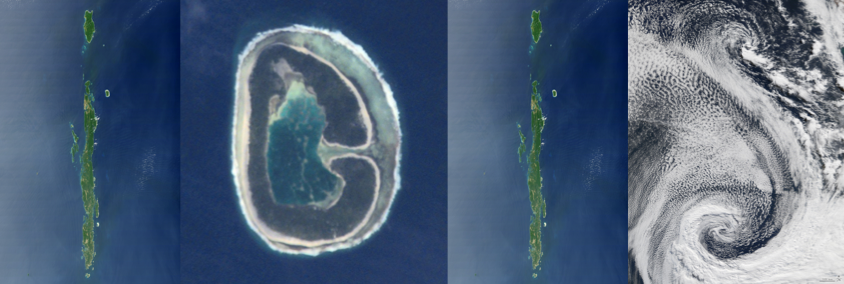
  • I: On February 10, 2007, the Moderate Resolution Imaging Spectroradiometer (MODIS) on NASA’s Terra satellite captured this image of the Andaman Islands. The thin, bright rings surrounding several of the islands are coral reefs that were lifted up by a massive earthquake near Sumatra in 2004.
  • G: This image of Pinaki Island was captured by astronauts on the International Space Station in April 2001.
  • S: On April 29, 2009, the Moderate Resolution Imaging Spectroradiometer (MODIS) on the Terra satellite acquired this image of clouds swirling over the Atlantic Ocean.
Wolf Hall meets GIS: Mapping musings for the holidays

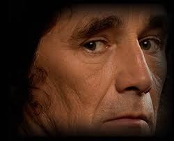
The great Mark Rylance in character of Thomas Cromwell, from the BBC. I realize this is not the real Cromwell, but Rylance is way easier on the eyes.There are so many reasons I keep returning to Hilary Mantel's Wolf Hall. The book to me seems infinitely revealing, I keep hearing new details. I also managed to use a quote from the book's dialogue in a faculty meeting this year, so there. She comments on history, art, science, collaboration, violence, power, love, politics, craft, cooking, and family. And of course, also mapping. Maps are mentioned many times through the book. At the end, Mantel has Thomas Cromwell say:

"But the trouble is, maps are always last year's. England is always remaking herself, her cliffs eroding, her sandbanks drifting, springs bubbling up in dead ground. They regroup themselves while we sleep, the landscapes through which we move..."

Lovely stuff! and a great holiday read (or re-read, or re-listen). It reminds us that mapping is a continual effort, a continuous process. All that we map changes: crops are harvested and fields are replanted, cities evolve, forests burn and re-grow, and people move across the face of the earth leaving traces. Our task is to capture in virtual space the key functional elements of space and time - through maps, through spectral reflectance and lidar, through text and discussions - so that we can find answers to to the key questions facing society today. It can also be very personal effort: mapping is mostly concerned with finding the best way to represent and describe a landscape or process that we love and want to understand better. 

Excerpt From: Mantel, Hilary. Wolf Hall. Henry Holt and Company, 2009. iBooks.

Honorary Geographer Maya Lin

When entertaining out of town visitors in the Bay Area you have a bounty of choices. Many years ago I took visitors to SFMOMA and stumbled into a Maya Lin exhibit. It blew my mind, and I've been a fan ever since. (I've even invited her to give a geolunch talk, but alas it has not happened.) At that time, I had no idea she was the the designer of the Vietnam Veterans Memorial in Washington, D.C., which I found to be a sublime work of reverance. She makes art with strong clear forms that echo the earth. I think what she does resonates with me so much because the idea of spatial representation of geographic form is for me the heart of all we do in science, yet it allows for deep and immediate understanding of place. Whenever I see one of her pieces, I "get" it very quickly, and always feel a little bit happier. Art, what can you say. 

Maya Lin: SF Bay @ Brower CenterShe had a small installation recently in the Brower Center in Berkeley. It was lovely. I can't find it on her website, so you will have to trust this. I include one picture here at left.  It is a representation of the Bay, made in some kind of metal, mounted flush on the wall.  In the same show she had a model of the Sacramento River made from silver stick pins, also mounted on the wall - very fluid and playful with light. I use a slide of her model of the SF Bay shown here as an into into my lectures on modeling (also a shot of the weird and wonderful SF Bay model in Sausalito, more about that anon). 
Her most recent work at the Smithsonian's newly renovated Renwick Gallery uses green marbles to model the Chesapeake Bay. It is a stunning piece, I wish I could be there. I read about the work here.  
Maya Lin: Chesapeake Bay, Smithsonian
Her description of a recent (2008) installation at the California Academy of Sciences in SF "Where the Land Meets the Sea" says: "By using science and technology in her artwork to create new ways of looking at the environment, Maya Lin's work inspires viewers to pay closer attention to the natural world." I think that is true, but it is also true that it is pleasing because it is so apart from the natural world and yet so resonant with it. If that makes any sense. The work is below:
Maya Lin's Where the Land Meets the Sea at Cal Academy in 2008
In that piece (picture above) modeling the shape of the SF Bay, the terrain (or bathymetry) is based on data supplied by the U.S. Geological Survey, among others, and represents a 1:700 scale with a vertical exaggeration of 5 times above sea level and 10 times below. Sea level is 18 feet above the terrace.
Looking forward to seeing more of her work, in person if possible. 


The mapping process: musings at the end of 2014

Here are some evocative words about mapping from an unlikely source: in her astounding and engrossing book Wolf Hall, Hilary Mantel has Thomas Cromwell say:

But the trouble is, maps are always last year's. England is always remaking herself, her cliffs eroding, her sandbanks drifting, springs bubbling up in dead ground. They regroup themselves while we sleep, the landscapes through which we move..."

Lovely stuff! and a great holiday read (or re-read, or re-listen). It reminds us that mapping is a continual effort, a continuous process. All that we map changes: crops are harvested and fields are replanted, cities evolve, forests burn and re-grow, and people move across the face of the earth leaving traces. Our task is to capture in virtual space the key functional elements of space and time - through maps, through spectral reflectance and lidar, through text and discussions - so that we can find answers to to the key questions facing society today.

Excerpt From: Mantel, Hilary. Wolf Hall. Henry Holt and Company, 2009. iBooks.

The art of remote sensing: Van Gogh in Space via Landsat

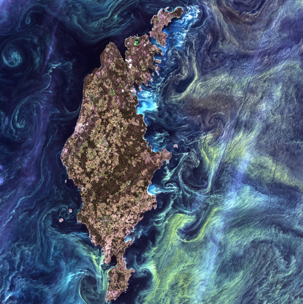
This image is making the rounds on social media, and it is a beaut. The Landsat program calls this one "Van Gogh from Space" - It was imaged July 13th, 2005. 

In the style of Van Gogh's painting "Starry Night," massive congregations of greenish phytoplankton swirl in the dark water around Gotland, a Swedish island in the Baltic Sea.In a recent paper by Michael Wulder and others discuss the tremendous benefits of the Landsat program on numerous scientific disciplines, and the overwhelming benefits to science of open access to the Landsat archive.

"Landsat occupies a unique position in the constellation of civilian earth observation satellites, with a long and rich scientific and applications heritage. With nearly 40 years of continuous observation – since launch of the first satellite in 1972 – the Landsat program has benefited from insightful technical specification, robust engineering, and the necessary infrastructure for data archive and dissemination. Chiefly, the spatial and spectral resolutions have proven of broad utility and have remained largely stable over the life of the program. The foresighted acquisition and maintenance of a global image archive has proven to be of unmatched value, providing a window into the past and fueling the monitoring and modeling of global land cover and ecological change."

Reference: Wulder, M.A.; Masek, J.G.; Cohen, W.B.; Loveland, T.R.; Woodcock, C.E. Opening the archive: How free data has enabled the science and monitoring promise of Landsat. Remote Sensing of Environment 2012,122, 2-10

A great week for radio

What a great week for radio and matters geospatial+web. On Wednesday last week we finished out our GIS class with a talk about the geoweb and issues of access, bias, motivation, control, and of course privacy. I used alot of William Gibson's previous writings about Google (posted here earlier) in that lecture. Yesterday TTBOOK re-aired a great interview with Gibson, on the topic of writing, but also about the internet. I recommend it. Additionally, last week Talk of the Nation had a interesting interview with Jerry Brotton about his new book "A History of the World in Twelve Maps"; the interview touched on Google Earth and representation, why north is up, and many other fantastic questions raised through the history of cartography. Check them out!

Aerial photography highlighted on new US Forever Stamps

Check out some of the gorgeous imagery that will be featured on a new series of US stamps. NASA imagery is highlighted, and the South Bay Salt ponds are featured on one stamp (see below). From the US Postal Service:

"Depicting America’s diverse landscapes on photos taken from ultra lights to satellites, the Earthscapes stamps provide a view of the nation’s diverse landscapes in a whole new way — from heights ranging from several hundred feet above the earth to several hundred miles in space.

south bay salt pondsThe stamps provide an opportunity to see the world in a new way by presenting examples of three categories of earthscapes: natural, agricultural, and urban. The photographs were all taken high above the planet’s surface, either snapped by satellites orbiting the Earth or carefully composed by photographers in aircraft. Howard E. Paine of Delaplane, VA, was the art director."


New blue marble: history of its development on video

Recently, NASA released a new Blue Marble graphic, from sensors aboard TERRA. The Talk of the Nation Science Friday video of the week tells the story of these NASA's Blue Marble maps.  From the Apollo 8 crew's image from 1968, to the Apollo 17 mission of 1972, through the Voyager image, through modern remote sensing techniques, to 2002's original Blue Marble image (now used as the default background on the iphone), to this new release. They highlight the work of Rob Simmon and Gene Feldman, who discuss the composition of the product, highlighting the art that goes into the scientific product. Very cool! More discussion here.

The structure of a city via Twitter

From Mashable Tech.

Check out this gorgeous visualization of NY City's tweetopolis from Oakland-based programmer Eric Fischer.

He plots out the motion of New Yorkers using public tweets on Twitter with geotags from May 2011 until January.

The project lays out around 10,000 geotagged tweets and 30,000 point-to-point trips in cities like New York City to plot the flow of people in terms of favored paths. In his map of NYC, seen above, there is a huge ink blot lining Broadway; as we’ve long suspected, it looks like the busy avenue is the backbone of the city.

Using a base map from OpenStreetMap, he drew out transit paths using Tweets. Movements are indicated on the geolocation of a Tweet, with an individual’s start point marked with one geotagged Tweet and ending with the next geotagged Tweet. This is what creates a mass of traffic routes.

Similar viz of the east bay“If you just draw lines from the beginning to the ending of each trip, you get a big mess, so the challenge is to come up with more plausible routes in between,” Fischer told Mashable. “That is where the 10,000 individual geotags come in, the most plausible routes are ones that pass closely through places that other people have been known to go.”

Fischer used Dijkstra’s Algorithm to calculate what exactly to map out. For those of who haven’t thought about math since high school algebra, that’s an equation that maps out the shortest path between two points on a graph. For this project, the equation pointed to the relevant paths to map out a city’s most dense corridors.

This might be of use for our mobility project with our space.

More here.

Artisan basemap sandwich - a great name for a band, and a new basemap from ESRI

An example from southern caliEver admired those lovely muted gray maps from NYTimes and elsewhere that are in vogue now? Subtle, calming, with great figure to ground contrast? Canvases on which your data can pop? I know I have. Now ESRI cartographers add these options to their basemap collection. Read more about it in these posts:

Esri Canvas Maps Part I: Author Beautiful Web Maps With Our New Artisan Basemap Sandwich, and Esri Canvas Maps Part II: Using the Light Gray Canvas Map effectively.

From Greeninfo Network.

The future is already here – it's just not evenly distributed. Or maybe it is.

William Gibson (yes that one) in the NYTimes Opinion page, writes about Google, and the way it has changed how we interact with information and the world. It is a really interesting article touching on human choice, surveillance, and the catch-up game the law plays with technology. This visionary author of Neuromancer says "Science fiction never imagined Google..." and goes on to describe its omipresence, our ready participation in this process, and our discomfort at the result. He is a fantastic writer. Check it:

Google is not ours. Which feels confusing, because we are its unpaid content-providers, in one way or another. We generate product for Google, our every search a minuscule contribution. Google is made of us, a sort of coral reef of human minds and their products.

Wow. Here is another example of his engaging and illuminating prose:

Jeremy Bentham’s Panopticon* prison design is a perennial metaphor in discussions of digital surveillance and data mining, but it doesn’t really suit an entity like Google. Bentham’s all-seeing eye looks down from a central viewpoint, the gaze of a Victorian warder. In Google, we are at once the surveilled and the individual retinal cells of the surveillant, however many millions of us, constantly if unconsciously participatory. We are part of a post-geographical, post-national super-state, one that handily says no to China. Or yes, depending on profit considerations and strategy.

The title of this post comes from his oft-cited quote in 2003 in The Economist.

*About the Panopticon from wikipedia: The Panopticon is a type of prison building designed by English philosopher and social theorist Jeremy Bentham in 1785. The concept of the design is to allow an observer to observe (-opticon) all (pan-) prisoners without the incarcerated being able to tell whether they are being watched, thereby conveying what one architect has called the "sentiment of an invisible omniscience."

Welcome to Fall 2010 with this stunner of a pic from NASA

Mataiva Atoll, Tuamotu Archipelago, South Pacific OceanFrom the NASA Earth Observatory Image of the Day: The Tuamotu Archipelago is part of French Polynesia, and forms the largest chain of atolls in the world. This astronaut photograph features Mataiva Atoll, the westernmost atoll of the Tuamotu chain. Mataiva Atoll is notable in that its central lagoon includes a network of ridges (white, image center) and small basins formed from eroded coral reefs. Mataiva means “nine eyes” in Tuamotuan, an allusion to nine narrow channels on the south-central portion of the island. The atoll is sparsely populated, with only a single village—Pahua—located on either side of the only pass providing constant connection between the shallow (light blue) water of the lagoon and the deeper (dark blue) adjacent Pacific Ocean. Much of the 10-kilometer- (6-mile-) long atoll is covered with forest (greenish brown). Vanilla and copra (dried coconut) are major exports from the atoll, but tourism is becoming a larger part of the economy.

This is not a satellite image, but a photograph taken by the Expedition 24 crew from the International Space Station (I think) on August 13, 2010, with a Nikon D2Xs digital camera using a 400 mm lens. More here.


If San Francisco Crime were Elevation

From Doug McCune's blog, the motto of which is: "I was Web 2.0 before your grandma was Web 2.0" which is kinda cute, gotta admit. Not that my grandma was ever anything close to that, she was a great baker though.

Anyway - he says: "I’ve been playing with different ways of representing data and I decided to venture into 3D representations. I’ve used a full year of crime data for San Francisco from 2009 to create these maps. The full dataset can be download from the city’s DataSF website." These are really rad and interesting.

He's chosen a solar illumination from the east, as it would be during sunrise.

He has a disclaimer: "These maps were generated from real data, but please don’t take them as being accurate. The data was aggregated geographically and artistically rendered. This is meant more as an art piece than an informative visualization." which is valid, but these are still really nice.


Happy Holidays 2009! Map-related gift ideas for the economic recovery

Just in time for the holidays: a round-up of cool map-themed gifts and chotchkies for the house... when the economy recovers.

First, the incomperably beautiful (and justifiably pricey) map butterflies from image surgery. These ethereal beauties would look great on any wall. Check out this specimen at left.

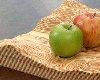
A more solid but no less beautiful option is the customizable fruit bowl (or brooch, or table, or clock - is there no end to their creativity?) from FluidForm. You can pick your area from a google maps interface (multilple scales supported!), and they will create a one-of-a-kind 3-D bowl using computer-controlled router dealie. Just don't pick an island or your fruit will roll away.  Very cool. 

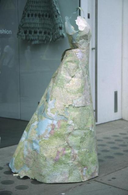
While technically not for sale, we can't omit the proliferation of wildly inventive and gorgeous examples of map art (some displayed here at inventorspot.com - look at this carto-fabulous ball gown!). 

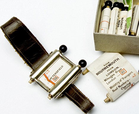
And finally... If only this beaute was available: the 1920s-era proto-gps watch, complete with tiny scrollable paper maps printed on individual canisters of rolled paper. Look at those little tiny road maps. From Portable Content.

Leah Evans' Textiles: Maps as Quilts

Leah Evans makes these hand-sewn quilts that channel cartographic themes. Just like us, her current work combines aerial photography, maps, and satellite imagery. But unlike us, she uses appliqué, reverse appliqué, piecing, natural and synthetic dyeing, needle-felting, hand printing, and a variety of embroidery stitches. Intriguingly, she says it is the use of maps in organizing our ideas of land that interests her most of all. The maps themselves “are not consciously based on specific places,” she writes. “For me they are intimate explorations of map language and imagined landscapes.”