Barbara Laraia talks about links between stress, food and obesity

Our colleague Barbara Laraia was recently interviewed by PBS newshour on her work linking stress and obesity in children. Barbara is the lead on our OurSpace project, in which Sam and Paulina and others are examining the interaction between food availability, walkability and health outcomes.

A very interesting interview: http://www.pbs.org/newshour/rundown/2014/01/why-stress-and-money-woes-may-lead-to-weight-gain.html

New study on diabetes risk and neighborhood walkability

The reading for this week's GIS class on vector analysis discussed network buffer measures of neighborhood walkability, and the class came up with numerous components of the built and social environment that the authors didn't include in their land-use based walkability measure that also likely influence people's walking behaviors (e.g. destinations to walk to, crime/safety, trees and greenness, sidewealk quality and ramps, traffic, disincentives from parking costs, etc.). It was a great discussion! I just came acrosos this write-up about a recent article in the journal Diabetes Care that finds a strong relationship between neighborhood walkability and diabetes risk, especially for low-income immigrants. The UC Library doesn't have online access to the most recent one month of articles for this journal, so I haven't been able to look at the full methodolgy for their walkabilty measure. But, I wanted to note it here and will follow-up later with details. Or, if anyone finds access to the full article, please let me know!


Philadelphia food desert eradication project

Here is a recent article from the Washington Post examining Philadelphia's Get Healthy Philly initiative. $900,000 from the project is going to be spent on turning 632 corner stores in the city into green grocers. The effort helps these corner stores buy and supply fresh fruits and vegetables and buy the infrastructure needed to store them, such as refrigerators.

This effort goes in hand with a new study in the city that will examine what happens when more nutritious foods are introduced into traditionally underserved neighborhoods. Measuring what people bought before, what they’re eating now, and how health outcomes change. The article also explores other research on food deserts, access to healthy foods, and health outcomes with lessons learned.

For the full article click here.

The structure of a city via Twitter

From Mashable Tech.

Check out this gorgeous visualization of NY City's tweetopolis from Oakland-based programmer Eric Fischer.

He plots out the motion of New Yorkers using public tweets on Twitter with geotags from May 2011 until January.

The project lays out around 10,000 geotagged tweets and 30,000 point-to-point trips in cities like New York City to plot the flow of people in terms of favored paths. In his map of NYC, seen above, there is a huge ink blot lining Broadway; as we’ve long suspected, it looks like the busy avenue is the backbone of the city.

Using a base map from OpenStreetMap, he drew out transit paths using Tweets. Movements are indicated on the geolocation of a Tweet, with an individual’s start point marked with one geotagged Tweet and ending with the next geotagged Tweet. This is what creates a mass of traffic routes.

Similar viz of the east bay“If you just draw lines from the beginning to the ending of each trip, you get a big mess, so the challenge is to come up with more plausible routes in between,” Fischer told Mashable. “That is where the 10,000 individual geotags come in, the most plausible routes are ones that pass closely through places that other people have been known to go.”

Fischer used Dijkstra’s Algorithm to calculate what exactly to map out. For those of who haven’t thought about math since high school algebra, that’s an equation that maps out the shortest path between two points on a graph. For this project, the equation pointed to the relevant paths to map out a city’s most dense corridors.

This might be of use for our mobility project with our space.

More here.

The City Project: Park Poor, Income Poor, and People of Color

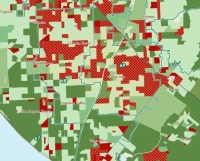
example from orange countyThe City Project has released a report for California analyzing access to green space.  The report uses geographic, demographic, economic and historical data to map and analyze access to the region's green space. In addition, the report examines access to green space based on income, race or ethnicity.
The report's GIS maps were produced by GreenInfo Network and help illustrate unfair disparities in park access.

The areas that are symbolized with red and crosshatching indicate areas that are park poor (less than 3 acres of parks per 1,000 residents) and income poor (below $47,331 median household income), and disproportionately populated by people of color.

ESRI Food Desert Mapping

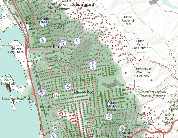
Also from Greeninfo Network. Team ESRI, publisher of ArcGIS software, has rolled out “The Food Desert Finder” a terrific interactive map which shows where there are gaps in access to supermarkets.  If access to nutritious food is limited or made difficult by factors such as cost or the distance traveled to obtain it, peoples’ health suffers – these areas that lack relatively easy access to nutritious, affordable food as popularly known as “food deserts.”  The ESRI Food Desert Finder is a searchable map that shows populations in poverty who live beyond a one mile walk to a supermarket and who lack other access to healthy fresh foods.

Berkeley/Kensington area, CAHere is a snap from the Berkeley/Kensington area. Obviously, something more than just walking distance to supermarkets is critical, as the Kensigton area (showing all the red dots - indicating people without easy access to grocery stores) is not known as an underserved community. Still a very nice tool, and one which will be used by our OurSpace project.


National Map of Food Deserts

I live in a Low Access Area! According to a new food desert webGIS, my neighobrhood around 58th & Shattuck doesn't have access to a full-service grocery store, has low car ownership, and low median household income. I have never considered my self to live in a food dessert because I go to Berkeley Bowl at least once a week on my bike ride home from campus, but according to these combined metrics I am more underserved by full-service food stores than most other neighborhoods. I think this is a really neat tool to start a broader conversation about how to measure and evaluate food access and what it means for individual and community health.

As Grist writes...."The point of the project isn't just to map food deserts, it's to help TRF and other investors, as well as policymakers, calculate how much money is "leaking" from an area (being spent elsewhere), so as to evaluate whether a loan for a new supermarket is a good idea -- financially, presumably. As Stephanie covered in her piece, food-justice advocates disagree on whether small, independently owned but somewhat limited food stores are the answer, or chain stores such as a Safeway or Walmart.

Alas, the tool does not include data for health care expenditures or obesity rates in these areas, which would be interesting comparisons to see."


GIS article database

I just came across a helpful bibliography of GIS literature created and maintained by ESRI. It indexes journals, conference proceedings, books, and reports fro the origins of GIS to the present. There are currently 78,400 entries. You can't download all articles directly from the site, but the keyword search is really helpful to get a list of articles on a particular topic that would be good to look into.

Democratizing Data

The Federal CIO Coucil has just launched Data.gov, a site that brings all federal data into one searchable place. You can directly download xml, csv, kml/kmz, and shp files and find links to tools for finding other data.

Here are some more details from the White House press release:

"Created as part of the President's commitment to open government and democratizing information, Data.gov will open up the workings of government by making economic, healthcare, environmental, and other government information available on a single website, allowing the public to access raw data and transform it in innovative ways.

Such data are currently fragmented across multiple sites and formats—making them hard to use and even harder to access in the first place. Data.gov will change this, by creating a one-stop shop for free access to data generated across all federal agencies. The Data.gov catalog will allow the American people to find, use, and repackage data held and generated by the government, which we hope will result in citizen feedback and new ideas.

Data.gov will also help government agencies—so that taxpayer dollars get spent more wisely and efficiently. Through live data feeds, agencies will have the ability to easily access data both internally and externally from other agencies, which will allow them to maintain higher levels of performance. In the months and years ahead, our goal is to continuously improve and update Data.gov with a wide variety of available datasets and easy-to-use tools based on public feedback and as we modernize legacy systems over time.

Democratizing government data will help change how government operates—and give citizens the ability to participate in making government services more effective, accessible, and transparent."


Measuring Your Food Environment

This site is related to the work Ellen and I are working on with Barbara Laraia and Irene Yen at UCSF. We are mapping the food environment for a study collaborating with Kaiser examining obesity and diabetes rates.  This is a new-ish field, with lots of new and exciting methods being developed to map access to "good" and "bad" food.  The National Cancer Institute has developed a site that collects many of these approaches.

FANTASTIC Bay Area spatial data

  If you love detailed spatial data and/or the bay area, I HIGHLY recommend downloading and exploring the readily available Upland Goals Project Data . Ryan Branciforte introduced  it to us last week during his enlightening geolunch presentation about his work with the Bay Area Open Space Council. There is a wealth of data for all interests, including vegetation, animals, environmental features, weather patterns, fire risk, and even camp sites if you want to plan a trip to go look at all the data on the ground.

Access private data at the UC Berkeley Census Research Data Center

Kevin and I went to a talk this week and found out about a very under-utilized resource on campus, the Research Data Center (RDC). It is one of only 9 RDCs in the U.S., and it is the only location where you can access non-public demographic, health, and economic data that contain detailed information on geographic location and/or other characteristics about firms or households. For an overview of all the confidential data you can seek access to,  look over the CRDC's data page, and specific details about each can be found at the Center for Economic Studies Data Page. The application process is described as "rigorous and lengthy", but the people at the center seem very friendly and eager to help more researchers use their data. For a list of other data resources on campus, check out the UC Data resources page.

Global disease alert map

healthmap.JPG Here is yet another exciting use of the GoolgeMaps API.... HealthMap aggregates outbreak data by disease from numerous sources (news, personal accounts, and official alerts) and displays them by location in real-time. It's a collaborative project brought together by the Harvard-MIT Division of Health Sciences and Technology. If you're not a germaphobe now, you may become one after taking a look at the map; be sure to check it out before your next international trip or even if you stay around here. For example, did you know that the West Nile Virus has infected 78 people in California this year? Even closer to home, there was a TB scare at Kaiser in SF last week.

Oakland Crimespotting Folks Talking Today

Oakland CrimespottingThe folks behind the excellent Oakland Crimespotting are giving a talk today at the iSchool. If you haven't seen the site, it shows crime data from Oakland on a map, with different icons for different types of crime, and allowing you to browse through time using a sliding, expandable window over a bar graph. Pretty sweet use of Flash. Here's the talk info:

Design Futures lecture series sponsored by the Berkeley Center for New Media and the UC Berkeley School of Information TODAY Thursday March 20 5:15-6:30pm 110 South Hall UC Berkeley Mike Migurski and Tom Carden, Stamen Design Visual Urban Data: A Journey Through Oakland Crimespotting A talk about the political, social and technical hiccoughs encountered since the inception of Stamen Design’s Oakland Crimespotting project just over a year ago. The talk will cover the inspirations and influences of the project, and how it relates to Stamen’s recent work in web-based information visualization and mapping. About Stamen Since 2001, Stamen has developed a reputation for beautiful and technologically sophisticated projects in a diverse range of commercial and cultural settings. They work and play with a surprising and growing range of collaborators: news media, financial institutions, artists and architects, car manufacturers, design agencies, museums, technology firms, political action committes, and universities.

Berkeley/Penn Urban and Environmental Modeler’s Datakit


Looking for GIS data for the U.S.? The Berkeley/Penn Urban and Environmental Modeler's Datakit has just been released. The site contains more than 150 downloadable ArcMap-ready shapefiles and raster datasets for the 48 contiguous United States.

The data were produced at the Institute of Urban and Regional Development (IURD) at the University of California, Berkeley and the Penn Institute of Urban Research (Penn IUR) at the University of Pennsylvania, in cooperation with Penn's Cartographic Modeling Lab (CML).

The data is free, and all interested urban and environmental planners, analysts, modelers and enthusiasts are encouraged to utilize the site to further narrow traditional disciplinary gaps between urban and environmental planning researchers/practitioners. It claims to be the first site to bring together spatially comprehensive and comparable urban and environmental GIS data.

Users who uncover problems (other than the fact that "Modeler" is mis-spelled on the title banner) or might wish to add their own national data to the website should e-mail John Landis at jlan@design.upenn.edu.