 Photo of Chicago from Frank Kehren, Flickr Creative Commons LicenseI focused on a series of CyberGIS sessions at AAG this year. This was partly to better situate our spatial data science ideas within the terminology and discipline of Geography, and partly to focus on a new topic for me in AAG conferences. There were a number of organized sessions over three days, including a plenary by Timothy Nyerges from UW. Talks ranged in topic: online collaboration, participatory analytics, open tool development such as python-based tools for parallelization of GIS operations, case studies of large area computation, introduction to languages that might be less familiar to geographers (e.g., Julia, R).
There was a session that focused on education in which ideas about challenging in teaching “cyberGIS” to undergraduate students, among other things. Additionally, Tim Nyerges gave the CyberGIS plenary: "Computing Complex Sustainable Systems Resilience" in which he made the case that CyberGIS is a framework for studying socio-economic systems, resilience, and system feedbacks.
About the term Cyber. I am not alone in my dislike of the term "CyberGIS" (Matrix 4, anyone?), but it seems to have stuck here at AAG. In many of the talks “cyber” meant “bigger". There were mentions of the “cyber thing”, which I took to be a placeholder for cluster computing. However, there are many other terms that are being used by the speakers. For example, I saw talks that focused on participatory, structured, analytic-deliberation from UW, or high performance geocomputation from ORNL; the latter term I think better captures what earth system science people might recognize. Many talks used as their entry point to Cyber the proliferation of data that characterizes modern geography and life.
These sessions were organized through an NSF-funded center: The CyberGIS Center for Advanced Digital and Spatial Studies http://cybergis.illinois.edu/. Their formal definition of CyberGIS is: “geographic information science and systems (GIS) based on advanced infrastructure of computing, information, and communication technologies (aka cyberinfrastructure)". They say it "has emerged over the past several years as a vibrant interdisciplinary field and played essential roles in enabling computing-, data- and collaboration-intensive geospatial research and education across a number of domains with significant societal impact."
And of course, we had excellent talks by the Kellys: Kelly presented on our VTM work: "Quantifying diversity and conservation status of California's Oak trees using the historic Vegetation Type Mapping (VTM) dataset” as part of an organized Historical Ecology session. Alice presented her paper: "Policing Paradise: The Evolution of Law Enforcement in US National Parks" as part of the session on Green Violence 2: Interrogating New Conflicts over Nature and Conservation.
Goodbye Chicago! You provided a wonderful venue, despite the cold!
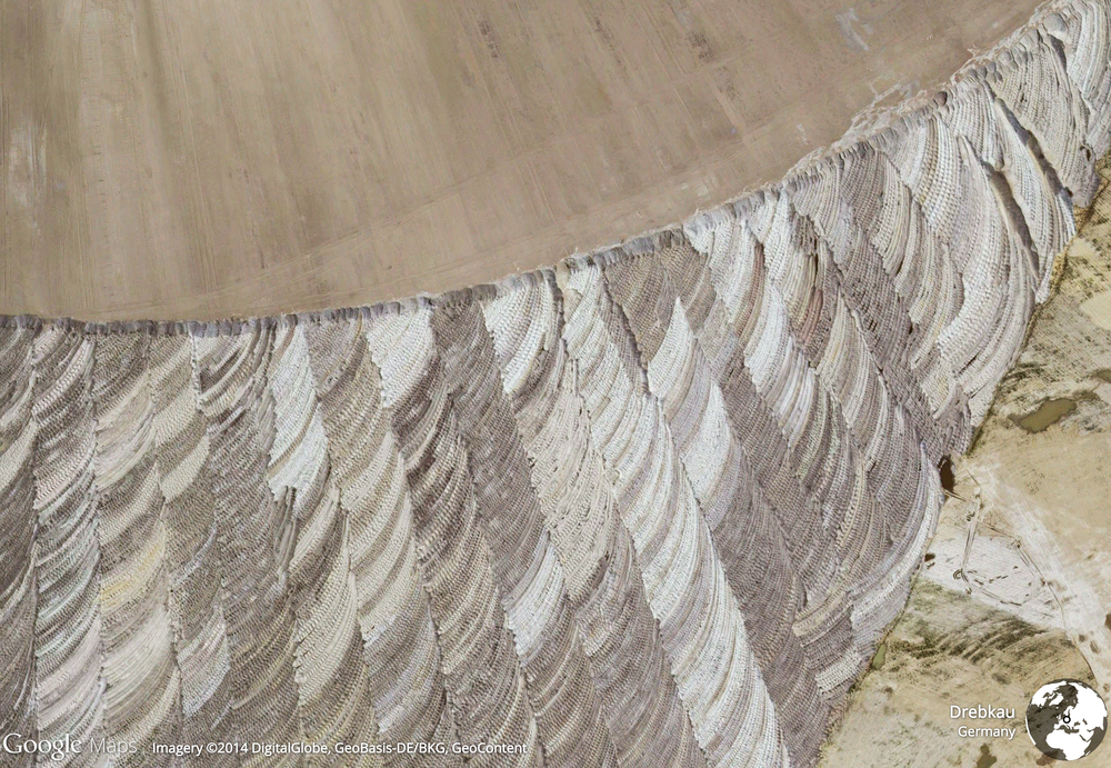
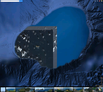 This is the island of Nihoa, northwest of Kauai, viewed in Google Maps. Hawaii on my mind. Anyway, it is a funny shot with mixed resolutions, bathymetry and optical imagery, and what looks to be a bordered image without its adjacent partner images. Web link: https://www.google.com/maps/@23.0606579,-161.8639537,39656m/data=!3m1!1e3
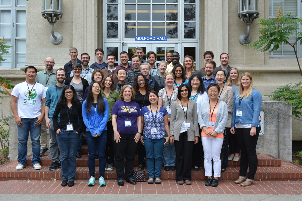


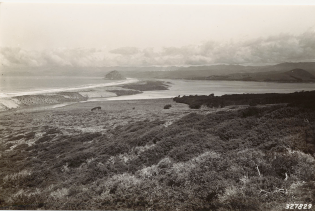
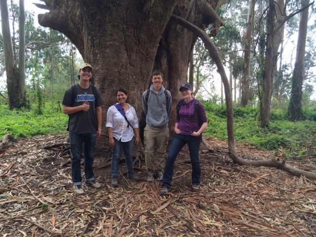 Kelly Lab SPUR Students Drew Adamski and Ryan Avery have been participating in lab research all semester. In particular they have been helping classify trails within the Pacific West's National Parks. This month we were lucky enough to travel out with them to Point Reyes National Seashore to see some of those trails in person. We were also lucky enough to spend the day with Chief Ranger Schifsky who was kind enough to talk to us about what issues different trails in the park were facing and which trails seemed to be changing most rapidly. Chief Schifsky was also kind enough to show us some of the points in the park where the landscape had changed dramatically over time due to fire, restoration projects, or differing management strategies. Overall it was a really inspiring and informative trip!