Mapping COVID19: a technology overview

Hello everyone, I hope you are all healthy, safe, sane, and if possible, being productive.

Here I provide a summary of some of the mapping technology that has been used in the past few weeks to understand the COVID-19 pandemic. This is not exhaustive! I pick three areas that I am personally focusing on currently: map-based data dashboards, disease projections, and social distancing scorecards. I look at where the data comes from and how the sites are built. More will come on the use of remote sensing and earth observation data in support of COVID-19 monitoring, response or recovery, and some of the cool genome evolution and pandemic spread mapping work going on.

COVID-19 map-based data dashboards. You have seen these: lovely dashboards displaying interactive maps, charts, and graphs that are updated daily. They tell an important story well. They usually have multiple panels, with the map being the center of attention, and then additional panels of data in graph or tabular form. There are many many data dashboards out there. My two favorites are the Johns Hopkins site, and the NYTimes coronavirus outbreak hub.

Where do these sites get their data?

  • Most of these sites are using data from similar sources. They use data on number of cases, deaths, and recoveries per day. Most sites credit WHO, US CDC (Centers for Disease Control and Prevention), ECDC (European Centre for Disease Prevention and Control), Chinese Center for Disease Control and Prevention (CCDC), and other sources. Finding the data is not always straightforward. An interesting article came out in the NYTimes about their mapping efforts in California, and why the state is such a challenging case. They describe how “each county reports data a little differently. Some sites offer detailed data dashboards, such as Santa Clara and Sonoma counties. Other county health departments, like Kern County, put those data in images or PDF pages, which can be harder to extract data from, and some counties publish data in tabular form”. Alameda County, where I live, reports positive cases and deaths each day, but they exclude the city of Berkeley (where I live), so the NYTimes team has to scrape the county and city reports and then combine the data.

  • Some of the sites turn around and release their curated data to us to use. JH does this (GitHub), as does NYTimes (article, GitHub). This is pretty important. Both of these data sources (JH & NYTimes) have led to dozens more innovative uses. See the Social Distancing Scorecard discussed below, and these follow-ons from the NYTimes data: https://chartingcovid.com/, and https://covid19usmap.com/.

  • However… all these dashboards are starting with simple data: number of patients, number of deaths, and sometimes number recovered. Some dashboards use these initial numbers to calculate additional figures such as new cases, growth factor, and doubling time, for example. All of these data are summarized by some spatial aggregation to make them non-identifiable, and more easily visualized. In the US, the spatial aggregation is usually by county.

How do these sites create data dashboards?

  • The summarized data by county or country can be visualized in mapped form on a website via web services. These bits of code allow users to use and display data from different sources in mapped form without having to download, host, or process them. In short, any data with a geographic location can be linked to an existing web basemap and published to a website; charts and tables are also done this way. The technology has undergone a revolution in the last five years, making this very doable. Many of the dashboards out there use ESRI technology to do this. They use ArcGIS Online, which is a powerful web stack that quite easily creates mapping and charting dashboards. The Johns Hopkins site uses ArcGIS Online, the WHO does too. There are over 250 sites in the US alone that use ArcGIS Online for mapping data related to COVID-19. Other sites use open source or other software to do the same thing. The NYTimes uses an open source mapping platform called MapBox to create their custom maps. Tools like MapBox allow you to pull data from different sources, add those data by location to an online map, and customize the design to make it beautiful and informative. The NYTimes cartography is really lovely and clean, for example.

An open access peer reviewed paper just came out that describes some of these sites, and the methods behind them. Kamel Boulos and Geraghty, 2020.

COVID-19 disease projections. There are also sites that provide projections of peak cases and capacity for things like hospital beds. These are really important as they can help hospitals and health systems prepare for the surge of COVID-19 patients over the coming weeks. Here is my favorite one (I found this via Bob Watcher, @Bob_Wachter, Chair of the UCSF Dept of Medicine):

  • Institute for Health Metrics and Evaluation (IHME) provides a very good visualization of their statistical model forecasting COVID-19 patients and hospital utilization against capacity by state for the US over the next 4 months. The model looks at the timing of new COVID-19 patients in comparison to local hospital capacity (regular beds, ICU beds, ventilators). The model helps us to see if we are “flattening the curve” and how far off we are from the peak in cases. I’ve found this very informative and somewhat reassuring, at least for California. According to the site, we are doing a good job in California of flattening the curve, and our peak (projected to be on April 14), should still be small enough so that we have enough beds and ventilators. Still, some are saying this model is overly optimistic. And of course keep washing those hands and staying home.

Where does this site get its data?

  • The IHME team state that their data come from local and national governments, hospital networks like the University of Washington, the American Hospital Association, the World Health Organization, and a range of other sources.

How does the model work?

  • The IHME team used a statistical model that works directly with the existing death rate data. The model uses the empirically observed COVID-19 population and calculates forecasts for population death rates (with uncertainty) for deaths and for health service resource needs and compare these to available resources in the US. Their pre-print explaining the method is here.

On a related note, ESRI posted a nice webinar with Lauren Bennet (spatial stats guru and all-around-amazing person) showing how the COVID-19 Hospital Impact Model for Epidemics (CHIME) model has been integrated into ArcGIS Pro. The CHIME model is from Penn Medicine’s Predictive Healthcare Team and it takes a different approach than the IHME model above. CHIME is a SIR (susceptible-infected-recovery) model. A SIR model is an epidemiological model that estimates the probability of an individual moving from a susceptible state to an infected state, and from an infected state to a recovered state or death within a closed population. Specifically, the CHIME model provides estimates of how many people will need to be hospitalized, and of that number how many will need ICU beds and ventilators. It also factors social distancing policies and how they might impact disease spread. The incorporation of this within ArcGIS Pro looks very useful, as you can examine results in mapped form, and change how variables (such as social distancing) might change outcomes. Lauren’s blog post about this and her webinar are useful resources.

Social distancing scorecards. This site from Unicast got a lot of press recently when it published a scoreboard for how well we are social distancing under pandemic rules. It garnered a lot of press because it tells and important story well, but also, because it uses our mobile phone data (more on that later). In their initial model, social distancing = decrease in distance traveled; as in, if you are still moving around as you were before the pandemic, then you are not socially distancing. There are some problems with this assumption of course. As I look out on my street now, I see people walking, most with masks, and no one within 10 feet of another. Social distancing in action. These issues were considered, and they updated their scorecard method. Now, in addition to a reduction in distance traveled, they also include a second metric to the social distancing scoring: reduction in visits to non-essential venues. Since I last blogged about this site nearly two weeks ago, California’s score went from an A- to a C. Alameda County, where I live, went from an A to a B-. They do point out that drops in scores might be a result of their new method, so pay attention to the score and the graph. And stay tuned! Their next metric is going to be the change rate for the number of person-to-person encounters for a given area. Wow.

Where do these sites get their data?

  • The data on reported cases of COVID-19 is sourced from the Corona Data Scraper (for county-level data prior to March 22) and the Johns Hopkins Github Repository (for county-level data beginning March 22 and all state-level data).

  • The location data is gathered from mobile devices using GPS, Bluetooth, and Wi-Fi connections. They use mobile app developers and publishers, data aggregation services, and providers of location-supporting technologies. They are very clear on their privacy policy, and they do say they are open to sharing data via dataforgood@unacast.com. No doubt, this kind of use of our collective mobile device location data is a game-changer and will be debated when the pandemic is over.

How does Unicast create the dashboard?

  • They do something similar to the dashboard sites discussed above. They pull all the location data together from a range of sites, develop their specific metrics on movement, aggregate by county, and visualized on the web using custom web design. They use their own custom basemaps and design, keeping their cartography clean. I haven’t dug into the methods in depth yet, but I will.

Please let me know about other mapping resources out there. Stay safe and healthy. Wash those hands, stay home as much as possible, and be compassionate with your community.

Mapping fires and fire damage in real time: available geospatial tools

Many of us have watched in horror and sadness over the previous week as fires consumed much of the beautiful hills and parts of the towns of Napa and Sonoma Counties. Many of us know people who were evacuated with a few minutes’ notice - I met a retired man who left his retirement home with the clothes on his back. Many other friends lost everything - house, car, pets. It was a terrible event - or series of events as there were many active fires. During those 8+ days all of us were glued to our screens searching for up-to-date and reliable information on where the fires were, and how they were spreading. This information came from reputable, reliable sources (such as NASA, or the USFS), from affected residents (from Twitter and other social media), and from businesses (like Planet, ESRI, and Digital Globe who were sometimes creating content and sometimes distilling existing content), and from the media (who were ofen using all of the above). As a spatial data scientist, I am always thinking about mapping, and the ways in which geospatial data and analysis plays an increasingly critical role in disaster notification, monitoring, and response. I am collecting information on the technological landscape of the various websites, media and social media, map products, data and imagery that played a role in announcing and monitoring the #TubbsFire, #SonomaFires and #NapaFires. I think a retrospective of how these tools, and in particular how the citizen science aspect of all of this, helped and hindered society will be useful.  

In the literature, the theoretical questions surrounding citizen science or volunteered geography revolve around:

  • Accuracy – how accurate are these data? How do we evaluate them?  

  • Access – Who has access to the data? Are their technological limits to dissemination?

  • Bias (sampling issues)/Motivation (who contributes) are critical.

  • Effectiveness – how effective are the sites? Some scholars have argued that VGI can be inhibiting. 

  • Control - who controls the data, and how and why?

  • Privacy - Are privacy concerns lessened post disaster?

I think I am most interested in the accuracy and effectiveness questions, but all of them are important.  If any of you want to talk more about this or have more resources to discuss, please email me: maggi@berkeley.edu, or Twitter @nmaggikelly.

Summary so far. This will be updated as I get more information.

Outreach from ANR About Fires

Core Geospatial Technology During Fires

Core Technology for Post-Fire Impact


Hopland Bioblitz is on!

Our big Hopland scientific bioblitz is this weekend (9-10 April, with some events on the 8th) and I look forward to seeing many of you there. If you can't make it to HREC, there are many ways you can remotely help us and check out what is happening all weekend long.

HELP US OUT. http://www.inaturalist.org/ Many people will be using iNaturalist to make and share observations. Helping out the effort is easy. Look for observations at the iNaturalist site by searching for "Hopland" in the "Projects" pulldown menu and choose "Hopland Research Extension Center". Once there, you can browse the plants and animals needing identification and needing confirmation. Every identification counts toward our goal of massively increasing the knowledge of the HREC's flora and fauna.

VOTE ON IMAGES.  http://www.hoplandbioblitz.org/ We are hosting an image contest for the plants and animals of HREC. Great prizes will be given  for images that get the most votes(REI gift cards and a GoPro grand prize!). Please visit the site and vote for your favorites frequently during the weekend and share them and then sit back and what the slide show.  

CHECK US OUT. http://geoportal.ucanr.edu/# Our new app will graphically show you our progress for the bioblitz observations. Results will be updated every 15 minutes. See how your favorite groups are doing in the challenge to document as many species as possible.

Look for #HoplandBioblitz on Twitter and Instagram

Follow along on Facebook https://www.facebook.com/HoplandREC/

California Economic Summit wrap-up

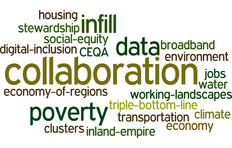
my wordle cloud on topics commonly discussed at the summit

I spent two days at the California Economic Summit, held this year in Ontario, heart of the "inland empire". I learned much about this region of the state that I know mostly as freeways connecting water polo games, or as endless similar roads through malls and housing developments. It is more populous, diverse, and vibrant than I had realized. The conference itself was very different from any that I have been to. Hardly any presentations, but break-out groups, passionate, inspiring panelists, tons of networking, good overviews, multiple perspectives, and no partisanship.

Here are some interesting facts about California that I did not know: 

  • 80% of CEQA lawsuits are related to urban infill development. Shocking. We need infill development as a sensible solution to a growing California. 
  • 1 in 3 children in the Central Valley live in poverty. 1 in 4 kids live in poverty in the inland empire. These rates are WORSE than they have been ever. 
  • The Bay Area is an anomaly in terms of education, income, health, voting rates, broadband adoption. The Bay Area is not representative of the state!
  • Think of a west-east line drawn across the state to demark the population halfway line. Where might it be? No surprise it is moving south. Now it runs almost along Wilshire Blvd in LA!
  • Empowering the Latino community in the state is going to be key in continued success. 
  • Broadband adoption around the state is highly variable: Latino, poor and disabled communities are far below other communities in terms of adoption. 
  • The first beer made with recyled water has been made by Maverick's Brewing Company. 
  • Dragon Fruit might be the new water-wise avocado. Good anti-oxidents, massive vitamin C, good fiber, etc. They taste a bit like a less sweet kiwi, with a bit of texture from the seeds. I don't think I'd like the quac, however. 
  • In 15 years, the state will be in a deficit of college graduates needed to meet skilled jobs. Those 2030 graduates are in 1st grade now, so we can do some planning. 
  • Access, affordability, and attainability are the cornerstones of our great UC system. 

In every session I attended I heard about the need for, and lack of collaboration between agencies, entities, people, in order to make our future better. Here is my wordle cloud of discussion topics, from my biased perspective, or course. 

2005-2015: A decade of intense innovation in mapping

The GIF began in November 2015 on a wave of excitement around geospatial technology. In the months leading up to our first GIS Day in 2005, Google Maps launched, then went mobile; Google Earth launched in the summer; and NASA Blue Marble arrived. Hurricane Katrina changed the way we map disasters in real time. The opening up of the Landsat archive at no-cost by the USGS revolutionized how we can monitor the Earth's surface by allowing dense time-series analysis. These and other developments made viewing our world with detail, ease, and beauty commonplace, but these were nothing short of revolutionary - spurring new developments in science, governance and business. The decade since then has been one of intense innovation, and we have seen a rush in geospatial technologies that have enriched our lives immeasurably. In November 2015 we can recognize a similar wave of excitement around geospatial technology as we experienced a decade ago, one that is more diverse and far reaching than in 2005. This GIS Day we would like to highlight the societal benefit derived from innovators across academia, non-profits, government, and industry. Our panel discussion on the 18th has representatives from several local innovators in the field, including: Stamen Designs, Geowing, PlanetLabs, 3D Robotics, NASA, iNaturalist.org, and Google, who will discuss their perspectives on the boom in Bay Area mapping. 

Please think about joining us at GIS Day!

http://gif.berkeley.edu/gisday.html

Governor Brown's new Executive Order, issued today is a banner day for our climate change efforts

From Bruce Riordan, at the Climate Readiness Institute. 

Bay Area Climate Stakeholders: Governor Brown's new Executive Order, issued today is a banner day for our climate change efforts. 

1. The Executive Order sets a new interim goal for GHG reduction—40% below 1990 levels by 2030.

2. The Executive Order, for the first time, outlines a series of steps the State will take to address climate adaptation and resilience. 

See the press release, reaction from world leaders, and the full Executive Order at: http://gov.ca.gov/home.php

Mapping the Berkeley Boom: Social Media and Mapping Help Unravel a Mystery

Last night we heard the Berkeley Boom again.  We’ve been hearing this thunderous boom quite frequently in the last month here in Berkeley, but this one sounded bigger than most.  Car alarms went off on the street.  The dog jumped.  “What IS that?” I wondered aloud.  With a quick search on the internet I found that that the Berkeley Boom is a phenomena whose Twitter reports are being actively mapped.  While Berkeley police and residents still have no idea what the mystery boom is, through the combined powers of social media and mapping we are gathering an understanding of where it is happening.  As Berkeley residents continue reporting the boom (#BerkeleyBoom), perhaps we’ll get to the bottom of this, the newest of Berkeley’s many mysteries. 

For more on the Berkeley Boom see the Berkeleyside article: http://www.berkeleyside.com/2015/03/31/the-unsolved-mystery-of-the-berkeley-boom/

Map from Berkeleyside Article:

Karin in the news! Google camera helps capture bay’s rising sea levels

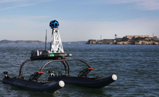
Neat article about Google teaming up with the nonprofit San Francisco Baykeeper to use Google Street View technology to map tides and sea level rise around the Bay. Former kellylabber Karin Tuxen-Bettman is involved. 

http://www.sfgate.com/bayarea/article/Google-camera-helps-capture-bay-s-rising-sea-6080481.php#photo-7524438

Geo-tagged Tweets in Yosemite


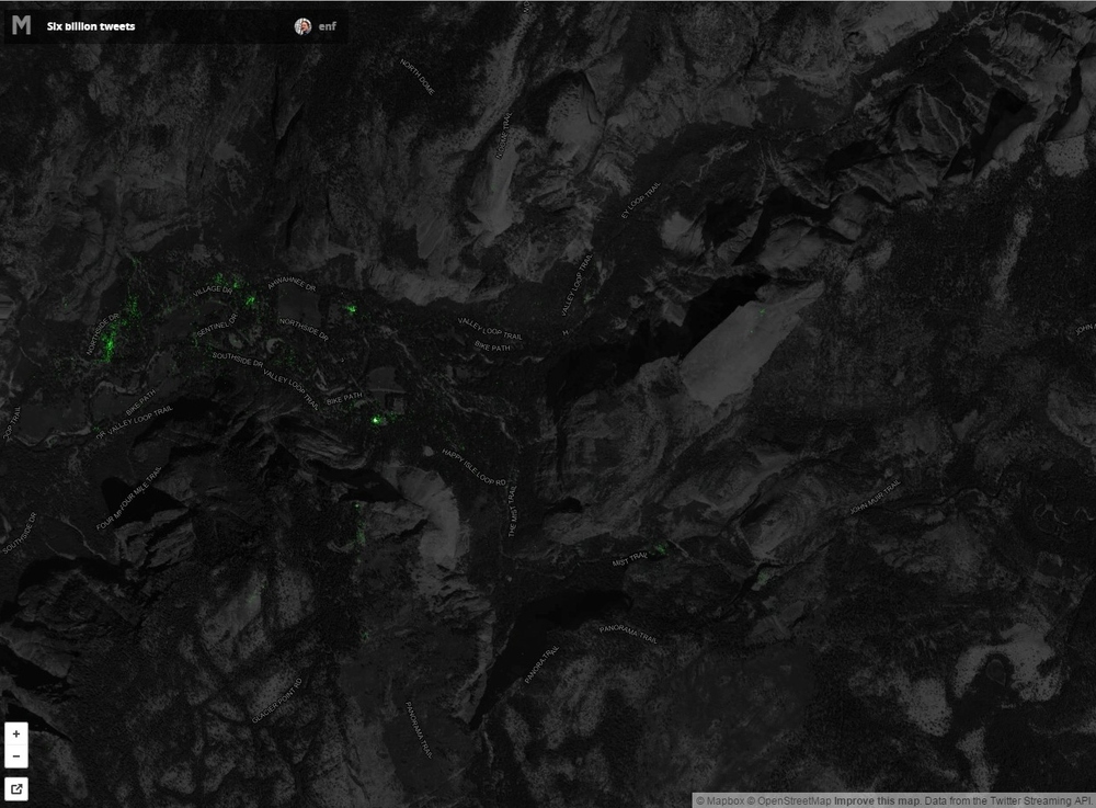
Check out the Geo-tagged tweets in Yosemite Valley.  If you look closely you can see that people are tweeting from the top of Half-Dome, The Mist Trail, Glacier Point, and many parts of Yosemite Valley.  Harnessing this publicly available information may help in understanding what people are thinking and doing in our National Parks.  

All 6 Billion Geo-tagged Tweets are available to view at: https://api.tiles.mapbox.com/v4/enf.c3a2de35/page.html?access_token=pk.eyJ1IjoiZW5mIiwiYSI6IkNJek92bnMifQ.xn2_Uj9RkYTGRuCGg4DXZQ#14/37.7386/-119.5548

Citizen science vs. MODIS on producing maps of atmospheric dust

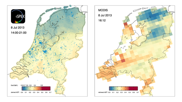
Measurements by thousands of citizen scientists in the Netherlands using their smartphones and the iSPEX add-on are delivering accurate data on dust particles in the atmosphere that add valuable information to professional measurements. The iSPEX team, led by Frans Snik of Leiden University, analyzed all measurements from three days in 2013 and combined them into unique maps of dust particles above the Netherlands. The results match and sometimes even exceed those of ground-based measurement networks and satellite instruments. Here is the comparison of the maps produced by citizen science versus MODIS:

iSPEX map compiled from all iSPEX measurements performed in the Netherlands on July 8, 2013, between 14:00 and 21:00. Each blue dot represents one of the 6007 measurements that were submitted on that day. At each location on the map, the 50 nearest iSPEX measurements were averaged and converted to Aerosol Optical Thickness, a measure for the total amount of atmospheric particles. This map can be compared to the AOT data from the MODIS Aqua satellite, which flew over the Netherlands at 16:12 local time. The relatively high AOT values were caused by smoke clouds from forest fires in North America, which were blown over the Netherlands at an altitude of 2-4 km. In the course of the day, winds from the North brought clearer air to the northern provinces.

Read more at: 

http://phys.org/news/2014-10-citizen-science-network-accurate-atmospheric.html#jCp

How Scotland voted

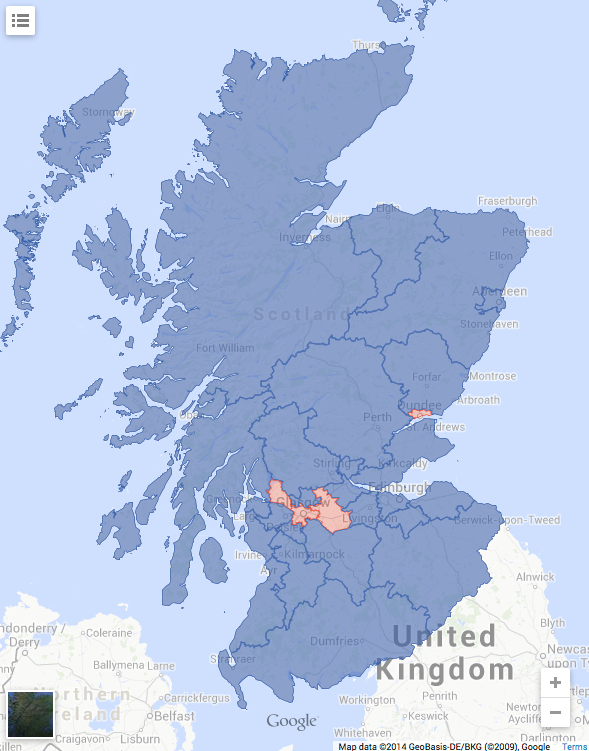
Reds are Yes, blues are NoHere is a map of voting results from yesterday's historic independence vote in Scotland. Overall the Nos carried the day - 55% - 45%. Interestingly, Motherwell and Hamilton, two towns in my family's life, were split. Motherwell voted Och Aye and Hamilton voted the Noo.

From http://www.ctvnews.ca/world/how-scotland-voted-map-of-referendum-results-1.2014138

OakMapper Mobile Updated (v2.4) - available now at the App Store

OakMapper Mobile has been updated (version 2.4) to take take advantage of the latest iOS interface design and requirements. It is available for download at the Apple App Store. Existing OakMapper Mobile users are encouraged to update to the latest version.

In the last 6 months, the site receives over 1,100 visitors, resulting in over 1,450 sessions this period, which is consistent with the same period last year. Visitors come mostly from the US; and within the US states, California dominates. There are 14 new registered users from the community. Participation from the community includes 4 new SOD submissions (721 total), 1 new comment about SOD, 6 new questions/feedback, and 2 new votes on whether they have seen the reported SOD cases.

Our paper published in the Annals of the Association of American Geographers has been cited 17 times according to Google Scholar.


Connors, J. P., S. Lei & M. Kelly (2012): Citizen Science in the Age of Neogeography: Utilizing Volunteered Geographic Information for Environmental Monitoring, Annals of the Association of American Geographers, 102(6): 1267-1289

Using Social Media to Discover Public Values, Interests, and Perceptions about Cattle Grazing on Park Lands

“Moment of Truth—and she was face to faces with this small herd…” Photo and comment by Flickr™ user, Doug GreenbergIn a recent open access journal article published in Envrionmental Management, colleague Sheila Barry explored the use of personal photography in social media to gain insight into public perceptions of livestock grazing in public spaces. In this innovative paper, Sheila examined views, interests, and concerns about cows and grazing on the photo-sharing website, FlickrTM. The data were developed from photos and associated comments posted on Flickr™ from February 2002 to October 2009 from San Francisco Bay Area parks, derived from searching photo titles, tags, and comments for location terms, such as park names, and subject terms, such as cow(s) and grazing. She found perceptions about cattle grazing that seldom show up at a public meeting or in surveys. Results suggest that social media analysis can help develop a more nuanced understanding of public viewpoints useful in making decisions and creating outreach and education programs for public grazing lands. This study demonstrates that using such media can be useful in gaining an understanding of public concerns about natural resource management. Very cool stuff!

Open Access Link: http://link.springer.com/article/10.1007/s00267-013-0216-4/fulltext.html?wt_mc=alerts:TOCjournals

Citizen science: key questions explored in a new report

In a recent article published in the Guardian, Michelle Kilfoyle and Hayley Birch discuss the widespread use of citizen science initiatives. They recently produced a report (pdf) for the Science for Environment Policy news service, in which the authors review a number of citizen science case studies, and explore the potential benefits of citizen science for both science and society, especially given the advent of new mobile technologies that enable remote participation. They also ask interesting questions about who really benefits the most from these developments: the amateurs or the professionals?

Key questions addressed and highlighted in this report include:
  1. How could new and developing technologies help citizen science projects feed into environmental policy processes?
  2. Is environmental data produced by citizen scientists as accurate as environmental data produced by professional scientists?
  3. How can citizen science benefit environmental monitoring and policymaking?