ESRI UC 2020 - Virtually. Day 1

My usual update from ESRI UC is a bit tougher this year, since I am working from home, and on one screen. So note taking is a bit rough. And I kind of miss the whole razz-ma-tazz of Day 1 on site. But here goes:

OK, so Jack’s Plenary is the always place to get a big view of new releases in software. 2020 is no different. A sweep of the software improvements coming this summer. Here is my (very) quick summary of highlights. Items with ‘*’ are those that will be useful in class (I hope).

The Conference Theme is Collaboration

What’s coming in ArcGIS Pro and AGOL: 

Data:

  • New layers

  • Better integration with OSM*

Visualization (New Map Apps* - launching this fall):

  • Beta now in AGOL

  • Better styling, better color ramps, and better dynamic interaction with color ramp *

  • Dot density mapping!

  • Clustering and new labeling

  • Filtering data

  • Some cool color blending as an alternative to transparency! *

Cartography in Pro:

  • Charts 

Story Maps

  • Optimize for mobile

  • Collections

  • StoryTeller role

Spatial Analytics and Data Science

  • New suitability modeling tool *

  • Spider diagrams

  • Modeling

  • AI, Big Data, ML

  • Jupyter Notebooks inside of ArcGIS Pro *

  • AGOL implementing Jupyter Notebooks

Imagery and Remote Sensing

  • Image management - ready to use workflows and content

  • Feature extraction

  • Analytics - classification, etc. 

  • Something called “Excalibur” - web-based exploitation. Search and find, feature extraction, add to a database

  • Drone Mapping *

    • Drone2Map on desktop

    • Site Scan - cloud-based solutions

3D Mapping

  • Jack loves voxels

Real-time Analytics

  • Cloud-based sensor data storage and management

Data Management

  • Improving editing: 2D and 3D editing improvements *

Field Maps App

  • In beta, and should streamline things. 

And Enterprise runs on kubernetes…

All leading up to ArcGIS 2021 next year.

OK deep breath, off for a lunch break. 

Mapping COVID19: a technology overview

Hello everyone, I hope you are all healthy, safe, sane, and if possible, being productive.

Here I provide a summary of some of the mapping technology that has been used in the past few weeks to understand the COVID-19 pandemic. This is not exhaustive! I pick three areas that I am personally focusing on currently: map-based data dashboards, disease projections, and social distancing scorecards. I look at where the data comes from and how the sites are built. More will come on the use of remote sensing and earth observation data in support of COVID-19 monitoring, response or recovery, and some of the cool genome evolution and pandemic spread mapping work going on.

COVID-19 map-based data dashboards. You have seen these: lovely dashboards displaying interactive maps, charts, and graphs that are updated daily. They tell an important story well. They usually have multiple panels, with the map being the center of attention, and then additional panels of data in graph or tabular form. There are many many data dashboards out there. My two favorites are the Johns Hopkins site, and the NYTimes coronavirus outbreak hub.

Where do these sites get their data?

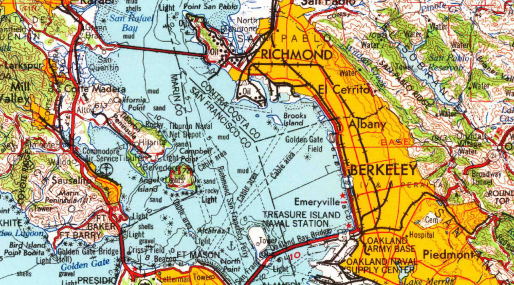
  • Most of these sites are using data from similar sources. They use data on number of cases, deaths, and recoveries per day. Most sites credit WHO, US CDC (Centers for Disease Control and Prevention), ECDC (European Centre for Disease Prevention and Control), Chinese Center for Disease Control and Prevention (CCDC), and other sources. Finding the data is not always straightforward. An interesting article came out in the NYTimes about their mapping efforts in California, and why the state is such a challenging case. They describe how “each county reports data a little differently. Some sites offer detailed data dashboards, such as Santa Clara and Sonoma counties. Other county health departments, like Kern County, put those data in images or PDF pages, which can be harder to extract data from, and some counties publish data in tabular form”. Alameda County, where I live, reports positive cases and deaths each day, but they exclude the city of Berkeley (where I live), so the NYTimes team has to scrape the county and city reports and then combine the data.

  • Some of the sites turn around and release their curated data to us to use. JH does this (GitHub), as does NYTimes (article, GitHub). This is pretty important. Both of these data sources (JH & NYTimes) have led to dozens more innovative uses. See the Social Distancing Scorecard discussed below, and these follow-ons from the NYTimes data: https://chartingcovid.com/, and https://covid19usmap.com/.

  • However… all these dashboards are starting with simple data: number of patients, number of deaths, and sometimes number recovered. Some dashboards use these initial numbers to calculate additional figures such as new cases, growth factor, and doubling time, for example. All of these data are summarized by some spatial aggregation to make them non-identifiable, and more easily visualized. In the US, the spatial aggregation is usually by county.

How do these sites create data dashboards?

  • The summarized data by county or country can be visualized in mapped form on a website via web services. These bits of code allow users to use and display data from different sources in mapped form without having to download, host, or process them. In short, any data with a geographic location can be linked to an existing web basemap and published to a website; charts and tables are also done this way. The technology has undergone a revolution in the last five years, making this very doable. Many of the dashboards out there use ESRI technology to do this. They use ArcGIS Online, which is a powerful web stack that quite easily creates mapping and charting dashboards. The Johns Hopkins site uses ArcGIS Online, the WHO does too. There are over 250 sites in the US alone that use ArcGIS Online for mapping data related to COVID-19. Other sites use open source or other software to do the same thing. The NYTimes uses an open source mapping platform called MapBox to create their custom maps. Tools like MapBox allow you to pull data from different sources, add those data by location to an online map, and customize the design to make it beautiful and informative. The NYTimes cartography is really lovely and clean, for example.

An open access peer reviewed paper just came out that describes some of these sites, and the methods behind them. Kamel Boulos and Geraghty, 2020.

COVID-19 disease projections. There are also sites that provide projections of peak cases and capacity for things like hospital beds. These are really important as they can help hospitals and health systems prepare for the surge of COVID-19 patients over the coming weeks. Here is my favorite one (I found this via Bob Watcher, @Bob_Wachter, Chair of the UCSF Dept of Medicine):

  • Institute for Health Metrics and Evaluation (IHME) provides a very good visualization of their statistical model forecasting COVID-19 patients and hospital utilization against capacity by state for the US over the next 4 months. The model looks at the timing of new COVID-19 patients in comparison to local hospital capacity (regular beds, ICU beds, ventilators). The model helps us to see if we are “flattening the curve” and how far off we are from the peak in cases. I’ve found this very informative and somewhat reassuring, at least for California. According to the site, we are doing a good job in California of flattening the curve, and our peak (projected to be on April 14), should still be small enough so that we have enough beds and ventilators. Still, some are saying this model is overly optimistic. And of course keep washing those hands and staying home.

Where does this site get its data?

  • The IHME team state that their data come from local and national governments, hospital networks like the University of Washington, the American Hospital Association, the World Health Organization, and a range of other sources.

How does the model work?

  • The IHME team used a statistical model that works directly with the existing death rate data. The model uses the empirically observed COVID-19 population and calculates forecasts for population death rates (with uncertainty) for deaths and for health service resource needs and compare these to available resources in the US. Their pre-print explaining the method is here.

On a related note, ESRI posted a nice webinar with Lauren Bennet (spatial stats guru and all-around-amazing person) showing how the COVID-19 Hospital Impact Model for Epidemics (CHIME) model has been integrated into ArcGIS Pro. The CHIME model is from Penn Medicine’s Predictive Healthcare Team and it takes a different approach than the IHME model above. CHIME is a SIR (susceptible-infected-recovery) model. A SIR model is an epidemiological model that estimates the probability of an individual moving from a susceptible state to an infected state, and from an infected state to a recovered state or death within a closed population. Specifically, the CHIME model provides estimates of how many people will need to be hospitalized, and of that number how many will need ICU beds and ventilators. It also factors social distancing policies and how they might impact disease spread. The incorporation of this within ArcGIS Pro looks very useful, as you can examine results in mapped form, and change how variables (such as social distancing) might change outcomes. Lauren’s blog post about this and her webinar are useful resources.

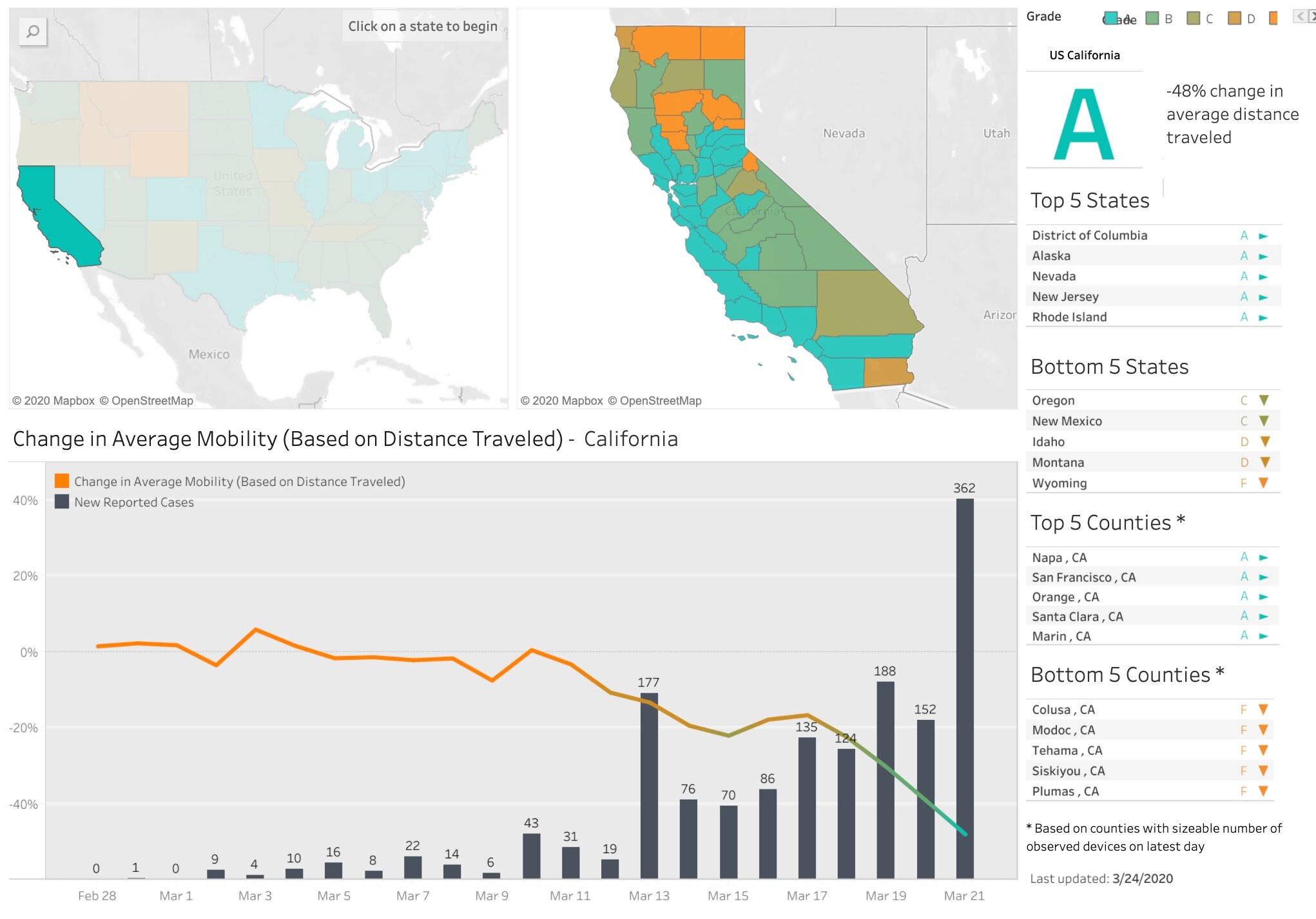
Social distancing scorecards. This site from Unicast got a lot of press recently when it published a scoreboard for how well we are social distancing under pandemic rules. It garnered a lot of press because it tells and important story well, but also, because it uses our mobile phone data (more on that later). In their initial model, social distancing = decrease in distance traveled; as in, if you are still moving around as you were before the pandemic, then you are not socially distancing. There are some problems with this assumption of course. As I look out on my street now, I see people walking, most with masks, and no one within 10 feet of another. Social distancing in action. These issues were considered, and they updated their scorecard method. Now, in addition to a reduction in distance traveled, they also include a second metric to the social distancing scoring: reduction in visits to non-essential venues. Since I last blogged about this site nearly two weeks ago, California’s score went from an A- to a C. Alameda County, where I live, went from an A to a B-. They do point out that drops in scores might be a result of their new method, so pay attention to the score and the graph. And stay tuned! Their next metric is going to be the change rate for the number of person-to-person encounters for a given area. Wow.

Where do these sites get their data?

  • The data on reported cases of COVID-19 is sourced from the Corona Data Scraper (for county-level data prior to March 22) and the Johns Hopkins Github Repository (for county-level data beginning March 22 and all state-level data).

  • The location data is gathered from mobile devices using GPS, Bluetooth, and Wi-Fi connections. They use mobile app developers and publishers, data aggregation services, and providers of location-supporting technologies. They are very clear on their privacy policy, and they do say they are open to sharing data via dataforgood@unacast.com. No doubt, this kind of use of our collective mobile device location data is a game-changer and will be debated when the pandemic is over.

How does Unicast create the dashboard?

  • They do something similar to the dashboard sites discussed above. They pull all the location data together from a range of sites, develop their specific metrics on movement, aggregate by county, and visualized on the web using custom web design. They use their own custom basemaps and design, keeping their cartography clean. I haven’t dug into the methods in depth yet, but I will.

Please let me know about other mapping resources out there. Stay safe and healthy. Wash those hands, stay home as much as possible, and be compassionate with your community.

Social Distancing Scorecard

According to the World Health Organization and the CDC, social distancing is currently the most effective way to slow the spread of COVID-19. Unacast created this interactive Scoreboard, updated daily, to empower organizations to measure and understand the efficacy of social distancing initiatives at the local level. 

They want us to explore the data — the more we all understand, the more lives we can save together.

Hooray! California gets an “A”. Good job California! Check out the maps and chart below (just a screenshot - much more on the site). See how our mobility has declined as the first cases came in; and its drastically reduced in the last week. This is good. Go Napa! Yet there are some outlier counties too - we can do better.

Covid-19_Social_Distancing_Scoreboard_—_Unacast.jpg

COVID-19 map resources

Hello all from the new shelter-in-place normal. We are all figuring this new way of working and living out, so in the meantime, stay calm, be compassionate, be positive and productive. At least that is what I am telling myself daily! Thanks to the wonderful former Kellylabber John Connors (who put together a great list), here is a quick round-up of some of the best map resources for COVID-19 out there.

NYTimes: Good map viz, lots of map resources

StoryMap from ESRI: Good visuals, good presentation, detail for China

ESRI: Solutions for local government, Esri toolkits

CDC: simple map from CDC

Stanford: Data visualization, timeline, literature, updated travel bans, and some resources

Washington Post: spread simulation model, showing how social isolation works

WHO: dynamic dashboard (built in Esri tools), up-to-date country totals

Stay safe and healthy out there everyone.

ESRI ArcGIS User Workshop - Jan 2020 in San Francisco

Wow! It’s been awhile since I posted. That’s because Fall semester was a full one. I’ll update you all on that soon - it basically will be a summary of using Pro for class, which was terrific.

OK on to the workshop.

We started with the inspirational video showcased at 2019 ESRI User Conference, and a video welcome from JD. The theme of the workshop is “Amplify your GIS”, and he introduced the new concept “geospatial infrastructure” also developed in a hot-off-the-presses paper with Michael Goodchild. Other new terms: the ESRI GIS technology world is referred to as the Esri Geospatial Cloud, and new key components are the geo-enabled workflows. OK, on to the new stuff.

What’s New in ArcGIS. There is lots of new stuff in Pro: coding, visualizations, editing workflows; new stuff in AGOL, primarily the new Map Viewer (Beta); and new stuff in the Solutions Workflows. Highlights for me include:

What’s new in ArcGIS Pro

  • Pro Extensions

    • New extension: LocateXT – to geocode unstructured data. Good for historical work.

  • New in Editor

    • Find and replace in an attribute table. Good for bulk re-formatting.

    • Contingent values within Domains. Makes editing more efficient.

    • Using Arcade for things like automatic calculation of attributes. They suggest we check it out, pronto.

  • New in Visualization Tools

    • Feature binning via the “Enable Feature Binning” tool. This opens a new tab on the ribbon, creates dynamic polygons summarizing features found within. This is good for example for large point datasets symbolized in hexagons.

    • Match Layer Symbology to a Style: Quick way to have different styles.  

    • The “Calendar Heat Chart” for data with temporal data. Looks slick.

    • You can add pie charts to polygon features, changing input and making pie charts variable; and make into 3D.

    • Text boxes: you can now change the shape of your text boxes – reshape along a complex boundary, e.g. This is pretty sweet.

  • New in Coding/Tools

    • In 2.5, you can schedule your geoprocessing tools. Wait what? This is going to be interesting.

    • Scripting: You can export a model to a python file, or export your geoprocessing history directly to python. Ok then.

    • In 2.5, jupyter notebook can be run directly in Pro (from “Notebooks”) in the Catalog. No need for to run JN externally. So there.

  • Sharing

    • New Layouts: Import Layout Gallery. ESRI has developed 12 default templates within a Gallery. You can use one of them, or add your own.

    • Printing: Printing is now done in the background, while you continue to work; you can print in black and white; and you can tile your larger maps.

    • You can Password protect your pdfs.

    • New export format for those carto-designers who like to work in AI: AIX files for Adobe Illustrator.

What’s new in ArcGIS Online

  • Map Viewer Beta is the new thing. This I must try, having yelled at AGOL more often than I care to admit about configuring pop-ups.

    • New Layout, with symbolization by field, by expression, (using Arcade) and filter data; New dot density symbolization choice, among other things.

    • More control over look and field of pop-ups (yay!), including adding text and images. Dynamic changes, yay!

    • Plus some slick links to Story Maps

What’s new in ArcGIS Solution Workflows

  • Showed us some great stuff from the Conservation Easement Solutions Workflow – migration from a paper-based solution to a digital workflow. There are many other examples

  • Use the ArcGIS Solution Deployment Tool.

  • This is a bit vague to me, and I will need to dig in.

What’s new in ArcGIS for Developers

  • ESRI continues its work to extend the platform through:

    • Javascript API

    • App Builders – Web AppBuilder (new is Experience Builder, which is in beta testing now)

    • Some other stuff that I wasn’t fast enough to capture. But looks good.

Example GIS workflows

Next the presenters walked us through a few key sectors using GIS. Some great stuff came out for me to explore, including:

GIS for law enforcement

  • There is a “Crime Analysis” toolbar, BTW. Free and added to the ribbon. It contains lots of crime-relevant tools and some ways to efficiently update data from tables

  • The “Import Records Tool” seems very useful for anyone using large tabular data that updates regularly.

  • Apparently ESRI has quite a few staff/engineers with law enforcement backgrounds who have built most of these tools. They stressed that lots of them can be/should be used for other workflows, and the Import Records Tool seems appropriate for this.

Public Works

  • Showed QuickCapture as an easy workflow to capture information about the condition of streets.

  • Once you have your problem areas, you can route them in AGOL via the “Plan Routes” Tool (uses credits!) in AGOL.

  • Those routes are used with the “Navigator” tool, and integrated with the “Tracker” app

AutoCad integration: you can now edit an ArcGIS hosted feature service in AutoCad. This is a big deal.

Parcel Editing and Parcel Fabric

  • Showcased the Parcel Fabric Administration, and Parcel Tasks

    • Parcel Fabric keeps track of all editing actions done on parcels, such as merging, splitting, etc.

    • Tasks include updating COGO; updates all the directions, areas, etc.

    • Besides my interest in haberdashery, I really need to get more into parcel fabrics.

Planning

  • This is where ESRI has been building the Urban Solution Workflow. We’ve seen this example before at the 2019 ESRI UC; it’s from Boston, discussing planning for a new high rise building and its potential shading of Boston Common.

Lots of stuff to follow up on for IGIS and for projects. Happy 2020.

Sabbatical in China in the spring...

Sabbatical report April 2019

I’ve been on sabbatical now for a few months, and it’s time to report. I’ve been working on updating all my course materials: slides, reading and labs, for the fall. This has been a blast, and a lot of work! Especially the labs. We are finally moving to ArcGIS Pro, people! It’s been scary, but thanks to some excellent on-line resources, including this list of excellent tutorials from Jarlath O’Neil-Dunne and from ESRI (Getting started with Pro) we are making progress. Shane Feirer and Robert Johnson from #IGIS are helping here too, and we’ll likely be using some of the new material in IGIS workshops soon. 

Currently, I am in China, visiting former PhD student Dr Qinghua Guo and my “grandstudent” Dr Yanjun Su at their lab set in the bucolic Institute of Botany northwest of Beijing (just outside the 5th ring, for those of you in the know). It has been a blast. I came to catch up on all the excellent UAV, lidar, remote sensing, and modeling work going on in the Digital Ecosystem Lab at the Institute of Botany (part of the Chinese Academy of Sciences). These students are serious Data Scientists: they are working on key spatial problems and remote sensing data problems using ML, classification, spatio-temporal algorithms, data fusion tools. They routinely work with lidar, hyperspectral, multispectral and field data, and focus on leaf-scale to landscape-scale processes. One of the big experiments they are working on uses a new instrument, dubbed “Crop3D”. It is a huge frame installed over an ag field with a movable sensor dock. The field is about 30m x 15m, and the sensor can move to cover the entire field. Here is my summary in graphic form:

CROP3D. Very cool.

CROP3D. Very cool.

This season’s experiment focuses on mapping corn plant phenotypes using hyperspectral, RGB, and lidar data by classifying leaf-scale metrics such as leaf angle and branching angles, along with spectral indices. VERY COOL STUFF. I am eager to hear more about the results of the experiment and see what is yet to come. 

I gave a couple of talks, one on “big” (serious air quotes here) data and ecology (to the Institute of Botany at the Chinese Academy of Sciences) and one on UAVs (to the Institute of Geographical Sciences and Natural Resources Research, CAS). In both I highlighted all the excellent work done by students and staff in my various research and outreach groups. In the first I focused on our Lidar work in the Sierra Nevada (with Qinghua Guo, Yanjun Su, Marek Jakubowski); the VTM work and FAIR data (with Kelly Easterday); and UAV/water stress (with Kelly again plus Sean Hogan and Jacob Flanagan). In the second talk I got to gush about all the IGIS work we are doing across our “Living Laboratories” in California. We have flown ~30 missions (total 25 km2) on and around the network of research properties in California (see the panel below for some examples). I talked about the recent CNN work with Ovidiu Csillik; the BORR water stress experiment with Kelly, Sean and Jacob; the fire recovery work at Hopland with Shane Feirer and the rest of the IGIS crew; and the outreach we do like DroneCamps. I also talked about UAV Grand Challenges: Scaling, Sampling, and Synergies. Those ideas are for another post. 

IGIS UAV Missions in California

IGIS UAV Missions in California

My hosts took great care of me: Showing me the sites, making sure I tried all the regional delicacies, and indulging me in my usual blather. Below are some pics of us on our adventures, including in the bus on our way to a distant portion of the Great Wall. Walking the Wall was: 1) awesome (in the real sense of the word – it really is mind-blowing); 2) STEEP (calves were screaming at the end of the day); and 3) windy. Plus there are snakes. I was told that there are other sections of the Wall that are called “Wild Wall” which I think is extremely cool. And speaking of walls, GOT starts again this weekend. China in springtime is BURSTING with flowers. And being housed at the Institute of Botany means all of them are on show in a concentrated area. Finally, you can get all over this huge country on trains. Trains that go really fast (220 MPH), and are on time, and are comfortable! I went to Shanghai (800+ miles away) for the weekend by train! My current joke: “In China, it takes 4 hours to get from Beijing to Shanghai. In California, it takes 4 hours to get from Berkeley to Sacramento.” (Thanks Dad!).   

GroupPeeps2.jpg

Off to Tokyo. But not before a final panel of pics that remind me of this trip: Technology, Art, Food, Flowers, Shopping, History. Here in China, Red = Happiness + GoodLuck, not the Cardinal.

ChinaFavs2.jpg

ESRI @ GIF Open GeoDev Hacker Lab

We had a great day today exploring ESRI open tools in the GIF. ESRI is interested in incorporating more open tools into the GIS workflow. According to www.esri.com/software/open, this means working with:

  1. Open Standards: OGC, etc.

  2. Open Data formats: supporting open data standards, geojson, etc.

  3. Open Systems: open APIs, etc.

We had a full class of 30 participants, and two great ESRI instructors (leaders? evangelists?) John Garvois and Allan Laframboise, and we worked through a range of great online mapping (data, design, analysis, and 3D) examples in the morning, and focused on using ESRI Leaflet API in the afternoon. Here are some of the key resources out there.

Great Stuff! Thanks Allan and John

Citizen science vs. MODIS on producing maps of atmospheric dust

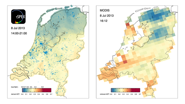
Measurements by thousands of citizen scientists in the Netherlands using their smartphones and the iSPEX add-on are delivering accurate data on dust particles in the atmosphere that add valuable information to professional measurements. The iSPEX team, led by Frans Snik of Leiden University, analyzed all measurements from three days in 2013 and combined them into unique maps of dust particles above the Netherlands. The results match and sometimes even exceed those of ground-based measurement networks and satellite instruments. Here is the comparison of the maps produced by citizen science versus MODIS:

iSPEX map compiled from all iSPEX measurements performed in the Netherlands on July 8, 2013, between 14:00 and 21:00. Each blue dot represents one of the 6007 measurements that were submitted on that day. At each location on the map, the 50 nearest iSPEX measurements were averaged and converted to Aerosol Optical Thickness, a measure for the total amount of atmospheric particles. This map can be compared to the AOT data from the MODIS Aqua satellite, which flew over the Netherlands at 16:12 local time. The relatively high AOT values were caused by smoke clouds from forest fires in North America, which were blown over the Netherlands at an altitude of 2-4 km. In the course of the day, winds from the North brought clearer air to the northern provinces.

Read more at: 

http://phys.org/news/2014-10-citizen-science-network-accurate-atmospheric.html#jCp

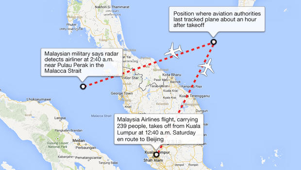
DigitalGlobe Crowdsourcing effort to find missing Malaysian Airlines plane

Digital Globe is enlisitng a crowdsourcing effort to scan through thousands of satellite images and tag potential sitings of the Malaysian Aircraft that went missing this weekend.

The crowdsourcing platform Tomnod, was launched on Monday afternoon and recieved 60,000 page views in the first hour depolying arguably one of the most responsive and comprehensive search missions aided by crowdsourcing and satellite imagery. 

Read more about this here and here and join the effort here

Who Says Religion and Science Can't Mix? Mapping the 7 Deadly Sins

The Las Vegas Sun ran an article about researchers from Kansas State who conducted a study on mapping the "Seven Deadl Sins". Well, actually proxies for those sins. Judge for yourself if you believe the surrogate variables are indeed indicative of the "sins". No matter how you slice it, it's mapping, and it's interesting...

http://www.lasvegassun.com/news/2009/mar/26/one-nation-seven-sins/

Ghost Maps

There are over 35 million geotagged, time-stamped photos on flickr now. That's enough to start doing some pretty interesting analyses, including this one from Crandall, et al., at Cornell (presented at the WWW 2009 conference, "Mapping the World's Photos" [PDF]).  Not only is it possible to map hot spots of world tourism, but by incorporating the time stamps to map the routes people are taking, you can make out individual streets. As suggested by the Information Aesthetics blog, you could even design popular walking tours.

Once GPS-enabled cameras represent a larger share of the market, flickr may provide data for all sorts of important analyses: tracking SOD, the migration of an endangered song bird, or estimating the "desolation" of a place: the world heat map that the Cornell group presents looks shockingly like the lights at night. The machine... it's ALIVE!!!

helpful new features from ESRI

here are some gems I learned about at CalGIS:

1. Go to ArcGIS Online Resources to quickly, easily, and freely add in terrific basemap data and high res imagery to any .mxd. If you are logged in you will have access to a lot more options.

2. Arc 9.3.1 (to be released any day now) will include a "layer packages" feature. So, if you want to send someone your file exactly as you are looking at it, you can right click on the layer and select "save as layer package", and it will zip the .shp + .lyr into a .lpk to share more easily. Also, there will be free access to Microsoft Virtual Earth within your Arc desktop.