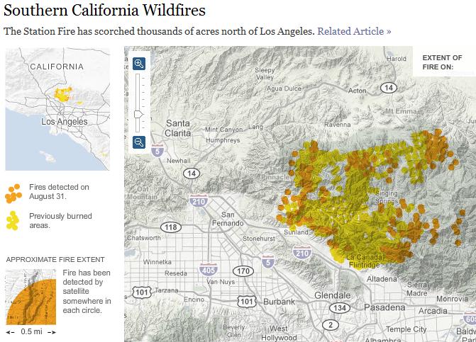
NY Times Interactive Map of SoCal Wildfires

The New York Times has an interesting interactive map displaying the progression of the latest Southern California wildfires over the course the past week. In addition to the rapid spread of the fires, what's interesting is that this map was generated via satellite imagery. (The map legend states that a fire has been detected by satellite within each 0.5 mile buffer displayed). Unfortunately no further details of the source data are offered.

Mapping virtual trees and buildings

From a series of news releases (all text, no pics, alas): UK aerial survey specialist Bluesky has launched a brand new digital map layer accurately modelling the location and extent of trees and their proximity to buildings. Designed as a tool to aid insurance assessors, property developers and Local Authority Planners, ProximiTREE details the exact spatial location and height of individual trees together with the circumference of its canopy. From this information a determination can be made of the root extent and the potential impact on either existing or proposed properties.

They plug this product for its use in avoiding building subsidence, but in fire-prone Cali, we could use it to look at defensible space and risk.

They also provide a range of good downloads, including sample data and software for your enjoyment.

FANTASTIC Bay Area spatial data

  If you love detailed spatial data and/or the bay area, I HIGHLY recommend downloading and exploring the readily available Upland Goals Project Data . Ryan Branciforte introduced  it to us last week during his enlightening geolunch presentation about his work with the Bay Area Open Space Council. There is a wealth of data for all interests, including vegetation, animals, environmental features, weather patterns, fire risk, and even camp sites if you want to plan a trip to go look at all the data on the ground.

San Diego Fires on Google My Maps

SD Fires on My MapsNick, a classmate of mine, pointed out this interesting use of Google My Maps for disaster reporting by KPBS News in San Diego. KPBS is also maintaining a Twitter stream for updates about the fires, which is the most useful potential use of Twitter I think I've seen. Has anyone seen any fire mapping systems on the web that integrate discussions? Requests for missing people, perhaps requests by evacuees for ground info on their homes?

Interactive images vs. webGIS

I came across an interesting interactive image depicting wildfire occurrences across the U.S. -- this one is hosted by the AP news service. I have seen a lot of images like this over the past year or so; maps turned interactive images depicting a wide variety of information, particularly in the climate change arena. I find it interesting because, using the above referenced image as an example, it basically covers the same information that is available via a wildfire webGIS (which, unfortunately, seems to be down right now - maybe that answers my question!) developed by a consortium of federal agencies (GeoMAC). Because the information is so redundant (and comes from the same data sources), it seems, to me, to raise questions about the accessibility of web-based mapping sites -- are they seemingly too complicated, or do they contain too much information that doesn't relate directly to a story? Certainly the image format is easier to deal with from a development standpoint, and can be made pretty a little more easily, and it may just be the news media focus on graphics for particular issues/stories, but I still think it is interesting to see, and to think about how web maps can be made more useful as information resources.