NY Times Interactive Map of SoCal Wildfires
/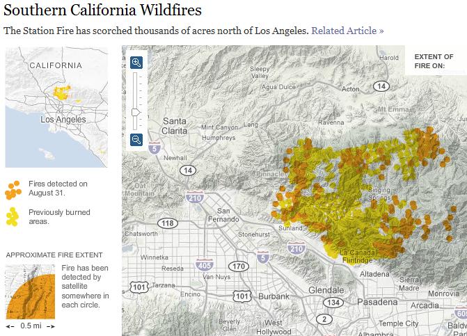
The New York Times has an interesting interactive map displaying the progression of the latest Southern California wildfires over the course the past week. In addition to the rapid spread of the fires, what's interesting is that this map was generated via satellite imagery. (The map legend states that a fire has been detected by satellite within each 0.5 mile buffer displayed). Unfortunately no further details of the source data are offered.
Update on 2009-09-07 20:14 by Maggi
Thanks Sarah. I was looking for a map of the fires.
The collected NASA MODIS images of the fire can be found here.
Plus the USFS MODIS large fire incident tracker: http://activefiremaps.fs.fed.us/.