Landsat 8 imagery available

From Kelly:

Data collected by the Operational Land Imager (OLI) and the Thermal Infrared Sensor (TIRS) onboard the Landsat 8 satellite are available to download at no charge from GloVis, EarthExplorer, or via the LandsatLook Viewer

Orbiting the Earth every 99 minutes, Landsat 8 images the entire Earth every 16 days in the same orbit previously used by Landsat 5. Data products are available within 24 hours of reception. Check it.

Past fire visualization: SandTable to SimTable

Chips fire via SimTableWhile up at Forestry Camp, Mike DeLasaux turned us on to this site: SimTable. Apparently in the early days (and still today) sandtables were used to practice for wildland fire management. A few pictures are shown here. A nice tool developed to update the sandtable idea using digital data and fire modeling is SimTable. Their website also has some great visualizations of past fires with real fire perimeter data.

For example, check out the spread of the Chips fire using their website (image at right). The fire was first sighted on July 29, 2012, burning about 20 miles (32 km) west of Quincy, California. It burned through the begining of September 2012, eventually burning about 75,000 acres in Plumas and Lassen national forests. In late August, a series of backfires along the eastern flank of the fire were lit (check out the forest treatments in purple on the map) to slow the spread. News article about the backfire here. The site is: http://apps.simtable.com/fireProgression/tests/chips/simpleOverlay.html.

Here is the Chips burn scar from NASA.

Conference wrap up: DataEdge 2013

The 2nd DataEdge Conference, organized by UC Berkeley’s I School, has wrapped, and it was a doozy. The GIF was a sponsor, and Kevin Koy from the Geospatial Innovation Facility gave a workshop Understanding the Natural World Through Spatial Data. Here are some of my highlights from what was a solid and fascinating 1.5 days. (All presentations are now available online.)

Michael Manoochehri, from Google, gave the workshop Data Just Right: A Practical Introduction to Data Science Skills. This was a terrific and useful interactive talk discussing/asking: who/what is a data scientist? One early definition he offered was a person with 3 groups of skills: statistics, coding or an engineering approach to solving a problem, and communication. He further refined this definition with a list of practical skills for the modern data scientist:

  • Short-term skills: Have a working knowledge of R; be proficient in python and JavaScript, for analysis and web interaction; understand SQL; know your way around a unix shell; be familiar with distributed data platforms like Hadoop; understand the Data Pipeline: collection, processing, analysis, visualization, communication.
  • Long-term skills: Statistics: understand what k-means clustering is, multiple regression, Baysien inference; and Visualization: both the technical and communication aspects of good viz.
  • Finally: Dive into a real data set; and focus on real use cases.

Many other great points were brought up in the discussion: the data storage conundrum in science was one. We are required to make our public data available: where will we store datasets, how will we share them and pay for access of public scientific data in the future?

Kate Crawford, Principal Researcher, Microsoft Research New England gave the keynote address entitled The Raw and the Cooked: The Mythologies of Big Data. She wove together an extremely thoughtful and informative talk about some of our misconceptions about Big Data: the “myths” of her title. She framed the talk by introducing Claude Levi-Strauss’ influential anthropological work “The Raw and the Cooked” - a study of Amerindian mythology that presents myths as a type of speech through which a language and culture could be discovered and learned. You know you are in for a provocative talk in a Big Data conference when the keynote leads with CLS. She then presented a series of 6 myths about Big Data, illustrated simply with a few slides each. Here is a quick summary of the myths:

  1. Big Data is new: the term was first used in 1997, but the “pre-history” of Big Data originates much earlier, in 1950s climate science for example, or even earlier. What we have is new tools driving new foci.
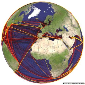
  2. Big Data is objective: she used the example of post-Sandy tweets, and makes the point that while widespread, these data are a subset of a subset. Muki Haklay makes the same point with his cautionary: “you are mining the outliers” comment (see previous post). She also pointed out that 2013 marks the point in the history of the internet when 51% of web traffic is non-human. Who are you listening to?
  3. Big Data won't discriminate: does BD avoid group level prejudice? We all know this, people not only have different access to the internet, but given that your user experience has been framed by your previous use and interaction with the web, the rich and the poor see different internets.
  4. Big Data makes cities smart: there are numerous terrific examples of smart cities (even many in the recent news) but resource allocation is not even. When smart phones are used for example to map potholes needing repair, repairs are concentrated in areas where cell phone use is higher: the device becomes a proxy for the need.
  5. Big Data is anonymous: Big Data has a Big Privacy problem. We all know this, especially in the health fields. I learned the new term “Health Surrogate Data” which is information about your health that results from your interaction with the Internet. Great stuff for Google Flu Tracker for example, but still worrying. The standard law for protection in the public health field, HIPAA, is similar to “bringing a knife to a gunfight” as she quoted Nicholas Terry.
  6. You can opt out: there are currently no clear ways to opt out. She asks: how much would you pay for privacy? And if the technological means to do so were created and made widespread, we would likely see the development of privacy as a luxury good, further differentiating internet experience based on income.

The panel discussion Digital Afterlife: What Happens to Your Data When You Die? moderated by Jess Hemerly from Google, and including Jed Brubaker from UC Irvine and Stephen Wu, a technology and intellectual property attorney was eye-opening and engaging. Each speaker gave a presentation from their expertise: Stephen Wu gave us a primer on digital identity estate planning and Jed Brubaker shared his research on the spaces left in social media when someone dies. Both talks were utterly fascinating, thought provoking and unique.

And finally, Jeffrey Heer from Stanford University gave a stunning and fun talk entitled Visualization and Interactive Data Analysis showcased his Viz work, and introduced to many of us Data Wrangler, which is awesome.

Great conference!

Mobile Field Data Collection, Made Easy

Recommendation from Greeninfo Network's MapLines newsletter:

"Attention land trusts, weed mappers, trail maintainers and others - Are you ready for the Spring field work season?  GreenInfo recommends using this customizable, free app for collecting data in the field - Fulcrum App, which offers a free single user plan for storing up to 100 mb of data."

According to their website, with Fulcrum, you build apps to your specifications, allowing you to control exactly what data is captured from the field and how. Maintain high standards of quality to minimize rework, QA/QC, and error correction by getting it done right the first time.

PROBA-V satellite launched May 7

Proba-V’s first image of FranceI haven't used PROBA imagery, but many colleagues in Europe rely on this sensor.

PROBA-V (i.e. "vegetation") was launched May 7. The miniature satellite is designed to map land cover and vegetation growth across the entire planet every two days. The data can be used for alerting authorities to crop failures or monitoring the spread of deserts and deforestation.

Less than a cubic metre in volume, Proba-V is a miniaturised ESA satellite tasked with a full-scale mission: to map land cover and vegetation growth across the entire planet every two days.

Proba-V is flying a lighter but fully functional redesign of the Vegetation imaging instruments previously flown aboard France’s full-sized Spot-4 and Spot-5 satellites, which have been observing Earth since 1998.

Check it out: http://www.esa.int/Our_Activities/Technology/Proba_Missions/Proba-V_opens_its_eyes

Bay Area Inequality & Mass Transit

Dan Grover and Mike Z created an interactive data visualization that shows the income distribution along mass transit routes in the Bay Area. 2010 Census median household income for each mass transit station within a census tract for MUNI metro and bus, BART, and CalTrain routes are currently viewable. The project was inspired by The New Yorker’s New York City income distribution viewer for the New York Subway here.

Screenshot of data viewer from dangrover.github.io

Google Timelapse

Google recently released the Timelapse project, hosted by Time Magazine, which shows Landsat images from 1984 to today in a timelapse video animation for the entire globe. The viewer allows users to navigate to any spot on the globe via place name and visualize changes on the earth’s surface over the time period captured by Landsat. Google highlights specific areas of interest such as Dubai, Las Vegas, and the Amazon.

Click the image below for more info and to access the site:

Screenshot of Google Timelapse on Time.com

Denali Repeat Photography Project

an example from the Denali ProjectFrom Shasta: along the lines of our VTM photo reshoot project, here is a far more advanced example - the Denali Repeat Photography Project.

he Denali Repeat Photography project has assembled more than 200 photo pairs taken across a large cross-section of Denali from the low-lying black spruce forests to ice fields high in the Alaska Range.  What unites these disparate images is that they show repeated views of a single location at different moments in time.  The interval separating the pairs of photos varies greatly – from just a few years to longer than a century!

CPAD 1.9 released today: mapping protected areas in California

CPAD, the California's Protected Areas Database is releasing a new version. This product maps lands owned in fee by public and nongovernmental organizations for open space purposes, ranging from small neighborhood parks to large wilderness areas.

CPAD 1.9 a major update that corrects many outstanding issues with CPAD holdings data and also has many new additions, particular for urban parks.

CPAD is produced and managed by GreenInfo Network, a 16 year old non-profit organization that supports public interest groups and agencies with geospatial technology. CPAD data development is conducted with Esri ArcGIS products, supplemented with open source web application tools. 

Find the data here.

map of global routes of ship-borne invasive species

From the BBC. Scientists have developed the first global model that analyses the routes taken by marine invasive species. The researchers examined the movements of cargo ships around the world to identify the hot spots where these aquatic aliens might thrive. The research is published in the Journal Ecology Letters.

Scientists mapped the global routes taken by cargo ships over a two-year period

Marine species are taken in with ballast water on freighters and wreak havoc in new locations, driving natives to extinction.

There has been a well-documented boom in global shipping over the past 20 years and this has led to growing numbers of species moving via ballast tanks, or by clinging to hulls.

Some ports such as San Francisco and Chesapeake Bay have reported several exotic new species arriving every year. Economic estimates indicate that marine invaders can have huge impacts that last for decades.

Now, scientists from the UK and Germany have developed a model that might help curb these unwanted visitors. They obtained detailed logs from nearly three million voyages that took place in 2007 and 2008. The model combines information such as shipping routes, ship sizes, temperatures and biogeography to come up with local forecasts of invasion probabilities.

DNRGarmin + QGIS for a free and useful way to map properties

This website shows how any average computer user and/or landowner or forester can utilize the Quantum GIS open source freeware to do professional analyses of their land or their clients' land for free. Thanks Bob Wagoner!

http://www.centralillinoisforestry.com/index.php/illinois-forestry-blog/73-quantum-gis-for-landowners-and-practitioners

New report on sierra forest health and carbon storage

The Sierra Nevada Conservancy has just released a new report on System Indicators for Forest Health and Carbon Storage. This fourth report in the System Indicators series focuses on Sierra Nevada forests, and includes indicators related to Forest Health and Biomass/Carbon Storage on forest lands. In addition, this report describes the extent, character, and ownership of forest land in the Sierra Nevada Conservancy (SNC) Region. The lead author on the report is our Susie Kocher, from UC Cooperative Extension, and from SNAMP.

See the report here: http://www.sierranevada.ca.gov/about-us/SystetmIndicatorsForestHealth.pdf/view

LDCM releases first images of Earth!

Turning on new satellite instruments is like opening new eyes. This week, the Landsat Data Continuity Mission (LDCM) released its first images of Earth, collected at 1:40 p.m. EDT on March 18. The first image shows the meeting of the Great Plains with the Front Ranges of the Rocky Mountains in Wyoming and Colorado. The natural-color image shows the green coniferous forest of the mountains coming down to the dormant brown plains. The cities of Cheyenne, Fort Collins, Loveland, Longmont, Boulder and Denver string out from north to south. Popcorn clouds dot the plains while more complete cloud cover obscures the mountains.

Much more on the story and the images here:

http://www.nasa.gov/mission_pages/landsat/news/first-images-feature.html

Cal-adapt in the news

Kevin and I wrote a blog story for UC's Center for Forestry on Cal-Adapt. We walk through the local tools for a community by focusing on Eureka in Humboldt County. Humboldt County, located in Northwest California, is the southern gateway to the Pacific Northwest. The County is bound on the north by Del Norte County; on the east by Siskiyou and Trinity counties; on the south by Mendocino County and on the west by the Pacific Ocean. The County encompasses 2.3 million acres, 80 percent of which is forestlands, protected redwoods and recreation areas. Humboldt County faces a range of changes to its local climate: temperature, snowpack, fire regimes and sea level. Each of these can be explored with Cal-Adapt Local Snapshot tool.

Check it out: http://ucanr.edu/blogs/blogcore/postdetail.cfm?postnum=9573

The New Cartographers

 Interesting article by Emily Underwood in Science Magazine 

The New Cartographer

"Geographers have traditionally studied how the natural environment contributes to human society and vice versa, whereas cartographers have focused more explicitly on the art and science of mapmaking. Over the past couple of decades, a new field has emerged: geographical information systems (GIS), blending the study and expression of geographic information. Cartography and geography have overlapped and spawned innumerable subspecialties and applications. Modern geographers and cartographers are involved in diverse projects: tracking fleets of vehicles or products, helping customers locate a Dunkin' Donuts, modeling environmental scenarios such as oil spills, and studying the spread of disease."


more online

ANR Statewide Program on GIS

Mission Statement: IGIS aims to support high-priority programs to advance research and extension projects that enhance agricultural productivity, natural resource conservation and healthy communities into the future by providing Informatics and Geospatial Information Systems tools and applications.

ANR Recently announced the development of a new Statewide Program called the Informatics and GIS (IGIS) program. The new program aims to over the next five years become the nexus for ANR’s rich and diverse geospatial and ecological data, research information, and resources for academics and the public who rely on geospatial and informatics data, analysis and display.  Through data capture, information sharing, and collaboration, we aim to increase our ability to make meaningful predictions of the agricultural, ecosystem, and community response to future change, to increase our understanding of California’s diverse natural, agricultural and human resources, and to support research and outreach projects that enhance agricultural productivity, natural resource conservation and healthy communities into the future.

The IGIS team needs your input to design this resource to be an efficient and helpful delivery of information and GIS support. If you are affiliated with ANR, please take a few minutes to complete the Survey of Informatics and GIS Needs, Knowledge and Data Availability.  This is a short and comprehensive survey that will assess GIS, data and information needs, evaluate your level of informatics and GIS expertise and use of geospatial tools and data.  Your response will be of great assistance toward building a successful State-wide program.

Google is fined for collecting private info with Street View

We're not just taking pictures any more... All over the channels this morning is the $7B fine paid by Google to multiple states for violating public privacy.

From the NYTimes: Google on Tuesday acknowledged to state officials that it had violated people’s privacy during its Street View mapping project when it casually scooped up passwords, e-mail and other personal information from unsuspecting computer users.

Google says "we work hard to get privacy right at Google, but in this case we didn’t, which is why we quickly tightened up our systems to address the issue.” A more sceptical view is found here: Scott Cleland's blog: http://www.precursorblog.com/ (including a Google Privacy Rap Sheet).

The new settlement, which requires Google to set up a privacy program within six months, that includes an annual privacy week event for employees, and training for the public on how to protect themselves.

New 2012 SOD Confirmations Added to OakMapper!

New SOD Blitz 2012 Data

New confirmed cases of Sudden Oak Death (SOD) (P. ramorum) have been added to OakMapper, a project that tracks the spread of Sudden Oak Death from data collected by citizens and organizations. All official SOD cases are collected and confirmed by the California Department of Food and Agriculture or the University of California. Community SOD cases are submitted by citizens via the OakMapper website and iPhone application. 613 new points collected in 2012 have been added to OakMapper bringing the total number of confirmed SOD locations to 2804. The new data consists of laboratory confirmed cases collected by the annual SOD Blitz campaign of 2012 from the Forest Pathology and Mycology Lab run by Dr. Matteo Garbelotto. 

Click on the image in the upper left to view a close-up of the new confirmed SOD data (in green) from the SOD Blitz 2012. 

Explore the new data online here.

OakMapper.org

Update from LDCM

Some updates from this video from NASA:

  • Imagery should be available late May 2013
  • Landsat 7 has enough fuel to last until 2016
  • LCDM has a 5 year mission, but they are hopeful for a 10 year mission
  • Data continuity is the key to this whole deal: "continuity drives landsat"
  • High resolution data does not have the temporal resolution as Landsat - via Kass G.

Very excited.

LDCM FAQ here.