The evolution of a Digital Earth

In 1998 Al Gore made his now famous speech entitled The Digital Earth: Understanding our planet in the 21st Century. He described the possibilities and need for the development of a new concept in earth science, communication and society. He envisioned technology that would allow us "to capture, store, process and display an unprecedented amount of information about our planet and a wide variety of environmental and cultural phenomena.” From the vantage point of our hyper-geo-emersed lifestyle today his description of this Digital Earth is prescient yet rather cumbersome: 

"Imagine, for example, a young child going to a Digital Earth exhibit at a local museum. After donning a head-mounted display, she sees Earth as it appears from space. Using a data glove, she zooms in, using higher and higher levels of resolution, to see continents, then regions, countries, cities, and finally individual houses, trees, and other natural and man-made objects. Having found an area of the planet she is interested in exploring, she takes the equivalent of a "magic carpet ride" through a 3-D visualization of the terrain.”

He said: "Although this scenario may seem like science fiction, most of the technologies and capabilities that would be required to build a Digital Earth are either here or under development. Of course, the capabilities of a Digital Earth will continue to evolve over time. What we will be able to do in 2005 will look primitive compared to the Digital Earth of the year 2020. In 1998, the necessary technologies were: Computational Science, Mass Storage, Satellite Imagery, Broadband networks, Interoperability, and Metadata. 

He anticipated change: "Of course, further technological progress is needed to realize the full potential of the Digital Earth, especially in areas such as automatic interpretation of imagery, the fusion of data from multiple sources, and intelligent agents that could find and link information on the Web about a particular spot on the planet. But enough of the pieces are in place right now to warrant proceeding with this exciting initiative.” 

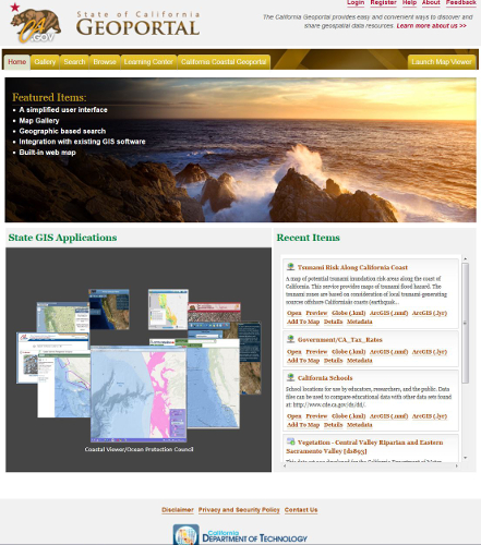
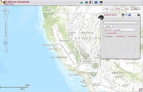
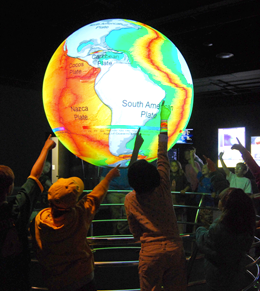
Example from NOAA's Science on a Sphere projectMuch has changed since he gave his talk, obviously. We have numerous examples of Virtual Globes for data exploration - for example, Google Earth, NASA’s WorldWind, ESRI’s ArcGIS Explorer, Bing Maps 3D, TerraExplorer, Marble.  (These virtual examples are made tangible with NOAA's terrific Science on a Sphere project.)

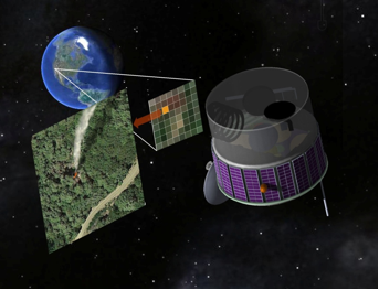
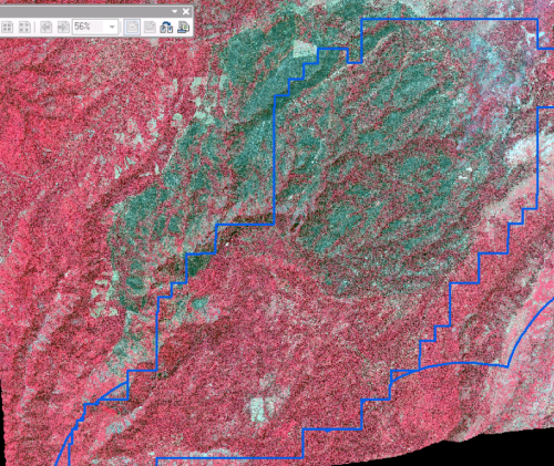
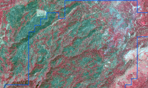
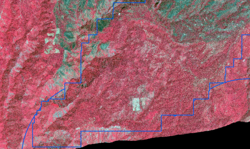
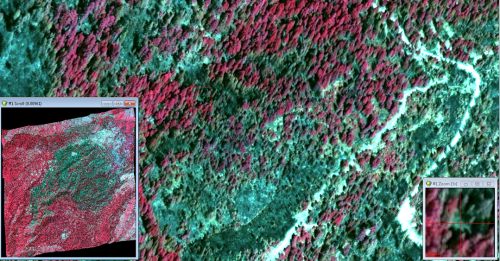
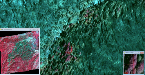
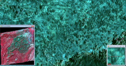
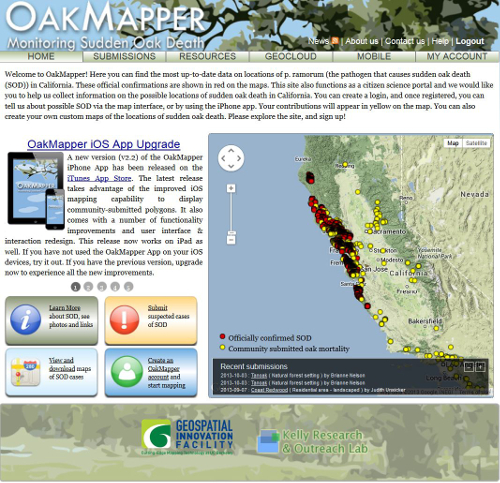
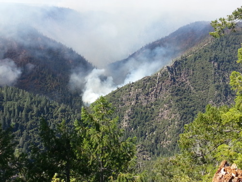
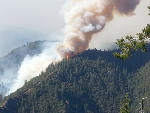
We also have realized a new vision of the Digital Earth that includes much more than immersive viewing of data. Today’s Digital Earth vision(s) include analytics and expertise for solving problems that are often cross-discplinary and large scale. Additionally, we make much more use today than was anticipated in 1998 from sensor networks and the geoweb (e.g. volunteered geographic information and croudsourcing). Examples of this multi-disciplinary Digital Earth concept include Google Earth Engine (and its recent forest loss product), Nasa Earth Exchange, and our own HOLOS.

NSF has adopted this concept for their Earth Cube concept. Last year NSF was looking for transformative concepts and approaches to create integrated data management infrastructures across the Geosciences. They were interested in the multifaceted challenges of modern, data-intensive science and education and envision an environment where low adoption thresholds and new capabilities act together to greatly increase the productivity and capability of researchers and educators working at the frontiers of Earth system science. I am not sure if this will be funded in 2014, but the concept reafirms that the concept of the Digital Earth is widespread and will likely be an important part of academia.

Global forest change from Landsat and Google

The video describing the partnership and the product is available now.

A new high-resolution global map of forest loss and gain has been created with the help of Google Earth. The interactive online tool is publicly available and zooms in to a remarkably high level of local detail - a resolution of 30m. Snapshot of Russia here (green = forest, blue = gain, red = loss):

Russia has much forest activity

Results from time-series analysis of 654,178 Landsat images from 2000–2012 characterize forest extent and change. Between 2000 and 2012, according to this analysis, the Earth lost a combined "forest" the size of Mongolia. http://www.bbc.co.uk/news/science-environment-24934790

Here is the abstract from the accompanying paper in Science:

Quantification of global forest change has been lacking despite the recognized importance of forest ecosystem services. In this study, Earth observation satellite data were used to map global forest loss (2.3 million square kilometers) and gain (0.8 million square kilometers) from 2000 to 2012 at a spatial resolution of 30 meters. The tropics were the only climate domain to exhibit a trend, with forest loss increasing by 2101 square kilometers per year. Brazil’s well-documented reduction in deforestation was offset by increasing forest loss in Indonesia, Malaysia, Paraguay, Bolivia, Zambia, Angola, and elsewhere. Intensive forestry practiced within subtropical forests resulted in the highest rates of forest change globally. Boreal forest loss due largely to fire and forestry was second to that in the tropics in absolute and proportional terms. These results depict a globally consistent and locally relevant record of forest change.

Hansen, M.C.; Potapov, P.V.; Moore, R.; Hancher, M.; Turubanova, S.A.; Tyukavina, A.; Thau, D.; Stehman, S.V.; Goetz, S.J.; Loveland, T.R.; Kommareddy, A.; Egorov, A.; Chini, L.; Justice, C.O.; Townshend, J.R.G. High-Resolution Global Maps of 21st-Century Forest Cover Change. Science 2013, 342, 850-853

NASA shares satellite and climate data on Amazon’s cloud


NASA has announced a partnership with Amazon Web Services that the agency hopes will spark wider collaboration on climate research. In an effort that is in some ways parallel to Google's Earth Engine, NASA has uploaded terabytes of data to Amazon's public cloud and made it available to the anyone. 

Three data sets are already up at Amazon. The first is climate change forecast data for the continental United States from NASA Earth Exchange (NEX) climate simulations, scaled down to make them usable outside of a supercomputing environment. The other two are satellite data sets—one from from the US Geological Survey's Landsat, and the other a collection of Moderate Resolution Imaging Spectroradiometer (MODIS) data from NASA's Terra and Aqua Earth remote sensing satellites.

More Here

Just how much do we need the rain?

Reservoir Drought Monitor Categories - Sep 30, 2013

From DWR's California Data Exchange Center - Reservoirs.

Callfornia is a pretty dry state as we roll into the winter season, but the bad news is spread over the state in different ways.  As of September 30, 17 of the 18 main reservoirs in the state are below 50% of normal storage percentiles. That is not quite as bad as it sounds, 5 of these reservoirs - Friant, Tahoe, New Bullards Bar, Almador and our very own Camanche/Pardee (which catches the lovely water of the Mokolumne River and satiates us EBMUDders) - are classified as "Normal" status. Three reservoirs - Cachima, Casitas and Isabella - are classified as "Drought Severe" status. Those three are in the southern portion of the state.

For more on our water supplies, check out http://cdec.water.ca.gov.

In case you want to know more about the water we drink in Berkeley, the Mokelumne River is a 95-mile-long river flowing west from the central Sierra Nevada into the Central Valley and ultimately the Sacramento–San Joaquin River Delta, where it empties into the San Joaquin River. Together with its main tributary, the Cosumnes River, the Mokelumne drains 2,143 square miles (5,550 km2) in parts of five California counties.

The Upper Mokelumne River stretches from the headwaters to Pardee Reservoir in the Sierra foothills, and the Lower Mokelumne River is the portion of the river below Camanche Dam. Camanche and Pardee dams provide water for the east San Francisco Bay Area through the Mokelumne Aqueduct.

The name is Plains Miwok and is constructed from moke, meaning fishnet, and -umne, a suffix meaning "people of". Thanks Wikipedia!

New Berkeley Institute for Data Science Launched!

UC Berkeley is establishing a new institute to enable university researchers to harness the full potential of the data-rich world that today characterizes all fields of science and discovery. The Berkeley Institute for Data Science (BIDS) will be part of a multi-million dollar effort supported by the Gordon and Betty Moore Foundation and the Alfred P. Sloan Foundation.

The new 5-year, $37.8 million initiative was announced today at a meeting sponsored by the White House Office of Science and Technology Policy (OSTP) focused on developing innovative partnerships to advance technologies that support advanced data management and data analytic techniques.

The ambitious Moore/Sloan partnership, which also includes New York University and the University of Washington, will spur collaborations within and across the three campuses and other partners pursuing similar data-intensive science goals. The three PIs who lead the respective campus efforts – Saul Perlmutter at UC Berkeley, Ed Lazowska at the University of Washington, and Yann Le Cunn at NYU – will promote common approaches to form the basis for ongoing collaboration between the three campuses.

To provide a home for the new Berkeley Institute for Data Science UC Berkeley has set aside renovated space in a historical library building on the central campus in 190 Doe Library. The Institute is expected to move into its new quarters in spring 2014. In order to help address challenges related to creating and sustaining attractive career paths the new Institute will offer new Data Science Fellow positions for faculty, post-doctoral fellows, and staff to be shared with departmental partners across the campus. The new Institute will also offer support for graduate students, and organize short courses, boot camps, hack-a-thons and many other activities.

More information about specific BIDS programs will be forthcoming in the coming weeks. The new Institute will be launched at a campus event on December 12, 2013. If you or your students and collaborators are interested in participating in the Data Science Faire that day, please be sure to register at http://vcresearch.berkeley.edu/datascience/dec12-registration. The deadline is November 25, 2013.

For updates and more information, please visit http://vcresearch.berkeley.edu/datascience/overview-data-science and contact data science@berkeley.edu with any questions you may have.

VGI or micro-mapping for response to Philippine’s typhoon disaster

urgent needs from the Philippines, from tweets and images

YolandaPH is a ESRI-based mapping platform for post-disaster response in the Philippines. Snapshot above.

These maps were produced using a selection of photos from Twitter, Facebook, news articles, and other websites curated using the MicroMapper platform. The locations are approximate and more photos and information are currently being mapped and categorized by the GIS Corps

Hundreds of digital humanitarian volunteers worldwide, including media monitors, translators, GIS specialists, statistical analysts, emotional support teams, and standby task forces, are working around the clock with rescue and recovery efforts, particularly in the hard-hit eastern city of Tacloban.

"DHN is sorting through very high volumes of social media information,” said Sara Jane Terp, a DHN volunteer with the Standby Volunteer Task Force.

Approximately 182,000 tweets have been collected and automatically filtered down to 35,715 based on relevance and uniqueness, according to Carden.

Volunteers use triangulation (comparing information against two other sources, such as traditional media and official government reports) to verify information. The time-consuming work is made easier because of the large number of volunteers working in different time zones.

Useful slideshow of the workflow is found here.

from: http://www.irinnews.org/report/99102/micro-mapping-philippine-s-typhoon-disaster

UPDATE: Nice round-up of disaster response from flying sheep here.

Sudden Oak Death in the UK - Oct 2013

From suddenoakdeath.org.

The United Kingdom (UK) Forestry Commission has updated its P. ramorum larch outbreak map (http://www.forestry.gov.uk/forestry/infd-86ajqa) to include Northern Ireland.  

The map at left identifies areas where there is or has been confirmed or presumed infection in larch trees. Laboratory analysis of samples returns conclusive results in only a minority of cases, so a presumption of infection is used where all the other indications point to the presence of P. ramorum infection.

The colored dots on the map indicate sites where P. ramorum has been confirmed or presumed, and statutory plant health notices (SPHNs) have been issued. Each colour represents the April-March year in which this occurred.

The Galloway Red Zone in southwest Scotland has also been added to the map.  The Red Zone is the region of Scotland where the rate and severity of disease spread is too intense for control through tree felling; consequently, this region will have requirements put in place regarding the movement of infected timber and bark.  Control by statutory plant health notices requiring sanitation felling will continue elsewhere in Scotland. For more information on the status of the situation in Scotland, go to http://www.forestry.gov.uk/forestry/infd-9bglrr.


Helsinki wants feedback on its new urban plans

From Greg Brown.

Helsinki, Finland is developing a new city plan for the future (http://www.hel.fi/wps/portal/Kaupunkisuunnitteluvirasto_en). Helsinki becomes possibly the first major world city to use PPGIS to inform its comprehensive city planning process.   The PPGIS website was developed by Mapita (http://mapita.eu/), a software company founded by Prof. Marketta Kytta and others at Aalto University.  The website launched several days ago and has already had over 5500 participants map places and preferences for the future of Helsinki.
 
You can visit the website here:  https://helsinki.asiatkartalle.fi (There is an option to try out the website without having your map markers or survey responses included in the results…see option below the “Begin” button that says ”Try without saving answers”).

Some cool images showing the power of lidar and cartography

From Martin Isenburg, the brain behind LAStools.

Using LAStools, ArcGIS, and Photoshop, GRAFCAN has produced a LiDAR-derived digital suface model (DSM) that is seriously doped up: a synthetic map providing an intuitive understanding of the landscape. The product combines standard hillshading with a height and feature based color-coding that enables the viewer to "see" where trees are tall and to grasp height differences between buildings. The new product is available at a resolution of 2.5 meters/pixel via the GRAFCAN Web viewer and also as a WMS service. More info and pics here: http://rapidlasso.com/2013/11/03/grafcan-launches-dsm-on-steroids/.

Comparison between bare earth DTM and DSM with cartography.


Check out the greenhouses, which ppear as “low planar vegetatation”. They are made out of coarse maze fabric (instead of glass) that lets the laser through and does not deflect it (like glass would).

How does the USFS map vegetation post fires?

The discussion of how the USFS deals with fires on public forests came up strongly in our recent SNAMP Public Meeting. Our Last Change field site burned in October, and we are very interested in understanding the behavior and impact of the American fire. Part of the discussion stemmed from this presentation on preliminary estimates for fire intensity, ascertained partly from analysis of WorldView imagery delivered at our SNAMP meeting. For more on the SNAMP presentation, check out our website.

The website (linked below) offers an initial description of post-fire vegetative conditions using the Rapid Assessment of Vegetation Condition after Wildfire (RAVG) process. RAVG analysis looks at fires that burn more than 1,000 acres of forested National Forest System (NFS) lands, beginning with fires that occurred in 2007. These fires result in direct losses of vegetative cover and many of the benefits associated with forested ecosystems.

NFS lands experience thousands of wildfires every year, most of which are relatively small. The largest fires typically account for 90% of the total acreage burned. RAVG analysis provides a first approximation of areas that due to severity of the fire may require reforestation treatments. These reforestation treatments would re-establish forest cover and restore associated ecosystem services. This initial approximation could be followed by a site-specific diagnosis and development of a silvicultural prescription identifying reforestation needs.

Some resources:


FUEGO — A concept for a fire detection satellite

A nice press release about our new paper on the concepts behind a fire detection satellite with perhaps the coolest acronym yet: FUEGO — Fire Urgency Estimator in Geosynchronous Orbit. From Bob Sanders.

Artist's conception of the FUEGO satellite

Current and planned wildfire detection systems are impressive but lack both sensitivity and rapid response times. A small telescope with modern detectors and significant computing capacity in geosynchronous orbit can detect small (12 m2) fires on the surface of the earth, cover most of the western United States (under conditions of moderately clear skies) every few minutes or so, and attain very good signal-to-noise ratio against Poisson fluctuations in a second. Hence, these favorable statistical significances have initiated a study of how such a satellite could operate and reject the large number of expected systematic false alarms from a number of sources. We suggest a number of algorithms that can help reduce false alarms, and show efficacy on a few. Early detection and response would be of true value in the United States and other nations, as wildland fires continue to severely stress resource managers, policy makers, and the public, particularly in the western US. Here, we propose the framework for a geosynchronous satellite with modern imaging detectors, software, and algorithms able to detect heat from early and small fires, and yield minute-scale detection times. Open Access Journal Link. Press Release. KPIX spot.

Post American fire imagery

Check out these images from after the American fire, from the WorldView 2 satelllite from our northern SNAMP site. The blue boundary is our SNAMP site.  This background imagery is a pan-sharpened WV2 image (0.5 meters, channels 7, 5, 3). The red color depicts alive vegetation (at least for the time being) and green-blue is post-fire NPV (non-photosynthetic veg).  Thanks to Carlos Ramirez for the images.

 The post-fire imagery shows the heterogeneity of this fire - some spots burned all the vegetation, some spots have standing trees remaining.

The art of remote sensing: Van Gogh in Space via Landsat

This image is making the rounds on social media, and it is a beaut. The Landsat program calls this one "Van Gogh from Space" - It was imaged July 13th, 2005. 

In the style of Van Gogh's painting "Starry Night," massive congregations of greenish phytoplankton swirl in the dark water around Gotland, a Swedish island in the Baltic Sea.In a recent paper by Michael Wulder and others discuss the tremendous benefits of the Landsat program on numerous scientific disciplines, and the overwhelming benefits to science of open access to the Landsat archive.

"Landsat occupies a unique position in the constellation of civilian earth observation satellites, with a long and rich scientific and applications heritage. With nearly 40 years of continuous observation – since launch of the first satellite in 1972 – the Landsat program has benefited from insightful technical specification, robust engineering, and the necessary infrastructure for data archive and dissemination. Chiefly, the spatial and spectral resolutions have proven of broad utility and have remained largely stable over the life of the program. The foresighted acquisition and maintenance of a global image archive has proven to be of unmatched value, providing a window into the past and fueling the monitoring and modeling of global land cover and ecological change."

Reference: Wulder, M.A.; Masek, J.G.; Cohen, W.B.; Loveland, T.R.; Woodcock, C.E. Opening the archive: How free data has enabled the science and monitoring promise of Landsat. Remote Sensing of Environment 2012,122, 2-10

California Geoportal Offers One-Stop Shop for Statewide GIS Data

The California Geoportal, officially launched in March 2013 (see here for related launch press release), augments and in some ways replaces the original Cal-Atlas statewide GIS data download webpage with a more simplified, smooth, and more intuitive website for all GIS related data in the state. You can now search or browse for GIS data by geography and any corresponding metadata using traditional search queries as well as by using a standalone webGIS interface. The portal also provides direct download links to some Oregon and Nevada state GIS datasets. The site acts as a GIS data repository for publicly available GIS data and related documents and maps from state agencies and local and regional governments. Rather than hosting the physical data, the site instead acts as a library of direct download links to datasets that connect directly to the author’s databases. The site also links you to other state GIS applications such as the California Coastal Geoportal and webGIS viewers from various state agencies.

Screenshot of the CA Geoportal

Screenshot of the CA Geoportal Map ViewerSee below for an informative video on how and why the portal was created and for highlights of features:

New 2012-2013 SOD Confirmations Added to OakMapper!

New 2013 SOD Blitz and 2012-13 UC Davis DataNew confirmed cases of Sudden Oak Death (SOD) (P. ramorum) have been added to OakMapper, a project that tracks the spread of Sudden Oak Death from data collected by citizens and organizations. All official SOD cases are collected and confirmed by the California Department of Food and Agriculture or the University of California. Community SOD cases are submitted by citizens via the OakMapper website and iPhone application. 442 new points collected between 2012-2013 have been added to OakMapper bringing the total number of confirmed SOD locations to 3246. The new data consists of laboratory confirmed cases collected by the annual SOD Blitz campaign of 2013 from the Forest Pathology and Mycology Lab run by Dr. Matteo Garbelotto and also laboratory confirmed cases collected by the UC Davis Rizzo Lab run by Dr. David Rizzo.

Click on the image left to view a close-up of the new confirmed SOD data (in green) from SOD Blitz and UC Davis. 

Explore the new data online here.

OakMapper.org


Photos from the American Fire

These are courtesy of Christopher Dow, crew leader for our SNAMP field work. They were in the Last Chance area gathering post-treatment data when the American Fire started. They were able to collect all the field data we needed for SNAMP before leaving. Which is great news for SNAMP. The fire burned through our northern control and treatment firesheds. Check out the SNAMP project here.