Fire in the Great Dismal Swamp, VI

A nice example of remote sensing for fire: this visualization allows you to compare the utility of hyperspectral images to see through the smoke and map fire scars. The article is about a lightning strick fire in the fantastically named "Great Dismal Swamp" in Virginia. Hurricane Irene might put a damper on the fire.

“Eight inches of rain will not put the fire out,” said Tim Craig, Fire Management Officer for the refuge. “It will buy us time to clear our way through the downed trees back to the fire zone after the storm.” Irene generously drenched the swamp with 10 – 15 inches of rain, but initial assessments show that the fire is still burning. Before the storm, the Lateral West fire was 35 percent contained. Smoke still rose from at least 30 acres after the storm though open flames were no longer visible and the fire did not spread under Irene’s strong winds, said local news reports. The sudden flush of rain left puddles that are still soaking in to the soil and may yet help extinguish the fire.

See the interactive tool and article here.

Photogrammetry in action: dating the great "A trip down Market Street", 1906

Sometime before the 1906 San Francisco earthquake, a camera was attached to a streetcar travelling north along Market Street, San Francisco, and recorded the hustle and bustle, the multi-modal transportation options, and the wonderful fashions of early 19th century San Francisco. The movie, which I happend to catch last week at SFMOMA as part of their great (but too large) Stein collection, is mesmerizing. Check it out here on You Tube. It is clearly pre-earthquake, but its exact timing has not been known until now.

Ferry Building arrivalIn an article in Photogrammetric Engineering and Remote Sensing, Richard Greene narrows the window of aquisition down to between 24 March and 30 March 1906, just weeks before the earthquake on 18 April. Remember, that earthquake and the fires that followed largely destroyed much of the city. He performs this feat of timing through detailed photogrammetry: determing the time of day, the solar position, and the time of year from shadows on cornices and other architectural details.

Another windy day in the city! these cornices were helpful in determing solar positionSo cool! The article can be found here. Full reference here: 

Greene, R., 2011. Dating the fliming of "A trip down Market Street". Photogrametric Engineering & Remote Sensing 77, 839-848.

Check out some fun pics from the movie.


Southwestern US drought from NASA

Vegetation anomaly from AVHRRFrom NASA Earth Observatory.  More of the United States was in exceptional drought in July 2011 than in any other month in the past 12 years, according to the National Climatic Data Center. The worst of the drought is spread across Texas, Oklahoma, New Mexico, and parts of Arizona, Colorado, Nebraska, and Louisiana. But 26 percent of the lower 48 states experienced severe to extreme drought in July.

On the other hand, about 33 percent of the contiguous United States experienced exceptionally rainy weather in July. The wet weather occurred largely in the Northern Plains and Western states.

These weather patterns—the mix of unusually dry and unusually wet—are reflected in plant growth throughout the month. The image shows plant growth in July compared to average conditions. Places where plants were growing more than average are green, while unusually poor growth is shown in brown. The image was made with data from the Advanced Very High Resolution Radiometer on the NOAA-18 POES satellite.

The worst growing conditions are, unsurprisingly, in the Southern Plains. States throughout the region reported poor pasture conditions and struggling crops. Much of the southeast and eastern United States is also mildly dry. These dry conditions weren’t helped by temperatures in July. For most of the United States, July was unusually hot, drying the soil and baking crops.

The Northern Plains and Western States, on the other hand, experienced a cool, rainy July. California had its eighth rainiest July on record, while Montana, North Dakota, Utah, Wyoming, and South Dakota all received above-average rain. This is reflected in plant growth, particularly in Montana and South Dakota.

The culprit behind these unusual weather patterns is a persistent high pressure system that is steering storms away from the south central United States. Based on current conditions, the Climate Prediction Center expects the drought to last through at least the end of October. In some parts of the South, it would take more than 20 inches of rain to end the drought in a month.

GIS and historical analysis: a good mix

In the new NYT artilce "Digital Maps Are Giving Scholars the Historical Lay of the Land," Patricia Cohen discusses the new academic field known as spatial humanities. Historians, literary theorists, archaeologists and others are using Geographic Information Systems to re-examine real and fictional places like the villages around Salem, Mass., at the time of the witch trials; the Dust Bowl region devastated during the Great Depression; and the Eastcheap taverns where Shakespeare’s Falstaff and Prince Hal caroused.

Mapping spatial information reveals part of human history that otherwise we couldn’t possibly know,” said Anne Kelly Knowles, a geographer at Middlebury College in Vermont. “It enables you to see patterns and information that are literally invisible.”

Fun stuff!

2011 ESRI User Conference

Earlier this month I attended the ESRI User Conference in San Diego which consisted of numerous presentations by ESRI as well exhibits by various vendors.  Maggi asked that I write up a short

 summary.  I've been collecting my thoughts and reviewing notes.  There were three main points I wanted to explore aside from the overall experience and general opportunity to learn and be a part of the event.

Mobile GIS

ESRI has had a client for the iPhone for some time now.  Soon they will have one for the Android platform as well.  They had working phones for attendees to use with the ability to do real-time data updates.  There is an API in beta for any ESRI customer to download.  If you're interested please let me know and I can obtain it.  The client software that actually runs on the Android device itself is also in the beta stage but is not yet available to download.   Mobile clients can connect to your own ArcGIS server or to data served by ArcGIS Online hosted by ESRI.

The mobile application allows for collection of data, measuring distances, as well as real-time editing and is intended for general users who do not have to be GIS experts.  The edits are shared right away with others who may be using a mobile or desktop application.  Of course, in many situations users may be in an area without an active cell/data connection.  It's still in various stages of development, but the plans are to have the mobile device cache the appropriate levels of map tiles, data, etc., and then sync with the server upon reconnecting much the same way other applications function when away from cell coverage.

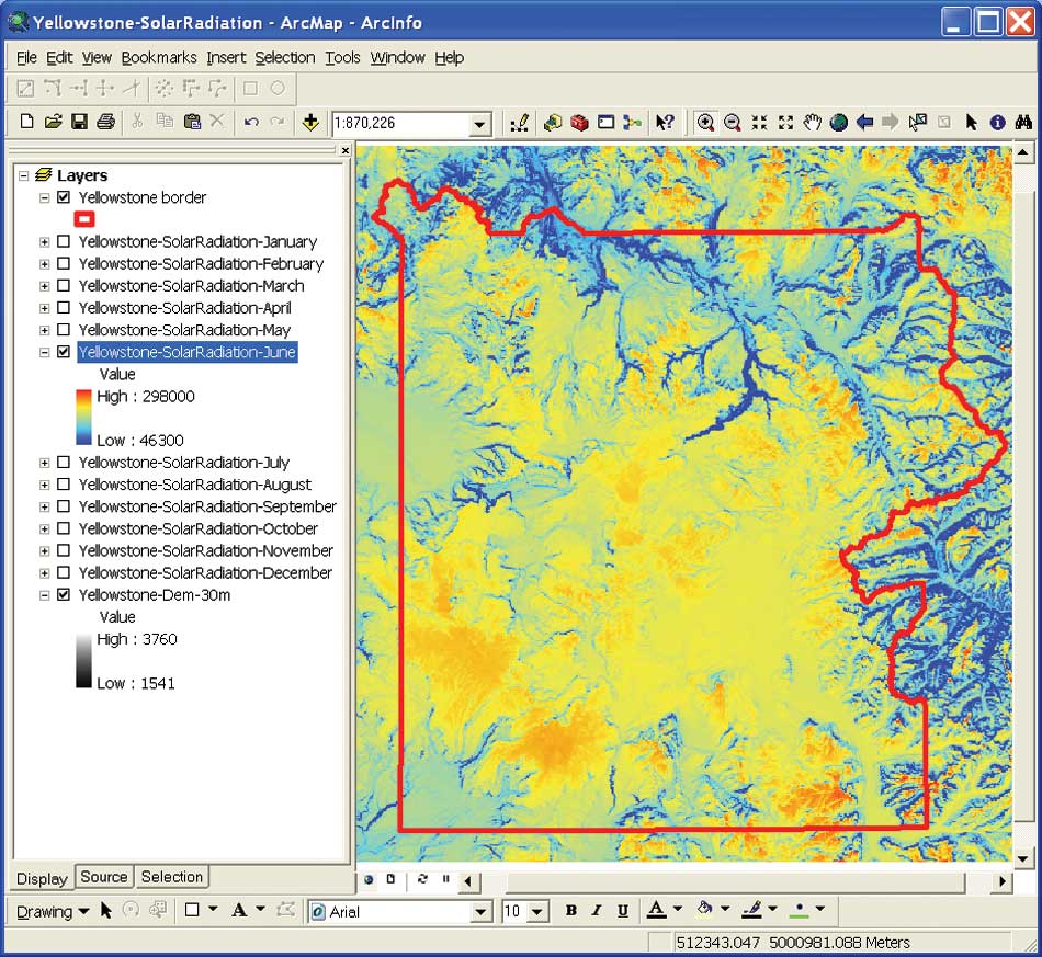
ArcGIS Server Configuration

Web servers are typically configured to accept connections from web browsers on TCP port 80.  Behind the scenes there can be many other servers feeding information on other ports.  Sometimes the other servers can accept direct connections without the web server in the middle.  For a number of reasons, security primarily, these other servers are often behind a firewall and do not accept direct connections from web browsers but do allow connections from the web server.  ArcGIS Server communicates GIS data on port 8399.  Since we generally have not had a need to serve confidential or sensitive data we have always allowed a direct connection to our servers on port 8399.  Recently one of our clients found that their in-house network did not allow connections to port 8399 and no GIS data was appearing in their maps.  Thanks to the help from Brian and Sarah V. we were able to come up with an implementation to allow the end users to connect without problems.  But, it was unclear if this was consistent with the ongoing functionality of ArcGIS Server.

There are a number of ways to configure the web server to accept a connection for ArcGIS Server on port 80 and then go behind the scenes to port 8399.  We have been experiencing various issues during the configuration process as outlined in ESRI and other documentation.  There is a lot of good information available, but it has been in the form of a number of different help articles andconfiguration instructions.  It has been difficult to locate one set of cogent instructions to get things configured start to finish.


Thankfully, I was able to sit down one-on-one with an ESRI technical staff member at the conference. He was able to walk through the process on a demo computer outlining the various steps and explain the process.  I had gotten so far on my own, but he was able to go further showing me the steps real-time.  I will be taking a closer look at how to implement this configuration – which is generally considered to be the "correct" method in lieu of direct connections to port 8399 – in our environment.

ArcGIS Software Updates

Both ArcGIS Server and Desktop will be updated to version 10.1 with an expected release of spring 2012 and a number of functions are to be deprecated.  Of course, the most visible changes are to the Desktop application. 

ArcGIS Server 

  • improved handling of API functions, query requests, and database optimization
  • Web Application Developer Framework (ADF) deprecated
  • rewritten to be 64-bit, 32-bit version deprecated
  • easier set-up
  • integrated printing function
  • improved Linux support
  • ArcIMS deprecated

ArcGIS Desktop 

  • scale bars with dual units (such as miles and kilometers)
  • use of magnetic north as a north arrow
  • coordinate system filtering – those inapplicable  to the current map extent not presented as choices
  • Maplex included for free at all license levels
  • new toolbox tools
  • accept GPS data in GPX format and convert to a layer
  • areal interpolation – for example census tract to ZIP code
  • filtering by time
  • support for LIDAR files in .las format
  • ArcInfo Workstation deprecated (version 10.0 will continue to function)
  • VBA deprecated for new development

ArcGIS Runtime 

  • a new developer tool to distribute with applications
  • no separate installation
  • does not require ArcGIS to be installed
  • small memory requirement, fast processing
  • Windows and Linux, 32- and 64-bit versions
  • mobile version later on, can be used offline

It's clear that ESRI intends to continue enhancing their online functionality.  Much of their effort is going toward making their desktop application more integrated with online data sharing.  There is, of course, the arcgis.com service which is an appealing alternative for those without their own server.  Mobile options are growing and again the emphasis is on real-time sharing and not just data collection with an upload later on.  Right along with their online service is ArcGIS Server which ties together all the various clients and applications for an integrated approach.   Your GIS data is the important focus – the same from desktop to mobile to server – and how you access it is, at best, secondary.  ESRI has shown that they are willing to move forward and recognize today's environment by discontinuing older products such as Web ADF, ArcInfo Workstation, ArcIMS, and so on after having supported them beyond their prime levels of functionality.  Overall the conference was a very positive experience, and I'm quite pleased to have had the opportunity to participate.

Details on ESRI's solar radiation tools

June solar radiation in YellowstoneA nice case study of detailed solar radiation modeling/mapping for Yellowstone National Park. All using existing ESRI spatial analyst tools.

Scientists at the National Aeronautics and Space Administration (NASA) Ames Research Center, including our buddy Chris Potter, the Yellowstone Ecological Research Center (YERC), the Creekside Center for Earth Observation (CCEO), and Esri have created 30-meter solar and temperature distribution maps in mountainous Yellowstone National Forest using tools in the ArcGIS Spatial Analyst extension. These products support ecological management in Yellowstone. 

An overview of ESRI's Solar Radiation Tools can be found here. Go forth and insolate.

New evidence of indirect land use change from biofuel production in Brazil

Querência, in Mato Grosso, BrazilA new article in Environmental Research Letters “Statistical confirmation of indirect land use change in the Brazilian Amazon," looks at how mechanized agriculture in Brazil affects the country's forest in the Amazon, which is the second largest forest in the world. The article is authored by Marcelus Caldas, an assistant professor of geography at K-State, and colleagues Eugenio Arima from the University of Texas at Austin, and Peter Richards and Robert Walker from Michigan State University. Using data from 2003-2008, the team statistically linked the loss of forest area as the indirect effect of changing pastureland into space for soybean and biofuel crops in counties bordering the Amazon.

Marcelus Caldas, an assistant professor of geography at K-State says: "Between 2003-2008 soy production expanded in Brazil by 39,000 square kilometers. Of this 39,000 square kilometers, our study shows that reducing soybean production by 10 percent in these pasture areas could decrease deforestation in heavily forested counties of the Brazilian Amazon by almost 26,000 square kilometers -- or 40 percent."

The Brazilian government says soybean and sugarcane are grown largely in degraded pasture, but data from the team's spatial analysis work cascading impacts: many of these crops have crept into the Brazilian savanna, a large area bordering the Amazon that's used for cattle. Consequently, this has created deforestation in the savanna, driving cattle inside the Amazon.

"Our data shows that the Amazon now has 79 million heads of cattle," Caldas said. "Fifteen years ago, it had less than 10 million. That means that there's a problem with cattle moving inside the forest."

This could be exacerbated with increased global demand for food crops in Brazil. The tradeoffs between food, fuel and forest could continue to come down on the side of food and fuel, at the expense of forests.

More here. Official press release here.

Wetland Tracker site, updated with new wetland data

Berkeley close up: orange are planned wetland restoration sites; yellow lines are impacted streams, blue lines are natural streams.SFEI's Wetland Tracker site has been updated with new wetland data. Specifically, the site makes available BAARI data. BAARI - the Bay Area Aquatic Resource Inventory - is a detailed base map of the Bay Area's aquatic features that includes all wetlands, open water, streams, ditches, tidal marshes and flats, and riparian
areas. The BAARI data will be used to track changes in the extent and condition of aquatic habitat, aid in ecological sample drawing, and is featured on the California Wetlands Portal, where users can browse the area's
aquatic features and restoration projects on an interactive map.

A bit late, but the tornado track from Tuscaloosa, AL

NASA has released a unique satellite image tracing the damage of a monster EF-4 tornado that tore through Tuscaloosa, Alabama, on April 27th. It combines visible and infrared data to reveal damage unseen in conventional photographs.

"This is the first time we've used the ASTER instrument to track the wake of a super-outbreak of tornadoes," says NASA meteorologist Gary Jedlovec of the Marshall Space Flight Center in Huntsville, AL.

How would you map it? as a line or as a field?

Another cool image of the tornado track.

Forest clearing and regrowth in Washington

These shots (both Landsat 5) are from much larger images provided by NASA Earth Observatory. They depict forest clearing and regrowth in Washington state. The checkerboard pattern is typical of land ownership patterns in the American West.  A nice article on this checkerboarded ownership patterns is here. The overall article talks about carbon storage and forestry; the point of the images below is 1) the pattern of clearing in 1984, which is really quite interesting and abstract, and 2) the regrowth in 2010.


From the article:

This pair of images, both from the Landsat 5 satellite, shows grids of forest disappearing and gradually regrowing over 26 years. In 1984, logging in the area appears to be in the early stages. In many places, red-brown earth is exposed under the swaths of freshly cut forest. Other grids, cleared just a bit earlier, are pale green with newly growing grasses or very young trees. The rest of the image is dominated by the deep green of dense, mature forest. In 2010, the logging operation seems to be more mature. There is little evidence of fresh cuts, but some areas have been recently cleared. Pockets of mature forest remain, and forest is regrowing in other places. Grids that had been clear in 1984 are forested in 2010.

Trees become houses, furniture, paper products, and myriad other products that we use every day. Trees are also important because they take carbon dioxide from the atmosphere and convert it to the sugars that make up the leaves and wood of the tree. Trees store carbon. The Earth Observatory’s new carbon cycle article describes the impact of deforestation on the carbon cycle:

When we clear forests, we remove a dense growth of plants that had stored carbon in wood, stems, and leaves—biomass. By removing a forest, we eliminate plants that would otherwise take carbon out of the atmosphere as they grow. We also expose soil that vents carbon from decayed plant matter into the atmosphere. Humans are currently emitting just under a billion tons of carbon into the atmosphere per year through land use changes. Changes that put carbon gases into the atmosphere result in warmer temperatures on Earth.

Satellite images like these help scientists estimate how much carbon dioxide goes into the atmosphere when a forest is cleared, and how much carbon dioxide is being taken out of the atmosphere as a forest regrows.

Read more in the Carbon Cycle feature.

Debris from Japanese tsunami steadily drifting toward California

This item got heavy news rotation this morning: the considerable debris from the tsunami in Japan is out to sea and slowly moving toward Hawaii and the west coast of the US. 

The debris is moving east at roughly 10 miles a day, and is spread over an area about 350 miles wide and 1,300 miles long -- an area roughly the size of California. It should reach beaches and coastal cities in California, Oregon and Washington in 2013 or early 2014. These estimates are from a computer model, the details of which are spotty in the articles I read. Example here from insidebayarea.

Debris movement similation: purple is low density, red is high density of debrisThere is considerable concern about this.  Last Monday, representatives from the Coast Guard, NOAA, the Environmental Protection Agency, the U.S. State Department and other agencies met for the first time in Honolulu to share information about the Japanese debris and begin to chart a strategy.

Among their plans: to notify the U.S. Navy and commercial shipping companies that regularly sail across the Pacific so they can begin to document what is floating. That could lead to expeditions to go map and study it.

Curtis Ebbesmeyer, a Seattle oceanographer who has studied marine debris for more than 20 years (and done some neat work with rubber duckies to map ocean currents) is one of the leads interviewed for the report.


Sacramento - vulnerable to levee breaks

Sacramento's levee system: levees are in orange, the inset is the capital under floodwaters.A good article from NYTimes discussing the vulnerability of Sacramento to levee breaks. Scientists consider Sacramento — which sits at the confluence of the Sacramento and American Rivers and near the delta — the most flood-prone city in the nation. The city is at risk from earthquake-damaged levees and storm related flooding.

New York City Solar Map Released

An interactive web-based map called The New York City Solar Map was recently released by the New York City Solar America City Partnership, led by Sustainable CUNY. The map allows users to search by neighborhood and address or interactively explore the map to zoom and click on a building or draw a polygon to calculate a number metrics related to building roof tops and potential solar power capacity including: potential energy savings, kilowatt output (in a time series), carbon emission reductions, payback, and a calculator for examining different solar installation options and savings with your utility provider. The map is intended to encourage solar panel installations and make information regarding solar panel capacity easier to access. Lidar data covering the entire city was collected last year and was used to compute the metrics used to determine solar panel capacity.

Solar Energy CalculatorThe data reveals that New York City has the potential to generate up to 5,847 megawatts of solar power. The installed solar capacity in the US today is only 2,300 megawatts. 66.4 percent of the city’s buildings have roof space suitable for solar panels. If panels were installed on those roof tops 49.7 percent of the current estimated daytime peak demand and about 14 percent of the city’s total annual electricity use could be met.

This map showcases the utility and power of webGIS and how it can be used to disseminate complex geographic information to anyone with a browser, putting the information needed to jump start solar panel installation in the hands of the city’s residents. The map was created by the Center for Advanced Research of Spatial Information (CARSI) at CUNY’s Hunter College and funded primarily by a United States Department of Energy grant.

Source: Click here for a NYTimes Article on the project for more information.

Click here to view the New York City Solar Map.

New York City Solar Map

Tracking apex marine predator movements in a dynamic ocean

From a new Nature article focusing on the tracking of marin predators in the Pacific. What a cool graphic!

a, Daily mean position estimates (circles) and annual median deployment locations (white squares) of all tagged species. b, Daily mean position estimates of the major TOPP guilds (from left): tunas (yellowfin, bluefin and albacore), pinnipeds (northern elephant seals, California sea lions and northern fur seals), sharks (salmon, white, blue, common thresher and mako), seabirds (Laysan and black-footed albatrosses and sooty shearwaters), sea turtles (leatherback and loggerhead) and cetaceans (blue, fin, sperm and humpback whales).

Wallow fire image from Nasa

From the Nasa Earth Observatory: The newly burned land left in the wake of the Wallow Fire is dark red in this false-color image taken on June 15, 2011. The image, acquired by the Landsat 5 satellite, is made with infrared light. The slightly blue blur is smoke, and dots of bright orange-red on the south side of the burn are active fires. Unburned forest is green, and sparsely vegetated land is pink.

By the end of the day on June 15, the Wallow Fire had burned 487,016 acres of forest in eastern Arizona and was 20 percent contained. Most of the fire activity was on the south side of the fire, away from the majority of the communities that had been evacuated. Among the places evacuated were Greer and Eager, labeled in the image. Irrigated plants (like lawns) are pale spots of green and buildings are tiny dots of blue. Most of the 32 homes destroyed in the fire were in Greer, where the fire clearly burned to the edge of the community. While the burned area encroaches on Eager in places, a buffer of green separates the community from the fire.