40 Years of Las Vegas Growth Visualized via Landsat
/NASA recently released a time-lapse video of false-color Landsat imagery from 1972-2010 for Las Vegas showing the city’s sprawling growth. For more on the video and data click here.
mapping for a changing california
Welcome to the Kellylab blog! We post fun facts and things that catch our eye. Occasionally I wax lyrically about a topic of interest.
NASA recently released a time-lapse video of false-color Landsat imagery from 1972-2010 for Las Vegas showing the city’s sprawling growth. For more on the video and data click here.
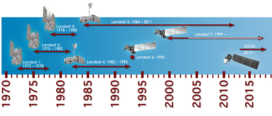
Tentatively excited: the Landsat mission will continue (I think). Its new name will be LDCM: Landsat Data Continuity Mission. Tentative launch date in 2013. More information here. The President's recent budget seemed to inlude continued funding for Earth Observation. The news post I read says: Among the other highlights in the White House summary, spending on Earth observation satellites would be maintained at nearly $1.8 billion next year.
 Here is the famous mangrove heart from Yann Arthhus-Bertrand's Earth From Above project. Which now lets you download imagery for free. And if you need more, here is a collection of random (and mostly vegetated) hearts from above.
 Europe's farmers receive payments for maintaining basic standards on the environment, food safety, plant health and animal welfare. In this BBC article "spying on Europe’s farms with satellites and drones" Lawrence Peter discusses the use of UAVs in conjunction with satellite imagery to validate and verify farmers' subsidies without having to send inspectors in person. They are not used everywhere: Austria does not use them, on the grounds that the shadows cast by very mountainous terrain sometimes make satellite images inaccurate. And Scotland, unlike the rest of the UK, decided against satellites because of the difficulty of getting enough clear weather for flyovers.
Notes:
Recently, NASA released a new Blue Marble graphic, from sensors aboard TERRA. The Talk of the Nation Science Friday video of the week tells the story of these NASA's Blue Marble maps. From the Apollo 8 crew's image from 1968, to the Apollo 17 mission of 1972, through the Voyager image, through modern remote sensing techniques, to 2002's original Blue Marble image (now used as the default background on the iphone), to this new release. They highlight the work of Rob Simmon and Gene Feldman, who discuss the composition of the product, highlighting the art that goes into the scientific product. Very cool! More discussion here.
I am reading a fascinating book this January (xmas gift from the parents) by Jonathan Raban called Driving Home: An American Journey. He is a wonderful writer, and in the introduction he discusses his love of reading, travel and landscapes. He puts all of these into a kind of analytical framework, and discusses how one can observe and consider writing, language, and landscapes as a way to better understand people, context, place and history. Consider this marvelous paragraph:
Trying to understand the habitat in which we live requires an ability to read it - and not just in a loose metaphorical sense. Every inhabited landscape is a palimpsest (this is me now: what an awesome word! see below for definition), its original parchment nearly blackened with the cross-hatching of successive generations of authors, claiming this place as their own and imposing their designs on it, as if their temporary interpretations would stand forever. Later overwriting has obscured all but a few, incompletely erased fragments of the earliest entries on the land, but one can still pick out a phrase here, a word there, and see how the most recently dried layer is already being partially effased with fresh ink.
From wikipedia: A palimpsest is a manuscript page from a scroll or book from which the text has been scraped off and which can be used again. I had not heard of its used as a metaphor for a landscape before, but I like it!
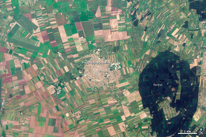 Hajdúböszörmény, Hungary. LandsatYesterday this NASA image post came across my screen as a fitting example of what Raban is talking about. In the text that accompanies the image, they say "The history of Hajdúböszörmény, Hungary, echoes across its name and over its outline on the land." They go on to discuss the derivation of its name, which echoes past conflicts and local economy, and show how its history is written on the land, in layers of land use.
"The city is round, a shape easily defended on the flat North Pannonian Plain in northeastern Hungary. The livestock-based economy may also play a role in the shape of the city. The center is densely built, a concentrated ellipse of tan and white. Surrounding the center is a slightly less dense circle, marked by diagonal roads, which held stockyards and gardens. Even today, tiny spots of green indicate that this area contains more open garden space than the city center."
Hooray for geography, landscape history and remote sensing. All fascinating subjects to study. And, I recently found this blogpost from Tim DeChant, former grad student and honorary geographer, in which he describes "ghosts of geography".
Thanks Marek! Flying into our northern SNAMP field site via landsat to lidar.
Happy New Year everyone.
earthmine's Anthony Fassero visited yesterday to give a Geolunch presentation and blew us away with the amazing technology that they are employing! Anthony, and Co-Founder John Ristevski started earthmine just a few years ago after graduating from Cal.
earthmine has developed the camera system and engineering to take high resolution 3d street level images using only photogrammetric techniques (no lidar), as well as software tools that allow users to work with the data directly in ArcGIS and other geospatial applications. These tools allow you to not only view the data alongside a map, but to actualy make 3d measurements one the fly and edit ancillary data layers from within the phot view.
You have to see it for yourself! Check out this video to see teh data and tools in action.
NASA and Japan’s Ministry of Economy, Trade and Industry released yesterday a new and improved version of their ASTER global digital elevation model (GDEM) which was first released in 2009. This new and improved version offers improved spatial resolution, horizontal and vertical accuracies, and more realistic coverage over water bodies with the ability to identify water bodies as small as 1 km in diameter. This new data is now comparable to NASA's Shuttle Radar Topography Mission DEM data. The new ASTER GDEM covers 99 percent of the Earth’s landmass at 30 meter spatial resolution. It is free to download here. For information on the improved version see here and here.
 ASTER DEM of Grand Canyon National Park in northern Arizona July 14, 2011 from space.com. Credit: NASA/GSFC/METI/ERSDAC/JAROS, and U.S./Japan ASTER Science Team
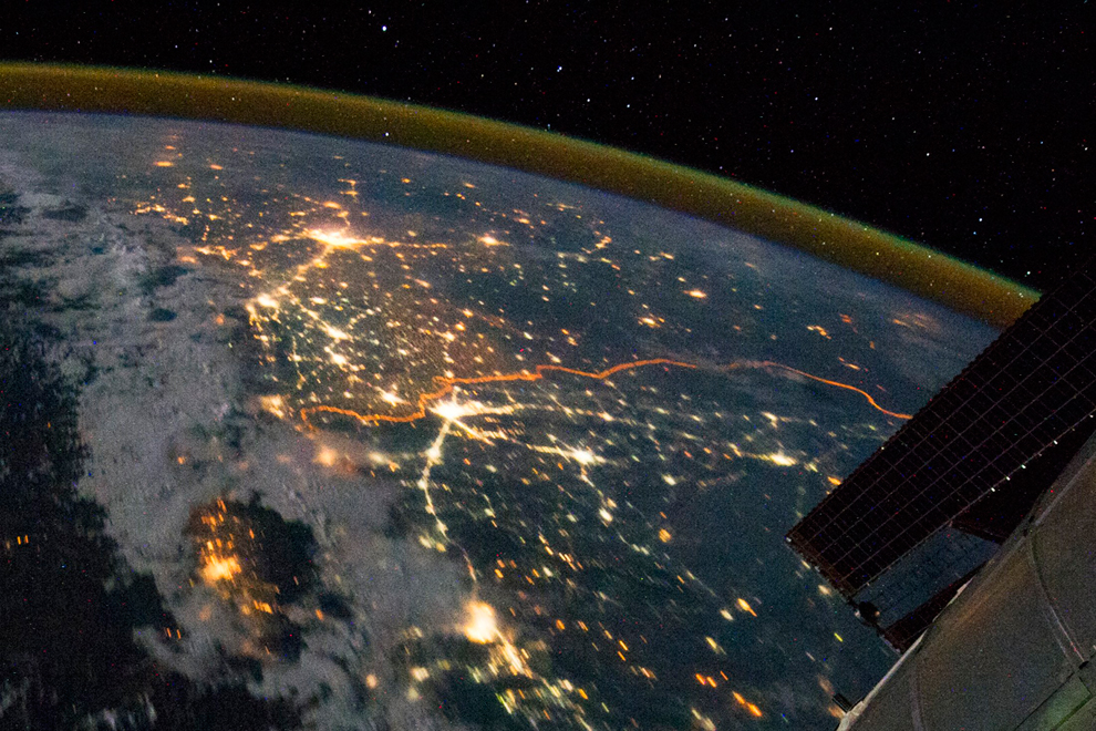 From NASA re-posted via Bostom.com's The Big Picture photojournalist website comes this fascinating, geographically-pertinent image: "The India-Pakistan border appears as an orange line in this photograph taken by the Expedition 28 crew on the International Space Station on August 21, 2011. The fence between the two countries is floodlit for surveillance purposes. Srinagar (left), Islamabad (bottom center), Lahore (center near the border line) and Delhi (top center) can be seen as brighter spots. (NASA/Handout/Reuters)#"
 A nice example of remote sensing for fire: this visualization allows you to compare the utility of hyperspectral images to see through the smoke and map fire scars. The article is about a lightning strick fire in the fantastically named "Great Dismal Swamp" in Virginia. Hurricane Irene might put a damper on the fire.
“Eight inches of rain will not put the fire out,” said Tim Craig, Fire Management Officer for the refuge. “It will buy us time to clear our way through the downed trees back to the fire zone after the storm.” Irene generously drenched the swamp with 10 – 15 inches of rain, but initial assessments show that the fire is still burning. Before the storm, the Lateral West fire was 35 percent contained. Smoke still rose from at least 30 acres after the storm though open flames were no longer visible and the fire did not spread under Irene’s strong winds, said local news reports. The sudden flush of rain left puddles that are still soaking in to the soil and may yet help extinguish the fire.
See the interactive tool and article here.
 Vegetation anomaly from AVHRRFrom NASA Earth Observatory. More of the United States was in exceptional drought in July 2011 than in any other month in the past 12 years, according to the National Climatic Data Center. The worst of the drought is spread across Texas, Oklahoma, New Mexico, and parts of Arizona, Colorado, Nebraska, and Louisiana. But 26 percent of the lower 48 states experienced severe to extreme drought in July.
On the other hand, about 33 percent of the contiguous United States experienced exceptionally rainy weather in July. The wet weather occurred largely in the Northern Plains and Western states.
These weather patterns—the mix of unusually dry and unusually wet—are reflected in plant growth throughout the month. The image shows plant growth in July compared to average conditions. Places where plants were growing more than average are green, while unusually poor growth is shown in brown. The image was made with data from the Advanced Very High Resolution Radiometer on the NOAA-18 POES satellite.
The worst growing conditions are, unsurprisingly, in the Southern Plains. States throughout the region reported poor pasture conditions and struggling crops. Much of the southeast and eastern United States is also mildly dry. These dry conditions weren’t helped by temperatures in July. For most of the United States, July was unusually hot, drying the soil and baking crops.
The Northern Plains and Western States, on the other hand, experienced a cool, rainy July. California had its eighth rainiest July on record, while Montana, North Dakota, Utah, Wyoming, and South Dakota all received above-average rain. This is reflected in plant growth, particularly in Montana and South Dakota.
The culprit behind these unusual weather patterns is a persistent high pressure system that is steering storms away from the south central United States. Based on current conditions, the Climate Prediction Center expects the drought to last through at least the end of October. In some parts of the South, it would take more than 20 inches of rain to end the drought in a month.
 Querência, in Mato Grosso, BrazilA new article in Environmental Research Letters “Statistical confirmation of indirect land use change in the Brazilian Amazon," looks at how mechanized agriculture in Brazil affects the country's forest in the Amazon, which is the second largest forest in the world. The article is authored by Marcelus Caldas, an assistant professor of geography at K-State, and colleagues Eugenio Arima from the University of Texas at Austin, and Peter Richards and Robert Walker from Michigan State University. Using data from 2003-2008, the team statistically linked the loss of forest area as the indirect effect of changing pastureland into space for soybean and biofuel crops in counties bordering the Amazon.
Marcelus Caldas, an assistant professor of geography at K-State says: "Between 2003-2008 soy production expanded in Brazil by 39,000 square kilometers. Of this 39,000 square kilometers, our study shows that reducing soybean production by 10 percent in these pasture areas could decrease deforestation in heavily forested counties of the Brazilian Amazon by almost 26,000 square kilometers -- or 40 percent."
The Brazilian government says soybean and sugarcane are grown largely in degraded pasture, but data from the team's spatial analysis work cascading impacts: many of these crops have crept into the Brazilian savanna, a large area bordering the Amazon that's used for cattle. Consequently, this has created deforestation in the savanna, driving cattle inside the Amazon.
"Our data shows that the Amazon now has 79 million heads of cattle," Caldas said. "Fifteen years ago, it had less than 10 million. That means that there's a problem with cattle moving inside the forest."
This could be exacerbated with increased global demand for food crops in Brazil. The tradeoffs between food, fuel and forest could continue to come down on the side of food and fuel, at the expense of forests.
 NASA has released a unique satellite image tracing the damage of a monster EF-4 tornado that tore through Tuscaloosa, Alabama, on April 27th. It combines visible and infrared data to reveal damage unseen in conventional photographs.
"This is the first time we've used the ASTER instrument to track the wake of a super-outbreak of tornadoes," says NASA meteorologist Gary Jedlovec of the Marshall Space Flight Center in Huntsville, AL.
How would you map it? as a line or as a field?
Another cool image of the tornado track.
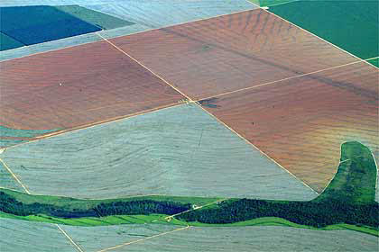
These shots (both Landsat 5) are from much larger images provided by NASA Earth Observatory. They depict forest clearing and regrowth in Washington state. The checkerboard pattern is typical of land ownership patterns in the American West. A nice article on this checkerboarded ownership patterns is here. The overall article talks about carbon storage and forestry; the point of the images below is 1) the pattern of clearing in 1984, which is really quite interesting and abstract, and 2) the regrowth in 2010.


From the article:
This pair of images, both from the Landsat 5 satellite, shows grids of forest disappearing and gradually regrowing over 26 years. In 1984, logging in the area appears to be in the early stages. In many places, red-brown earth is exposed under the swaths of freshly cut forest. Other grids, cleared just a bit earlier, are pale green with newly growing grasses or very young trees. The rest of the image is dominated by the deep green of dense, mature forest. In 2010, the logging operation seems to be more mature. There is little evidence of fresh cuts, but some areas have been recently cleared. Pockets of mature forest remain, and forest is regrowing in other places. Grids that had been clear in 1984 are forested in 2010.
Trees become houses, furniture, paper products, and myriad other products that we use every day. Trees are also important because they take carbon dioxide from the atmosphere and convert it to the sugars that make up the leaves and wood of the tree. Trees store carbon. The Earth Observatory’s new carbon cycle article describes the impact of deforestation on the carbon cycle:
When we clear forests, we remove a dense growth of plants that had stored carbon in wood, stems, and leaves—biomass. By removing a forest, we eliminate plants that would otherwise take carbon out of the atmosphere as they grow. We also expose soil that vents carbon from decayed plant matter into the atmosphere. Humans are currently emitting just under a billion tons of carbon into the atmosphere per year through land use changes. Changes that put carbon gases into the atmosphere result in warmer temperatures on Earth.
Satellite images like these help scientists estimate how much carbon dioxide goes into the atmosphere when a forest is cleared, and how much carbon dioxide is being taken out of the atmosphere as a forest regrows.
Read more in the Carbon Cycle feature.

From the Nasa Earth Observatory: The newly burned land left in the wake of the Wallow Fire is dark red in this false-color image taken on June 15, 2011. The image, acquired by the Landsat 5 satellite, is made with infrared light. The slightly blue blur is smoke, and dots of bright orange-red on the south side of the burn are active fires. Unburned forest is green, and sparsely vegetated land is pink.
By the end of the day on June 15, the Wallow Fire had burned 487,016 acres of forest in eastern Arizona and was 20 percent contained. Most of the fire activity was on the south side of the fire, away from the majority of the communities that had been evacuated. Among the places evacuated were Greer and Eager, labeled in the image. Irrigated plants (like lawns) are pale spots of green and buildings are tiny dots of blue. Most of the 32 homes destroyed in the fire were in Greer, where the fire clearly burned to the edge of the community. While the burned area encroaches on Eager in places, a buffer of green separates the community from the fire.
Yesterday at the annual ASPRS conference in Milwaukee, WI (yes there were sausages shaped like the state), Jack Dangermond announced the release of ChangeMatters, and new Landsat Image Services from ESRI.
ChangeMatters. Working with partners, ESRI developed this web application - ChangeMatters - which allows users throughout the globe to quickly view the GLS Landsat imagery both multi-spectrally (in different Landsat band combinations) and multi-temporally (across epochs), and to conduct simple change detection analysis.
Image Services, with examples of vegetation, false color, land-water band combinations in seamless, color matched Landsat mosaics. Downloads will be available soon. Pretty nice. Website.
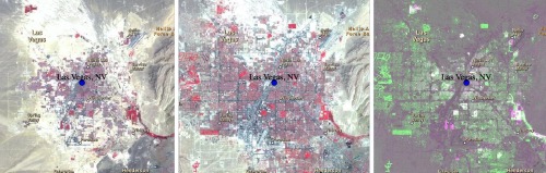 Example from ChangeMatters: Las Vegas from 1975 - 2000. Green is increase and red decrease in veg
This is an exerpt from our recent SNAMP newsletter on our lidar work, written by me, Sam, and Qinghua.
We are using Lidar data to map forests before and after vegetation treatments and measuring forest habitat characteristics across our treatment and control sites. These data will give us detailed information about how forest habitat was affected by fuel management treatments.
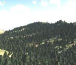 Visualizing the forest
The image at left is not a photograph: it is a computer generated image of our SNAMP study area, using only Lidar data. These kinds of visualizations are commonly used in the forestry field for stand and landscape management, and to predict environments into the future. But visualization software packages usually only focus on one stand at a time. Our method allows us to visualize the whole firescape. This is useful for understanding the complexity in forest structure across the landscape, how the forest recovers from treatments, and how animals with large home ranges might use the forest. The UC Merced team created this cutting-edge product.
Finding the trees in the forest
In order to see the trees in the forest, the UC Merced spatial team researchers developed a method to segment individual trees from the Lidar point cloud. The method identifies and classifies trees individually and sequentially from the tallest tree to the shortest tree. We tested this method on our SNAMP Lidar data. These forests are complex mixed coniferous forests on rugged terrain, and yet our method is very accurate at defining individual tree shapes. We are applying the method in both of the SNAMP study areas.
 Mapping downed Logs with lidar data
The UC Berkeley spatial team researchers used some new techniques that help distinguish individual features, and mapped the logs, as well as some of the trees in this stand. In the figure at left: red colors are logs, green colors are trees.
More information on these and other projects can be found on the SNAMP website.
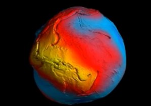 the new geoid: yellow is highest and blue lowest gravityNew results from Europe's Goce satellite has rendered a highly detailed map of how gravity varies across the Earth. These kind of measures are important for understanding how gravity shapes some key processes on Earth.
"Chief among these new insights is a clearer view of how the oceans are moving and how they redistribute the heat from the Sun around the world - information that is paramount to climate studies.
Those interested in earthquakes are also poring over the Goce results. The giant jolts that struck Japan last month and Chile last year occurred because huge masses of rock suddenly moved. Goce should reveal a three-dimensional view of what was going on inside the Earth."
The article describing the work, from the BBC, also includes a nice discussion of the concept of the geoid.
This is an exerpt from an older SNAMP newsletter Marek and I wrote describing the use of lidar in our Sierra Nevada Adaptive Management Project. Originally published November 2008.
Environmental sciences are inherently spatial, and geospatial tools such as Geographical Information Systems (GIS), Global Positioning Systems (GPS) and remote sensing are fundamental to these research enterprises. Remote sensing has been used for forest and habitat mapping for a long time, and new technological developments such as LIDAR (light detection and ranging) are making this field even more exciting. Here we briefly describe LIDAR’s basic principles and show some preliminary analyses completed for the SNAMP Project. We are using this data to model detailed topography to help the water team understand runoff in the SNAMP watersheds, to map forest canopy cover and vegetation height as inputs to the fire and forest health team’s detailed fire models, and to derive important forest habitat characteristics for the spotted owl and fisher teams.
We contracted with the National Center for Airborne LIDAR Mapping (NCALM) for our data. They flew the GEMINI instrument at approximately 600 m above ground level, with 67% swath overlap. The instrument collected 4 discrete returns per pulse at 125kHz, and the data has a final
density of 9 points per m2.
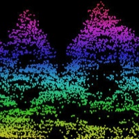 Raw Data: LIDAR data is typically delivered as a “point cloud,” a collection of elevations and their intensities that can be projected in a three-dimensional space. In Figure 2 (right) we show this “point cloud” concept. There are thousands of individual points in the image, each colored according to its height (magenta and red are high, orange and yellow are low).
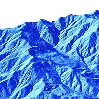 Bare Earth: Once the data is collected, the first step is to transform the data into a “bare earth” model; which is an approximation of the ground if all objects above surface are removed. We use the “Last Return” data (see Figure 1 above) to generate this model of the bare earth. These are typically very detailed products (with a small footprint on the ground) and provide much more topographic information than from Digital Elevation Models (DEMs) that were derived from topographic maps. Our DEM has a ground resolution of under 1m.
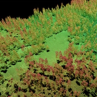 Forest Structure: Another typical step in processing LIDAR data is to examine individual trees and forest structure. An example of a forest stand is shown in Figure 4. These and other products help us understand how the forest influences surface hydrology, how a patch of forest might provide habitat for a fisher and how a forest might burn given certain weather and wind patterns.
Future Analyses: We are in the process of linking the forest parameters gathered by the Fire & Forest Ecosystem Health Team in summer 2008 with the LIDAR-derived data to help scale-up forest variables to the fireshed scale. For example, tree height, tree DBH (diameter-at- breast-height) and canopy cover have been successfully modeled using LIDAR data in other studies, and there is active research linking field-based and LIDAR-based fire-related measures such as canopy base height and ladder fuels, and wildlife-related measures such as vertical structure.