Before and after the Japanese earthquake, and our nuclear sites in CA

California’s two nuclear power plant locations: Diablo Canyon and San OnofreUpdated satellite photos from Japan, before and after the earthquake, including the Fukushima Daiichi Nuclear Plant. From the NY Times. Imagery from GeoEye and Digital Globe.  FYI, California’s two nuclear power plants, the dual-unit Diablo Canyon and dual-unit San Onofre systems, produce about one-fifth of the state’s total electricity generation. San Onofre is featured in a number of films, including Naked Gun. Both are apparently designed to withstand earthquakes of 7 or 7.5 magnitude, depending on who you ask. 

Google Earth Engine Debuted at the International Climate Change Conference in Cancun, Mexico

Google.org introduced a new Google Labs product called Google Earth Engine at the International Climate Change Conference in Cancun, Mexico. Google Earth Engine is a new technology platform that puts petabytes of satellite imagery and data from the past 25 years online, many of which have never been seen, much less analyzed. The platform will enable scientists around the world to use Google’s cloud computing infrastructure to implement their applications. For example, creating a detailed forest cover and water map of Mexico, a task that would have taken 3 years on one computer, was accomplished in less than a day.

Google Earth Engine can help scientists track and analyze changes in Earth’s environment  and can be used for a wide range of applications—from mapping and monitoring water resources to ecosystem services to deforestation. The idea is to enable global-scale monitoring and measurement of changes in the earth’s environment by providing scientists a vast new amount of data and powerful computing resources.

Read more at Introducing Google Earth Engine or watch Google Earth Engine Overview videos.

New global map of mangroves

From NASA. Mangroves are among the most biologically important ecosystems on the planet, and a common feature of tropical and sub-tropical coastlines. But ground-based evidence suggests these vital coastal forests have been strained in many regions because of harvesting for food, fuel, and medicine. Now, scientists have used satellite images to compile the most comprehensive map of mangroves worldwide, which should help in future efforts in monitoring and conservation. New global maps of mangroves have been developed.

The effort to create the maps was led by Chandra Giri of the U.S. Geological Survey and published recently in the journal Global Ecology and Biogeography. Using digital image classification techniques, the research team compiled and analyzed more than 1,000 scenes from the Landsat series of satellites.

Giri and colleagues found 12.3 percent less area covered by mangroves than previously estimated by the United Nations Food and Agriculture Organization. The current extent of mangroves is probably half of what once existed. Only 6.9 percent of mangrove forests are protected by law.

See more here.

TanDEM-X and TerraSAR-X set to create global DEM by 2014 at 12 m spatial resolution

German based TanDEM-X and TerraSAR-X satellites, launched in 2007 and 2010 respectively, begin their tandem orbit flight to create a new global DEM product of the Earth's surface to be available in 2014.

The TanDEM mission seeks to produce a global DEM at 12 meter sp

atial resolution with a relative vertical accuracy of less than two meters. With this kind of specification "'the TanDEM dataset will replace SRTM'". The US Shuttle Radar Topography Mission (SRTM) of 2000 is one of the best-known, near-global, space-borne DEM prior to TanDEM. Its best product has a 30 meter spatial resolution, and a vertical accuracy that varies from 16m to 10m.

Airborne laser instruments such as Lidar can achieve finer spatial resolution and vertical accuracy but their products are regional - they are not seamless maps of the whole Earth as TanDEM will be able to achieve. For more read the full story here.

Welcome to Fall 2010 with this stunner of a pic from NASA

Mataiva Atoll, Tuamotu Archipelago, South Pacific OceanFrom the NASA Earth Observatory Image of the Day: The Tuamotu Archipelago is part of French Polynesia, and forms the largest chain of atolls in the world. This astronaut photograph features Mataiva Atoll, the westernmost atoll of the Tuamotu chain. Mataiva Atoll is notable in that its central lagoon includes a network of ridges (white, image center) and small basins formed from eroded coral reefs. Mataiva means “nine eyes” in Tuamotuan, an allusion to nine narrow channels on the south-central portion of the island. The atoll is sparsely populated, with only a single village—Pahua—located on either side of the only pass providing constant connection between the shallow (light blue) water of the lagoon and the deeper (dark blue) adjacent Pacific Ocean. Much of the 10-kilometer- (6-mile-) long atoll is covered with forest (greenish brown). Vanilla and copra (dried coconut) are major exports from the atoll, but tourism is becoming a larger part of the economy.

This is not a satellite image, but a photograph taken by the Expedition 24 crew from the International Space Station (I think) on August 13, 2010, with a Nikon D2Xs digital camera using a 400 mm lens. More here.


Global 12m DEM with TanDEM-X satellite

Comparison between SRTM and TanDEM-XFrom the BBC: The TanDEM-X satellite has blasted into orbit on a mission to acquire the most precise 3D map of the Earth's surface.

The German radar spacecraft will fly in formation with an identical platform called TerraSAR-X launched in 2007.  Together, the pair will measure the variation in height across the globe to an accuracy of better than two metres.

With the TanDEM mission, the intention is to go down to a vertical resolution of two metres, with a spatial resolution of 12m by 12m. Airborne laser instruments (lidars) can do better than this but their DEMs are only regional. To achieve the TanDEM level of detail on all 150 million sq km of the Earth's land surface will require three years of operation.

NAIP 2009 Color Infrared Released

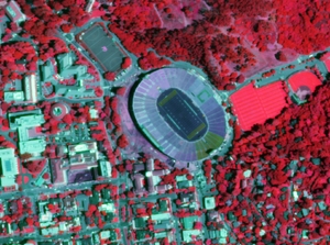
NAIP Color infrared, June 19, 2009Color Infrared imagery acquired during the summer of 2009 are now available for download from Cal-Atlas.  An index shapefile to identify the location of each image can be downloaded here (ZIP - 727KB).

The National Agriculture Imagery Program (NAIP) is tasked with providing access to high-resolution aerial image data on a state-by-state basis. 

These images are 1 meter resolution, 4 band GeoTIFFs that contain all of the natural color and infrared channels. 

Direct links to all of the California NAIP products are maintained on the GIF's website.  Currently, NAIP data is available for both 2005 and 2009.

Lightweight UAV Camera System Demo

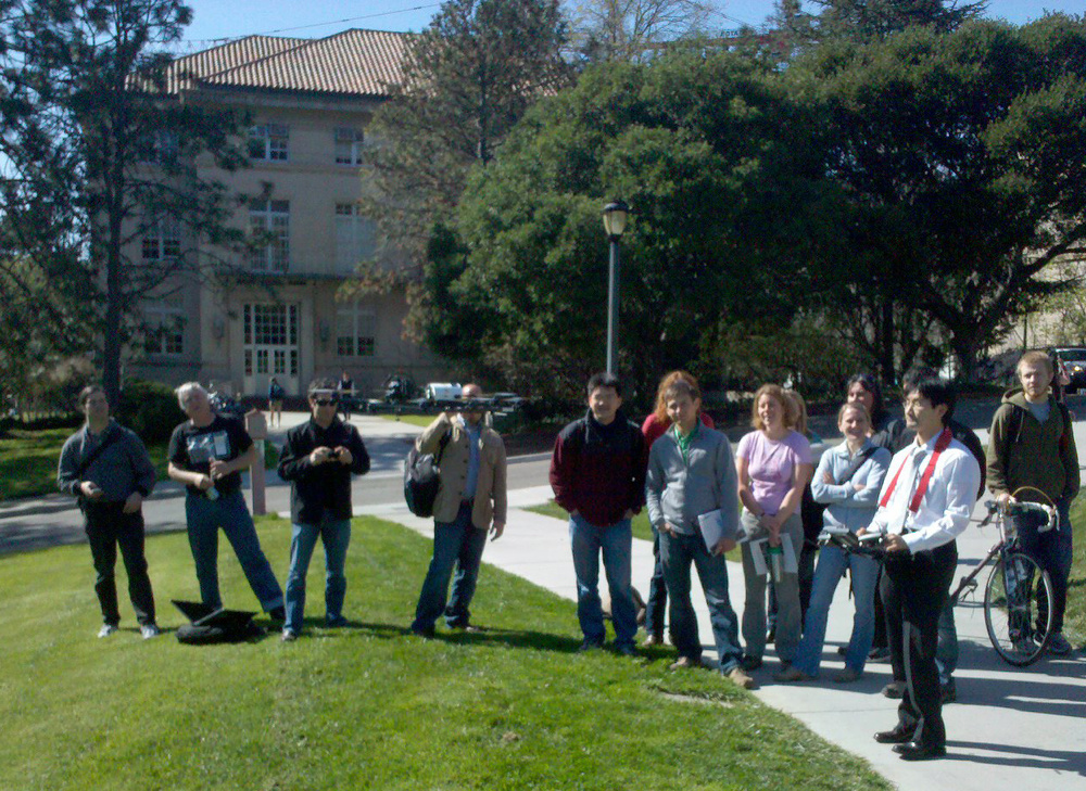
Yasuyuki launches the remotely controlled UAVWe enjoyed a fun Geolunch presentation yesterday, where Ben Burford of ISTS America and Yasuyuki Watabe and Masaki Usami from ISTS Japan showed off a new aerial photography system.  

This lightweight camera system is able to capture centimeter resolution image data at a fraction of the weight and cost of a traditional aerial photography system.  They’ve also developed software that can automatically orthorectify these acquired images with only the photos, gps location of the camera, and camera information. 

After presenting their systems capabilities in a slideshow presentation, the developers showed off their UAV with a live demo outside of Mulford Hall! 

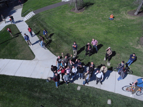
Photo of onlookers taken from the UAV (photo compliments of Yasuyuki Watabe)

 You can view ISTS's promotional video here:


Fog in California - it's declining

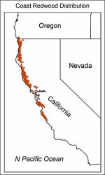
James A. Johnstone and Tod Dawson's recent paper in PNAS show that California's coastal fog has decreased significantly over the past 100 years, potentially endangering coast redwood trees dependent on cool, humid summers. Coast redwoods, Sequoia sempervirens, grow in a narrow coastal band, from Big Sur to Oregon, characterized by cool summer temperatures and high humidity from fog (see map at right from USGS).  They analyzed 20th century climate station records, and have shown that since 1901, the average number of hours of fog along the coast in summer has dropped from 56 percent to 42 percent, which is a loss of about three hours per day. Excerpted here.

Disaster response evolves: faster, more detailed, and community focused

The recent earthquake in Haiti makes us, placed as we are on another of the great faults of the western hemisphere, take pause and think about the fragility of life and the suddenness of disasters like earthquakes.  The mapping of earthquakes - their shake strength, fault lines, and past seismicity - and their damage, has changed in recent years. The Haiti quake shows this: within hours and days of the quake, we were able to see the shake intensity, historical seismicity and detailed faults from the USGS, and Open Street Map opened up a crisis center for participatory mapping. International agencies requested satellite data of the area and, NASA, GeoEye and the European Space Agency responded, and shared their imagery freely.  A number of detailed before and after visualizations from outlets like the NY Times and Bing Maps quickly followed. The disaster and the geospatial response was chronicled in many blogs. 

This is more than what was available to us recently with the San Diego, California fires or the San Francisco Oil Spill in 2007, or Hurricane Katrina in 2005, or the Indian Ocean Tsunami in 2004, each of which set new records for mapping speed and creativity. Each global-scale disaster seems to be a driving innovative force to help shape and evolve participatory mapping, detailed imagery delivery, and spatial decision support tools.  For example, this past weekend I was involved in a World Bank effort called Operation GEO-CAN – Global Earth Observation – Catastrophe Assessment Network (press release here) to analyze aerial imagery from imagery from Port au Prince in 2009 (top) and 2010 (bottom)before and after the Haiti earthquake.  The World Bank needed fast action to get a clearer picture of damage and rebuilding needs. Hundreds of people, from 20 countries, recruited via email, were quick to lend their expertise to digitize and describe collapsed buildings evident in new GeoEye imagery when compared to older imagery (see example at left).  The Earthquake Engineering Research Institute (EERI), who helped coordinate the effort, used a fast, mobile, distributed thinking system that employed a Google Earth framework and a clever workload management system that allowed users to check out individual tiles of imagery, search for collapsed buildings, digitize them, and then upload the data as lean and mean kmz files. The effort was viral, and continued to grow over the weekend as many of us analyzed tile after tile of imagery, and saw the unimaginable destruction in Haiti. It is astonishing what you are able to see with detailed, multi-temporal, nadir view imagery: collapsed buildings and walls; tents erected in back yards; blocked roads.  The dataset we created will be used to guide emergency response and restoration.

This kind of distributed analysis was inconceivable not long ago. The GeoEye satellite, which captures sub-meter imagery routinely, and Google Earth, which seamlessly coordinates multiple imagery streams, are now mainstream in the 21st century, as are other tools like Open Street Map and Bing. New imagery of disaster foci, new software to fuse and analyze multi-temporal imagery, new database management tools to guide workflow are critical, but it is visionary thinking that is able to quickly capture a concerned and technically capable audience that is paramount. We can learn from our response to the horror of natural disasters like earthquakes to support research in environmental sciences.  These experiences reinforce the message that geospatial tools, as tools alone, are inconsequential. But when we can quickly and accurately map pattern and context, and use that to support decisions, plan for the future, and communicate options, geospatial tools can be the among most powerful available to us.  Along these lines, we at the GIF have been turning our attention internationally, and are focusing on several international projects. For example, we are working with colleagues from the Department of Economics to map land cover change in order to study patterns of human conflict in Sierra Leone, and helping train professional health care students from UCSF who will be stationed in African and India in coming years to look for connections between human health and environment.  We will write about some of these in our upcoming newsletter.

As a last word, there is plenty more to do in Haiti: places to donate include the Red Cross, Salvation Army, and Partners in Health, among many, many more.

Free Haiti Imagery through Digital Globe

Digital Globe is offering free access to Haiti imagery pre- and post-earthquake.

They're offering three ways to access the imagery:

  1. KML Overlay for Google Earth that displays the most current imagery for a given location.
  2. ImageConnect plug-in for GIS software that allows GIS professionals to view all the images that have been loaded to the Crisis Event Service.
  3. FTP access to GeoTIFF imagery from QuickBird, WorldView-1 and WorldView-2.

Register at this site for free imagery: http://dgl.us.neolane.net/res/dgl/survey/CES_H.jsp

New NAIP imagery available for CA!

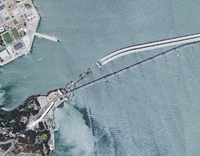
New Bay Bridge construction as seen in the 2009 NAIP imagery

Two great new resources from the National Agriculture Imagery Program (NAIP) are now available for the State of California, and can be download via Cal-Atlas:

2009 Natural Color Imagery: Divided into counties, natural color imagery is now available in MrSid Format.  These images were acquired in the summer of 2009.

2005 Color Infrared Imagery: Divided into quarter-quads, color infrared image tiles from the 2005 dataset are now available for the entire state in jpeg2000 format. 

Michael Byrne, California’s Geographic Information Officer, estimates that the color infrared imagery from the 2009 dataset will be available in 6-7 months.

Mapping wetlands: the GlobWetland project

A bit late, but a good source of wetland mapping information from the the GlobWetland Symposium: Looking Lake Bogoria in Kenya, Landsatat wetlands from space.  The GlobWetland project was launched in 2003 with the aim of developing and demonstrating earth observation-based information services to support wetland managers and national authorities worldwide in responding to the requirements agreed under the Convention. The project involved 50 different wetlands in 21 countries and relied on the direct collaboration of several regional, national and local conservation authorities and wetland managers. It has now produced a number of standardised information products (e.g. land use and land cover maps, change-detection maps, water cycle regime maps and others) validated over the 50 selected sites by the users themselves, consolidated methods and guidelines for the users to continue the work after the project lifetime.

The GlobWetland Symposium was held in October 2006 in Frascati, Italy to inform the general public and policy makers of the importance of wetlands and to promote their conservation and protection worldwide. The papers in this special issue highlight the major points and recommendations derived from the Symposium while the final conclusions provide a basis for initiating new actions within the ESA in support of the EO requirements of the Ramsar Convention and the wetlands community.

The special issue in Journal of Environmental Management from the conference has many interesting papers on wetlands mapping.

William Bowen: 3 new aerial flights of the Sierra Nevada


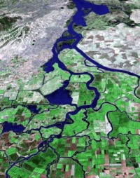
William Bowen has produced some new lovely high res aerial flyovers (some with what he describes as "choppy and unscripted" - but very informative - narration). At left, one of his great images of the Delta from the California Atlas of Panoramic Images.


Three new silent movies focusing on the High Sierra:

Examples with narration:

Using LiDAR las files in next eCognition version

via Andreas Lang at the Definiens Community

Can we load and process LiDAR las files in Definiens eCognition (Developer or Server) directly?

The new Definiens software will have two ways for handling las files via converting them into rasters directly in the Software:

  • a raster driver for loading and visualizing these kind of images (with an appropriate dialog for setting the resolution for converting the point cloud to a 2D raster) using the driver the user can see the intensity data and select an appropriate subset;
  • an algorithm for converting the existing loaded image layer (las file) into a feasible layer with appropriate data of intensity, elevation, class or number of returns for further processing with much more functionality for filtering:
    • By Return (All/First/All)
    • By Classes
    The user can also select the kind of calculation for a raster cell value (Average, Minimum, Maximum, Median, Most frequently. value).


ASPRS board approves LAS 1.3 specification

The American Society for Photogrammetry and Remote Sensing (ASPRS) is pleased to announce LAS 1.3, a new release of the open file format for lidar data storage and delivery. ASPRS has been maintaining and updating this widely used specification since its inception at the beginning of this decade.

The 1.3 release adds support for waveform encoding of laser returns. The encoding of this new data extension is optional, allowing LAS 1.3 to be used as the specification in normal multi-return delivery products.

“ASPRS has been very proactive in accommodating the rapid advances in LIDAR hardware technology with frequent updates to the LAS specification,” said Jim Plasker, Executive Director of the ASPRS. “This latest update allows lidar system vendors to store waveform information directly in the LAS file. This new capability offers exciting opportunities for developing advanced algorithms for application areas such as urban modeling and forestry. Over 50 hardware vendors, software developers, production companies and commercial/government agencies participated in the development of this latest version of the specification and thus we expect that it will be rapidly adopted for both exploitation and data delivery.”

The LAS version 1.3 specification was approved by the ASPRS Board of Directors on July 14, 2009 and is available for immediate use. The full specification can be downloaded from the ASPRS website at http://www.asprs.org/society/committees/standards/lidar_exchange_format.html