A brief history of the digital map
/Nice consise history of mapping from his lecture "The Ubiquitous Digital Map" by Gary Gale, Director of Global Ccommunity Programs, HERE.
http://www.vicchi.org/2013/02/19/the-ubiquitous-digital-map-abridged/
mapping for a changing california
Welcome to the Kellylab blog! We post fun facts and things that catch our eye. Occasionally I wax lyrically about a topic of interest.
Nice consise history of mapping from his lecture "The Ubiquitous Digital Map" by Gary Gale, Director of Global Ccommunity Programs, HERE.
http://www.vicchi.org/2013/02/19/the-ubiquitous-digital-map-abridged/
 http://www.neoninc.org/data-resources/get-data/airborne-dataFrom LASTools list:
The National Ecological Observatory Network (NEON) published this week airborne remote sensing data including full waveform and discrete return LiDAR data and LiDAR derivatives (DTM, DSM, CHM) as well as corresponding hyperspectral data, orthophotos, and field data on vegetation strucutre, foliar chemistry and ASD field spectra.
NEON Airborne Data Set.
In May, the GIF will be hosting a 3-day bootcamp on Spatial Data Science.
What is the significance of Spatial Data Science?
We live in a world where the importance and availability of spatial data is ever increasing, and the value of Spatial Data Science: big data tools, geospatial analytics, and visualization is on the rise. There are many new and distributed tools available to the geospatial professional, and the ability to efficiently evaluate and integrate the wide array of options is a critical skill for the 21st century marketplace. Spatial Data Science offers a modern workflow that includes the integration of data from multiple sources and scales; with open-source and web-based technology for robust data analysis and publication; with core spatial concepts and application of spatial analysis methods; and allows for the collaborations of people – companies, scientists, policy-makers, and the public.
Why come to the GIF to learn about it?
The Geospatial Innovation Facility (GIF) at UC Berkeley is the premier research and educational facility in the Bay Area that focuses on a broad vision of Spatial Data Science. The GIF has a decade-long history of successful GIS and remote sensing research projects. The GIF has also trained many students, researchers, and community members in geospatial techniques and applications through our popular workshop series and private consultation. With more recent advances in web-based mapping capabilities, the GIF has been at the forefront of complex web-based spatial data informatics (web-based data sharing and visualization), such as the Cal-Adapt tool, which provides a wealth of data and information about California’s changing climate. Participants will get the benefit of our decade-long focus on Spatial Data Science: collaborative project development, rigorous spatial analysis methods, successful interaction with clients, and delivery of results to project managers, the public, and other stakeholders.
What are the key elements of the Bootcamp?
This Bootcamp is designed to familiarize participants with some of the major advances in geospatial technology today: big data wrangling, open-source tools, and web-based mapping and visualization. You will learn how and when to implement a wide range of modern tools that are currently in use and under development by leading Bay Area mapping and geospatial companies, as well as explore a set of repeatable and testable workflows for spatial data using common standard programming practices. Finally, you will learn other technical options that you can call upon in your day-to-day workflows. This 3-day intensive training will jump start your geospatial analysis and give you the basic tools you need to start using open source and web-based tools for your own spatial data projects.
Interested in integrating open source and web-based solutions into your GIS toolkit? Come join us at our May 2015 Bootcamp: Spatial Data Science for Professionals. Applications due: 3/16/2015. Sign up here!
Hi all,
Our gis.berkeley.edu website had to be taken down. Information on the GIST Minor and Graduate Certificate can be found here:
Thanks!
From Sean's IGIS workshops this week.
Base Layers
Land Cover and Wildlife Habitat
Imagery
Soils
Climate and Weather Data
California Geopolitical Boundaries
Digital Elevation Models
Thanks to all who attended today! Here is a link (modified after FOSS4G NA 2015) to the slides, and below are more links for some of the free resources that were highlighted.
Code Academy (programming tutorials): http://www.codecademy.com/
Coursera (full courses): https://www.coursera.org/courses?query=python
Python wiki pages: https://wiki.python.org/moin/BeginnersGuide/NonProgrammers
https://docs.python.org/2/tutorial/
Python at Berkeley (DLab): http://python.berkeley.edu/learning_resources.html
Python Books and Training: http://pythonbooks.revolunet.com/
http://www.learnpython.org/
ArcPy tutorials from ESRI: http://training.esri.com/gateway/index.cfm?fa=catalog.
webCourseDetail&courseid=2520
http://training.esri.com/gateway/index.cfm?fa=catalog.webCourseDetail&courseid=2523
List of spatial Python packages: https://github.com/SpatialPython/spatial_python/blob/master/packages.md
If you are a graduate student, check out the graduate student-led workshops for Spring 2015: http://goo.gl/forms/rUceY1I67n
Mapbox introduced a new javascript library for spatial analysis called Turf.js. On the "Guides to getting started" page, it claims that Turf "helps you analyze, aggregate, and transform data in order to visualize it in new ways and answer advanced questions about it."
Turf provides you with functions like calculating buffers and areas. Other common functions include aggregation, measurement, transformation, data filtering, interpolation, joining features, and classification. The detailed explanations of these functions can be found on this page.
Turf seems like a cool tool to try out if you want to provide spatial analysis functions on your webGIS applications.
 Neat article about Google teaming up with the nonprofit San Francisco Baykeeper to use Google Street View technology to map tides and sea level rise around the Bay. Former kellylabber Karin Tuxen-Bettman is involved.
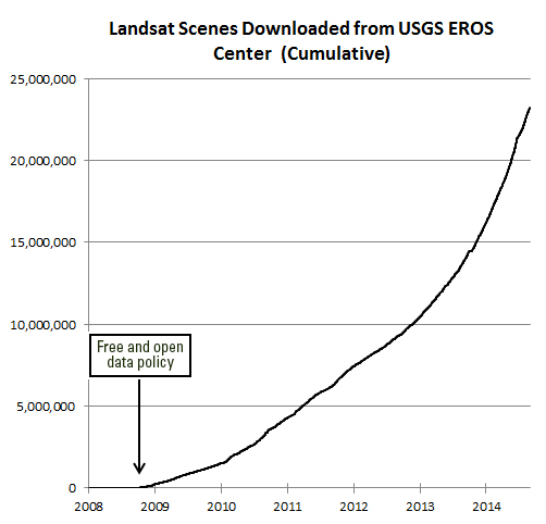 Undersanding the value of Landsat program to the U.S. economy has been the ambitious goal of the Landsat Advisory Group of the National Geospatial Advisory Committee. This team of commercial, state/local government, and NGO geospatial information experts recently updated a critical review of the value of Landsat information that has recently been released to the public.
They found that the economic value of just one year of Landsat data far exceeds the multi-year total cost of building, launching, and managing Landsat satellites and sensors. This would be considered a stunning return on investment in any conventional business setting.
Full article by Jon Campbell, U.S. Geological Survey found here.
I recently adventured into science journalism with a piece describing our recent article in PNAS detailing changes in forest structure over the 20th century. I talk about the use of the old data, and what the implications are for these changes. Check it out!
By Maggi Kelly, University of California, Berkeley
Scientists in my native state of California were handed a gift: a trove of detailed information about the state’s forests taken during the 1920s and 1930s and digitized over the past 15 years. When we compared this historical data – covering an area bigger than Great Britain – to current forests surveys, we found that California’s famed giant trees are suffering due to drier and warmer conditions.
This change to the forest landscape is important not only to the people of California. Large trees are huge sinks of carbon dioxide, provide habitat for many creatures and play a vital role in the water supply by, for example, providing catchment areas for snow. Forests that are denser with smaller trees are also more likely to burn.
Studying how the structure of forests is shifting over time provides us insight into how forests — a resource we depend on for many environmental and economic reasons — could change in a world of warmer temperatures.
Researchers from the University of California at Berkeley and Davis, the Department of Forest Management at the University of Montana, and the US Geological Survey’s California Water Science Center worked together on a paper on California’s forests published last week in the Proceedings of the National Academy of Sciences.
The historical data for our study came from the Wieslander Vegetation Type Mapping (VTM) collection, which was created in the 1920s and 1930s. It’s been described in a 2000 paper as “the most important and comprehensive botanical map of a large area ever undertaken anywhere on the earth’s surface.”
This botanical map was pioneered by Albert Wieslander, an employee of the Forest Service Forest and Range Experiment Station in Berkeley, California. The collection consists of 18,000 detailed vegetation plots, over 200 vegetation maps, 3,100 photographs and hundreds of plant specimens. Overall, the collection covers about 280,000 square kilometers, or just over a third of the state. Combined, the data created a detailed picture of the state’s vegetation in the early 20th century — an important marker ecologists today can use for comparison.
During the 2000s, several groups, including my lab, launched efforts to digitize the plot data, maps and photograph portions of the collection. There still are some missing pieces. Indeed, the journey from paper collection to digital data has been a long one, with several cases in which documents were nearly destroyed either intentionally or by accident. It’s a cautionary tale about the importance of rescued and shared historical data in ecological and geographical analysis.
 An example of one of the vegetation maps from the VTM collection. Shufei Lei, photographer
In our large trees study, we wanted to look at forest structure throughout the state by comparing the 1920s and 30s data with contemporary data collected through the Forest Inventory and Analysis (FIA) program. The FIA program is similar to the VTM project: Forest Service crews report on the species, size, and health of trees across all forest land ownerships. Our study was comprehensive, covering the five ecological regions of the state - over 120,000 square kilometers in total – and took into account land-management and land-use history.
We found that statewide, tree density – or the number of trees in a given area – in forested regions increased by 30% between the two time periods and that forest biomass declined by 19%. This means that there are more smaller trees filling in the forest, while the number of large trees is shrinking. (A large tree was defined as having a diameter larger than 60 centimeters or two feet.)
 Wieslander’s photo of French Lake and English Mt. looking north, morphing into 2014 photo by Joyce Gross. Wieslander’s photo shows a large area of barren and semi-barren oak. University of California, Berkeley, CC BY
Also, we found that forest composition in California in the last century shifted toward increased dominance by oaks relative to pines, a pattern consistent with warming and increased water stress. It also fits the shifts in vegetation we can surmise from the paleorecord in California over the last 150,000 years.
Why this shift from fewer large trees to more smaller trees?
Water stress seems to be the best explanation for the pattern we observed. Water stress in a forest is caused by a combination of rising temperatures, which cause trees to lose more water to the air and to earlier melting of snowpacks, which reduces the amount of water available to trees. And indeed, large tree declines were more severe in areas experiencing greater increases in water deficit since the 1930s.
Large trees, in general, seem to be more vulnerable to water shortfalls. This might be because larger, taller trees have trouble getting water to the tops of the trees when water is short, a phenomenon being studied by many tree physiologists.
It might also be that these big trees – some likely 300 years old or more – grew up in a different, colder and moister climate. Regardless of the reasons for large tree decline, we likely can expect more water stress in California from rising global temperatures.
Apart from the fact that we tend to love and admire our emblematic large trees, they also serve very important roles in the forests. And changes to forest structure – a shift to fewer large trees and more smaller trees – are important for us to pay attention to.
Forests with large trees store more carbon; groups of larger trees provide preferential habitat for many species; forest structure impacts the way fires burn and impacts the way forests store and release water. These changes are a warning of possible changes to come. The loss of these trees, for example, would take away a massive carbon sink, change the way wildlife use these forests, and change the way they burn.
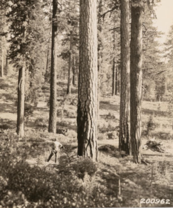
 This photo was taken by Albert Wieslander in 1936 in a redwood grove in San Mateo County. The tree in the front has a diameter around 6 feet. Marian Koshland Biosciences Library
Finally, we would like to stress the importance of rescuing, curating and digitizing historic data. The changes we observed here, although large, did not happen over night – indeed, they really took two or three generations to occur.
Each generation perhaps sees the nature around them as the “normal.” Yet the forests of our grandparents and great-grandparents, observed by the Wieslander crews, were very different than ours today and they will be different again for our grandchildren. We need these historic data to document these changes and demonstrate the rate of change in the natural world.
Some key references:
Jepson, W. L., R. Beidleman, and B. Ertter. 2000. Willis Linn Jepson’s ‘‘Mapping in Forest Botany’’. Madroño 47:269–272.
Kelly, M., B. Allen-Diaz, and N. Kobzina. 2005. Digitization of a historic dataset: the Wieslander California vegetation type mapping project. Madroño 52(3):191-201
Wieslander, A. E. 1935. A vegetation type map of California. Madroño 2:140-144
This article was originally published on The Conversation. Read the original article.
Great retrospective on 100 years of National Geographic map making.

100 Years of National Geographic Maps: The Art and Science of Where
Since 1915, National Geographic cartographers have charted earth, seas, and skies in maps capable of evoking dreams.
This beaut on the right is from 1968 of the ocean floor. The article says: " Based on the work of geophysicists Bruce Heezen and Marie Tharp, this 1968 map of the ocean floor helped bring the concept of plate tectonics to a wide audience. Tharp began plotting the depths in 1950 from soundings taken by ships in the Atlantic, but, as a woman, wasn't allowed on the ships herself. In 1978 she was awarded the Society's Hubbard Medal for her pioneering research."
From Sam: Clark Labs is shipping their new software: TerrSet. They say: TerrSet - a new name, a new concept and a wealth of advances.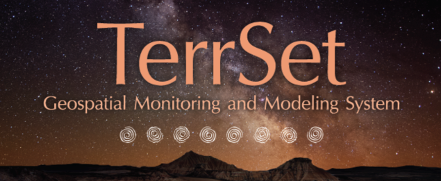
Clark Labs is pleased to announce that the TerrSet software is now shipping. TerrSet is an integrated constellation of software applications for monitoring and modeling the Earth system. Developed in close cooperation with leading institutions focused on sustainable development and environmental conservation, TerrSet provides groundbreaking tools for addressing major challenges to smart growth - climate change: trends, projections and adaptation; land cover conversion: trajectories and impacts; ecosystem services: present and future value.
TerrSet = Space + Time
Thanks for the update Sam!
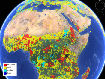 From Live Science. Two new maps released Jan. 16 considerably improve estimates of the amount of land farmed in the world — one map reveals the world's agricultural lands to a resolution of 1 kilometer, and the other provides the first look at the sizes of the fields being used for agriculture.
The researchers built the cropland database by combining information from several sources, such as satellite images, regional maps, video and geotagged photos, which were shared with them by groups around the world. Combining all that information would be an almost-impossible task for a handful of scientists to take on, so the team turned the project into a crowdsourced, online game. Volunteers logged into "Cropland Capture" on a computer or a phone and determined whether an image contained cropland or not. Participants were entered into weekly prize drawings.
They say: With the launch of this new journal, Remote Sensing Applications: Society and Environment focuses on providing a platform for describing innovative methods and scientific results from the application of remote sensing technology to a wide range of societal and environmental relevant topics including local, national and international policy, regulatory and management challenges.
With over four decades of data and information coming from for instance space-based instruments, remote sensing has become a familiar part of daily life in our modern society. To name just a few, weather forecasts, precision farming, mapping natural phenomena and disasters, population trends, urbanization and dynamic, virtual animations all use remotely sensed data, such as satellite images. Although remote sensing data is widely available, scientific analysis, methodological development and uncertainty characterization is necessary before data can be transformed into information for improved decision making and better understanding of the dynamics of our environment.
(Alice, this sounds like it would have been perfect for our crime paper!)
 Some press on our PNAS paper: Twentieth-century shifts in forest structure in California: Denser forests, smaller trees, and increased dominance of oaks.
In the paper we document changes in forest structure between historical (1930s) and contemporary (2000s) surveys of California vegetation. The shorthand is:
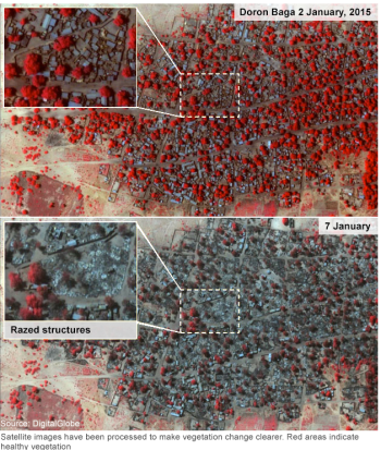 Amnesty's before and after satellite images were taken on 2 January and 7 January. Healthy vegetation is shown in red on the graphics.This is related to the paper that Alice and I just published on the use of remote sensing for crime. In that paper, we make it clear that estimates of crime from remote sensing are very difficult to validate; however, these important efforts continue to expand. Case in point from the BBC: Satellite images of Nigerian towns attacked by Boko Haram show widespread destruction and suggest a high death toll, Amnesty International says.
The images show some 3,700 structures damaged or destroyed in Baga and Doron Baga this month, Amnesty said. This is in stark contrast with goverment estimates of destruction.
The BBC's Will Ross says that while the images show the destructive nature of Boko Haram, they do not help establish just how many people were killed.
Last week, Musa Alhaji Bukar, a senior government official in the area, said that fleeing residents told him that Baga, which had a population of about 10,000, was now "virtually non-existent".
Here are some evocative words about mapping from an unlikely source: in her astounding and engrossing book Wolf Hall, Hilary Mantel has Thomas Cromwell say:
But the trouble is, maps are always last year's. England is always remaking herself, her cliffs eroding, her sandbanks drifting, springs bubbling up in dead ground. They regroup themselves while we sleep, the landscapes through which we move..."
Lovely stuff! and a great holiday read (or re-read, or re-listen). It reminds us that mapping is a continual effort, a continuous process. All that we map changes: crops are harvested and fields are replanted, cities evolve, forests burn and re-grow, and people move across the face of the earth leaving traces. Our task is to capture in virtual space the key functional elements of space and time - through maps, through spectral reflectance and lidar, through text and discussions - so that we can find answers to to the key questions facing society today.
Excerpt From: Mantel, Hilary. Wolf Hall. Henry Holt and Company, 2009. iBooks.
The Arthur Temple College of Forestry and Agriculture, in conjunction with Stephen F. Austin State University, will soon launch a new scholarly journal titled “Journal of Geospatial Applications in Natural Resources”. The focus of the journal will be to publish via a rapid double-blind peer-review process articles that apply geospatial technology to quantify, qualify, map, monitor, and manage natural resources.
There is no website yet, but I will keep you posted.
Mike Bostock's visualizations are glorious. This gives me lots of ideas for visualizing temporal variability across space. I can't embed this here, but I recommend you check it out.

http://bost.ocks.org/mike/drought/
They say: We published a more serious graphic today on drought’s effect on crops, but this was a fun animation we made to sanity-check parsing drought data. NOAA publishes monthly values for the Palmer Drought Severity Index going all the way back to 1895! Dark purple represents extreme drought, while dark green represents extreme moisture. In effect, this is a crazy electric version of Haeyoun Park and Kevin Quealy’s graphic, Drought’s Footprint.
From our Faith Kearns at the UC Water Institute: https://twitter.com/ucanrwater/status/543501860527550464
As great as this bath has been, we still are way behind normal.
 Major California reservoir levels (% avg) as of midnight yesterday compared to last week