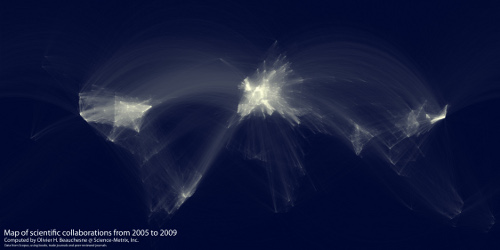
Map of scientific collaboration between researchers
/This map of scientific collaboration between researchers by Olivier Beauchesne has a similar look and methodology to the facebook friend maps done by Paul Butler but instead of mapping facebook friendships these maps try to describe the level of scientific collaboration between researchers from 2005 to 2009 using databases of academic paper authorship and author location. From Olivier Beauchesne's blog this is how to interpret it: "For example, if a UCLA researcher published a paper with a colleague at the University of Tokyo, this would create an instance of collaboration between Los Angeles and Tokyo." The brighter the lines, the higher number of collaborations between a pair of locations. Seems to be a lack of data in certain regions.
For more information and to view the maps in hi-res see Olivier's blog post here.