Graduate research: Annie Taylor gets new grants to fund research!

Annie Taylor, PhD student and IGIS GSR has been awarded no less than 3(!) new grants to fund her PhD research. Congrats to Annie! The awards are:

  • Research Grant from Joseph A. Myers Center for Research on Native American Issues

  • Natalie Hopkins Award and Grant from the California Native Plant Society

  • Sally Casey Research Scholarship from the Santa Clara Valley Chapter of the California Native Plant Society

These are all funding her research at Año Nuevo State Park, where she is working with the Amah Mutsun Tribal Band to study the biodiversity of cultural plants in a unique coastal grassland ecosystem with decades of frequent fire stewardship.


Stay tuned for more!

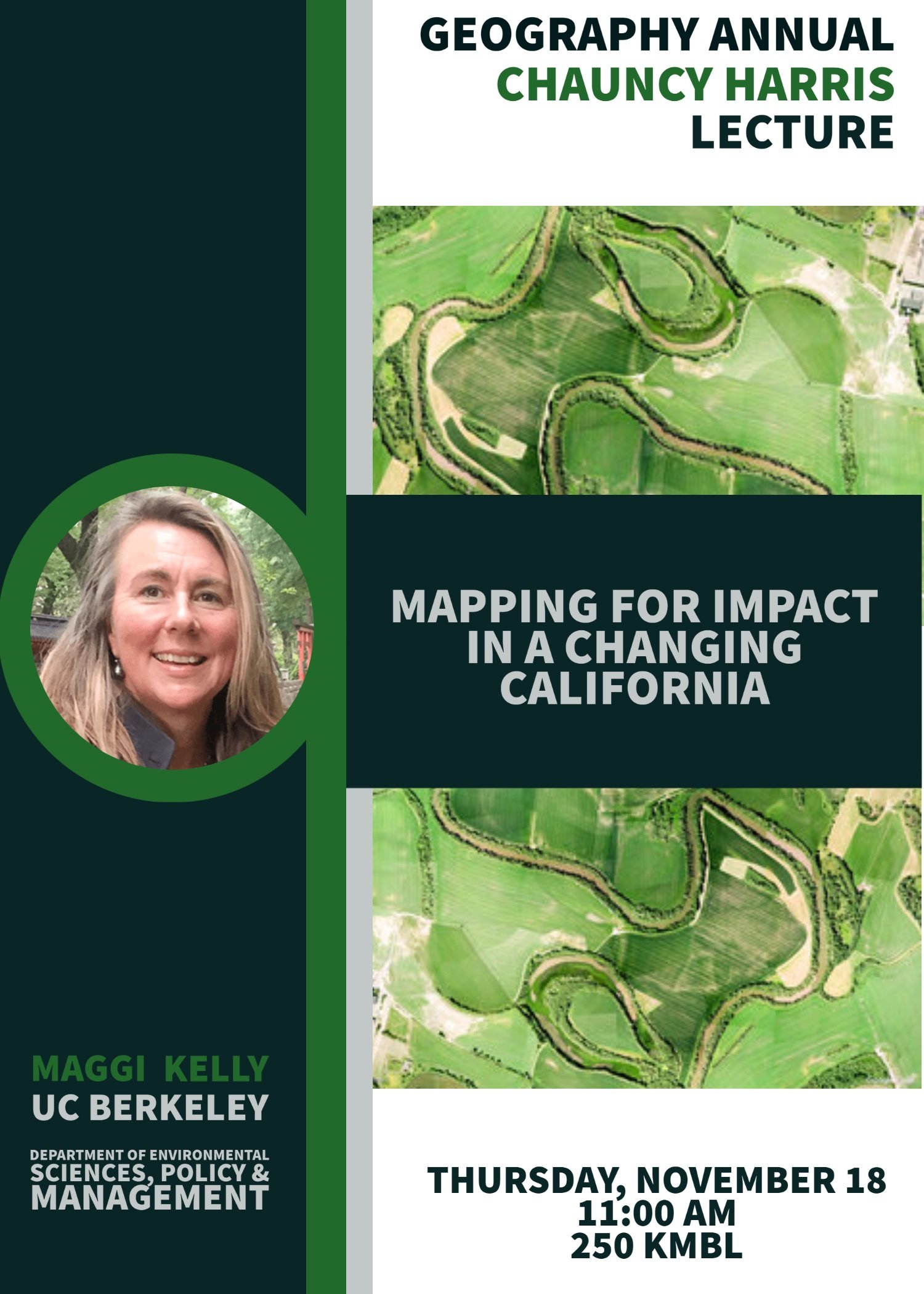
I am giving the Chauncy Harris lecture at BYU this week!

This week I am venturing out of California for a quick trip to Provo Utah and BYU to deliver the Chauncy Harris Lecture. Chauncy Harris was a pioneer of modern urban geography, with critical scholarship in urban form: "The Nature of Cities" and "A Functional Classification of Cities in the United States". He was a geographer, born in Utah, and every year the Geography Department at BYU hold a lecture in his honor. My buddy Ryan Jensen, son of the famous and fabulous John Jensen, invited me to give this year’s talk - so I am going!

I’ll be talking about my “Mapping for Impact” concept - and how we can use spatial data science to help tackle some of the thorny problems facing us today. I am going to highlight some of my lidar + forest work, the VTM historical ecology project, and of course, drones.

Check out this cute poster they put together for the talk.

SPUR 2021 update: Mapping changes to police spending in California

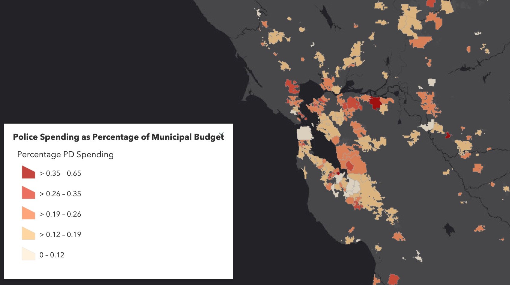
The Fall 2020 UC Berkeley’s Rausser College of Natural Resources Sponsored Project for Undergraduate Research (SPUR) project “Mapping municipal funding for police in California” continued in Spring 2021 with the Kellylab. This semester we continued our work with Mapping Black California (MBC), the Southern California-based collective that incorporates technology, data, geography, and place-based study to better understand and connect African American communities in California. Ben Satzman, lead in the Fall, was joined by Rezahn Abraha. Together they dug into the data, found additional datasets that helped us understand the changes in police funding from 2014 to 2019 in California and were able to dig into the variability of police spending across the state. Read more below, and here is the Spring 2021 Story Map: How Do California Cities Spend Money on Policing? Mapping the variability of police spending from 2014-2019 in 476 California Cities.
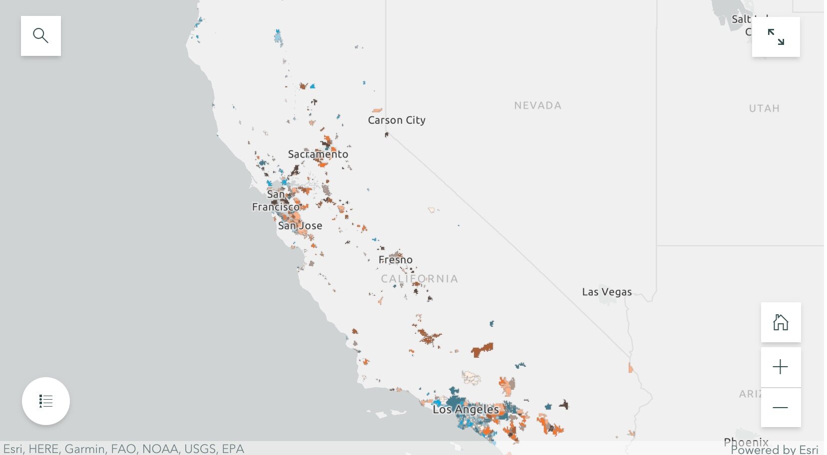
This semester we again met weekly and used data from 476 cities across California detailing municipal police funding in 2014 and 2019. By way of background, California has nearly 500 incorporated cities and most municipalities have their own police departments and create an annual budget determining what percentage their police department will receive. The variability in police spending across the state is quite surprising. This is what we dug into in Fall 2020. In 2019 the average percentage of municipal budgets spent on policing is about 20%, and while some municipalities spent less than 5% of their budgets on policing, others allocated more than half of their budgets to their police departments. Per capita police spending is on average about $500, but varies largely from about $10 to well over $2,000. Check out the Fall 2020 Story Map.

This semester, we set out to see how police department spending changed from 2014 to 2019, especially in relation to population changes from that same 5-year interval. We used the California State Controller's Finance Data to find each city's total expenditures and police department expenditures from 2014 and 2019. This dataset also had information about each city's total population for these given years. We also used a feature class provided by CalTrans that had city boundary GIS data for all incorporated municipalities in California.

By dividing the police department expenditures by the total city expenditures for both 2014 and 2019, we were able to create a map showing what percentage of their municipal budgets 476 California cities were spending on policing. We were also able to visualize the percentage change in percentage police department spending and population from 2014 to 2019. Changes in police spending (and population change) were not at all consistent across the state. For example, cities that grew sometimes increased spending, but sometimes did not. Ben and Rezahn came up with a useful way of visualizing how police spending and population change co-vary (click on the map above to go to the site), and found 4 distinct trends in the cities examined:

SPUR2021.jpg
  • Cities that increased police department (PD) spending, but saw almost no change in population (these are colored bright blue in the map);

  • Cities that saw increases in population, but experienced little or negative change in PD spending (these are bright orange in the map);

  • Cities that saw increases in both PD spending and population (these are dark brown in the map); and

  • Cities that saw little or negative change in both PD spending and population (these are cream in the map).

They then dug into southern California and the Bay Area, and selected mid-size cities that exemplified the four trends to tell more detailed stories. These included for the Bay Area: Vallejo (increased police department (PD) spending, but saw almost no change in population), San Ramon (increases in population, but experienced little or negative change in PD spending), San Francisco (increases in both PD spending and population) and South San Francisco (little or negative change in both PD spending and population); and for southern California: Inglewood (increased police department (PD) spending, but saw almost no change in population), Irvine (increases in population, but experienced little or negative change in PD spending), Palm Desert (increases in both PD spending and population), Simi Valley (little or negative change in both PD spending and population). Check out the full Story Map here, and read more about these individual cities.

The 5-year changes in municipal police department spending are challenging to predict. Cities with high population growth from 2014 to 2019 did not consistently increase percentage police department spending. Similarly, cities that experienced low or even negative population growths varied dramatically in percentage change police department spending. The maps of annual police department spending percentages and 5-year relationships allowed us to identify these complexities, and will be an important source of future exploration.

The analysts on the project were Rezahn Abraha, a UC Berkeley Society and Environment Major, and Ben Satzman, a UC Berkeley Conservation and Resource Studies Major with minors in Sustainable Environmental Design and GIS. Both worked in collaboration with MBC and the Kellylab to find, clean, visualize, and analyze statewide data. Personnel involved in the project are: from Mapping Black California - Candice Mays (Partnership Lead), Paulette Brown-Hinds (Director), Stephanie Williams (Exec Editor, Content Lead), and Chuck Bibbs (Maps and Data Lead); from the Kellylab: Maggi Kelly (Professor and CE Specialist), Chippie Kislik (Graduate Student), Christine Wilkinson (Graduate Student), and Annie Taylor (Graduate Student).

We thank the Rausser College of Natural Resources who funded this effort.

Fall 2020 Story Map: Mapping Police Spending in California Cities. Examine Southern California and the Bay Area in detail, check out a few interesting cities, or search for a city and click on it to see just how much they spent on policing in 2017. 

Spring 2021 Story Map: How Do California Cities Spend Money on Policing? Mapping the variability of police spending from 2014-2019 in 476 California Cities.

SPUR2020 Update: Mapping Police Budgets in California

In September 2020, UC Berkeley’s Rausser College of Natural Resources selected the Kellylab for a Sponsored Project for Undergraduate Research (SPUR) project for their proposal entitled “Mapping municipal funding for police in California.” The project partnered with Mapping Black California (MBC), the Southern California-based collective that incorporates technology, data, geography, and place-based study to better understand and connect African American communities in California. We met weekly during the fall semester and gathered data from 472 cities across California, detailing the per-capita police funding and percent of municipal budget that is spent on police departments. California has nearly 500 incorporated cities and most municipalities have their own police departments and create an annual budget determining what percentage their police department will receive. The variability in police spending across the state is quite surprising - check out the figures below. The average percentage of municipal budgets spent on policing is about 20%, and while some municipalities spent less than 5% of their budgets on policing, others allocated more than half of their budgets to their police departments. Per capita police spending is on average about $500, but varies largely from about $10 to well over $2,000. If you are interested in this project, explore our findings through the Story Map: examine Southern California and the Bay Area in detail, check out a few interesting cities, or search for a city and click on it to see just how much they spent on policing in 2017. 

Figure showing variability in Police Spending (% of municipal budget) in Northern California in 2017. Data from California State Controller's Cities Finances Data, 2017 (City and police spending information). For more information see the Story Map h…

Figure showing variability in Police Spending (% of municipal budget) in Northern California in 2017. Data from California State Controller's Cities Finances Data, 2017 (City and police spending information). For more information see the Story Map here

Figure showing variability in Police Spending (PEr capita) in Northern California in 2017. Data from California State Controller's Cities Finances Data, 2017 (City and police spending information). For more information see the Story Map here. 

Figure showing variability in Police Spending (PEr capita) in Northern California in 2017. Data from California State Controller's Cities Finances Data, 2017 (City and police spending information). For more information see the Story Map here

The analyst on the project has been Ben Satzman, a UC Berkeley Conservation and Resource Studies Major with minors in Sustainable Environmental Design and GIS, who worked in collaboration with MBC and the Kellylab to find, clean, visualize, and analyze statewide data. We plan on continuing the project to explore the possible influences (such as racial diversity, crime, poverty, ethnicity, income, and education) underlying these regional trends and patterns in police spending. Personnel involved in the project are: from Mapping Black California - Candice Mays (Partnership Lead), Paulette Brown-Hinds (Director), Stephanie Williams (Exec Editor, Content Lead), and Chuck Bibbs (Maps and Data Lead); from the Kellylab: Maggi Kelly (Professor and CE Specialist), Chippie Kislik (Graduate Student), Christine Wilkinson (Graduate Student), and Annie Taylor (Graduate Student).

We thank the Rausser College of Natural Resources who funded this effort.

CNR SPUR Project Open: Mapping Police Budgets in California - apply now!

Hello!

If you are a Berkeley undergrad and GIS enthusiast interested in learning new GIS skills and contributing to an important project, consider applying for our Fall 2020 SPUR research project. The Kellylab will mentor one SPUR student on a project with Mapping Black California (MBC) to map the proportion of municipal budgets that fund police departments in municipalities across California. 

This project will: 1) gather information from websites of several major cities or municipalities in California; 2) visualize results on a map of California; and 3) create a Story Map presentation showcasing the work. 

It will be fun, rewarding, and important work! 

Read more and apply here by August 31. 

Thanks!

ESRI UC 2020 - Virtually. Day 1

My usual update from ESRI UC is a bit tougher this year, since I am working from home, and on one screen. So note taking is a bit rough. And I kind of miss the whole razz-ma-tazz of Day 1 on site. But here goes:

OK, so Jack’s Plenary is the always place to get a big view of new releases in software. 2020 is no different. A sweep of the software improvements coming this summer. Here is my (very) quick summary of highlights. Items with ‘*’ are those that will be useful in class (I hope).

The Conference Theme is Collaboration

What’s coming in ArcGIS Pro and AGOL: 

Data:

  • New layers

  • Better integration with OSM*

Visualization (New Map Apps* - launching this fall):

  • Beta now in AGOL

  • Better styling, better color ramps, and better dynamic interaction with color ramp *

  • Dot density mapping!

  • Clustering and new labeling

  • Filtering data

  • Some cool color blending as an alternative to transparency! *

Cartography in Pro:

  • Charts 

Story Maps

  • Optimize for mobile

  • Collections

  • StoryTeller role

Spatial Analytics and Data Science

  • New suitability modeling tool *

  • Spider diagrams

  • Modeling

  • AI, Big Data, ML

  • Jupyter Notebooks inside of ArcGIS Pro *

  • AGOL implementing Jupyter Notebooks

Imagery and Remote Sensing

  • Image management - ready to use workflows and content

  • Feature extraction

  • Analytics - classification, etc. 

  • Something called “Excalibur” - web-based exploitation. Search and find, feature extraction, add to a database

  • Drone Mapping *

    • Drone2Map on desktop

    • Site Scan - cloud-based solutions

3D Mapping

  • Jack loves voxels

Real-time Analytics

  • Cloud-based sensor data storage and management

Data Management

  • Improving editing: 2D and 3D editing improvements *

Field Maps App

  • In beta, and should streamline things. 

And Enterprise runs on kubernetes…

All leading up to ArcGIS 2021 next year.

OK deep breath, off for a lunch break. 

Mapping COVID19: a technology overview

Hello everyone, I hope you are all healthy, safe, sane, and if possible, being productive.

Here I provide a summary of some of the mapping technology that has been used in the past few weeks to understand the COVID-19 pandemic. This is not exhaustive! I pick three areas that I am personally focusing on currently: map-based data dashboards, disease projections, and social distancing scorecards. I look at where the data comes from and how the sites are built. More will come on the use of remote sensing and earth observation data in support of COVID-19 monitoring, response or recovery, and some of the cool genome evolution and pandemic spread mapping work going on.

COVID-19 map-based data dashboards. You have seen these: lovely dashboards displaying interactive maps, charts, and graphs that are updated daily. They tell an important story well. They usually have multiple panels, with the map being the center of attention, and then additional panels of data in graph or tabular form. There are many many data dashboards out there. My two favorites are the Johns Hopkins site, and the NYTimes coronavirus outbreak hub.

Where do these sites get their data?

  • Most of these sites are using data from similar sources. They use data on number of cases, deaths, and recoveries per day. Most sites credit WHO, US CDC (Centers for Disease Control and Prevention), ECDC (European Centre for Disease Prevention and Control), Chinese Center for Disease Control and Prevention (CCDC), and other sources. Finding the data is not always straightforward. An interesting article came out in the NYTimes about their mapping efforts in California, and why the state is such a challenging case. They describe how “each county reports data a little differently. Some sites offer detailed data dashboards, such as Santa Clara and Sonoma counties. Other county health departments, like Kern County, put those data in images or PDF pages, which can be harder to extract data from, and some counties publish data in tabular form”. Alameda County, where I live, reports positive cases and deaths each day, but they exclude the city of Berkeley (where I live), so the NYTimes team has to scrape the county and city reports and then combine the data.

  • Some of the sites turn around and release their curated data to us to use. JH does this (GitHub), as does NYTimes (article, GitHub). This is pretty important. Both of these data sources (JH & NYTimes) have led to dozens more innovative uses. See the Social Distancing Scorecard discussed below, and these follow-ons from the NYTimes data: https://chartingcovid.com/, and https://covid19usmap.com/.

  • However… all these dashboards are starting with simple data: number of patients, number of deaths, and sometimes number recovered. Some dashboards use these initial numbers to calculate additional figures such as new cases, growth factor, and doubling time, for example. All of these data are summarized by some spatial aggregation to make them non-identifiable, and more easily visualized. In the US, the spatial aggregation is usually by county.

How do these sites create data dashboards?

  • The summarized data by county or country can be visualized in mapped form on a website via web services. These bits of code allow users to use and display data from different sources in mapped form without having to download, host, or process them. In short, any data with a geographic location can be linked to an existing web basemap and published to a website; charts and tables are also done this way. The technology has undergone a revolution in the last five years, making this very doable. Many of the dashboards out there use ESRI technology to do this. They use ArcGIS Online, which is a powerful web stack that quite easily creates mapping and charting dashboards. The Johns Hopkins site uses ArcGIS Online, the WHO does too. There are over 250 sites in the US alone that use ArcGIS Online for mapping data related to COVID-19. Other sites use open source or other software to do the same thing. The NYTimes uses an open source mapping platform called MapBox to create their custom maps. Tools like MapBox allow you to pull data from different sources, add those data by location to an online map, and customize the design to make it beautiful and informative. The NYTimes cartography is really lovely and clean, for example.

An open access peer reviewed paper just came out that describes some of these sites, and the methods behind them. Kamel Boulos and Geraghty, 2020.

COVID-19 disease projections. There are also sites that provide projections of peak cases and capacity for things like hospital beds. These are really important as they can help hospitals and health systems prepare for the surge of COVID-19 patients over the coming weeks. Here is my favorite one (I found this via Bob Watcher, @Bob_Wachter, Chair of the UCSF Dept of Medicine):

  • Institute for Health Metrics and Evaluation (IHME) provides a very good visualization of their statistical model forecasting COVID-19 patients and hospital utilization against capacity by state for the US over the next 4 months. The model looks at the timing of new COVID-19 patients in comparison to local hospital capacity (regular beds, ICU beds, ventilators). The model helps us to see if we are “flattening the curve” and how far off we are from the peak in cases. I’ve found this very informative and somewhat reassuring, at least for California. According to the site, we are doing a good job in California of flattening the curve, and our peak (projected to be on April 14), should still be small enough so that we have enough beds and ventilators. Still, some are saying this model is overly optimistic. And of course keep washing those hands and staying home.

Where does this site get its data?

  • The IHME team state that their data come from local and national governments, hospital networks like the University of Washington, the American Hospital Association, the World Health Organization, and a range of other sources.

How does the model work?

  • The IHME team used a statistical model that works directly with the existing death rate data. The model uses the empirically observed COVID-19 population and calculates forecasts for population death rates (with uncertainty) for deaths and for health service resource needs and compare these to available resources in the US. Their pre-print explaining the method is here.

On a related note, ESRI posted a nice webinar with Lauren Bennet (spatial stats guru and all-around-amazing person) showing how the COVID-19 Hospital Impact Model for Epidemics (CHIME) model has been integrated into ArcGIS Pro. The CHIME model is from Penn Medicine’s Predictive Healthcare Team and it takes a different approach than the IHME model above. CHIME is a SIR (susceptible-infected-recovery) model. A SIR model is an epidemiological model that estimates the probability of an individual moving from a susceptible state to an infected state, and from an infected state to a recovered state or death within a closed population. Specifically, the CHIME model provides estimates of how many people will need to be hospitalized, and of that number how many will need ICU beds and ventilators. It also factors social distancing policies and how they might impact disease spread. The incorporation of this within ArcGIS Pro looks very useful, as you can examine results in mapped form, and change how variables (such as social distancing) might change outcomes. Lauren’s blog post about this and her webinar are useful resources.

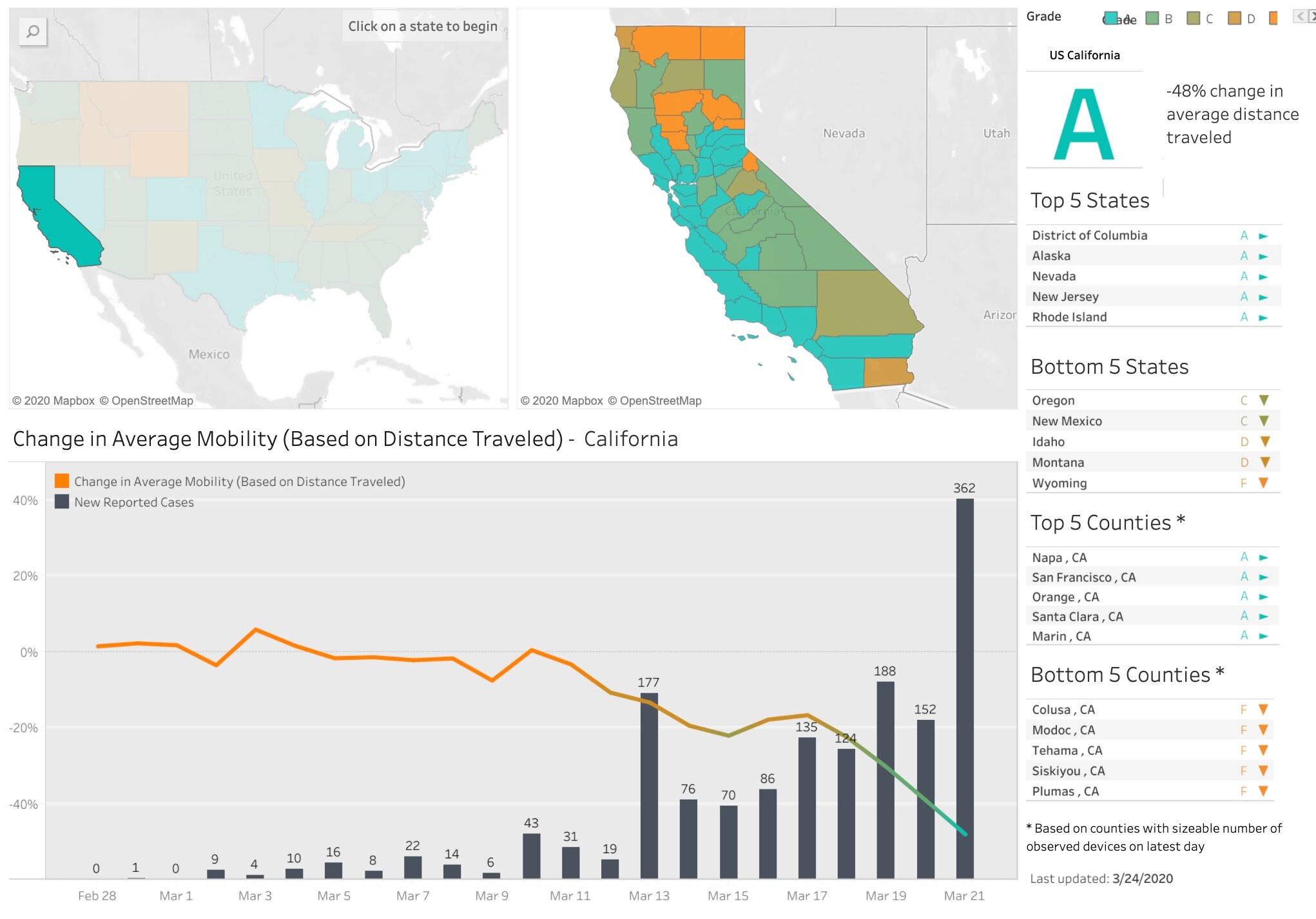
Social distancing scorecards. This site from Unicast got a lot of press recently when it published a scoreboard for how well we are social distancing under pandemic rules. It garnered a lot of press because it tells and important story well, but also, because it uses our mobile phone data (more on that later). In their initial model, social distancing = decrease in distance traveled; as in, if you are still moving around as you were before the pandemic, then you are not socially distancing. There are some problems with this assumption of course. As I look out on my street now, I see people walking, most with masks, and no one within 10 feet of another. Social distancing in action. These issues were considered, and they updated their scorecard method. Now, in addition to a reduction in distance traveled, they also include a second metric to the social distancing scoring: reduction in visits to non-essential venues. Since I last blogged about this site nearly two weeks ago, California’s score went from an A- to a C. Alameda County, where I live, went from an A to a B-. They do point out that drops in scores might be a result of their new method, so pay attention to the score and the graph. And stay tuned! Their next metric is going to be the change rate for the number of person-to-person encounters for a given area. Wow.

Where do these sites get their data?

  • The data on reported cases of COVID-19 is sourced from the Corona Data Scraper (for county-level data prior to March 22) and the Johns Hopkins Github Repository (for county-level data beginning March 22 and all state-level data).

  • The location data is gathered from mobile devices using GPS, Bluetooth, and Wi-Fi connections. They use mobile app developers and publishers, data aggregation services, and providers of location-supporting technologies. They are very clear on their privacy policy, and they do say they are open to sharing data via dataforgood@unacast.com. No doubt, this kind of use of our collective mobile device location data is a game-changer and will be debated when the pandemic is over.

How does Unicast create the dashboard?

  • They do something similar to the dashboard sites discussed above. They pull all the location data together from a range of sites, develop their specific metrics on movement, aggregate by county, and visualized on the web using custom web design. They use their own custom basemaps and design, keeping their cartography clean. I haven’t dug into the methods in depth yet, but I will.

Please let me know about other mapping resources out there. Stay safe and healthy. Wash those hands, stay home as much as possible, and be compassionate with your community.

Social Distancing Scorecard

According to the World Health Organization and the CDC, social distancing is currently the most effective way to slow the spread of COVID-19. Unacast created this interactive Scoreboard, updated daily, to empower organizations to measure and understand the efficacy of social distancing initiatives at the local level. 

They want us to explore the data — the more we all understand, the more lives we can save together.

Hooray! California gets an “A”. Good job California! Check out the maps and chart below (just a screenshot - much more on the site). See how our mobility has declined as the first cases came in; and its drastically reduced in the last week. This is good. Go Napa! Yet there are some outlier counties too - we can do better.

Covid-19_Social_Distancing_Scoreboard_—_Unacast.jpg

COVID-19 map resources

Hello all from the new shelter-in-place normal. We are all figuring this new way of working and living out, so in the meantime, stay calm, be compassionate, be positive and productive. At least that is what I am telling myself daily! Thanks to the wonderful former Kellylabber John Connors (who put together a great list), here is a quick round-up of some of the best map resources for COVID-19 out there.

NYTimes: Good map viz, lots of map resources

StoryMap from ESRI: Good visuals, good presentation, detail for China

ESRI: Solutions for local government, Esri toolkits

CDC: simple map from CDC

Stanford: Data visualization, timeline, literature, updated travel bans, and some resources

Washington Post: spread simulation model, showing how social isolation works

WHO: dynamic dashboard (built in Esri tools), up-to-date country totals

Stay safe and healthy out there everyone.

ESRI ArcGIS User Workshop - Jan 2020 in San Francisco

Wow! It’s been awhile since I posted. That’s because Fall semester was a full one. I’ll update you all on that soon - it basically will be a summary of using Pro for class, which was terrific.

OK on to the workshop.

We started with the inspirational video showcased at 2019 ESRI User Conference, and a video welcome from JD. The theme of the workshop is “Amplify your GIS”, and he introduced the new concept “geospatial infrastructure” also developed in a hot-off-the-presses paper with Michael Goodchild. Other new terms: the ESRI GIS technology world is referred to as the Esri Geospatial Cloud, and new key components are the geo-enabled workflows. OK, on to the new stuff.

What’s New in ArcGIS. There is lots of new stuff in Pro: coding, visualizations, editing workflows; new stuff in AGOL, primarily the new Map Viewer (Beta); and new stuff in the Solutions Workflows. Highlights for me include:

What’s new in ArcGIS Pro

  • Pro Extensions

    • New extension: LocateXT – to geocode unstructured data. Good for historical work.

  • New in Editor

    • Find and replace in an attribute table. Good for bulk re-formatting.

    • Contingent values within Domains. Makes editing more efficient.

    • Using Arcade for things like automatic calculation of attributes. They suggest we check it out, pronto.

  • New in Visualization Tools

    • Feature binning via the “Enable Feature Binning” tool. This opens a new tab on the ribbon, creates dynamic polygons summarizing features found within. This is good for example for large point datasets symbolized in hexagons.

    • Match Layer Symbology to a Style: Quick way to have different styles.  

    • The “Calendar Heat Chart” for data with temporal data. Looks slick.

    • You can add pie charts to polygon features, changing input and making pie charts variable; and make into 3D.

    • Text boxes: you can now change the shape of your text boxes – reshape along a complex boundary, e.g. This is pretty sweet.

  • New in Coding/Tools

    • In 2.5, you can schedule your geoprocessing tools. Wait what? This is going to be interesting.

    • Scripting: You can export a model to a python file, or export your geoprocessing history directly to python. Ok then.

    • In 2.5, jupyter notebook can be run directly in Pro (from “Notebooks”) in the Catalog. No need for to run JN externally. So there.

  • Sharing

    • New Layouts: Import Layout Gallery. ESRI has developed 12 default templates within a Gallery. You can use one of them, or add your own.

    • Printing: Printing is now done in the background, while you continue to work; you can print in black and white; and you can tile your larger maps.

    • You can Password protect your pdfs.

    • New export format for those carto-designers who like to work in AI: AIX files for Adobe Illustrator.

What’s new in ArcGIS Online

  • Map Viewer Beta is the new thing. This I must try, having yelled at AGOL more often than I care to admit about configuring pop-ups.

    • New Layout, with symbolization by field, by expression, (using Arcade) and filter data; New dot density symbolization choice, among other things.

    • More control over look and field of pop-ups (yay!), including adding text and images. Dynamic changes, yay!

    • Plus some slick links to Story Maps

What’s new in ArcGIS Solution Workflows

  • Showed us some great stuff from the Conservation Easement Solutions Workflow – migration from a paper-based solution to a digital workflow. There are many other examples

  • Use the ArcGIS Solution Deployment Tool.

  • This is a bit vague to me, and I will need to dig in.

What’s new in ArcGIS for Developers

  • ESRI continues its work to extend the platform through:

    • Javascript API

    • App Builders – Web AppBuilder (new is Experience Builder, which is in beta testing now)

    • Some other stuff that I wasn’t fast enough to capture. But looks good.

Example GIS workflows

Next the presenters walked us through a few key sectors using GIS. Some great stuff came out for me to explore, including:

GIS for law enforcement

  • There is a “Crime Analysis” toolbar, BTW. Free and added to the ribbon. It contains lots of crime-relevant tools and some ways to efficiently update data from tables

  • The “Import Records Tool” seems very useful for anyone using large tabular data that updates regularly.

  • Apparently ESRI has quite a few staff/engineers with law enforcement backgrounds who have built most of these tools. They stressed that lots of them can be/should be used for other workflows, and the Import Records Tool seems appropriate for this.

Public Works

  • Showed QuickCapture as an easy workflow to capture information about the condition of streets.

  • Once you have your problem areas, you can route them in AGOL via the “Plan Routes” Tool (uses credits!) in AGOL.

  • Those routes are used with the “Navigator” tool, and integrated with the “Tracker” app

AutoCad integration: you can now edit an ArcGIS hosted feature service in AutoCad. This is a big deal.

Parcel Editing and Parcel Fabric

  • Showcased the Parcel Fabric Administration, and Parcel Tasks

    • Parcel Fabric keeps track of all editing actions done on parcels, such as merging, splitting, etc.

    • Tasks include updating COGO; updates all the directions, areas, etc.

    • Besides my interest in haberdashery, I really need to get more into parcel fabrics.

Planning

  • This is where ESRI has been building the Urban Solution Workflow. We’ve seen this example before at the 2019 ESRI UC; it’s from Boston, discussing planning for a new high rise building and its potential shading of Boston Common.

Lots of stuff to follow up on for IGIS and for projects. Happy 2020.

Wrap-up from ESRI User Conference 2019 Day 3

Day 3 Highlights

Note to Self: Remember the User Types: Viewer, Editor, Field Worker, Creator, GIS Professional

Wednesday morning I went to ArcGIS Apps for the Field so that I could get my head around all the different and new tools that can be used to collect field data. And sister, there are a lot of them. There are of course the capture apps that we know and love - Survey123 and Collector - but there are also apps for all the steps of the field operations: planning, coordination, monitoring and navigation to sites. These apps include: Explorer, Workforce, Tracker, Operations Dashboard, QuickCapture, and Navigator. Excellent session.

Apologies to the NRC for borrowing the tagline…

Apologies to the NRC for borrowing the tagline…

I then went to two Women in GIS events: the “Ask Me Anything” panel of women leaders, and then the Women in SIG lunchtime session where I was the guest speaker. The panel was super inspiring and included Whitney Kotlewski, Nicole Franklin, Dierdre Bishop, Wan-Hwa Cheng, and Miriam Olivares. These passionate and smart women shared very diverse experiences in life, in their careers, and in GIS. We saw a hot-off-the-presses video from Black Girls MAPP, which was so great. Why haven’t BGMAPP been featured at the ESRI Plenary Session? My session was a lot of fun, with a great turnout and good questions. I talked about my ideas around “Mapping for Impact” and what that means in terms of #people, #data, and #tools. Here is one of my slides. This is what I think about all day. Very pleased that this kind of networking is going on, and that panel in the morning session was extraordinary. 

Afternoon sessions had me try to ingest as much as possible about cutting-edge tools. I focused first on QuickCapture. This looks like a promising app for classroom teaching, field sampling, and citizen science. And I am not the only one who thought so - the room was full and so I watched the workshop livestream from another room. Some points: fully customizable collection forms via Designer, can collect points, paths, photos, text, maybe voice in the future, and can connect to external high accuracy GPS antenna. More to do! Then, to close out the day, it was a toss-up between Architecting my ArcGIS Online or more Kenneth Field showing off 3D Cartographic Techniques. Of course I chose 3D. This was an immersive presentation with Kenneth Field (the self-proclaimed “3D skeptic”) and Nathan Shepard guiding us through some of their favorite 3D visualizations and how they make cartographic choices in 3D. The good news is most of the things you know from 2D cartography are relevant in 3D. The bad news is that there are some vis challenges like perspective distortion and hidden content with 3D. But also, 3D might be overkill. When do you use 3D? When is 2D good enough? After all, 2D mapping is awesome. To discuss this (and provide lots of friendly banter back and forth) they showed us an example of 2D vs 3D by mapping the arctic fox on her journey from Norway to Canada. I liked the 2D version myself. They also looked at the classic Minard map of Napoleon’s journey to and from Moscow in 2D and 3D. Lots of good stuff to dig in to. Thanks to Nathan Shepard and Kenneth “I quite like spinny globe thingys” Field. Good stuff.

Wrap Up from Day 2
Wrap Up from Day 1

Wrap-up from ESRI User Conference 2019 Day 2

Day 2 Highlights

Morning sessions included using ArcGIS Pro for Lidar analysis. This was a great overview of working with LAS files within ArcGIS Pro: data formats, including LAS related data structures multipoints and multipatches, data diagnostics to examine data quality and coverage, and basic processing of Lidar data in ArcGIS Pro. Very useful. Thanks to ccrawford. Next Shane and I checked out Data Science in ArcGIS Pro: Using R and Python. This is an update from last year’s session on R and Python in ArcGIS, and again we started with the classic battle of the bands. The python demo showed PySAL, and how to do a quick spatial econometric analysis in PySAL within Pro. Need more time, obvi. The R demo was a nice walk through of data input - vector and raster - via the R-bridge, and showed how easy the framework is. Very useful. 

Afternoon sessions included a bunch of stuff, but the highlight was the always funny, always useful, always inspiring wizards of cartography Kenneth Field, John Nelson, and Edie Punt and Mapping with Style. Another great session! Edie discussed the excellent Styles capacity in Pro, which I am aware of but not an expert at. She helpfully pointed out some key things to pay attention to: USE STYLES FOR COLOR CONTROL! because of the new graphics engines used in Pro, TRANSPARENCY is available on all colors, and will be transferred to your PDF! Also, color locking is great! And color brewer schemes are available in Pro Styles. So much love! Interspersed with Edie’s slide were John and Kenneth delivering their usual hilarious take on making beautiful maps: John showed off some nice and creative new published styles: Firefly, Imhof, and Lego; and Kenneth presented a whimsical case study bringing to life a 1930s map of Redlands using the watercolor style from John. See other styles here. Good day.

Wrap-up from Day 1

Wrap-up from ESRI User Conference 2019 Day 1

ESRI UC 2019 Day 1 Highlights - The Plenary Sessions

The morning session as usual was a flood of high-level vision about GIS (this year’s catchphrase is “see what others can’t”); as well as key shout-outs of new tech wizardry we can expect in the next software update. Jack spent some time discussing the concept of the human nervous system as an analogy for GIS: an intelligent nervous system to respond to, analyze, and use complex spatial data. The goals of this network remind me of the goals of cooperative extension: Learning, Sharing, Collaborating, and Engaging Communities. We also heard about the new NatureServe biodiversity/imperiled species database. This gathers field work from biologists on critical imperiled species and fills in the gaps using predictive species modeling (RF) on jupyter notebooks. The maps are validated via a network of scientists. Seems like they should connect with iNaturalist.org stat.

ESRI2019_2.jpg

Lunch was kick-ass fish tacos, FYI.

New Tools in ArcGIS Pro 2.4 include some coooooool stuff. What I am excited about:

  • Story Maps updates are rad. Gotta get after it. Already available.

  • I can customize my basemaps using the Vector Tile Editor;

  • Calendar heat maps are now provided;

  • YAY! Through the “History” tab we can capture analysis workflow and turn into processing model automatically;

  • Pixel editor – OMFG. What new devilry is this. I want in.

  • Slice multipath tool to cut, clip and visualize 3d objects;

  • Viz of real material properties in 3D (e.g. light reflection, waves in water, etc.);

  • Parcel fabric: cadaster parcel processing: topology, editing, COGO measurements; helpful for deed changes and deed edits;

  • ArcGIS Monitor: This is like a dashboard for administrators of ArcGIS Enterprise to monitor web performance times, diagnostics, and utilization analytics, plus others.

The afternoon session usually packs in important examples of groups using GIS internationally. 2019 was no exception. The speakers included Ambassador Stefano Toscano and Olivier Cottray from the Geneva International Centre for Humanitarian Demining. They showed the Mine Action program, that uses GIS to find and destroy mines. This involves using community input from Survey123 to target searches for mines and mine destruction. Olivier Cottray says “webapps and webmaps have been game-changers for us”. He closed with this critical example: modern warfare – such as in Mosul and elsewhere - has led to mass-scale urban destruction and mines being left not only in the ground, but in buildings, above ground. Imagine what this means for search and destroy: it is now a 3D problem.  We heard from Naftali Honig, Evan Trotzuk, Geoff Clinning who work in the Garamba National Park in the Congo basin about their Conservation Intelligence framework to combat illegal poaching.  In the last panel, we heard from Jane Goodall and E. O. Wilson on an informal panel moderated by Jack. Wilson laid out his top three challenges for human kind: climate change, fresh water shortages, and mass extinctions. He talked about his HalfEarth program, and also gave us a primer on biodiversity from global to microbial scales. We need to discover, characterize, and map all remaining species on earth, creating a true science of ecosystem organization in aid of conservation and earth sustainability. Finally, we got to hear from Jane Goodall. Her work is so inspiring. At the heart of all her conservation and science work, are the importance of empowering women, the role of traditional knowledge in biodiversity conservation, using local decision making, and supporting education. She offered us passion, humor, hope, while frankly discussing the stark realities of a changing climate and the rise of the political right and widespread corruption. Her work and voice still instructs us on the power of the human intellect and indomitable human spirit to make positive change.

ESRI2019-1.jpg


Inspiring stuff.

DroneCamp2019 was a blast!

301517display.jpg

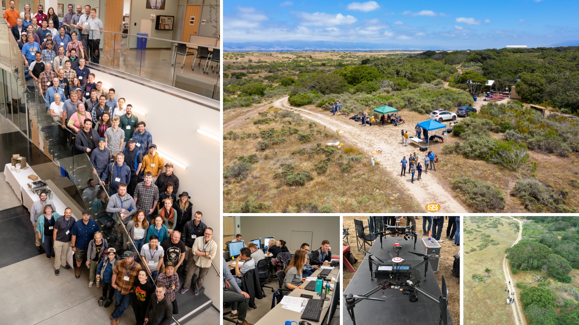
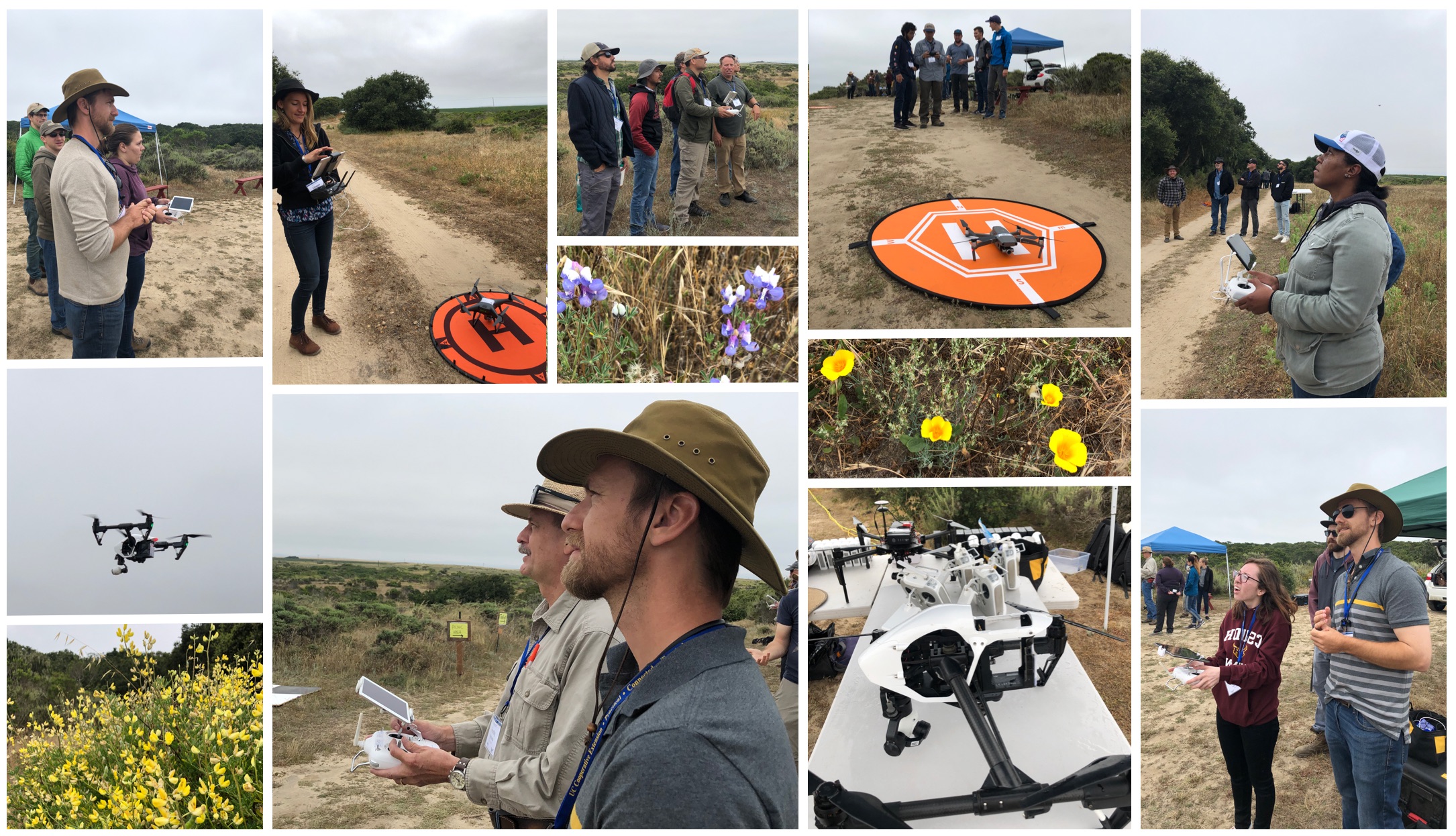
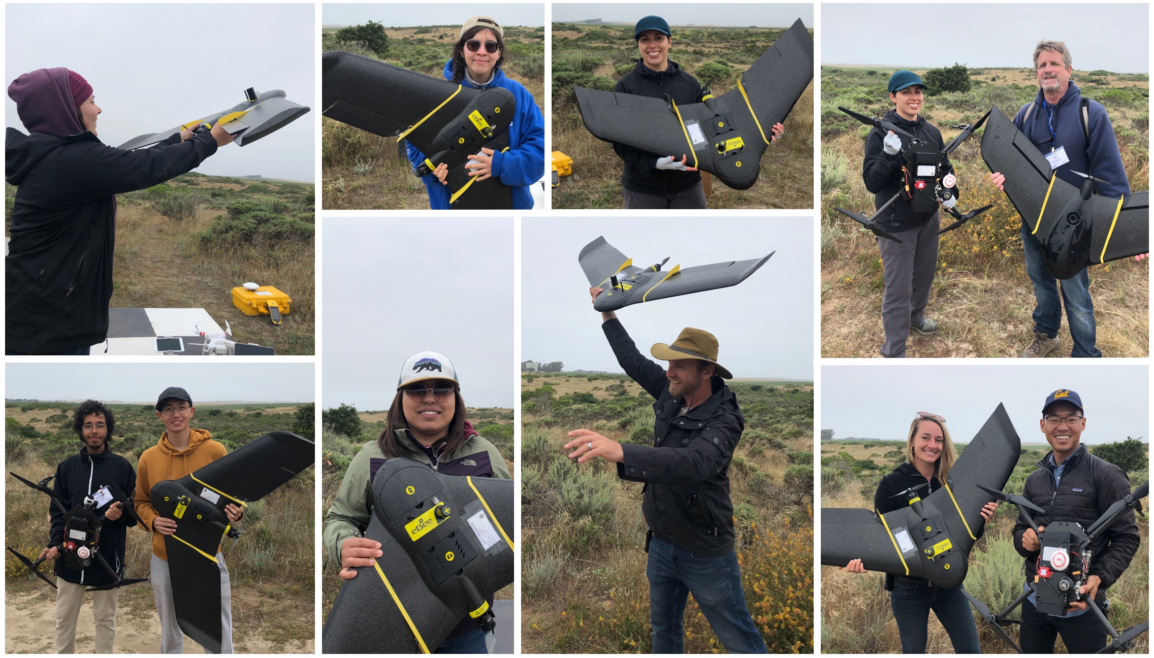
DroneCamp2019 has wrapped, and it was a lot of fun. We held DroneCamp2019 (the 3rd annual event) in Monterey in collaboration between us (IGIS) and Monterey DART. As usual, DroneCamp was a multi-day affair with one day focused on the technology, regulations and research, one day focused on the drone data workflow, and one day focusing on flying skills: takeoffs and landings, automated flying, and watching eBee barrel rolls. We held the meeting sessions at CSUMB and flew out at the gorgeous UCSC NRS Fort Ord Reserve. Lots of fun. Here are some pics (flight pics are more fun than classroom photos I guess!).

Clockwise from left: the group; Fort Ord Reserve; Fort Ord Reserve; the lovely matrice; data workshop.

Clockwise from left: the group; Fort Ord Reserve; Fort Ord Reserve; the lovely matrice; data workshop.

Flight practice at fort ord reserve. Plus some wildflowers.

Flight practice at fort ord reserve. Plus some wildflowers.

campers posing with uavs.

campers posing with uavs.


DroneCamp 2019 Student Scholarships

We are very pleased to announce the recipients of the 2019 student scholarship awards for DroneCamp 2019. We were able to leverage seed support from the open access journal Drones (dedicated to research on the design and applications of drones) to support three wonderful young scholars to attend DroneCamp 2019 in Monterey CA in June. Here is a little bit about each of them.

Reyes headshot.JPG

Melinda Reyes is the recipient of the Drones scholarship. A computer science student at Northeastern University, Melinda aims to improve precision agriculture tools that measure and advance soil health and soil-based carbon capture via data collected by UAVs. Her ultimate goal is to ensure food security in a changing climate. She is passionate about UAVs and their applications in agriculture, and is a future leader in agricultural innovation.  She comes to DroneCamp to learn to fly drones, to learn more about current applications in the field, and to meet others interested in UAVs' agricultural applications and applications for good.

zackdinh_portrait.JPG

Zack Dinh is the recipient of the IGIS student scholarship. He is a M.S. student in the Department of Landscape Architecture and Environmental Planning at the University of California, Berkeley. He is working with Professor Iryna Dronova at UC Berkeley on wetland restoration monitoring in the Sacramento-San Joaquin Delta. Together, they are interested in using UAV-captured optical imagery and point clouds to detect vegetation patch heterogeneity, and plant growth. He comes to DroneCamp to learn about best practices for using UAVs for field research as well as networking with others who are engaged in this type of research. He has some experience flying UAV surveys and processing imagery, and is interested in learning more about fixed-wing vehicles, sensors, and data processing techniques.

Anish Photo.jpg

Anish Sapkota is the recipient of the IGIS student scholarship. He is a Ph.D. student in the Department of Environmental Sciences at the University of California, Riverside. He is working in the Irrigation and Water Management Lab under the supervision of Dr. Haghverdi. His research focuses on the effect of water-stress conditions in landscape and agricultural crop species, and he seeks to develop irrigation management strategies to save water while increasing production, and soil and plant health. His research involves collection of data from a range of handheld sensors that measure stomatal conductance, biomass growth, and soil moisture. These data will be combined with NDVI and NDRE data from field and UAV-based sensors to determine the stress level in plants and their response to varying rates of irrigation. He comes to DroneCamp to continue to gather skills in the geospatial domain, and to learn how to fly drones, and process UAV data.

Congratulations to each of you!

Sabbatical in China in the spring...

Sabbatical report April 2019

I’ve been on sabbatical now for a few months, and it’s time to report. I’ve been working on updating all my course materials: slides, reading and labs, for the fall. This has been a blast, and a lot of work! Especially the labs. We are finally moving to ArcGIS Pro, people! It’s been scary, but thanks to some excellent on-line resources, including this list of excellent tutorials from Jarlath O’Neil-Dunne and from ESRI (Getting started with Pro) we are making progress. Shane Feirer and Robert Johnson from #IGIS are helping here too, and we’ll likely be using some of the new material in IGIS workshops soon. 

Currently, I am in China, visiting former PhD student Dr Qinghua Guo and my “grandstudent” Dr Yanjun Su at their lab set in the bucolic Institute of Botany northwest of Beijing (just outside the 5th ring, for those of you in the know). It has been a blast. I came to catch up on all the excellent UAV, lidar, remote sensing, and modeling work going on in the Digital Ecosystem Lab at the Institute of Botany (part of the Chinese Academy of Sciences). These students are serious Data Scientists: they are working on key spatial problems and remote sensing data problems using ML, classification, spatio-temporal algorithms, data fusion tools. They routinely work with lidar, hyperspectral, multispectral and field data, and focus on leaf-scale to landscape-scale processes. One of the big experiments they are working on uses a new instrument, dubbed “Crop3D”. It is a huge frame installed over an ag field with a movable sensor dock. The field is about 30m x 15m, and the sensor can move to cover the entire field. Here is my summary in graphic form:

CROP3D. Very cool.

CROP3D. Very cool.

This season’s experiment focuses on mapping corn plant phenotypes using hyperspectral, RGB, and lidar data by classifying leaf-scale metrics such as leaf angle and branching angles, along with spectral indices. VERY COOL STUFF. I am eager to hear more about the results of the experiment and see what is yet to come. 

I gave a couple of talks, one on “big” (serious air quotes here) data and ecology (to the Institute of Botany at the Chinese Academy of Sciences) and one on UAVs (to the Institute of Geographical Sciences and Natural Resources Research, CAS). In both I highlighted all the excellent work done by students and staff in my various research and outreach groups. In the first I focused on our Lidar work in the Sierra Nevada (with Qinghua Guo, Yanjun Su, Marek Jakubowski); the VTM work and FAIR data (with Kelly Easterday); and UAV/water stress (with Kelly again plus Sean Hogan and Jacob Flanagan). In the second talk I got to gush about all the IGIS work we are doing across our “Living Laboratories” in California. We have flown ~30 missions (total 25 km2) on and around the network of research properties in California (see the panel below for some examples). I talked about the recent CNN work with Ovidiu Csillik; the BORR water stress experiment with Kelly, Sean and Jacob; the fire recovery work at Hopland with Shane Feirer and the rest of the IGIS crew; and the outreach we do like DroneCamps. I also talked about UAV Grand Challenges: Scaling, Sampling, and Synergies. Those ideas are for another post. 

IGIS UAV Missions in California

IGIS UAV Missions in California

My hosts took great care of me: Showing me the sites, making sure I tried all the regional delicacies, and indulging me in my usual blather. Below are some pics of us on our adventures, including in the bus on our way to a distant portion of the Great Wall. Walking the Wall was: 1) awesome (in the real sense of the word – it really is mind-blowing); 2) STEEP (calves were screaming at the end of the day); and 3) windy. Plus there are snakes. I was told that there are other sections of the Wall that are called “Wild Wall” which I think is extremely cool. And speaking of walls, GOT starts again this weekend. China in springtime is BURSTING with flowers. And being housed at the Institute of Botany means all of them are on show in a concentrated area. Finally, you can get all over this huge country on trains. Trains that go really fast (220 MPH), and are on time, and are comfortable! I went to Shanghai (800+ miles away) for the weekend by train! My current joke: “In China, it takes 4 hours to get from Beijing to Shanghai. In California, it takes 4 hours to get from Berkeley to Sacramento.” (Thanks Dad!).   

GroupPeeps2.jpg

Off to Tokyo. But not before a final panel of pics that remind me of this trip: Technology, Art, Food, Flowers, Shopping, History. Here in China, Red = Happiness + GoodLuck, not the Cardinal.

ChinaFavs2.jpg

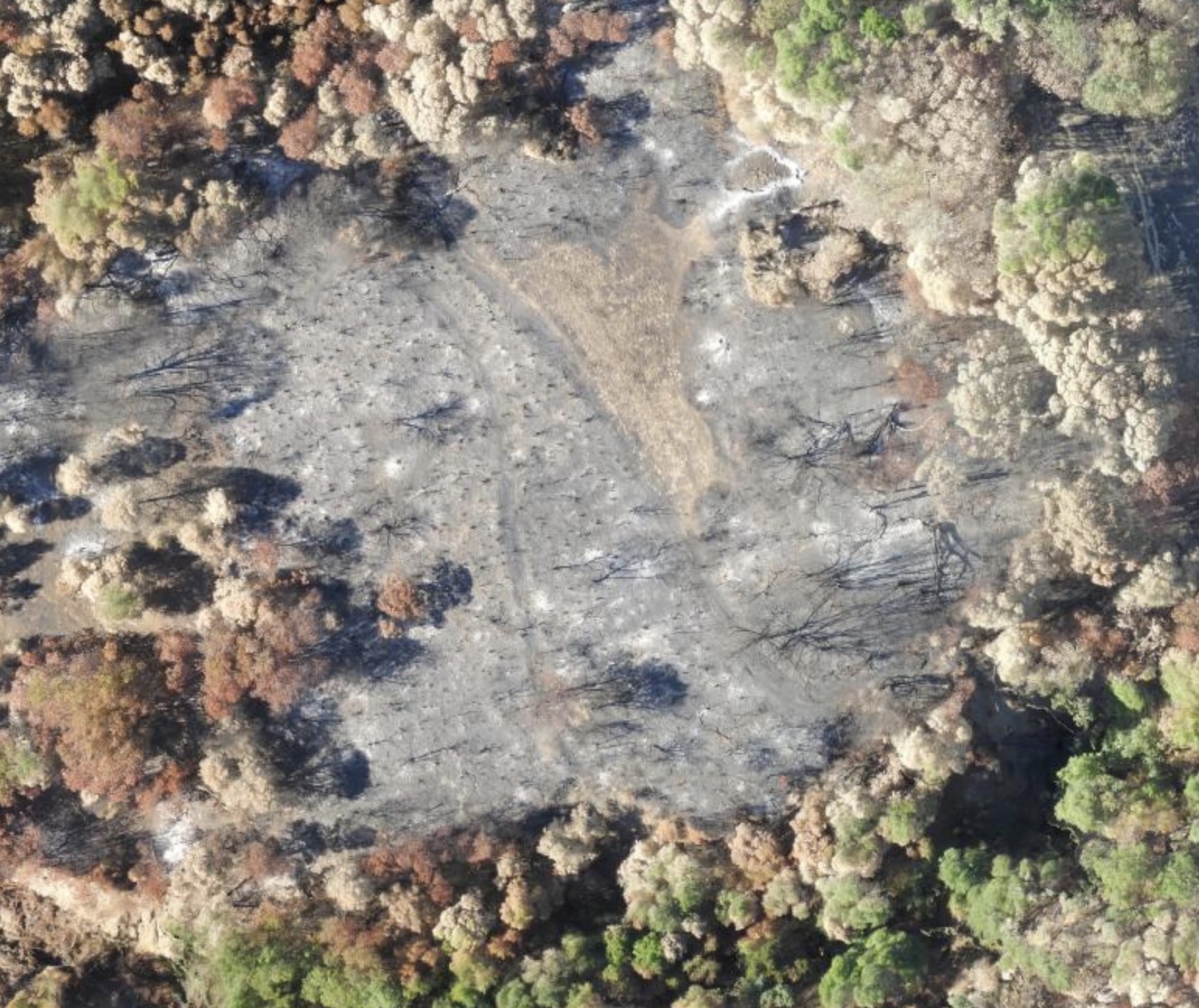
Mapping post-fire landscapes at Hopland Research & Extension Center

The River Fire began July 27, 2018 at 1pm on Old River Road in Hopland. By the evening it had spread, and was threatening numerous buildings in the area. We have a ANR Research and Extension Center (HREC) there, and Shane Feirer from IGIS lives and works here. Evacuations were ordered quickly, and down in the bay area we all held our breath hoping the fire wouldn’t harm people or animals or consume the HREC buildings. By the time it was contained (as part of the Mendocino Complex), it had burned 48,920 acres. We’ve been flying drones over HREC for awhile, and the last month we did more drone flights to map the post-fire landscape. We flew some Hangar 360 flights with a DJI Phantom to get some sweet overviews of the scene (example1, example2, example3), and flew much of the area with our eBee on the first mission and Matrices on the second mission with both multispectral and RGB cameras.

These pics below compare the eBee imagery (2cm) with Planet imagery (3m).

These are pics of the eBee (far left) and the Matrice (far right) getting ready to fly into the blackened landscape, and some snaps from the Hanger pics.

Tag proliferation!

I've come to rely on this, my blog, for recalling important work related events, places, tools, and datasets. But, it is a bit unwieldy as a search engine. Perhaps it is delayed spring cleaning (ok, delayed like 12 years...), but I feel that have way too many tags on this blog, and it could do with a tidy-up. I started the blog back in 2006 (ok, I didn't start it, Ken-ichi did, back when he was a Kellylabber), and since then its been fair game as far as tags go. What to tag a post about "drones"? fine, why not also tag it as "UAVs"! Like old maps? Tag a post "cool old maps" and "history"! You get the pic. As of now I have 88 tags. My go-tos are: 

  • conferences: where I give my wrap-ups from meetings, and provide some perspective along with new software, data, etc. 
  • class: where I capture stuff for class; and 
  • data and software: where I tag new stuff I need to follow up on. 

So... from 88 I am going to move to 10. The core are "people", "data", and "tools", and there are a few more. They are: 

  • class: for all things class related; and conferences: keep up the wrap-ups!
  • the triad: people: all things collaboration related; data: obvi, from drones, to imagery, to mobile, to pics; tools: analytics and apps and all the rest;
  • the groupsgif: cool posts related to the gif; igis: cool posts related to IGIS; lab: for all the wonderful student work;
  • science: all the domains we focus on; and
  • meta: for all the culture about mapping: papers, literature, movies and music videos.

Wow. Hope it works. Now I have to reclass all the original 88 into their new homes. 

Wrap-up from the Geospatial Software Institute (GSI) Workshop: “Towards a National Geospatial Software Ecosystem”

My wrap-up from a very engaged and provocative 1.5 day workshop on geospatial technology futures, hosted by the CyberGIS Center: “Towards a National Geospatial Software Ecosystem”. First: great group of cool peeps all hyper-engaged in geospatial data, tools, use cases, science, and community. Second: fun to be involved in big-picture thinking on what a geospatial software institute might look like if it was to be built from scratch. Finally, I was on the panel discussing core questions bridging use cases and core technical capabilities, and I share my reflections of the workshop here.

  • Question 1. Are there any significant gaps between the use cases and core technical capabilities that GSI should address?
    • Training needs: beyond GIS training – “spatial data science” training, for K-12; undergrad; graduate; veterans; professionals
    • Easy ways to get access to cloud storage and computation, and for different datasets like UAVs. There are examples like CyVerse (from Tyson Swetnam) and others
    • Data integration: Data assimilation, Data fusion, Sensor triangulation.
      • Whatever you want to call it – this remains a challenge for geospatial experts and beginners alike. And it is especially a challenge when you work across disciplines (e.g. the work of SESYNC from Mary Shelley and Margaret Palmer, SESYNC, University of Maryland)
    • Dynamics: Spatio-temporal and real-time data streams: sensor networks, social media, cube sats
    • Resolution:
      • in space (e.g. the new Antarctic DEM from Paul Morin, University of Minnesota);
      • in time (e.g. cubesats, sensor networks; social media);
      • in depth?: going under-ground (from Debra Laefer, NYU)
    • We love FAIR for data. What about FAIR for tools: make tools Findable, Accessible, Interoperable, and Re-usable
  • Question 2: What does the CyberGIS Geographic Software Institute (GSI) need to do to address community needs and contribute to the national CyberInfrastructure ecosystem?
    • Link strongly with existing diversity-supporting frameworks: HBCU; community colleges; tribes; networks such as @WomenWhoCode, @LadiesOfLandsat, @BlackGirlsCode, @500womensci, @RLadiesGlobal, etc.
    • More of these workshops! Multi-disciplinary meetings of people with tight/packed agendas and make use of workshop attendees between workshops; what can we do to spread the word
    • Create GSI Data Institute or Bootcamp or Faculty Education Mentoring Network
    • Support standards for data and software standards to promote interoperability
    • Support frameworks for data and software discovery and interoperability: FAIR for data; FAIR for tools

Conclusion: Super Fun. Learned a Ton. Plus parting words from Michael Goodchild: It is not location that matters, it is context. Location provides context; context allows integration: with data, between disciplines, between people, between tools. "Let's get above the layers".

ESRI User Conference 2018 wrap-up

As always, the Plenary session was an immersive and emotional showcase of the power of mapping. Running through Monday’s talks was a sense of urgency for we GIS people to save the world. This is what JD calls “societal GIS”, or “embracing the digital transformation and leverage the science of where”. Shane and I had a great time. Some key news from the Plenary:

  • ESRI is in every K-12 school in the US; JD announced it will be offered to every K-12 school in the world. JD gave a special award to two inspirational teachers - Mariana Ramirez and Alice Im from the Technology Magnet Academy at Roosevelt High School in LA. Not a dry eye in the house: starts at 22.21 on this video. I hope they can hook up with @strtwyze
  • The work of Thomas Crowther, Professor of Global Ecosystem Ecology at ETH Zürich (@crowthelab) is inspirational. His talk here. They estimate 3T trees globally, with room for 1T more. (See paper here.)  Gonna be checking out his tree data on the Living Atlas (global maps of tree density, diversity, carbon uptake, and reflectance).
  • A great demo from JD Irving, a private Canadian forestry, transportation and products company heavy into sustainability and GIS. All there properties are managed using ArcGIS + R. Demo here
  • ESRI is showcasing some key "Solution Configurations" that are bundled software products focused on high-priority areas such as: 1) community engagement ("Hub"); 2) interior spaces ("Indoors") and, 3) smart cities ("Urban"). The highlighted snazzy urban planning 3D vis tools (demo here) will be giving UrbanSim a run for their money. Might we work RUCS2.0 into a "Solution Configuration" for working landscape planning? 

Plus some highlights of what I learned overall: 

Data updates

  • Wow. ESRI's Living Atlas of the World has some amazing resources. Living Atlas is ESRI’s curated web data portal that links seamlessly with Pro. It has tons of data on environment and imagery. Want Sentinel-2 imagery, NAIP, or MODIS thermal? Want global climate and weather data? Want to easily play with Open Street Map or other vector tiles within your GIS project? It is all in the Living Atlas. This will be a game changer for class. Plus TC’s tree data. Gonna be checking this out.
  • Unstructured data can be added to your workflow now, this is text, etc. This is big. 
  • ESRI is offering editable access to Open Street Map within Pro. 

Software updates (mostly about Pro)

  • Pro is the way to go, but ESRI will continue to support ArcMap “for years to come
  • New stuff in ArcGIS Pro related to Image Analysis:
    • Sensor support has been expanded; plus new formats supported, eg. netcdf. Pro supports mosaic datasets, they call mosaics the optimum data model for image management. 
    • ESRI is now supporting “oriented” imagery - StreetView Imagery, oblique imagery, etc. Easily integrate things like iPhone photos within your Pro project. They call this working in “image space” rather than “map space”.
    • Ortho Mapping within ESRI has 3 solutions: Drone2Map (stand-alone software), within ArcGIS Pro (using the Image Server license), and OrthoMaker (web interface).
    • New release of Pro has full motion video support. (Upcoming releases will have more deep learning algorithms, multi-patch editing in stereo, and pixel editing.)
    • There are so many cool things going on on the imagery front in Pro, makes me excited.
  • New stuff in ArcGIS Pro in general:

    • Adding an unstructured data format - e.g. text!
    • 3D editing and 3D voxel support.
    • Machine Learning is increasingly embedded in ESRI workflows, and when that is not enough, ML is also possible via linkages with external resources (via R, TensorFlow, MXNET, AWS tools, etc.).
    • ESRI increasingly recognizing that people work in and outside of ESRI software: R-Bridge, Python API, Jupyter Notebooks makes external linkages super easy. 
  • ESRI is working to support cloud-based storage and computing with support via AWS and Azure; Optimizing raster storage and caching in multiple formats; and the ability to point to existing cloud storage
  • Plus, for your inexpensive GPS needs, consider the new Trimble Catalyst antenna + ESRI Collector might be the way to go, but it is windows/android specific for now. iOS compatibility is "on a horizon" as of now.
  • A quick note about ArcGIS online (ESRI's complete mapping and location intelligence platform). It has 6M subscribers (!), making 1B maps a day (!!). (Did I get those numbers right?)

Notes for classes/workshops

  • GIS-stat-analysis-py-tutor on GitHub. 
  • ESRI provides many Learning templates for us who are dreading converting all our ArcMap labs to Pro: https://www.esri.com/training/ and https://www.esri.com/training/learning-plans/
  • ESRI is also working on providing templated best practice workflows to help teach concepts. They call them, at least in Image Analyst "Imagery workflows". Might be useful in class/workshops. 

The new ESRI terminology might be a useful organizing structure for class: A GIS is a system of: 

  • Record: storing spatially indexed information
  • Insights: via analysis
  • Engagement: through mapping and visualization

As always a great conference!