Measuring impact in extension programming: case study of IGIS

At UC Berkeley and at UC ANR, my outreach program involves the creation, integration, and application of research-based technical knowledge for the benefit of the public, policy-makers, and land managers. My work focuses on environmental management, vegetation change, vegetation monitoring, and climate change. Critical to my work is the ANR Statewide Program in Informatics and GIS (IGIS), which I began in 2012 and is now really cranking with our crack team of IGIS people.  We developed the IGIS program in 2012 to provide research technology and data support for ANR’s mission objectives through the analysis and visualization of spatial data. We use state-of-the-art web, database and mapping technology to provide acquisition, storage, and dissemination of large data sets critical to the ANR mission. We develop and delivers training on research technologies related to important agricultural and natural resource issues statewide. We facilitate networking and collaboration across ANR and UC on issues related to research technology and data. And we deliver research support through a service center for project level work that has Division-wide application. Since I am off on sabbatical, I have decided to take some time to think about my outreach program and how evaluate its impact.  

There is a great literature about the history of extension since its 1914 beginnings, and specifically about how extension programs around the nation have been measuring impact. Extension has explored a variety of ways to measure the value of engagement for the public good (Franz 2011, 2014). Early attempts to measure performance focused on activity and reach: the number of individuals served and the quality of the interaction with those individuals. Through time, extension began to turn their attention to program outcomes. Recently, we’ve been focusing on articulating the Public Values of extension, via Condition Change metrics (Rennekamp and Engle 2008). One popular evaluation method has been the Logic Model, used by extension educators to evaluate the effectiveness of a program through the development of a clear workflow or plan that links program outcomes or impacts with outputs, activities and inputs.  We’ve developed a fair number of these models for the Sierra Nevada Adaptive Management Program (SNAMP) for example. Impacts include measures of changes in learning, behavior, or condition change across engagement efforts. Recently, change in policy became an additional measure to evaluate impact. I also think measuring reach is needed, and possible.

So, just to throw it out there, here is my master table of impact that I try to use for measuring and evaluating impact of my outreach program, and I’d be interested to hear what you all think of it.

  • Change in reach: Geographic scope, Location of events, Number of users, etc.
  • Change in activity: Usage, Engagement with a technology, New users, Sessions, Average session duration
  • Change in learning; Participants have learned something new from delivered content
  • Change in action, behavior, method; New efficiencies, Streamlined protocols, Adoption of new data, Adoption of best practices
  • Change in policy; Evidence of contributions to local, state, or federal regulations
  • Change in outcome: measured conditions have improved = condition change

I recently used this framework to help me think about impact of the IGIS program, and I share some results here.

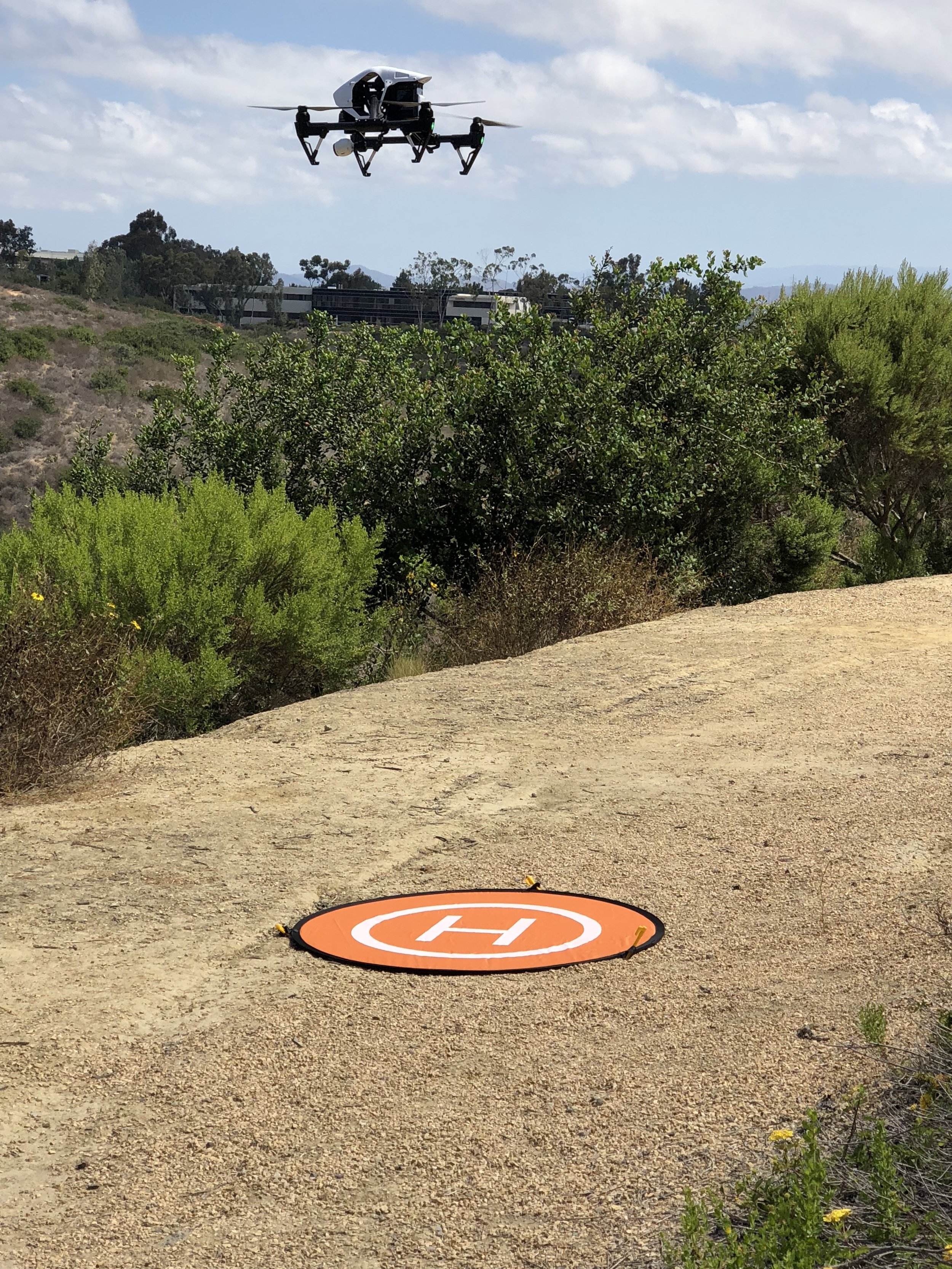
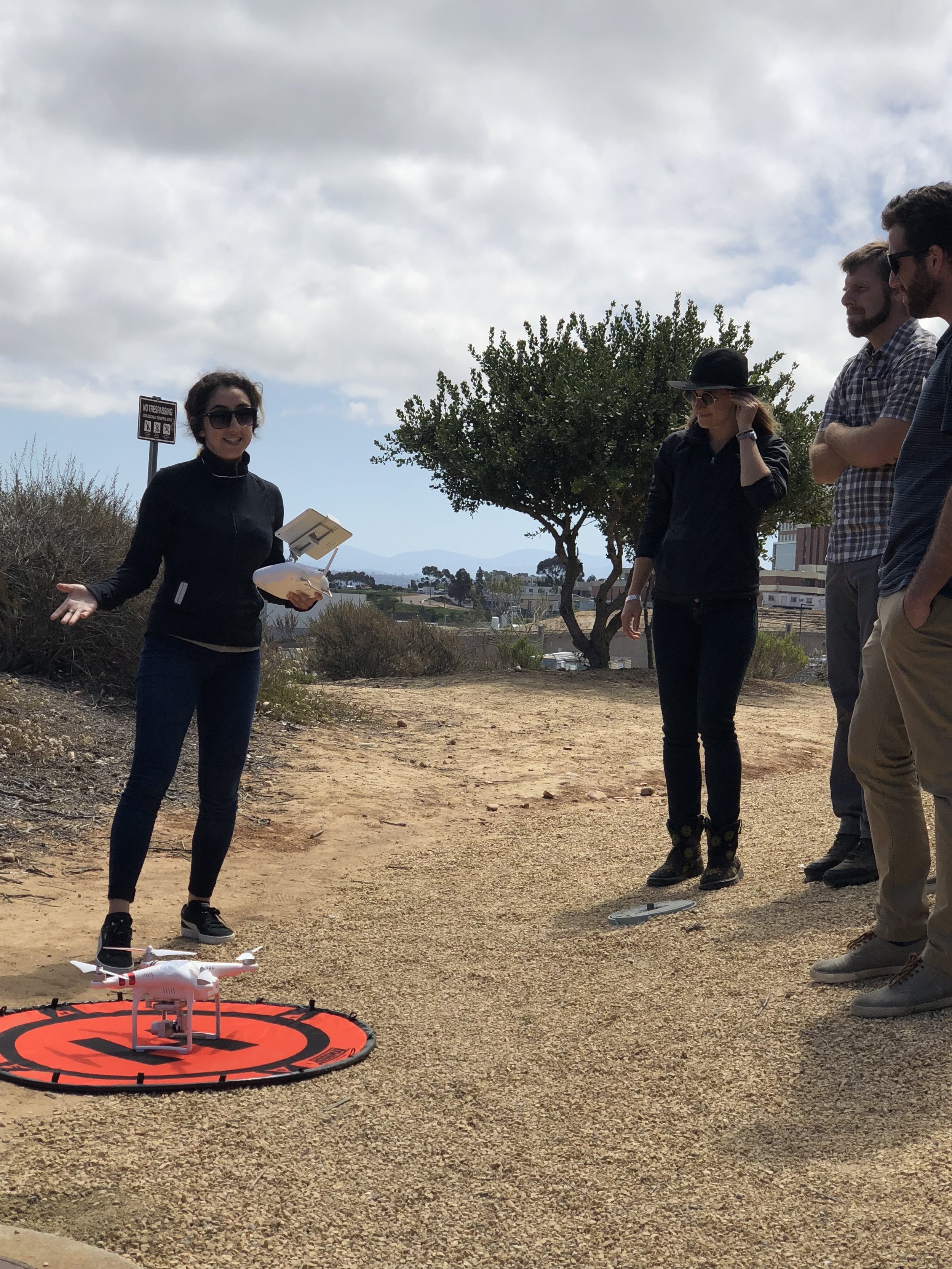
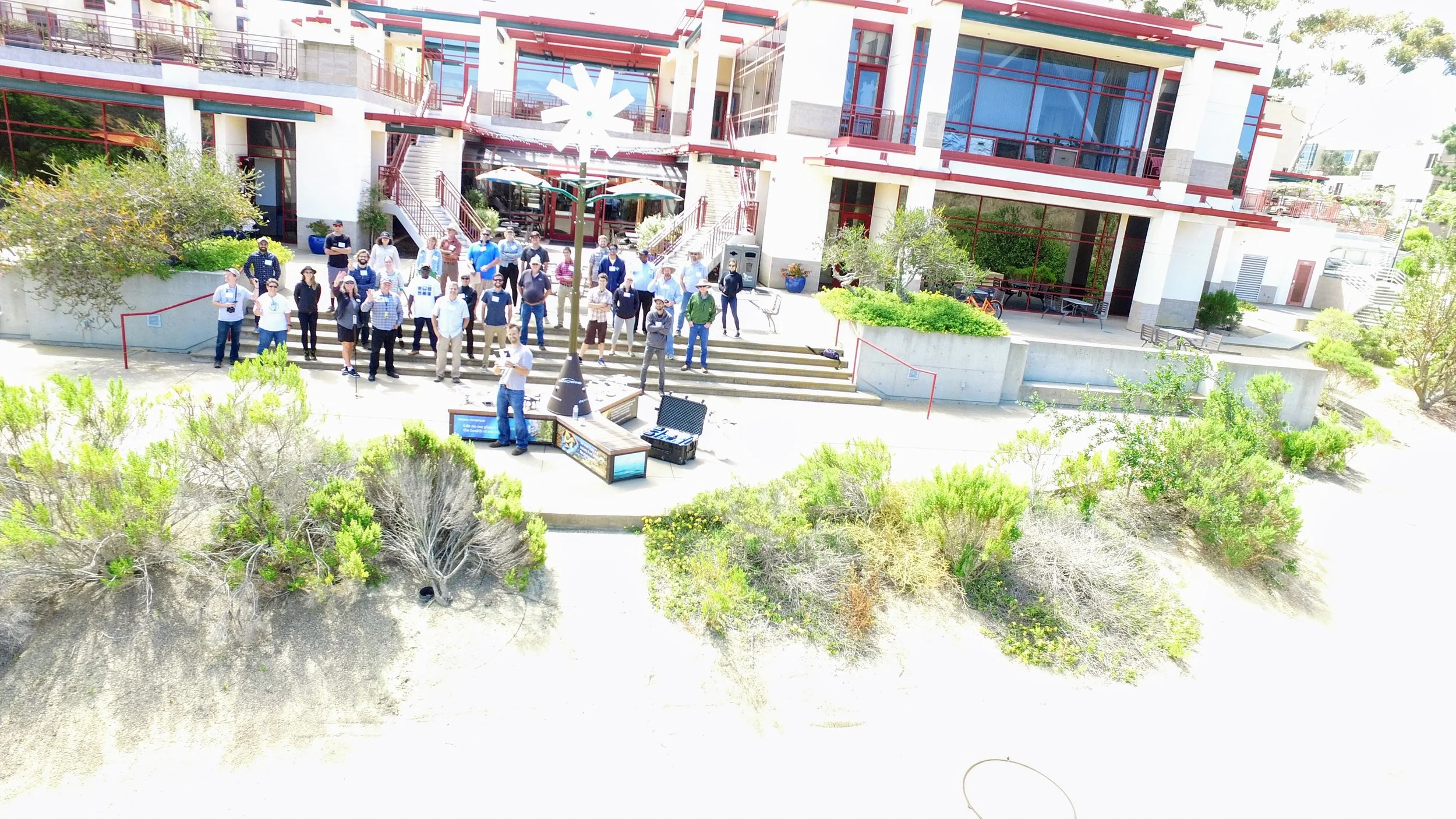
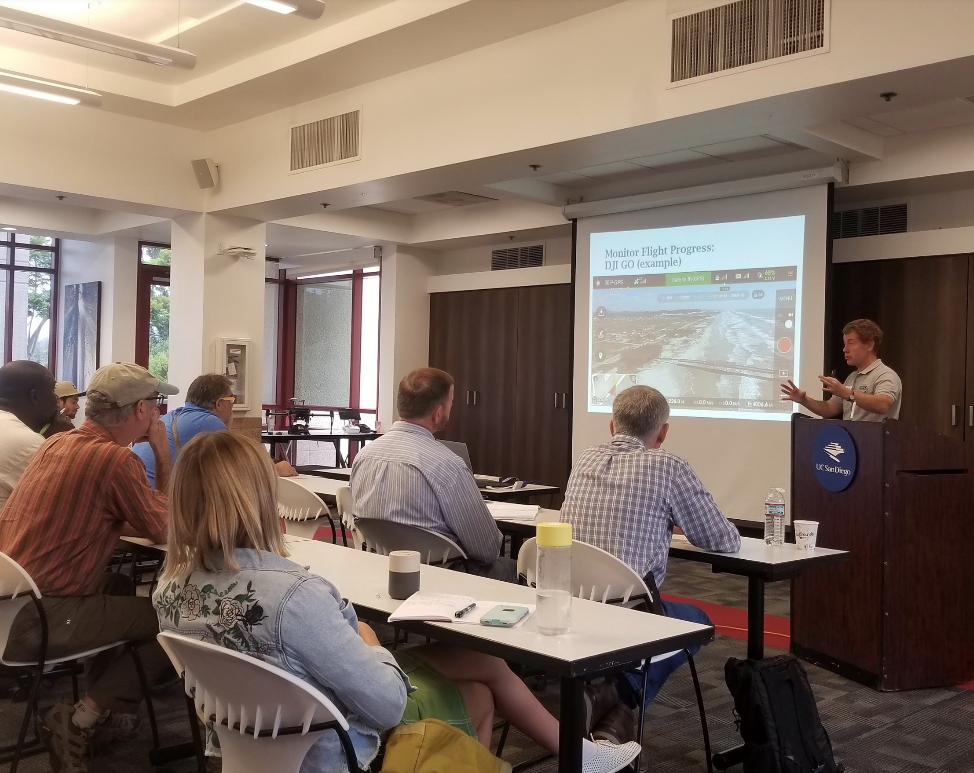
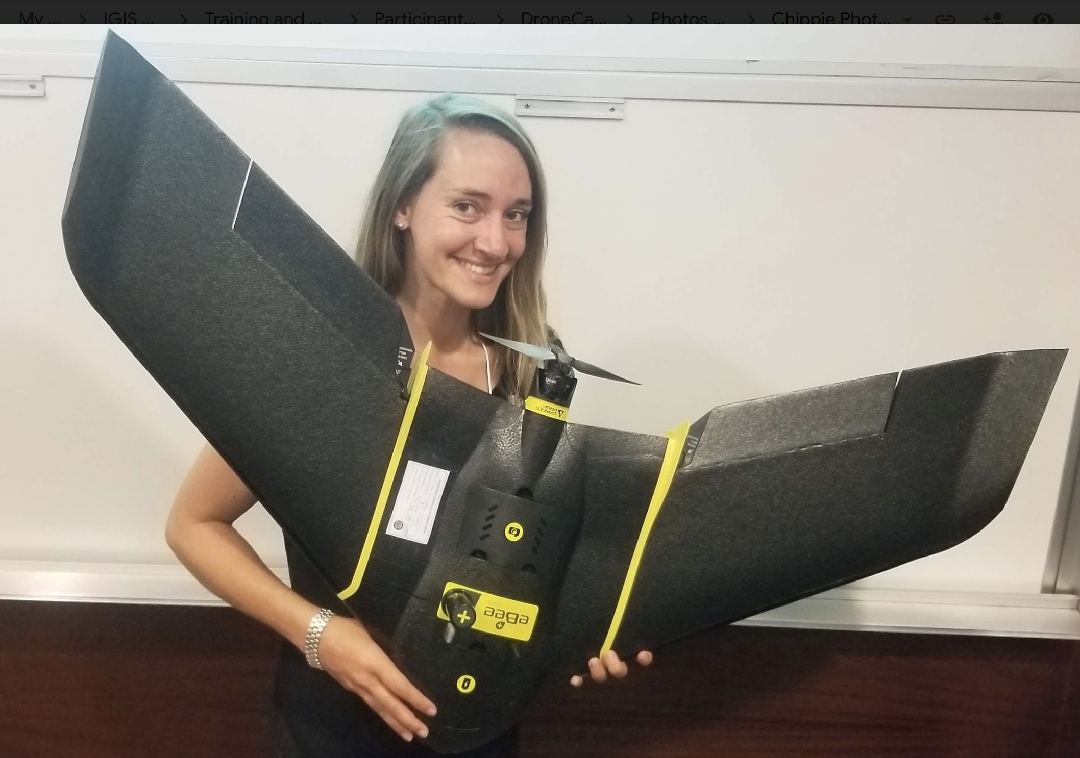
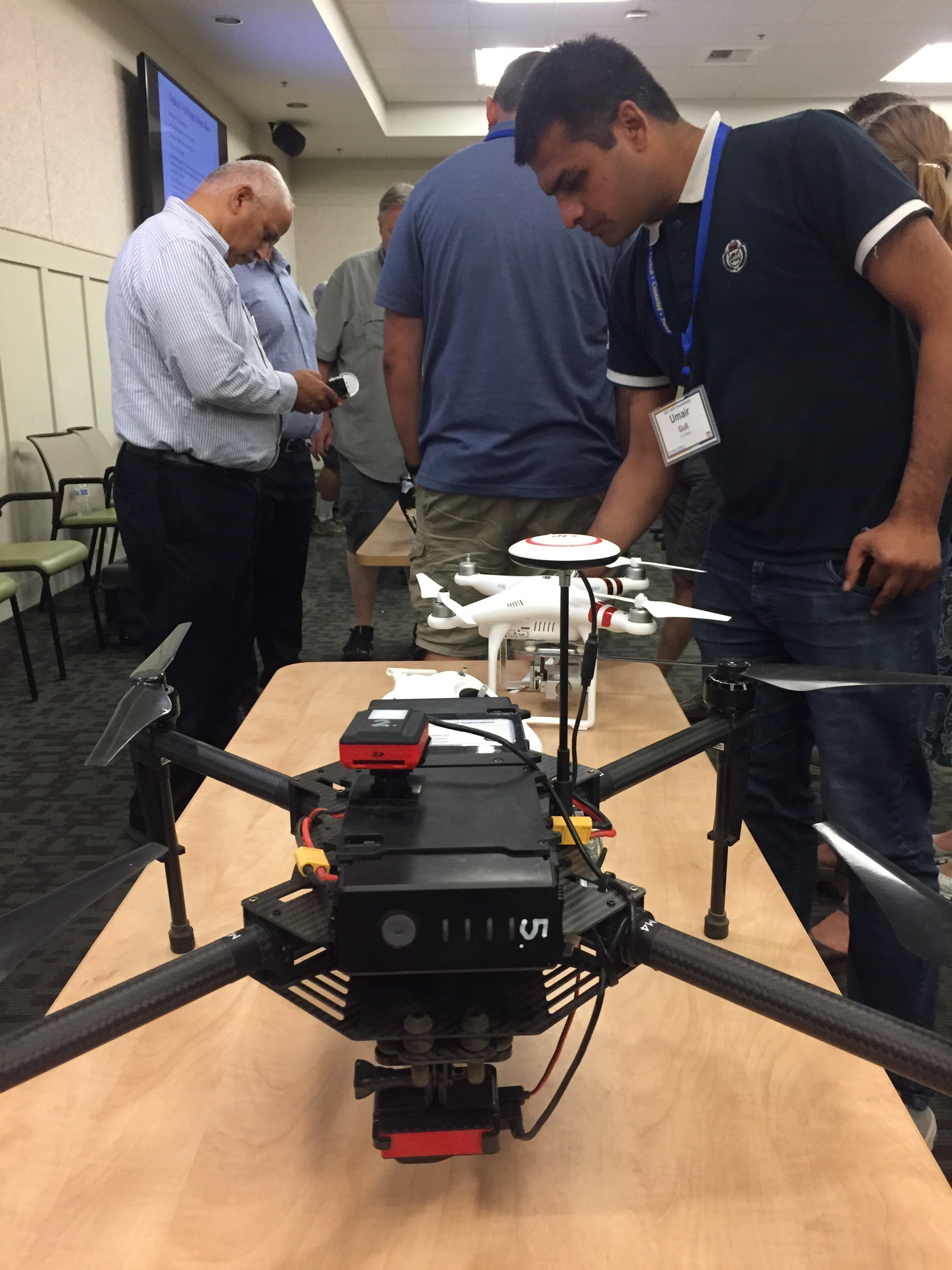
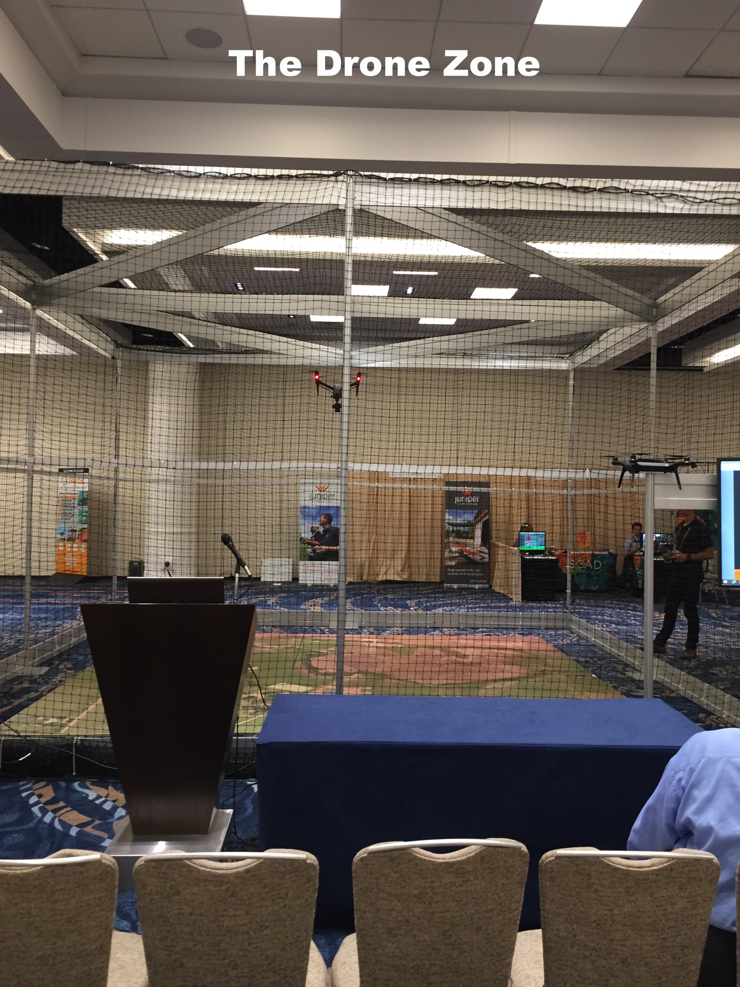
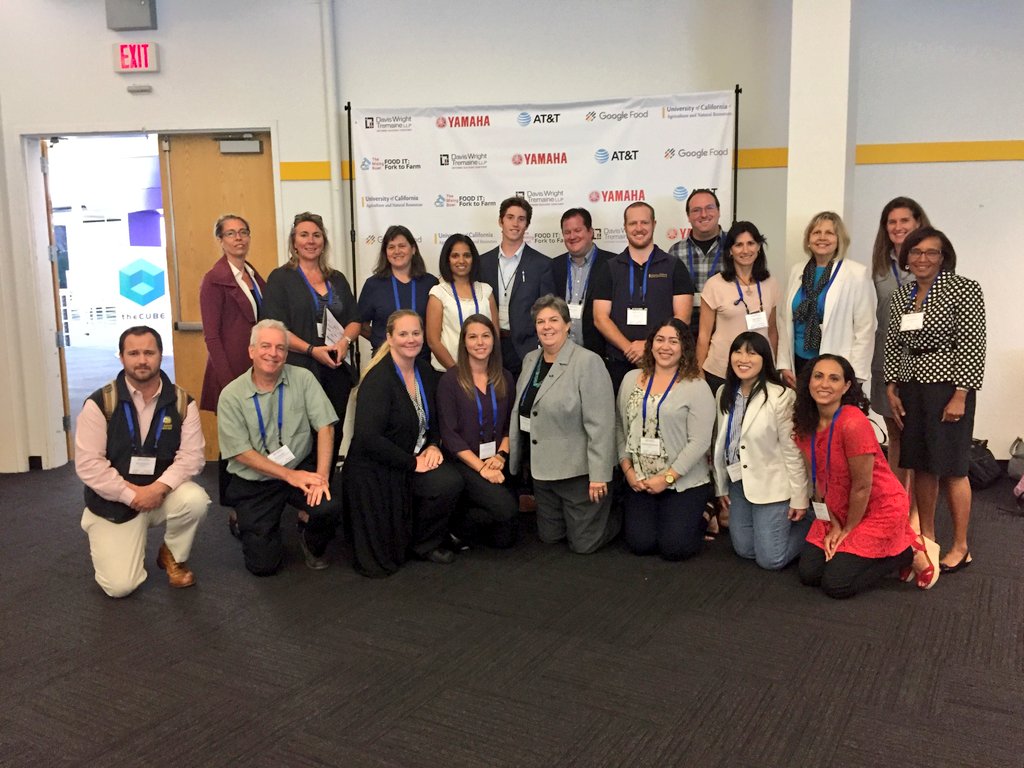
Measuring Reach. The IGIS program has developed and delivered workshops throughout California, through the leadership of Sean Hogan, Shane Feirer, and Andy Lyons (http://igis.ucanr.edu/IGISTraining). We manage and track all this activity through a custom data tracking dashboard that IGIS developed (using Google Sheets as a database linked to ArcGIS online to render maps - very cool), and thus can provide key metrics about our reach throughout California. Together, we have delivered 52 workshops across California since July 2015 and reached nearly 800 people. These include workshops on GIS for Forestry, GIS for Agriculture, Drone Technology, WebGIS, Mobile Data Collection, and other topics. This is an impressive record of reach: these workshops have served audiences throughout California. We have delivered workshops from Humboldt to the Imperial Valley, and the attendees (n=766) have come from all over California. Check this map out:

2015-2018.jpg

Measuring Impact. At each workshop, we provide a feedback mechanism via an evaluation form and use this input to understand client satisfaction, reported changes in learning, and reported changes in participant workflow. We’ve been doing this for years, but I now think the questions we ask on those surveys need to change. We are really capturing the client satisfaction part of the process, and we need to do a better job on the change in learning and change in action parts of the work.

Having done this exercise, I can clearly see that measuring reach and activity are perhaps the easiest things to measure. We have information tools at our fingertips to do this: online web mapping of participant zip-codes, google analytics to track website activity. Measuring the other impacts: change in action, contributions to policy and actual condition changes are tough. I think extension will continue to struggle with these, but they are critical to help us articulate our value to the public. More work to do!

References
Franz, Nancy K. 2011. “Advancing the Public Value Movement: Sustaining Extension During Tough Times.” Journal of Extension 49 (2): 2COM2.
———. 2014. “Measuring and Articulating the Value of Community Engagement: Lessons Learned from 100 Years of Cooperative Extension Work.” Journal of Higher Education Outreach and Engagement 18 (2): 5.
Rennekamp, Roger A., and Molly Engle. 2008. “A Case Study in Organizational Change: Evaluation in Cooperative Extension.” New Directions for Evaluation 2008 (120): 15–26.

#DroneCamp2018 is in the bag!

We've just wrapped up #DroneCamp2018, hosted at beautiful UC San Diego. 

This was an expanded version from last year's model, which we held in Davis. We had 52 participants (from all over the world!) who were keen to learn about drones, data analysis, new technology, and drone futures.  

Day 1 was a flight day from half our participants: lots of hands-on with takeoffs and landings, and flying a mission; 
Day 2 covered drone safety and regulations, with guest talks from Brandon Stark and Dominique Meyer;
Day 3 covered drone data and analysis;
Day 4 was a flight day for Group 2 and a repeat of Day 1. 

We had lots of fun taking pics and tweeting: here is our wrapup on Twitter for #DroneCamp2018.

NASA Data and the Distributed Active Archive Centers

I’ve been away from the blog for awhile, but thought I’d catch up a bit. I am in beautiful Madison Wisconsin (Lake Mendota! 90 degrees! Rain! Fried cheese curds!) for the NASA LP DAAC User Working Group meeting. This is a cool deal where imagery and product users meet with NASA team leaders to review products and tools. Since this UWG process is new to me, I am highlighting some of the key fun things I learned. 

What is a DAAC?
A DAAC is a Distributed Active Archive Center, run by NASA Earth Observing System Data and Information System (EOSDIS). These are discipline-specific facilities located throughout the United States. These institutions are custodians of EOS mission data and ensure that data will be easily accessible to users. Each of the 12 EOSDIS DAACs process, archive, document, and distribute data from NASA's past and current Earth-observing satellites and field measurement programs. For example, if you want to know about snow and ice data, visit the National Snow and Ice Data Center (NSIDC) DAAC. Want to know about social and population data? Visit the Socioeconomic Data and Applications Data Center (SEDAC). These centers of excellence are our taxpayer money at work collecting, storing, and sharing earth systems data that are critical to science, sustainability, economy, and well-being.

What is the LP DAAC?
The Land Processes Distributed Active Archive Center (LP DAAC) is one of several discipline-specific data centers within the NASA Earth Observing System Data and Information System (EOSDIS). The LP DAAC is located at the USGS Earth Resources Observation and Science (EROS) Center in Sioux Falls, South Dakota. LP DAAC promotes interdisciplinary study and understanding of terrestrial phenomena by providing data for mapping, modeling, and monitoring land-surface patterns and processes. To meet this mission, the LP DAAC ingests, processes, distributes, documents, and archives data from land-related sensors and provides the science support, user assistance, and outreach required to foster the understanding and use of these data within the land remote sensing community.

Why am I here?
Each NASA DAAC has established a User Working Group (UWG). There are 18 people on the LP DAAC committee, 12 members from the land remote sensing community at large, like me! Some cool stuff going on. Such as...

New Sensors
Two upcoming launches are super interesting and important to what we are working on. First, GEDI (Global Ecosystem Dynamics Investigation) will produce the first high resolution laser ranging observations of the 3D structure of the Earth. Second, ECOSTRESS (The ECOsystem Spaceborne Thermal Radiometer Experiment on Space Station), will measure the temperature of plants: stressed plants get warmer than plants with sufficient water. ECOSTRESS will use a multispectral thermal infrared radiometer to measure surface temperature. The radiometer will acquire the most detailed temperature images of the surface ever acquired from space and will be able to measure the temperature of an individual farmer's field. Both of these sensors will be deployed on the International Space Station, so data will be in swaths, not continuous global coverage. Also, we got an update from USGS on the USGS/NASA plan for the development and deployment of Landsat 10. Landsat 9 comes 2020, Landsat 10 comes ~2027.

Other Data Projects
We heard from other data providers, and of course we heard from NEON! Remember I posted a series of blogs about the excellent NEON open remote sensing workshop I attended last year. NEON also hosts a ton of important ecological data, and has been thinking through the issues associated with cloud hosting. Tristin Goulden was here to give an overview.

Tools Cafe
NASA staff gave us a series of demos on their WebGIS services; AppEEARS; and their data website. Their webGIS site uses ArcGIS Enterprise, and serves web image services, web coverage services and web mapping services from the LP DAAC collection. This might provide some key help for us in IGIS and our REC ArcGIS online toolkits. AppEEARS us their way of providing bundles of LP DAAC data to scientists. It is a data extraction and exploration tool. Their LP DAAC data website redesign (website coming soon), which was necessitated in part by the requirement for a permanent DOI for each data product.

User Engagement
LP DAAC is going full-force in user engagement: they do workshops, collect user testimonials, write great short pieces on “data in action”, work with the press, and generally get the story out about how NASA LP DAAC data is used to do good work. This is a pretty great legacy and they are committed to keep developing it. Lindsey Harriman highlighted their excellent work here.

Grand Challenges for remote sensing
Some thoughts about our Grand Challenges: 1) Scaling: From drones to satellites. It occurs to me that an integration between the ground-to-airborne data that NEON provides and the satellite data that NASA provides had better happen soon; 2) Data Fusion/Data Assimilation/Data Synthesis, whatever you want to call it. Discovery through datasets meeting for the first time; 3) Training: new users and consumers of geospatial data and remote sensing will need to be trained; 4) Remote Sensible: Making remote sensing data work for society. 

A primer on cloud computing
We spent some time on cloud computing. It has been said that cloud computing is just putting your stuff on “someone else’s computer”, but it is also making your stuff “someone else’s problem”, because cloud handles all the painful aspects of serving data: power requirements, buying servers, speccing floor space for your servers, etc. Plus, there are many advantages of cloud computing. Including: Elasticity. Elastic in computing and storage: you can scale up, or scale down or scale sideways. Elastic in terms of money: You pay for only what you use. Speed. Commercial clouds CPUs are faster than ours, and you can use as many as you want. Near real time processing, massive processing, compute intensive analysis, deep learning. Size. You can customize this; you can be fast and expensive or slow and cheap. You use as much as you need. Short-term storage of large interim results or long-term storage of data that you might use one day.

Image courtesy of Chris Lynnes

Image courtesy of Chris Lynnes

We can use the cloud as infrastructure, for sharing data and results, and as software (e.g. ArcGIS Online, Google Earth Engine). Above is a cool graphic showing one vision of the cloud as a scaled and optimized workflow that takes advantage of the cloud: from pre-processing, to analytics-optimized data store, to analysis, to visualization. Why this is a better vision: some massive processing engines, such as SPARC or others, require that data be organized in a particular way (e.g. Google Big Table, Parquet, or DataCube). This means we can really crank on processing, especially with giant raster stacks. And at each step in the workflow, end-users (be they machines or people) can interact with the data. Those are the green boxes in the figure above. Super fun discussion, leading to importance of training, and how to do this best. Tristan also mentioned Cyverse, a new NSF project, which they are testing out for their workshops.

Image attribution: Corey Coyle

Image attribution: Corey Coyle

Super fun couple of days. Plus: Wisconsin is green. And warm. And Lake Mendota is lovely. We were hosted at the University of Wisconsin by Mutlu Ozdogan. The campus is gorgeous! On the banks of Lake Mendota (image attribution: Corey Coyle), the 933-acre (378 ha) main campus is verdant and hilly, with tons of gorgeous 19th-century stone buildings, as well as modern ones. UW was founded when Wisconsin achieved statehood in 1848, UW–Madison is the flagship campus of the UW System. It was the first public university established in Wisconsin and remains the oldest and largest public university in the state. It became a land-grant institution in 1866. UW hosts nearly 45K undergrad and graduate students. It is big! It has a med school, a business school, and a law school on campus. We were hosted in the UW red-brick Romanesque-style Science Building (opened in 1887). Not only is it the host building for the geography department, it also has the distinction of being the first building in the country to be constructed of all masonry and metal materials (wood was used only in window and door frames and for some floors), and may be the only one still extant. How about that! Bye Wisconsin!

Mapping fires and fire damage in real time: available geospatial tools

Many of us have watched in horror and sadness over the previous week as fires consumed much of the beautiful hills and parts of the towns of Napa and Sonoma Counties. Many of us know people who were evacuated with a few minutes’ notice - I met a retired man who left his retirement home with the clothes on his back. Many other friends lost everything - house, car, pets. It was a terrible event - or series of events as there were many active fires. During those 8+ days all of us were glued to our screens searching for up-to-date and reliable information on where the fires were, and how they were spreading. This information came from reputable, reliable sources (such as NASA, or the USFS), from affected residents (from Twitter and other social media), and from businesses (like Planet, ESRI, and Digital Globe who were sometimes creating content and sometimes distilling existing content), and from the media (who were ofen using all of the above). As a spatial data scientist, I am always thinking about mapping, and the ways in which geospatial data and analysis plays an increasingly critical role in disaster notification, monitoring, and response. I am collecting information on the technological landscape of the various websites, media and social media, map products, data and imagery that played a role in announcing and monitoring the #TubbsFire, #SonomaFires and #NapaFires. I think a retrospective of how these tools, and in particular how the citizen science aspect of all of this, helped and hindered society will be useful.  

In the literature, the theoretical questions surrounding citizen science or volunteered geography revolve around:

  • Accuracy – how accurate are these data? How do we evaluate them?  

  • Access – Who has access to the data? Are their technological limits to dissemination?

  • Bias (sampling issues)/Motivation (who contributes) are critical.

  • Effectiveness – how effective are the sites? Some scholars have argued that VGI can be inhibiting. 

  • Control - who controls the data, and how and why?

  • Privacy - Are privacy concerns lessened post disaster?

I think I am most interested in the accuracy and effectiveness questions, but all of them are important.  If any of you want to talk more about this or have more resources to discuss, please email me: maggi@berkeley.edu, or Twitter @nmaggikelly.

Summary so far. This will be updated as I get more information.

Outreach from ANR About Fires

Core Geospatial Technology During Fires

Core Technology for Post-Fire Impact


The Why, How, What, and Who of GIS Fall 2017

Every fall I ask my GIS students to answer the big questions in advance of their class projects. This year climate change, wildlife conservation, land use and water quality are important, as well as a number of other topics. Remote sensing continues to be important to GISers. Scientists, government and communities need to work together to solve problems. 

Why? 

  • What does the proposed project hope to accomplish?
  • What is the problem that needs to be addressed?
  • What do you expect to happen?

How? 

  • What analysis approach will be used?
  • Why was this approach selected?
  • What are alternative methods?
  • Is the analysis reproducible?

What?

  • What are the datasets that are needed?
  • Where will they come from?
  • Have you downloaded and checked this dataset?
  • Do you have a backup dataset?

Who?

  • Who will care about this? And why?
  • How will they use the results?
  • Will they be involved in the entire workflow?

Here are the responses from Fall 2017:

Wrap up from #DroneCamp2017!

UC ANR's IGIS program hosted 36 drone enthusiasts for a three day DroneCamp in Davis California. DroneCamp was designed for participants with little to no experience in drone technology, but who are interested in using drones for a variety of real world mapping applications. The goals of DroneCamp were to:

  • Gain an broader understanding of the drone mapping workflow: including
    • Goal setting, mission planning, data collection, data analysis, and communication & visualization
  • Learn about the different types of UAV platforms and sensors, and match them to specific mission objectives;
  • Get hands-on experience with flight operations, data processing, and data analysis; and
  • Network with other drone-enthusiasts and build the California drone ecosystem. 

The IGIS crew, including Sean Hogan, Andy Lyons, Maggi Kelly, Robert Johnson, Kelly Easterday, and Shane Feirer were on hand to help run the show. We also had three corporate sponsors: GreenValley Intl, Esri, and Pix4D. Each of these companies had a rep on hand to give presentations and interact with the participants.

Day 1 of #DroneCamp2017 covered some of the basics - why drone are an increasingly important part of our mapping and field equipment portfolio; different platforms and sensors (and there are so many!); software options; and examples. Brandon Stark gave a great overview of the Univ of California UAV Center of Excellence and regulations, and Andy Lyons got us all ready to take the 107 license test. We hope everyone here gets their license! We closed with an interactive panel of experienced drone users (Kelly Easterday, Jacob Flanagan, Brandon Stark, and Sean Hogan) who shared experiences planning missions, flying and traveling with drones, and project results. A quick evaluation of the day showed the the vast majority of people had learned something specific that they could use at work, which is great. Plus we had a cool flight simulator station for people to practice flying (and crashing).

Day 2 was a field day - we spent most of the day at the Davis hobbycraft airfield where we practiced taking off, landing, mission planning, and emergency maneuvers. We had an excellent lunch provided by the Street Cravings food truck. What a day! It was hot hot hot, but there was lots of shade, and a nice breeze. Anyway, we had a great day, with everyone getting their hands on the commands. Our Esri rep Mark Romero gave us a demo on Esri's Drone2Map software, and some of the lidar functionality in ArcGIS Pro.

Day 3 focused on data analysis. We had three workshops ready for the group to chose from, from forestry, agriculture, and rangelands. Prior to the workshops we had great talks from Jacob Flanagan and GreenValley Intl, and Ali Pourreza from Kearney Research and Extension Center. Ali is developing a drone-imagery-based database of the individual trees and vines at Kearney - he calls it the "Virtual Orchard". Jacob talked about the overall mission of GVI and how the company is moving into more comprehensive field and drone-based lidar mapping and software. Angad Singh from Pix4D gave us a master class in mapping from drones, covering georeferencing, the Pix4D workflow, and some of the checks produced for you a the end of processing.

One of our key goals of the DroneCamp was to jump start our California Drone Ecosystem concept. I talk about this in my CalAg Editorial. We are still in the early days of this emerging field, and we can learn a lot from each other as we develop best practices for workflows, platforms and sensors, software, outreach, etc. Our research and decision-making teams have become larger, more distributed, and multi-disciplinary; with experts and citizens working together, and these kinds of collaboratives are increasingly important. We need to collaborate on data collection, storage, & sharing; innovation, analysis, and solutions. If any of you out there want to join us in our California drone ecosystem, drop me a line.

Thanks to ANR for hosting us, thanks to the wonderful participants, and thanks especially to our sponsors (GreenValley Intl, Esri, and Pix4D). Specifically, thanks for:

  • Mark Romero and Esri for showing us Drone2Map, and the ArcGIS Image repository and tools, and the trial licenses for ArcGIS;
  • Angad Singh from Pix4D for explaining Pix4D, for providing licenses to the group; and
  • Jacob Flanagan from GreenValley Intl for your insights into lidar collection and processing, and for all your help showcasing your amazing drones.

#KeepCalmAndDroneOn!

Wrap up from the Esri Imagery and Mapping Forum

Recently, Esri has been holding an Imagery and Mapping Forum prior to the main User Conference. This year I was able to join as an invited panelist for the Executive Panel and Closing Remarks session on Sunday. During the day I hung out in the Imaging and Innovation Zone, in front of the Drone Zone (gotta get one of these for ANR). This was well worth attending: smaller conference - focused topics - lots of tech reveals - great networking. 

Notes from the day: Saw demos from a range of vendors, including:

  • Aldo Facchin from Leica gave a slideshow about the Leica Pegasus: Backpack. Their backpack unit workflow uses SLAM; challenges include fusion of indoor and outdoor environments (from transportation networks above and below ground). Main use cases were industrial, urban, infrastructure. http://leica-geosystems.com/en-us/products/mobile-sensor-platforms/capture-platforms/leica-pegasus-backpack
  • Jamie Ritche from Urthecast talked about "Bringing Imagery to Life". He says our field is "a teenager that needs to be an adult". By this he means that in many cases businesses don't know what they need to know. Their solution is in apps- "the simple and the quick": quick, easy, disposable and useful. 4 themes: revisit, coverage, time, quality. Their portfolio includes DEIMOS 1, Theia, Iris, DEIMOIS-2, PanGeo + . Deimos-1 focuses on agriculture. UrtheDaily: 5m pixels, 20TB daily, (40x the Sentinel output); available in 2019. They see their constellation and products as very comparable to Sentinel, Landsat, RapidEye. They've been working with Land O Lakes as their main imagery delivery. Stressing the ability of apps and cloud image services to deliver quick, meaningful information to users. https://www.urthecast.com/
  • Briton Vorhees from SenseFly gave an overview of: "senseFly's Drone Designed Sensors". They are owned by Parrot, and have a fleet of fixed wing drones (e.g. the eBee models); also drone optimized cameras, shock-proof, fixed lens, etc (e.g. SODA). These can be used as a fleet of sensors (gave an citizen-science example from Zanzibar (ahhh Zanzibar)). They also use Sequoia cameras on eBees for a range of applications. https://www.sensefly.com/drones/ebee.html
  • Rebecca Lasica and Jarod Skulavik from Harris Geospatial Solutions: The Connected Desktop". They showcased their new ENVI workflow implemented in ArcGIS Pro. Through a Geospatial Services Framework that "lifts" ENVI off the desktop; and creates an ENVI Engine. They showed some interesting crop applications - they call it "Crop Science". This http://www.harrisgeospatial.com/
  • Jeff Cozart and McCain McMurray from Juniper Unmanned shared "The Effectiveness of Drone-Based Lidar" and talked about the advantages of drone-based lidar for terrain mapping and other applications. They talked through a few projects, and highlighted that the main advantages of drone-based lidar are in the data, not in the economics per se. But the economies do work out too. (They partner with Reigl and YellowScan from France.)  They showcased an example from Colorado that compared lidar (I think it was a Reigl on a DJI Matrice) and traditional field survey - the lidar cost was 1/24th as expensive as the field survey. They did a live demo of ArcGIS tools with their CO data: classification of ground, feature extraction, etc. http://juniperunmanned.com/
  • Aerial Imaging Productions talked about their indoor scanning - this linking-indoor-to-outdoor (i.e. making point cloud data truly geo) is a big theme here. Also OBJ is a data format. (From Wikipedia: "The OBJ file format is a simple data-format that represents 3D geometry alone — namely, the position of each vertex, the UV position of each texture coordinate vertex, vertex normals, and the faces that make each polygon defined as a list of vertices, and texture vertices.") It is used in the 3D graphics world, but increasingly for indoor point clouds in our field.
  • My-Linh Truong from Riegl talked about their new static, mobile, airborne, and UAV lidar platforms. They've designed some mini lidar sensors for smaller UAVas (3lbs; 100kHz; 250m range; ~40pts/m2). Their ESRI workflow is called LMAP, and it relies on some proprietary REIGL software processing at the front end, then transfer to ArcGIS Pro (I think). http://www.rieglusa.com/index.html

We wrapped up the day with a panel discussion, moderated by Esri's Kurt Schwoppe, and including Lawrie Jordan from Esri, Greg Koeln from MDA, Dustin Gard-Weiss from NGA, Amy Minnick from DigitalGlobe, Hobie Perry from USFS-FIA, David Day from PASCO, and me. We talked about the promise and barriers associated with remote sensing and image processing from all of our perspectives. I talked alot about ANR and IGIS and the use of geospatial data, analysis and viz for our work in ANR. Some fun things that came out of the panel discussion were:

  • Cool stuff:
    • Lawrie Jordan started Erdas!
    • Greg Koeln wears Landsat ties (and has a Landsat sportcoat). 
    • Digital Globe launched their 30cm resolution WorldView-4. One key case study was a partnership with Associated Press to find a pirate fishing vessel in action in Indonesia. They found it, and busted it, and found on board 2,000 slaves.
    • The FIA is increasingly working on understanding uncertainty in their product, and they are moving for an image-base to a raster-based method for stratification.
    • Greg Koeln, from MDA (he of the rad tie- see pic below) says: "I'm a fan of high resolution imagery...but I also know the world is a big place".
  • Challenges: 
    • We all talked about the need to create actionable, practical, management-relevant, useful information from the wealth of imagery we have at our fingertips: #remotesensible. 
    • Multi-sensor triangulation (or georeferencing a stack of imagery from multiple sources to you and me) is a continual problem, and its going to get worse before it gets better with more imagery from UAVs. On that note, Esri bought the patent for "SIFT" a Microsoft algorithm to automate the relative registration of an image stack.
    • Great question at the end about the need to continue funding for the public good: ANR is critical here!
    • Space Junk.
  • Game-changers: 
    • Opening the Landsat archive: leading to science (e.g. Hansen et al. 2013), leading to tech (e.g. GEE and other cloud-based processors). Greg pointed out that in the day, his former organization (Ducks Unlimited) paid $4,400 per LANDSAT scene to map wetlands nationwide! That's a big bill. 
    • Democratization of data collection: drones, smart phones, open data...
The panel in action

The panel in action

Notes and stray thoughts:

  • Esri puts on a quality show always. San Diego always manages to feel simultaneously busy and fun, while not being crowded and claustrophobic. Must be the ocean, the light and the air.
  • Trying to get behind the new "analytics" replacement of "analysis" in talks. I am not convinced everyone is using analytics correctly ("imagery analytics such as creating NDVI"), but hey, it's a thing now: https://en.wikipedia.org/wiki/Analytics#Analytics_vs._analysis
  • 10 years ago I had a wonderful visitor to my lab from Spain - Francisco Javier Lozano - and we wrote a paper: http://www.sciencedirect.com/science/article/pii/S003442570700243X. He left to work at some crazy startup company called Deimos in Spain, and Lo and Behold, he is still there, and the company is going strong. The Deimos satellites are part of the UrtheCast fleet. Small world!
  • The gender balance at the Imagery portion of the Esri UC is not. One presenter at a talk said to the audience with a pointed stare at me: "Thanks for coming Lady and Gentlemen".

Good fun! Now more from Shane and Robert at the week-long Esri UC!

Wrap up from the FOODIT: Fork to Farm Meeting

UC ANR was a sponsor for the FOODIT: Fork to Farm meeting in June 2017: http://mixingbowlhub.com/events/food-fork-farm/. Many of us were there to learn about what was happening in the food-data-tech space and learn how UCANR can be of service. It was pretty cool. First, it was held in the Computer History Museum, which is rad. Second, the idea of the day was to link partners, industry, scientists, funders, and foodies, around sustainable food production, distribution, and delivery. Third, there were some rad snacks (pic below). 

We had an initial talk from Mikiel Bakker from Google Food, who have broadened their thinking about food to include not just feeding Googlers, but also the overall food chain and food system sustainability. They have developed 5 "foodshots" (i.e. like "moonshot" thinking): 1) enable individuals to make better choices, 2) shift diets, 3) food system transparency, 4) reduce food losses, and 5) how to make a closed, circular food system.

We then had a series of moderated panels.

The Dean's List introduced a panel of University Deans, moderated by our very own Glenda Humiston @UCANR, and included Helene Dillard (UCDavis), Andy Thulin (CalPoly), Wendy Wintersteen (Iowa State). Key discussion points included lack of food system transparency, science communication and literacy, making money with organics, education and training, farm sustainability and efficiency, market segmentation (e.g. organics), downstream processing, and consumer power to change food systems. Plus the Amazon purchase of Whole Foods.

The Tech-Enabled Consumer session featured 4 speakers from companies who feature tech around food. Katie Finnegan from Walmart, David McIntyre from Airbnb, Barbara Shpizner from Mattson, Michael Wolf from The Spoon. Pretty neat discussion around the way these diverse companies use tech to customize customer experience, provide cost savings, source food, contribute to a better food system. 40% of food waste is in homes, another 40% is in the consumer arena. So much to be done!

The session on Downstream Impacts for the Food Production System featured Chris Chochran from ReFed @refed_nowaste, Sabrina Mutukisna from The Town Kitchen @TheTownKitchen, Kevin Sanchez from the Yolo Food Bank @YoloFoodBank, and Justin Siegel from UC Davis International Innovation and Health. We talked about nutrition for all, schemes for minimizing food waste, waste streams, food banks, distribution of produce and protein to those who need them (@refed_nowaste and @YoloFoodBank), creating high quality jobs for young people of color in the food business (@TheTownKitchen), the amount of energy that is involved in the food system (David Lee from ARPA-E); this means 7% of our energy use in the US inadvertently goes to CREATING FOOD WASTE. Yikes!

The session on Upstream Production Impacts from New Consumer Food Choices featured Ally DeArman from Food Craft Institute @FoodCraftInst, Micke Macrie from Land O' Lakes, Nolan Paul from Driscoll's @driscollsberry, and Kenneth Zuckerberg from Rabobank @Rabobank. This session got cut a bit short, but it was pretty interesting. Especially the Food Craft Institute, whose mission is to help "the small guys" succeed in the food space.

The afternoon sessions included some pitch competitions, deep dive breakouts and networking sessions. What a great day for ANR.

Distillation from the NEON Data Institute

So much to learn! Here is my distillation of the main take-homes from last week. 

Notes about the workshop in general:

NEON data and resources:

Other misc. tools:

Day 1 Wrap Up
Day 2 Wrap Up 
Day 3 Wrap Up
Day 4 Wrap Up

Day 4 Wrap Up from the NEON Data Institute 2017

Day 4 http://neondataskills.org/data-institute-17/day4/

This is it! Final day of LUV-DATA. Today we focused on hyperspectral data and vegetation. Paul Gader from the University of Florida kicked off the day with a survey of some of his projects in hyperspectral data, explorations in NEON data, and big data algorithmic challenges. Katie Jones talked about the terrestrial observational plot protocol at the NEON sites. Sites are either tower (in tower air-shed) or distributed (throughout site). She focused on the vegetation sampling protocols (individual, diversity, phenology, biomass, productivity, biogeochemistry). Data to be released in the fall. Samantha Weintraub talked to us about foliar chemistry data (e.g. C, N, lignin, chlorophyll, trace elements) and linking with remote sensing. Since we are still learning about fundamental controls on canopy traits within and between ecosystems, and we have a poor understanding of their response to global change, this kind of NEON work is very important. All these foliar chemistry data will be released in the fall. She also mentioned the extensive soil biogeochemical and microbial measurements in soil plots (30cm depth) again in tower and distributed plots (during peak greenness and 2 seasonal transitions).

The coding work focused on classifying spectra (Classification of Hyperspectral Data with Ordinary Least Squares in Python), (Classification of Hyperspectral Data with Principal Components Analysis in Python) and (Using SciKit for Support Vector Machine (SVM) Classification with Python), using our new best friend Jupyter Notebooks. We spent most of the time talking about statistical learning, machine learning and the hazards of using these without understanding of the target system. 

Fun additional take-home messages/resources:

  • NEON data seems like a tremendous resource for research and teaching. Increasing amounts of data are going to be added to their data portal. Stay tuned: http://data.neonscience.org/home
  • NRC has collaborated with NEON to do some spatially extensive soil characterization across the sites. These data will also be available as a NEON product.
  • Fore more on when data rolls out, sign up for the NEON eNews here: http://www.neonscience.org/

Thanks to everyone today! Megan Jones (ran a flawless workshop), Paul Gader (remote sensing use cases/classification), Katie Jones (NEON terrestrial vegetation sampling), Samantha Weintraub (foliar chemistry data).

And thanks to NEON for putting on this excellent workshop. I learned a ton, met great people, got re-energized about reproducible workflows (have some ideas about incorporating these concepts into everyday work), and got to spend some nostalgic time walking around my former haunts in Boulder.

Day 1 Wrap Up
Day 2 Wrap Up
Day 3 Wrap Up

Day 3 Wrap Up from the NEON Data Institute 2017

Today we focused on uncertainty. Yay! http://neondataskills.org/data-institute-17/day3/

Tristan Goulden gave a talk on sources of uncertainty in the discrete return lidar data. Uncertainty comes from two main sources: geolocation - horizontal and vertical (e.g. distance from base station, distribution and number of satellites, and accuracy of IMU), and processing (e.g. classification of point cloud, interpolation method ). The NEON remote sensing team has developed tests for each of these error sources. NEON provides with all their lidar data a simulated point cloud error product, with horizontal and vertical error per point in LAS format (cool!). These products show the error is largest at the edges of scans, obvi.

  • The take homes are: fly within 20km of a basestation; test your lidar sensor annually; check your boresight; dense canopy make ground point density more sparce, so DTM is problematic; and initial point cloud misclassification can lead to large errors in downstream products. So much more in my notes.

We then coded an example from the PRIN NEON site, where NEON captured lidar data twice within 2 days, and so we could explore how different the data were. Again, we used Jupyter Notebooks and explored the relative differences in DSM and DTM values between the two lidar captures. The differences are random, but non-negligible, at least for DSM. For the DTM, the range = 0.0-20cm; but for the DSM the range = 0.0-1.5. The mean DSM is 6.34m, so the difference can be ~20%. The take home is that despite a 15cm accuracy spec from vendors on vertical accuracies, you can get very different measures on different flights and those can be considerable, especially with vegetation. In fact, NEON meets its 15cm accuracy requirements only in non-vegetated areas. Note, when you download NEON data, you can get line-to-line differences in the NEON lidar metadata, to kind of explore this. But assume if you are in heavily vegetated areas you should expect higher than 15cm error.

After lunch we launched into the NEON Imaging Spectrometer data and uncertainty with Nathan This is something I had not really thought about before this workshop.
We talked about orthorectfication and geolocation, focal plan characterization, spectral calibration and radiometric calibration and all the possible sources of error that can creep into the data, like blurring and ghosting of light. NEON calibrates their data across these areas, and provided information on each. I don't think there are many standards for reporting these kinds of spectral uncertainties.

The first live coding exercise (Hyperspectral Variation Uncertainty Analysis in Python) looked at the NEON site F07A, at which NEON acquired 18 individual flights (for BRDF work) over an hour on one day. We used these data and plotted the different spectral reflectance curves for several pixels. For a vegetated pixel, the NIR can vary tremendously! (e.g. 20% reflectance compared to 50% reflectance, depending on time of day, solar angle, etc.) Wow! I should note that the related indices - NDVI, which are ratios, will not be as affected. Also, you can normalize the output using some nifty methods like the Standard Normal Variate (SNV) algorithm, if you have large areas over which you can gather multiple samples.

The second live coding exercise (Assessing Spectrometer Accuracy using Validation Tarps with Python) focused on a calibration experiment they conducted at CHEQ for the NIS instrument. They laid out two reflectance tarps - 3% (black) and 48% (white), measured reflectance with an ASD spectrometer, and flew over with the NIS. We compared the data across wavelengths. Results summary: small differences between ASD and NIS across wavelengths; water absorption bands play a role; % differences can be quite high - up to 50% for the black tarp. This is mostly from stray light from neighboring areas. NEON has a calibration method for this (they call it their "de-blurring correction").

Fun additional take-home messages/resources:

  • All NEON point cloud classifications are done with LASTools. Go LASTools! https://rapidlasso.com/lastools/
  • Check out pdal - like gdal for point clouds. It can be used from bash. Learned from my workshop neighbor Sergio Marconi https://www.pdal.io/
  • Reflectance Tarps are made by GroupVIII http://www.group8tech.com/
  • ATCOR http://www.rese.ch/products/atcor/ says we should be able to rely on 3-5% error on reflectance when atmospheric correction is done correctly (say that 10 times fast) with a well-calibrated instrument.
  • NEON hyperspectral data is stored in HDF5 format. HDFView is a great tool for interrogating the metadata, among other things.

Thanks to everyone today! Megan Jones (our fearless leader), Tristan Goulden (Discrete Lidar Uncertainty and all the coding), Nathan Leisso (spectral data uncertainty), and Amanda Roberts (NEON intern - spectral uncertainty).

Day 1 Wrap Up
Day 2 Wrap Up 
Day 3 Wrap Up
Day 4 Wrap Up

Day 2 Wrap Up from the NEON Data Institute 2017

First of all, Pearl Street Mall is just as lovely as I remember, but OMG it is so crowded, with so many new stores and chains. Still, good food, good views, hot weather, lovely walk.

Welcome to Day 2! http://neondataskills.org/data-institute-17/day2/
Our morning session focused on reproducibility and workflows with the great Naupaka Zimmerman. Remember the characteristics of reproducibility - organization, automation, documentation, and dissemination. We focused on organization, and spent an enjoyable hour sorting through an example messy directory of misc data files and code. The directory looked a bit like many of my directories. Lesson learned. We then moved to working with new data and git to reinforce yesterday's lessons. Git was super confusing to me 2 weeks ago, but now I think I love it. We also went back and forth between Jupyter and python stand alone scripts, and abstracted variables, and lo and behold I got my script to run. All the git stuff is from http://swcarpentry.github.io/git-novice/

The afternoon focused on Lidar (yay!) and prior to coding we talked about discrete and waveform data and collection, and the opentopography (http://www.opentopography.org/) project with Benjamin Gross. The opentopography talk was really interesting. They are not just a data distributor any more, they also provide a HPC framework (mostly TauDEM for now) on their servers at SDSC (http://www.sdsc.edu/). They are going to roll out a user-initiated HPC functionality soon, so stay tuned for their new "pluggable assets" program. This is well worth checking into. We also spent some time live coding with Python with Bridget Hass working with a CHM from the SERC site in California, and had a nerve-wracking code challenge to wrap up the day.

Fun additional take-home messages/resources:

Thanks to everyone today! Megan Jones (our fearless leader), Naupaka Zimmerman (Reproducibility), Tristan Goulden (Discrete Lidar), Keith Krause (Waveform Lidar), Benjamin Gross (OpenTopography), Bridget Hass (coding lidar products).

Day 1 Wrap Up
Day 2 Wrap Up 
Day 3 Wrap Up
Day 4 Wrap Up

Our home for the week

Our home for the week

Day 1 Wrap Up from the NEON Data Institute 2017

I left Boulder 20 years ago on a wing and a prayer with a PhD in hand, overwhelmed with bittersweet emotions. I was sad to leave such a beautiful city, nervous about what was to come, but excited to start something new in North Carolina. My future was uncertain, and as I took off from DIA that final time I basically had Tom Petty's Free Fallin' and Learning to Fly on repeat on my walkman. Now I am back, and summer in Boulder is just as breathtaking as I remember it: clear blue skies, the stunning flatirons making a play at outshining the snow-dusted Rockies behind them, and crisp fragrant mountain breezes acting as my Madeleine. I'm back to visit the National Ecological Observatory Network (NEON) headquarters and attend their 2017 Data Institute, and re-invest in my skillset for open reproducible workflows in remote sensing. 

Day 1 Wrap Up from the NEON Data Institute 2017
What a day! http://neondataskills.org/data-institute-17/day1/
Attendees (about 30) included graduate students, old dogs (new tricks!) like me, and research scientists interested in developing reproducible workflows into their work. We are a pretty even mix of ages and genders. The morning session focused on learning about the NEON program (http://www.neonscience.org/): its purpose, sites, sensors, data, and protocols. NEON, funded by NSF and managed by Battelle, was conceived in 2004 and will go online for a 30-year mission providing free and open data on the drivers of and responses to ecological change starting in Jan 2018. NEON data comes from IS (instrumented systems), OS (observation systems), and RS (remote sensing). We focused on the Airborne Observation Platform (AOP) which uses 2, soon to be 3 aircraft, each with a payload of a hyperspectral sensor (from JPL, 426, 5nm bands (380-2510 nm), 1 mRad IFOV, 1 m res at 1000m AGL) and lidar (Optech and soon to be Riegl, discrete and waveform) sensors and a RGB camera (PhaseOne D8900). These sensors produce co-registered raw data, are processed at NEON headquarters into various levels of data products. Flights are planned to cover each NEON site once, timed to capture 90% or higher peak greenness, which is pretty complicated when distance and weather are taken into account. Pilots and techs are on the road and in the air from March through October collecting these data. Data is processed at headquarters.

In the afternoon session, we got through a fairly immersive dunk into Jupyter notebooks for exploring hyperspectral imagery in HDF5 format. We did exploration, band stacking, widgets, and vegetation indices. We closed with a fast discussion about TGF (The Git Flow): the way to store, share, control versions of your data and code to ensure reproducibility. We forked, cloned, committed, pushed, and pulled. Not much more to write about, but the whole day was awesome!

Fun additional take-home messages:

Thanks to everyone today, including: Megan Jones (Main leader), Nathan Leisso (AOP), Bill Gallery (RGB camera), Ted Haberman (HDF5 format), David Hulslander (AOP), Claire Lunch (Data), Cove Sturtevant (Towers), Tristan Goulden (Hyperspectral), Bridget Hass (HDF5), Paul Gader, Naupaka Zimmerman (GitHub flow).

Day 1 Wrap Up
Day 2 Wrap Up 
Day 3 Wrap Up
Day 4 Wrap Up

Cloud-based raster processors out there

Hi all,

Just trying to get my head around some of the new big raster processors out there, in addition of course to Google Earth Engine. Bear with me while I sort through these. Thanks for raster sleuth Stefania Di Tomasso for helping. 

1. Geotrellis (https://geotrellis.io/)

Geotrellis is a Scala-based raster processing engine, and it is one of the first geospatial libraries on Spark.  Geotrellis is able to process big datasets. Users can interact with geospatial data and see results in real time in an interactive web application (for regional, statewide dataset).  For larger raster datasets (eg. US NED). GeoTrellis performs fast batch processing using Akka clustering to distribute data across the cluster.  GeoTrellis was designed to solve three core problems, with a focus on raster processing:

  • Creating scalable, high performance geoprocessing web services;
  • Creating distributed geoprocessing services that can act on large data sets; and
  • Parallelizing geoprocessing operations to take full advantage of multi-core architecture.

Features:

  • GeoTrellis is designed to help a developer create simple, standard REST services that return the results of geoprocessing models.
  • GeoTrellis will automatically parallelize and optimize your geoprocessing models where possible.
  • In the spirit of the object-functional style of Scala, it is easy to both create new operations and compose new operations with existing operations.

2. GeoPySpark - in synthesis GeoTrellis for Python community

Geopyspark provides python bindings for working with geospatial data on PySpark (PySpark is the Python API for Spark). Spark is open source processing engine originally developed at UC Berkeley in 2009.  GeoPySpark makes Geotrellis (https://geotrellis.io/) accessible to the python community.  Scala is a difficult language so they have created this Python library. 

3. RasterFoundry (https://www.rasterfoundry.com/)

They say: "We help you find, combine and analyze earth imagery at any scale, and share it on the web." And "Whether you’re working with data already accessible through our platform or uploading your own, we do the heavy lifting to make processing your imagery go quickly no matter the scale."

Key RasterFoundry workflow: 

  1. Browse public data
  2. Stitch together imagery
  3. Ingest your own data
  4. Build an analysis pipeline
  5. Edit and iterate quickly
  6. Integrate with their API

4. GeoNotebooks

From the Kitware blog: Kitware has partnered with The NASA Earth Exchange (NEX) to design GeoNotebook, a Jupyter Notebook extension created to solve these problems (i.e. big raster data stacks from imagery). Their shared vision: a flexible, reproducible analysis process that makes data easy to explore with statistical and analytics services, allowing users to focus more on the science by improving their ability to interactively assess data quality at scale at any stage of the processing.

Extending Jupyter Notebooks and Jupyter Hub, this python analysis environment provides the means to easily perform reproducible geospatial analysis tasks that can be saved at any state and easily shared. As the geospatial datasets come in, they are ingested into the system and converted into tiles for visualization, creating a dynamic map that can be managed from the web UI and can communicate back to a server to perform operations like data subsetting and visualization. 

Blog post: https://blog.kitware.com/geonotebook-data-driven-quality-assurance-for-geospatial-data/ 

DS421 Data Science for the 21st Century Program Wrap Up!

Today we had our 1st Data Science for the 21st Century Program Conference. Some cool things that I learned: 

  • Cathryn Carson updated us on the status of the Data Science program on campus - we are teaching 1200 freshman data science right now. Amazing. And a new Dean is coming. 
  • Phil Stark on the danger of being at the bleeding edge of computation - if you put all your computational power into your model, you have nothing left to evaluate uncertainty in your model. Let science guide data science. 
  • David Ackerly believes in social networking! 
  • Cheryl Schwab gave us an summary of her evaluation work. The program outcomes that we are looking for in the program are: Concepts, communication, interdisciplinary research
  • Trevor Houser from the Rhodian Group http://rhg.com/people/trevor-houser gave a very interesting and slightly optimistic view of climate change. 
  • Break out groups, led by faculty: 
    • (Boettiger) Data Science Grand Challenges: inference vs prediction; dealing with assumptions; quantifying uncertainty; reproducibility, communication, and collaboration; keeping science in data science; and keeping scientists in data science. 
    • (Hsiang) Civilization collapses through history: 
    • (Ackerly) Discussion on climate change and land use. 50% of the earth are either crops or rangelands; and there is a fundamental tradeoff between land for food and wildlands. How do we deal with the externalities of our love of open space (e.g. forcing housing into the central valley). 
  • Finally, we wrapped up with presentations from our wonderful 1st cohort of DS421 students and their mini-graduation ceremony. 
  • Plus WHAT A GREAT DAY! Berkeley was splendid today in the sun. 
 

Plus plus, Carl B shared Drew Conway's DS fig, which I understand is making the DS rounds: 

From: http://drewconway.com/zia/2013/3/26/the-data-science-venn-diagram

From: http://drewconway.com/zia/2013/3/26/the-data-science-venn-diagram

Planet Lab wants YOU to work with their data!

They say: 

Are you a college student, researcher or professor? We’re looking for innovative academics, researchers and scientists to unlock the power of a one-of-a-kind dataset. You can now apply for access to Planet’s unique dataset for non-commercial research purposes. In an area as large as 2,000 square kilometers, you’ll have access to download imagery, analyze trends, and publish your results.

Check it: https://www.planet.com/products/education-and-research/

AAG 2017 Wrap Up: Day 3

Day 3: I opened the day with a lovely swim with Elizabeth Havice (in the largest pool in New England? Boston? The Sheraton?) and then embarked on a multi-mile walk around the fair city of Boston. The sun was out and the wind was up, showing the historical buildings and waterfront to great advantage. The 10-year old Institute of Contemporary Art was showing in a constrained space, but it did host an incredibly moving video installation from Steve McQueen (Director of 12 Years a Slave) called “Ashes” about the life and death of a young fisherman in Grenada.

My final AAG attendance involved two plenaries hosted by the Remote Sensing Specialty Group and the GIS Specialty Group, who in their wisdom, decided to host plenaries by two absolute legends in our field – Art Getis and John Jensen – at the same time. #battleofthetitans. #gisvsremotesensing. So, I tried to get what I could from both talks. I started with the Waldo Tobler Lecture given by Art Getis: The Big Data Trap: GIS and Spatial Analysis. Compelling title! His perspective as a spatial statistician on the big data phenomena is a useful one. He talks about how data are growing fast: Every minute – 98K tweets; 700K FB updates; 700K Google searches; 168+M emails sent; 1,820 TB of data created. Big data is growing in spatial work; new analytical tools are being developed, data sets are generated, and repositories are growing and becoming more numerous. But, there is a trap. And here is it. The trap of Big Data:

10 Erroneous assumptions to be wary of:

  1. More data are better
  2. Correlation = causation
  3. Gotta get on the bandwagon
  4. I have an impeccable source
  5. I have really good software
  6. I am good a creating clever illustrations
  7. I have taken requisite spatial data analysis courses
  8. It’s the scientific future
  9. Accessibly makes it ethical
  10. There is no need to sample

He then asked: what is the role of spatial scientists in the big data revolution? He says our role is to find relationships in a spatial setting; to develop technologies or methods; to create models and use simulation experiments; to develop hypotheses; to develop visualizations and to connect theory to process.

The summary from his talk is this: Start with a question; Differentiate excitement from usefulness; Appropriate scale is mandatory; and Remember more may or may not be better. 

When Dr Getis finished I made a quick run down the hall to hear the end of the living legend John Jensen’s talk on drones. This man literally wrote the book(s) on remote sensing, and he is the consummate teacher – always eager to teach and extend his excitement to a crowded room of learners.  His talk was entitled Personal and Commercial Unmanned Aerial Systems (UAS) Remote Sensing and their Significance for Geographic Research. He presented a practicum about UAV hardware, software, cameras, applications, and regulations. His excitement about the subject was obvious, and at parts of his talk he did a call and response with the crowd. I came in as he was beginning his discussion on cameras, and he also discussed practical experience with flight planning, data capture, and highlighted the importance of obstacle avoidance and videography in the future. Interestingly, he has added movement to his “elements of image interpretation”. Neat. He says drones are going to be routinely part of everyday geographic field research. 

What a great conference, and I feel honored to have been part of it. 

AAG Boston 2017 Day 1 wrap up!

Day 1: Thursday I focused on the organized sessions on uncertainty and context in geographical data and analysis. I’ve found AAGs to be more rewarding if you focus on a theme, rather than jump from session to session. But less steps on the iWatch of course. There are nearly 30 (!) sessions of speakers who were presenting on these topics throughout the conference.

An excellent plenary session on New Developments and Perspectives on Context and Uncertainty started us off, with Mei Po Kwan and Michael Goodchild providing overviews. We need to create reliable geographical knowledge in the face of the challenges brought up by uncertainty and context, for example: people and animals move through space, phenomena are multi-scaled in space and time, data is heterogeneous, making our creation of knowledge difficult. There were sessions focusing on sampling, modeling, & patterns, on remote sensing (mine), on planning and sea level rise, on health research, on urban context and mobility, and on big data, data context, data fusion, and visualization of uncertainty. What a day! All of this is necessarily interdisciplinary. Here are some quick insights from the keynotes.

Mei Po Kwan focused on uncertainty and context in space and time:

  • We all know about the MAUP concept, what about the parallel with time? The MTUP: modifiable temporal unit problem.
  • Time is very complex. There are many characteristics of time and change: momentary, time-lagged response, episodic, duration, cumulative exposure
    • sub-discussion: change has patterns as well - changes can be clumpy in space and time. 
  • How do we aggregate, segment and bound spatial-temporal data in order to understand process?
  • The basic message is that you must really understand uncertainty: Neighborhood effects can be overestimated if you don’t include uncertainty.

As expected, Michael Goodchild gave a master class in context and uncertainty. No one else can deliver such complex material so clearly, with a mix of theory and common sense. Inspiring. Anyway, he talked about:

  • Data are a source of context:
    • Vertical context – other things that are known about a location, that might predict what happens and help us understand the location;
    • Horizontal context – things about neighborhoods that might help us understand what is going on.
    • Both of these aspects have associated uncertainties, which complicate analyses.
  • Why is geospatial data uncertain?
    • Location measurement is uncertain
    • Any integration of location is also uncertain
    • Observations are non-replicable
    • Loss of spatial detail
    • Conceptual uncertainty
  • This is the paradox. We have abundant sources of spatial data, they are potentially useful. Yet all of them are subject to myriad types of uncertainty. In addition, the conceptual definition of context is fraught with uncertainty.
  • He then talked about some tools for dealing with uncertainty, such as areal interpolation, and spatial convolution.
  • He finished with some research directions, including focusing on behavior and pattern, better ways of addressing confidentiality, and development of a better suite of tools that include uncertainty.

My session went well. I chaired a session on uncertainty and context in remote sensing with 4 great talks from Devin White and Dave Kelbe from Oak Ridge NL who did a pair of talks on ORNL work in photogrammetry and stereo imagery, Corrine Coakley from Kent State who is working on reconstructing ancient river terraces, and Chris Amante from the great CU who is developing uncertainty-embedded bathy-topo products. My talk was on uncertainty in lidar inputs to fire models, and I got a great question from Mark Fonstad about the real independence of errors – as in canopy height and canopy base height are likely correlated, so aren’t their errors? Why do you treat them as independent? Which kind of blew my mind, but Qinghua Guo stepped in with some helpful words about the difficulties of sampling from a joint probability distribution in Monte Carlo simulations, etc. 

Plus we had some great times with Jacob, Leo, Yanjun and the Green Valley International crew who were showcasing their series of Lidar instruments and software. Good times for all!

GIF Bootcamp 2017 wrap up!

Our third GIF Spatial Data Science Bootcamp has wrapped!  We had an excellent 3 days with wonderful people from a range of locations and professions and learned about open tools for managing, analyzing and visualizing spatial data. This year's bootcamp was sponsored by IGIS and GreenValley Intl (a Lidar and drone company). GreenValley showcased their new lidar backpack, and we took an excellent shot of the bootcamp participants. What is Paparazzi in lidar-speak? Lidarazzi? 

Here is our spin: We live in a world where the importance and availability of spatial data are ever increasing. Today’s marketplace needs trained spatial data analysts who can:

  • compile disparate data from multiple sources;
  • use easily available and open technology for robust data analysis, sharing, and publication;
  • apply core spatial analysis methods;
  • and utilize visualization tools to communicate with project managers, the public, and other stakeholders.

At the Spatial Data Science Bootcamp we learn how to integrate modern Spatial Data Science techniques into your workflow through hands-on exercises that leverage today's latest open source and cloud/web-based technologies.