Cool cartography--Risk mapping at a broad view

I came across this short blurb by  on some tricks for catchy large-scale maps. The bullet-points include:

  • Interesting Topic.  The subjects of these maps inherently represent risk, which we want to understand.
  • Unexpected Scope.  A forest view of something that’s usually seen at the tree-level offers satisfying perspective.
  • Big and Clear.  A single dataset is conceptually simple, and when large enough, it provides its own context-promoting conversation in the wild.
  • Sharable.  A static image is portable and paste-able, easily nestling into articles, blogs, tweets, and PowerPoints.
  • Attractive.  The currency of design buys a second or third look.

There is often a push to make large datasets available through interactive webGIS portals, but I think this makes a good case that there is still also a role for skilled cartography to present information in captivating ways. 

Below is an example of one of the author's (John Nelson) maps, and more can be found here

One Hundred Years of Land Values in Chicago

Gabriel Ahlfeldt, from the London School of Economics, presents in a video in the link below on an interesting project that digitized Olcott's Blue Books, a unique dataset of historical land values, land uses, building heights, and other information in Chicago and its suburbs, published annually between 1900 and 1990. The digitized information from the Blue Books allows for detailed historical statistical and geospatial analyses. The visualization of the data is presented in the video using GIS software.

View the video on youtube by clicking here.

1906 Earthquake & Present Day Photo Mashup

Shawn Clover recently released part 2 of his “1906 + Today: The Earthquake Blend” series which is a mashup of 1906 earthquake aftermath photos in San Francisco with present day photos at the same location. The photos are blended creating a seamless image of the past superimposed on the present.

View part 1 of the series here from 2010 and part 2 of the series here from 2012.

Credit: shawnclover.com

Bing Maps completes Global Ortho project for US

The Bing Maps team has anounced the completion of the Global Ortho Project for the US.  The project provides 30cm resolution imagery for the entire US, all acquired within the last 2 years.  You can access all of the imagery now through Bing Maps, it is pretty amazing to see such detail for all of the far off places that typically don't get high resolution attention. 

Find out more about the project from the Bing Maps Blog, or view the data for yourself.

Tag clouds from Fall 2012 GIS class

In class today, I asked everyone to share what they thought of as the 2 big challenges facing the world, 2 possible GIS-related methods that could be used to examine the challenges, and 2 possible data products or output products that might be used in the process. Here are the results!

Challenges facing us in the 21st century:

created at TagCrowd.com


Data used and products created:

created at TagCrowd.com

Cool stuff! On with GIS Fall 2012.

Fire Forecast

NPR recently created a neat interactive web map depicting locations of large active wildfires (updated every 30 min) and current wildfire danger forecasts (Low to Extreme) for areas in the lower 48 states (updated daily). Check out the map here and the accompany news story here. Map was created by Matt Stiles, Stephanie D'Otreppe and Brian Boyer.

Screenshot of NPR's Fire Forecast map

See the bigger picture. Make a better world.

Earlier this week we in ESPM heard a report from the folks in the SWIRL marketing team, who have been working to extract the essence of what we do in ESPM and in CNR. Their proposed tagline for us is: "See the bigger picture. Make a better world." Which aptly describes what we do in applied geospatial sciences. I kinda wish I'd thought it up myself. And since this summer marks the 40th anniversary of the Landsat program, I thought I'd use this post to talk about how our ability to observe the earth from space does indeed fit this new tagline.

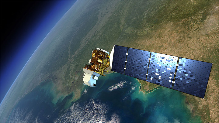
July 23, 1972 ERTS Earth Resources Technology Satellite (ERTS), later christened Landsat 1, was launched into a near-polar orbit. We had our first earth-watching, civilian science satellite. ERTS instruments recorded information in four spectral bands: red, green, and two infrared.

Remote sensing missions have continued through the decades that followed, making modern earth system science, landscape ecology, agriculture prediction, and many other fields possible. The Landsat missions continue with some blips: Landsat2 was launched in 1975, Landsat 3 in 1978; Landsat 4 in 1982 and Landsat 5 in 1984; in 1993 funds were found to keep Landsat 4 and 5 operational just before Landsat 6 failed upon launch in 1993 and ended up in the Indian Ocean. Landsat 5 only recently gave out after 27 year of imaging; Landsat 7, launched in 1999 continues its work as well.  The eighth satellite, dubbed the Landsat Data Continuity Mission (LDCM), is scheduled for launch in 2013. It will be the next chapter for the longest-operating Earth-observing program in the world. More information here: http://earthobservatory.nasa.gov.

Landsat 7 is entirely government owned and operated, and after launch, the USGS was charged with distributing the data at government (nonprofit) rates. Today, the USGS distributes Landsat data over the Internet for free, and usage has exploded. Back in the day, we had to pay for each scene individually. This tended to limit the ability to work at regional, let alone global scales.  The new model of data distribution has made a number of on-line resources and visuzalizations possible.  Additionally, there are currently a quarter of a million science citations that use Landsat imagery, focusing on agriculture, oceans, land change, urban and natural areas.

The first fully operational Landsat image taken on July 25, 1972, inaugurating a 40-year run when the first satellite was known as the Earth Resources Technology Satellite, or ERTS. Credit: NASA’s Earth Observatory

This image above was the first image from the Landsat program. It shows Dallas, TX. Check out those reservoirs!

Some nice write-ups about Landsat:

Landsat imagery:

Happy Fall Semester 2012!

California Climate Change Portal

Climate change is expected to have significant, widespread impacts on California's economy and environment. California's unique and valuable natural treasures - hundreds of miles of coastline, high value forestry and agriculture, snow-melt fed fresh water supply, vast snow and water fueled recreational opportunities, as well as other natural wonders - are especially at risk.

California is leading the way with prevention measures to reduce greenhouse gases, but no matter how quickly we cut our climate polluting emissions, climate impacts will still occur. Many impacts - increased fires, floods, severe storms and heat waves - are occurring already and will only become more frequent and more costly. There are many things we can do to protect against climate change impacts. Taking steps now to prepare for and adapt to climate change will protect public health and safety, our economy and our future.

The state of California has released the Climate Change Portal, where you will find resources you can use and actions you can take to address both climate change prevention and climate change adaptation. Cal-adapt is a big part of the portal.

Drought imagery from MODIS

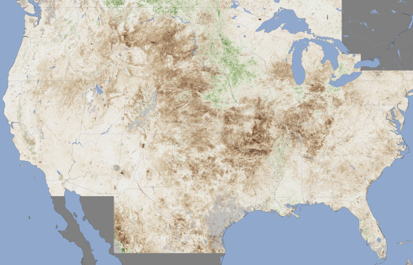
As the warm weather moves west this week we think about those battling the drought in the midwest and northern states. Here is a shot from July from NASA's Moderate Resolution Imaging Spectroradiometer (MODIS) sensor, on the Terra satellite.  The map contrasts plant health in the United States between June 25 and July 10, 2012, against the average conditions between 2002 and 2012. Brown areas show where plant growth was less vigorous than normal; cream colors depict normal levels of growth; and green indicates abnormally lush vegetation. Data was not available in the gray areas due to snow or cloud cover. From NASA.

New open datasets for City of Oakland and Alameda County

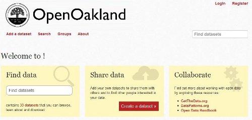
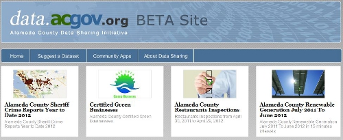
Following on the footsteps of the county and city of San Francisco open data repository at data.sfgov.org, two new beta open data repositories have recently been released for the City of Oakland and Alameda County. This development coincides with the recent 2012 Code for Oakland hackathon last week. The hackathon aims to make government more transparent in the city and county through the use of technology with apps and the web to make public access to government data easier. The City of Oakland’s open data repository at data.openoakland.org includes data on crime reports for a variety of spatial scales, a variety of tabular and geographic data such as parcels, roads, trees, public infrastructure, and locations of new development to name a few. It is important to note that the Oakland open data repository is currently not officially run or maintained by the City of Oakland. It is currently maintained by members of the community and the OpenOakland Brigade. Alameda County’s open data repository at data.acgov.org includes data on Sherriff crime reports, restaurant health reports, solar generation data, and a variety of tabular and geographic data and public health department data. Data can be viewed on a browser as an interactive table or an interactive map or the data can be downloaded in a variety of formats. Both sites are still in their infancy so expect more datasets to come online soon. Also on the same note, the Urban Strategies Council recently released a new version of their InfoAlamedaCounty webGIS data visualization and map viewer - check it out.

 Screenshot of City of Oakland Open Data: data.openoakland.org

Screenshot of Alameda County Open Data: data.acgov.org

Crowdsourced neighborhood boundaries

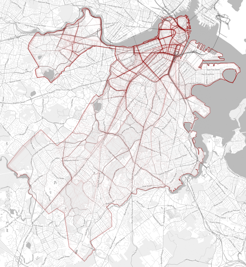
Andy Woodruff and Tim Wallace from Bostonography discuss the first preliminary results of an experiment they set up with an interactive webGIS tool that allows people to draw polygons where they think each of Boston’s neighborhoods are located. About 300 maps of neighborhoods have been submitted so far and with the compiled data there are many areas of agreement and disagreement on where neighborhood boundaries may lay. Bostonography created maps showing a gradient of agreement for each neighborhood's boundary. This exercise is reminiscent to the work of Kevin Lynch and is an interesting experiment in trying to see if there is a consensus on where people think neighborhood boundaries are as opposed to how they are defined officially by the city. For the full blog post and maps on Bostonography click here. For an article in the Atlantic Cities that discusses the maps click here.

Strength or density of polygon line placement of crowdsourced neighborhood boundaries

New Trulia commute time maps

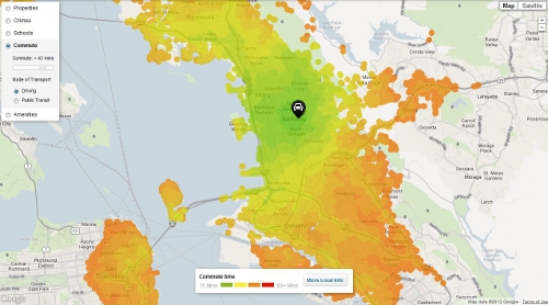
Trulia recently released a new commute time map that shows your estimated time of arrival in real time to all points in a region. The service uses OpenStreetMap data and General Transit Feed Specification (GTFS) feeds to calculate travel time. Drive times are available nationwide with public transit travel time only available in select cities for now. Read the full story here or click here for the map.

Screenshot from Trulia commute map

New ArcGIS and QGIS desktop versions available

Big updates are now available to both ArcGIS and QGIS bringing more power and functionality to desktop GIS users!

ArcGIS 10.1 is now available with lots of new features.  Learn more from ESRI.com.  The GIF is now testing the updated software and we plan to make it available on lab workstations in the coming weeks.

QGIS 1.8 is also now available, and is free for download.  Visit QGIS.org for download instructions and to learn more about the new features available in this release.

What is "success" with post-disaster crowdsourcing?

At a recent workshop I gave on webGIS, after giving an overview of some of the recent uses of crowdsourced and VGI in disasters (fire in San Diego, earthquake in Christchurch, Ushahidi everywhere...), I was asked about success of these projects. Who used the data? How? (and who funded these websites, but that is another story.) And I had only the vaguest of answers. Here is a thoughful critique on this subject by Paul Currion on MobileActive.org. He examines the use of the Ushahidi project in Haiti. Paul is an aid worker who has been working on the use of ICTs in large-scale emergencies for the last 10 years.  He asks whether crowdsourcing adds significant value to responding to humanitarian emergencies, arguing that merely increasing the quantity of information in the wake of a large-scale emergency may be counterproductive. Why? because aid workers need clear answers, not a fire-hose of information. Information from the crowd needs to be curated, organized, targeted for response. He makes the point that since crowdsourced data is going have to be sorted through, and can be biased, and can be temporary, aid agencies are going to have to carry out exactly the same needs assessments that they would done without the crowdsourced information.

Where and when do crowdsourced data add value to a situation or project? How can we effectively deal with the bias in the data that comes naturally? We deal with this all the time in my smaller web-related projects: oakmapper and snamp for example. What is the future role of the web for adaptive forest management for example? How do these new collaborative and extensive tools help us make important decisions about natural resources management in often contentious contexts? More to think about.

SNAMP lidar team featured in ANR's Green Blog

The SNAMP spatial team and the cool lidar work we are doing was recently featured in ANR's Green Blog. The article highlights the work of UC Merced in forest visualization. Currently, most visualization software packages focus on one forest stand at a time (hundreds of acres), but now we can visualize an entire forest, from ridge top to ridge top. The Sierra Nevada Adaptive Management Project (SNAMP) Spatial Team principle investigators Qinghua Guo and Maggi Kelly, and graduate student Jacob Flanagan and undergraduate research assistant Lawrence Lam have created cutting-edge software that allows us to visualize the entire firescape (thousands of acres).

New software to extract geographically representative images from Google Street View

New software developed by Carnegie Mellon University in Pittsburgh and INRIA in Paris mines the geotagged imagery in Google Street View to uncover what architectural features distinguish one city from another across the globe. The software is based upon a discriminative clustering algorithm to distinguish features in one picture from another. This research shows that geographically representative image elements can be discovered automatically from Google Street View imagery in a discriminative manner.

Jacob Aron from the New Scientist reports:

"The researchers selected 12 cities from across the globe and analysed 10,000 Google Street View images from each. Their algorithm searches for visual features that appear often in one location but infrequently elsewhere...It turns out that ornate windows and balconies, along with unique blue-and-green street signs, characterise Paris, while columned doorways, Victorian windows and cast-iron railings mark London out from the rest. In the US, long staircases and bay windows mean San Francisco, and gas-powered street lamps are scattered throughout Boston."

"The discovered visual elements can also support a variety of computational geography tasks, such as mapping architectural correspondences and influences within and across cities, finding representative elements at different geo-spatial scales, and geographically-informed image retrieval."

Read the full story by clicking here.

To read the research paper and view the project website click here.