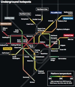
It's hot down there! New map of the London tube hot spots.

I have a real fondness for the London Underground, having spent many hours on it as a child and teenager, but also because of the role the first tube map played in transportation cartography and 20th Century design, so nicely described in Bill Bryson's Notes from a Small Island.  From a BBC website devoted to the map: the map was devised in the 1930s by Harry Beck, who worked on it throughout his life, trying to improve and modify it. A nice website that captures this evolution is here. Many of the world's cities use a similar "non-geographic, electrical wiring" design for their public transport maps.

Luckily, many of my hours on the Tube were on the cooler Jubillee Line, and not on the Central Line. A new map compiled by Transport for London (TfL) has revealed the hottest spots on the Tube network, notorious for its lack of air-conditioning.  For many, it proves that London has indeed become a melting pot. The Central Line — which serves some of the most popular tourist spots such as Oxford Street and St Paul’s Cathedral — is one to avoid on a hot day.  The Central Line boasted some of the highest temperatures when the heat map was compiled on July 28 last year — the hottest day. Many sections of the tube reach over 30C (86F). Full-size graphic:  Graphic: underground hotspots. From the Times, via the Map Room.
William Bowen: 3 new aerial flights of the Sierra Nevada


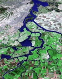
William Bowen has produced some new lovely high res aerial flyovers (some with what he describes as "choppy and unscripted" - but very informative - narration). At left, one of his great images of the Delta from the California Atlas of Panoramic Images.


Three new silent movies focusing on the High Sierra:

Examples with narration:

New 'Map Illustration' Software for Mac Users

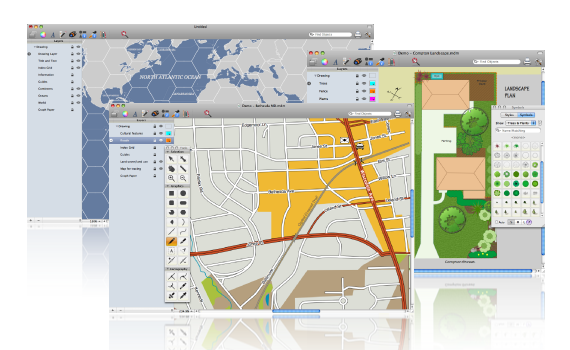
Mapdiva, LLC has just resleased its map illustration software OrteliusTM  for Mac computers. It's only 30Mb to download a free 31-day trial version, and for now they're offering an 'Introductory Price' of $79 (versus $99) until the end of September. An Education Edition is also available only $39 (after Sept. 30 willl be $49) for currently enrolled students with a valid .edu address.

Note that the company states, "Ortelius is designed for cartographic output as the end product, intentionally not a GIS system, though the Professional Edition with add more GIS-type operations to the currently available tools. On a general note the Standard Edition is likely to fall short in some aspects for hardcore geographers and GIS users; the Professional Edition is intended to provide many more GIS features." So some users may want to wait for the Pro Edition for increased functionality.

From The Map Room

When good maps go bad - cartastrophe blog

I am not a fan of blogs soley created to bash others' mapping and webGIS work without offering any constructive critisism or at least offering examples of the author's own work. You know who you are. But this one seems to provide good examples of common map mistakes with helpful reference to cartographic theory (and has a clever title).  I will likely use some of these examples in my class.

Type Brewer

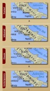
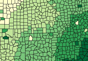
From Marek. Perhaps borrowing a bit of the name from the famous ColorBrewer (snap at right) project comes the TypeBrewer project (snap at left) to help us pick fonts on our maps. TypeBrewer is a free help tool that gives non-specialist mapmakers a chance to explore typography in a semi-structured environment. I confess I could spend some time playing with font type, spacing, density on a map of Italy.

Video on Myriahedral Projections

http://www.youtube.com/watch?v=b1xXTi1nFCo

This video on Myriahedral Projections is a great illustration of how projections work in general, but the cuts it makes are fantastic. Myriahedral Projections have many sides, but are (almost) conformal and conserve areas well. This video is entertaining for any crowd.

Recent Paper on Myriahedral Projections here: http://www.win.tue.nl/~vanwijk/myriahedral/CAJ103.pdf

New York Times Data Visualization Lab

So I have to admit, the last two days I've spent about 8hrs playing with the 20+  visualizations on NYT online. I also just saw they launched their own website  NYT Data Visualization Lab And users can access this to create their own visualizations. The potential for this Flash style graphics with GIS is endless, it would be great to see a Flash+GIS product out there.  The New York Times is clearly leading this march, it will be interesting to watch it develop. Cheers, Josh

Rad! Mapping Manhattan Project

Manhattan in 1609 Eric Sanderson is visiting CNR next week: Chris G pointed me to his work. Imagining Manhattan before European contact through visualization. Gorgeous work, and appealing on many levels for geographers everywhere.  Project site, and highlights from the New Yorker.  The image here shows an aerial view of Manhattan as it might have looked in 1609, juxtaposed with the outline of Manhattan today.

Schiaparelli’s Beautiful Canali

Sciaparelli’s Canali For those of you without at least a passing interest in Martian cartography, Giovanni Schiaparelli was one of the first astronomer's to map Mars using a halfway decent telescope. He drew exceedingly detailed maps of what he saw, depicting massive, linear trenches he called canali. He firmly believed these were too straight to be formed by any natural process, and that they must have been artificially produced by inhuman minds (perhaps even cool and unsympathetic ones). His maps were the state of the art for about 20 years. BibliOdyssey has a wonderful post showing some of Schiaparelli's maps, which are far more beautiful than I had imagined, having previously only seen crude reproductions in 2-tone print. Wonderful stuff. Via The Map Room

Skulls, Bones, and Mother Ships

Pirate Map It's probably wrong of me to find a UNOSAT map of recent pirate activity off the coast of Somalia kind of hilarious, but they actually used the skull and cross bones to iconify pirate attacks, and did, in fact, use the phrase "mother ship." I'm sort of ambivalent about the map as a whole. The spatial distribution of attacks is interesting (why so many hijackings around Mogadishu and Mudug?) as are the narratives, but the cartography leaves something to be desired. Land features get an inexplicable amount of detail and attention for a map depicting strictly maritime activity, and the iconography is almost meaningless (we get it, skulls and bones mean pirates). The colors create thematic associations fairly well, but seem primarily focused on the narrative callouts, which are arguably of secondary important to the locations of the attacks. Probably the most interesting data graphic is the bar chart at the bottom, depicting a (significant?) drop in absolute pirate attacks correlating with changes in government. Via humanitarian.info and Nick

Flow Map Layout

Several researchers at Stanford have written some software for visualizing flow maps. There pictures are very pretty, and, I think, good data vis. The map above shows the top ten states providing migrants to NY and CA. Here's their abstract:

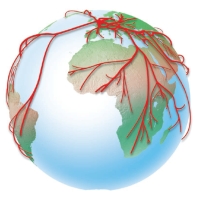
Cartographers have long used flow maps to show the movement of objects from one location to another, such as the number of people in a migration, the amount of goods being traded, or the number of packets in a network. The advantage of flow maps is that they reduce visual clutter by merging edges. Most flow maps are drawn by hand and there are few computer algorithms available. We present a method for generating flow maps using hierarchical clustering given a set of nodes, positions, and flow data between the nodes. Our techniques are inspired by graph layout algorithms that minimize edge crossings and distort node positions while maintaining their relative position to one another. We demonstrate our technique by producing flow maps for network traffic, census data, and trade data.