ArcGIS 10 coming in June

The latest ArcGIS release, ArcGIS 10, is slated to become available in June with a lot of big updates.  Check out ESRI's website to see more about what's coming.  They have several informative videos that demo the new software. 

Some of the improvements listed include:

  • Faster display, smoother navigation, and the ability to run geoprocessing in the background.
  • Perform in 3D virtually everything you can do in a 2D environment: modeling, editing, visualization, and analysis.
  • Simplify map creation and production with streamlined sketch-based Desktop (2D/3D) and Web editing.
  • Use and manage imagery more efficiently on the desktop and on the server.
  • New image analysis window for image interpretation and processing.
  • Automate common tasks and analyses with Python scripting.


NAIP 2009 Color Infrared Released

NAIP Color infrared, June 19, 2009Color Infrared imagery acquired during the summer of 2009 are now available for download from Cal-Atlas.  An index shapefile to identify the location of each image can be downloaded here (ZIP - 727KB).

The National Agriculture Imagery Program (NAIP) is tasked with providing access to high-resolution aerial image data on a state-by-state basis. 

These images are 1 meter resolution, 4 band GeoTIFFs that contain all of the natural color and infrared channels. 

Direct links to all of the California NAIP products are maintained on the GIF's website.  Currently, NAIP data is available for both 2005 and 2009.

Google Earth Browser Plugin

A union of Google Earth and Google Map took place yesterday (4/26/2010) resulting in Earth view. To be able to see the Earth view, you need to install the Google Earth browser plugin. From the LatLong Blog:

Those of you who aren’t as familiar with Google Earth might be wondering how Earth view differs from the satellite view that’s currently available in Maps. First of all, Earth view offers a true three-dimensional perspective, which lets you experience mountains in full detail, 3D buildings, and first-person dives beneath the ocean. The motion is fluid, and you can see the world from any viewpoint. Because Earth view is built right into Maps, you can switch back to cartographic view simply by clicking on the “Map” button. The view will even adjust automatically to a top-down, north-heading perspective as you transition. In essence, you now have all the best mapping tools at your fingertips, all in one place.

Today we are proud to announce the next major step in the marriage between Google Earth and Google Maps -- Earth view.

Smarter Suggest Feature for Google Maps

I tried out the smarter Suggest feature for Google Maps using my home address with mixed feelings. Because the search box is so responsive, some of the suggestions seemed very random as I typed my address. It also gave a list of shops and services, which made me wonder if this was more of an advertising scheme. Why don't you go ahead and try it out and see how you like it? Go to the same ole Google map address: maps.google.com.

The Suggest feature for Google Maps helps you find what you want faster and more accurately by showing search suggestions for the most relevant places, businesses and points of interest as you type. We experimentally launched suggest for Google Maps in Germany, China, Hong Kong and Taiwan a while ago. Since then, we’ve been working hard to improve the quality and coverage.

So from today we’re making the feature available on 10 more domains and in 8 additional languages, including English and on maps.google.com for the first time.

from Google LatLong Blog

New: Geospatial Modelling Environment

If you're a fan of Hawth's tools, be sure to check out SpatialEcology.com's latest product, Geospatial Modelling Environment.

"It combines the power of the statistical software R with the geographic processing functionality of ESRI ArcGIS to drive geospatial analyses.

"It incorporates most of the functionality of its predecessor, HawthsTools, but with some important improvements. It has a greater range of analysis and modelling tools, supports batch processing, offers new graphing functionality, automatically records work-flows for future reference, supports geodatabases, and can be called programatically." - http://www.spatialecology.com/gme/

Lovely geologic quads of SF Bay - 1914

This is the bay bridge plan... Goat Island is Treasure Is., there was a narrow gauge railway from Oakland for shipments to SF and beyond.The repository interface with integrated Yahoo! Maps was developed by the Digital Initiatives -- Research & Technology group within the TAMU Libraries using the Manakin interface framework on top of the DSpace digital repository software.

Geologic Atlas of the United States by Texas A & M University Libraries is licensed under a Creative Commons Attribution 3.0 United States License.

Lightweight UAV Camera System Demo

Yasuyuki launches the remotely controlled UAVWe enjoyed a fun Geolunch presentation yesterday, where Ben Burford of ISTS America and Yasuyuki Watabe and Masaki Usami from ISTS Japan showed off a new aerial photography system.  

This lightweight camera system is able to capture centimeter resolution image data at a fraction of the weight and cost of a traditional aerial photography system.  They’ve also developed software that can automatically orthorectify these acquired images with only the photos, gps location of the camera, and camera information. 

After presenting their systems capabilities in a slideshow presentation, the developers showed off their UAV with a live demo outside of Mulford Hall! 

Photo of onlookers taken from the UAV (photo compliments of Yasuyuki Watabe)

 You can view ISTS's promotional video here:


casablanca: the google earth prototype

I am so glad someone wrote this up! I was watching Casablanca (1942!) again awhile back, and just loved the intro scene of the earth, europe, and the route from Paris to Casablanca. This blog ((E)Space&Fiction: spatial machinery of fiction) (cool name, right?) makes the case that it was the first proto google earth, and analyzes the technical specifics that presaged Keyhole, etc. Specifically:

  • the combination of the spinning globe with a zoom effect on a specific point: Paris;
  • the use of a “jump” effect similar to Google Earth to move from one place (Paris) to another (Casablanca); and
  • the perspective changes from the vertical view to an oblique perspective of the streets of Casablanca, similar to current street views.

california map society website

The California Map Society has just launched a cool new website.  I am a member, I like these guys and their message. They say it well:

We are passionate about all phases of cartography in its broadest sense. We are fascinated by the potential of remote sensing, GIS, and the tools for today’s digital mapmaking. Yet we love the art and history embodied in antique maps. Understanding man’s continuing change in perception of his environment and world is part of the fun of viewing old maps. And we never fail to delight in the curious forms that maps have taken over the centuries.

Check out the website here.

California Coastal LiDAR Project (CCLP) to be available later this year

The California Coastal LiDAR Project (CCLP) is a collaborative effort to produce high-resolution topography data from Oregon to Mexico, extending from the shoreline up to the 10 m topographic contour. The U.S. Army Corps of Engineers (USACE) began a coastal aerial LiDAR collection in October 2009 as part of the National Coastal Mapping Program (NCMP). A combined effort by NOAA and USGS was developed in the latter half of 2009 to conduct LiDAR surveys of the San Francisco Bay Area extending from the Carquinez Strait to outside of the Golden Gate. The two projects are expected to be completed by mid-2010. Datasets will become publicly available by the end of 2010.

http://www.opc.ca.gov/webmaster/ftp/pdf/opc_cclp_report_final.pdf

http://www.opc.ca.gov/2010/01/mapping-californias-coastal-areas/

The volunteer mappers who helped Haiti

Using an image slideshow, BBC News tells the story of how volunteer mappers used OpenStreetMap, an open source mapping platform, to construct a detailed map of Port au Prince in Haiti with layers of geographic information. The geographic information was accessed and used by the rescue personel on the ground. This short slideshow highlights the importance of PPGIS/webGIS, mobile GIS, open source/platform, crowdsourcing, and public participation in a critical situation like the rescue effort in Haiti.

To view the slideshow, please click here.

Orthorectifying for the Masses

In a bit of Tom Sawyer-inspired app making, the New York Public Library has created an online application for rectifying their collection of digital maps of New York City. "Finding control points is so much fun! It is truly an honor to allow you, our special internet browser, to assist us in collecting them." The NYPL Map Rectifier allows you to export the rectified maps as KMLs. They've also added a separate section for maps of Haiti to assist in earthquake relief. 

Food Environmental Atlas for the US

Example from the USDA food atlas: pounds per capita of solid fats eatenFood insecurity, diet choice, access to healthy foods: these vary greatly across communities in the US.  In order to visualize these patterns and stimulate research and discussion, the USDA has published an online food atlas.  The USDA Food Atlas currently includes 90 indicators of the food environment such as: store/restaurant proximity, food prices, food and nutrition assistance programs, and community characteristics—interact to influence food choices and diet quality. It is fairly course, but very illustrative of spatial pattern of food insecurity, diet, access to restaurants and fast food, and many other factors.  With this interactive atlas, you can:

  • Create maps showing the variation in a single indicator across the U.S.; for example, variation in the prevalence of obesity or access to grocery stores across U.S. counties. Check out this scary example above: pounds per capita of solid fats eaten (light green - low; dark blue high, up to 24 pounds);

  • View all of the county-level indicators for a selected county;

  • Use the advanced query tool to identify counties sharing the same degree of multiple indicators; for example, counties with both high poverty and high obesity rates;

  • Download data.

Fog in California - it's declining

James A. Johnstone and Tod Dawson's recent paper in PNAS show that California's coastal fog has decreased significantly over the past 100 years, potentially endangering coast redwood trees dependent on cool, humid summers. Coast redwoods, Sequoia sempervirens, grow in a narrow coastal band, from Big Sur to Oregon, characterized by cool summer temperatures and high humidity from fog (see map at right from USGS).  They analyzed 20th century climate station records, and have shown that since 1901, the average number of hours of fog along the coast in summer has dropped from 56 percent to 42 percent, which is a loss of about three hours per day. Excerpted here.

CPAD 1.4 drops today! California Protected Areas Database

From GreenInfo Network.  The new California Protected Areas Database (CPAD 1.4) has just been released in geodatabase and shape file formats.  Please visit www.calands.org to download.  Updates and improvements to CPAD are described in the CPAD Manual also available on the CALands web site.

WHAT'S NEW IN CPAD 1.4:  CPAD 1.4 contains a number of important data improvements - more coverage of urban parks, more complete alignment to parcels, broader implementation of management designations, and more.

VIEW CPAD DATA ONLINE, REPORT ISSUES:  For those who do not use GIS or prefer to view CPAD via the web, you can do so though a google map overlay at http://www.calands.org/review.php.  We welcome input from the CPAD user community to keep us informed about errors and updates in CPAD.  Please report errors by clicking on the "Report Error" button.

GET NOTIFIED WHEN CPAD IS UPDATED: We encourage you to receive CPAD updates.  You can do this by clicking on the "Receive Update Notification" link on the calands.org homepage.  We will not distribute any of your information or use your email outside of the CPAD mailing list.  Registering helps us better serve the CPAD user community.

Disaster response evolves: faster, more detailed, and community focused

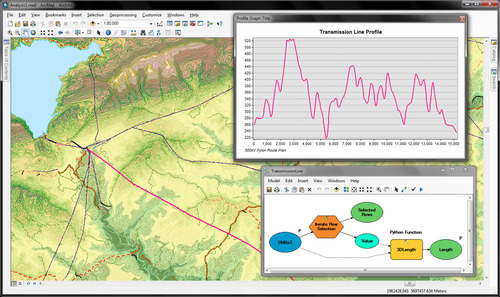
The recent earthquake in Haiti makes us, placed as we are on another of the great faults of the western hemisphere, take pause and think about the fragility of life and the suddenness of disasters like earthquakes.  The mapping of earthquakes - their shake strength, fault lines, and past seismicity - and their damage, has changed in recent years. The Haiti quake shows this: within hours and days of the quake, we were able to see the shake intensity, historical seismicity and detailed faults from the USGS, and Open Street Map opened up a crisis center for participatory mapping. International agencies requested satellite data of the area and, NASA, GeoEye and the European Space Agency responded, and shared their imagery freely.  A number of detailed before and after visualizations from outlets like the NY Times and Bing Maps quickly followed. The disaster and the geospatial response was chronicled in many blogs. 

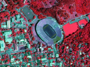
This is more than what was available to us recently with the San Diego, California fires or the San Francisco Oil Spill in 2007, or Hurricane Katrina in 2005, or the Indian Ocean Tsunami in 2004, each of which set new records for mapping speed and creativity. Each global-scale disaster seems to be a driving innovative force to help shape and evolve participatory mapping, detailed imagery delivery, and spatial decision support tools.  For example, this past weekend I was involved in a World Bank effort called Operation GEO-CAN – Global Earth Observation – Catastrophe Assessment Network (press release here) to analyze aerial imagery from imagery from Port au Prince in 2009 (top) and 2010 (bottom)before and after the Haiti earthquake.  The World Bank needed fast action to get a clearer picture of damage and rebuilding needs. Hundreds of people, from 20 countries, recruited via email, were quick to lend their expertise to digitize and describe collapsed buildings evident in new GeoEye imagery when compared to older imagery (see example at left).  The Earthquake Engineering Research Institute (EERI), who helped coordinate the effort, used a fast, mobile, distributed thinking system that employed a Google Earth framework and a clever workload management system that allowed users to check out individual tiles of imagery, search for collapsed buildings, digitize them, and then upload the data as lean and mean kmz files. The effort was viral, and continued to grow over the weekend as many of us analyzed tile after tile of imagery, and saw the unimaginable destruction in Haiti. It is astonishing what you are able to see with detailed, multi-temporal, nadir view imagery: collapsed buildings and walls; tents erected in back yards; blocked roads.  The dataset we created will be used to guide emergency response and restoration.

This kind of distributed analysis was inconceivable not long ago. The GeoEye satellite, which captures sub-meter imagery routinely, and Google Earth, which seamlessly coordinates multiple imagery streams, are now mainstream in the 21st century, as are other tools like Open Street Map and Bing. New imagery of disaster foci, new software to fuse and analyze multi-temporal imagery, new database management tools to guide workflow are critical, but it is visionary thinking that is able to quickly capture a concerned and technically capable audience that is paramount. We can learn from our response to the horror of natural disasters like earthquakes to support research in environmental sciences.  These experiences reinforce the message that geospatial tools, as tools alone, are inconsequential. But when we can quickly and accurately map pattern and context, and use that to support decisions, plan for the future, and communicate options, geospatial tools can be the among most powerful available to us.  Along these lines, we at the GIF have been turning our attention internationally, and are focusing on several international projects. For example, we are working with colleagues from the Department of Economics to map land cover change in order to study patterns of human conflict in Sierra Leone, and helping train professional health care students from UCSF who will be stationed in African and India in coming years to look for connections between human health and environment.  We will write about some of these in our upcoming newsletter.

As a last word, there is plenty more to do in Haiti: places to donate include the Red Cross, Salvation Army, and Partners in Health, among many, many more.

Free Haiti Imagery through Digital Globe

Digital Globe is offering free access to Haiti imagery pre- and post-earthquake.

They're offering three ways to access the imagery:

  1. KML Overlay for Google Earth that displays the most current imagery for a given location.
  2. ImageConnect plug-in for GIS software that allows GIS professionals to view all the images that have been loaded to the Crisis Event Service.
  3. FTP access to GeoTIFF imagery from QuickBird, WorldView-1 and WorldView-2.

Register at this site for free imagery: http://dgl.us.neolane.net/res/dgl/survey/CES_H.jsp

Transit & Trails: Go hiking without a car in the Bay Area

Ryan Branciforte at the Bay Area Open Space Council reports on their new web tool: Transit and Trails. The new interactive website identifies more than 500 trailheads and 150 campgrounds in our region’s 1.2 million acres of preserved lands. Just enter your starting location at Transit and Trails’ Google Maps-powered site, and select the radius. Once you’ve picked your ideal trail from the results, Transit and Trails will open a new link in 511 Transit Trip Planner, where you’ll find a detailed trip itinerary, complete with a map, transit times, fares, and walking directions to and from the transit stop. Very cool.

Related news: from the SF Chron, SF Hostels, mother nature network, & triple pundit.